A Minimal Kitchen to optimize the living area

A Minimal Kitchen to optimize the living area

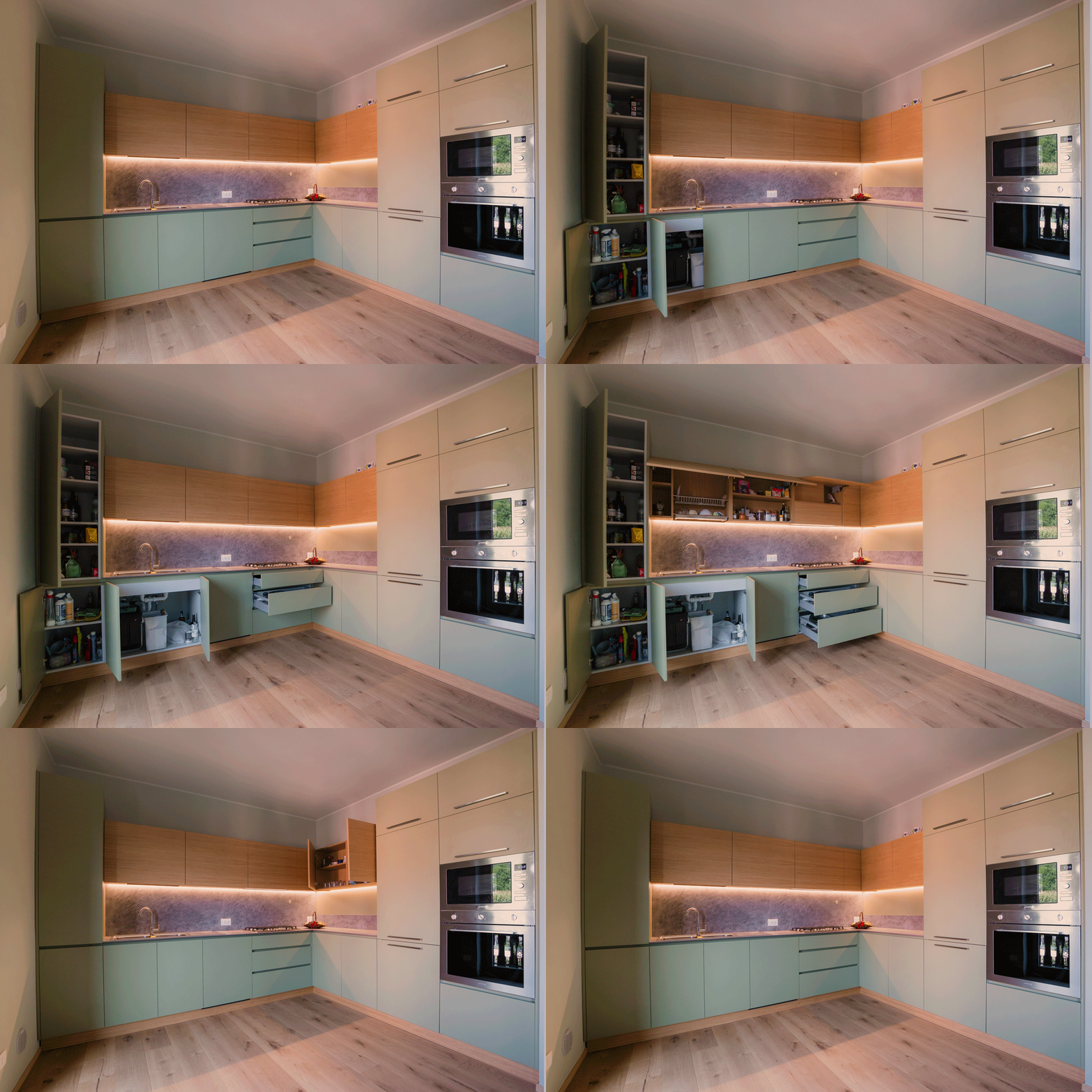
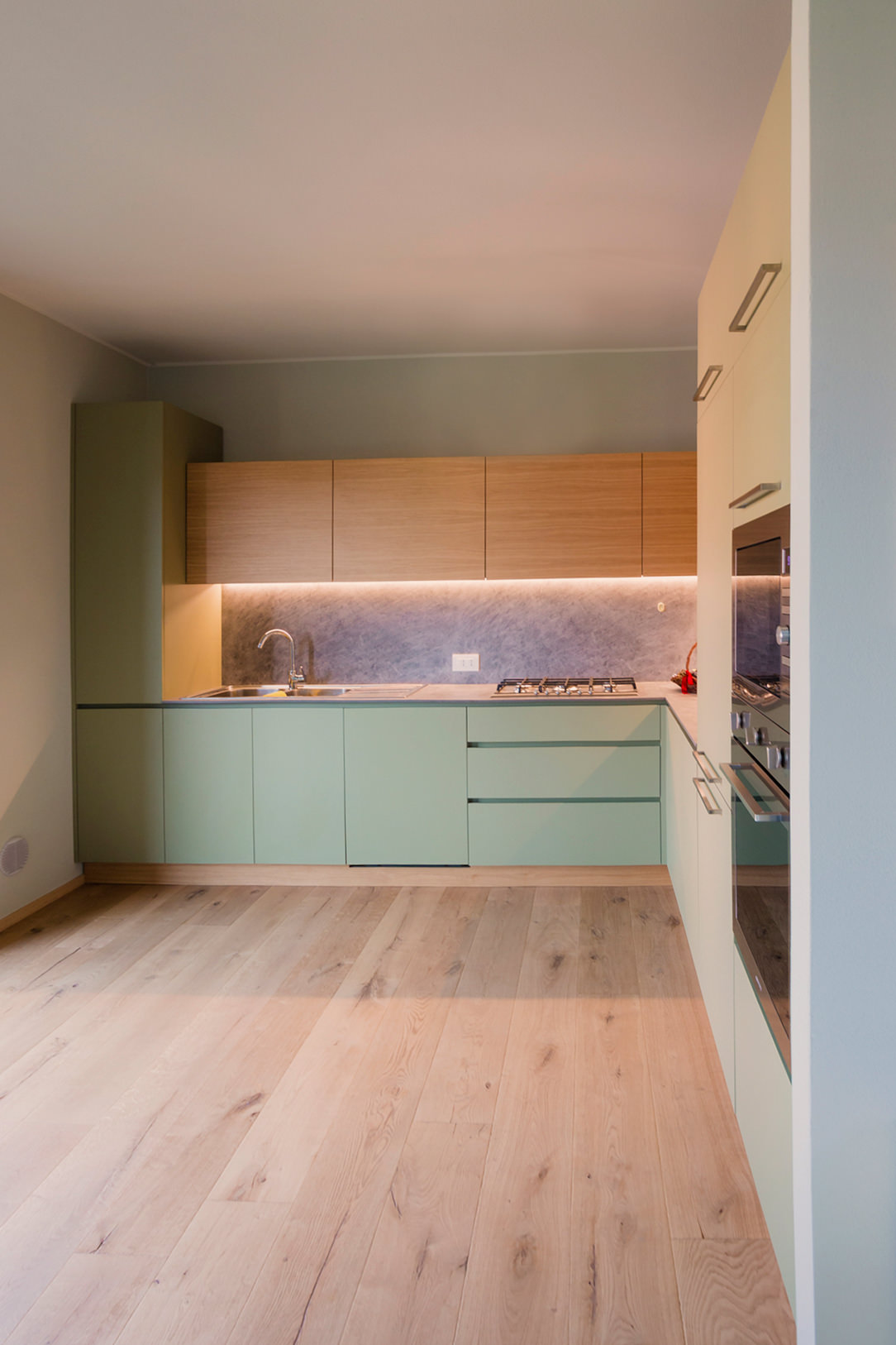
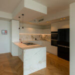
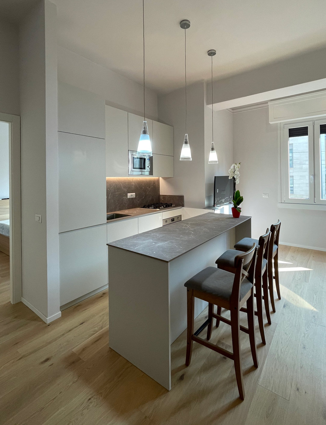
To optimize the available space, in a small two-room apartment in Milan, we have created this minimal, discreet, bright and elegant kitchen.
Minimal white Kitchen

ALL LIVING ROOM

As we wrote in this article dedicated to the Kitchen Snack Table, in contemporary kitchens the living area and the kitchen increasingly merge into a single open space.
There are no more partitions even at the entrance to the apartments, the door opens and everything we can have in a Living area is revealed in front of us.
So the kitchen, dining area and living room become a single room, just like in this article dedicated to a functional kitchen.
To give harmony to this triptych, the kitchen must therefore lose its “operative” spirit by hiding ladles, pots and groceries and becoming a more discreet element, which is revealed only when necessary.
Much more storage space and doors closed from view, while maintaining everything needed to cook, serve and enjoy food.
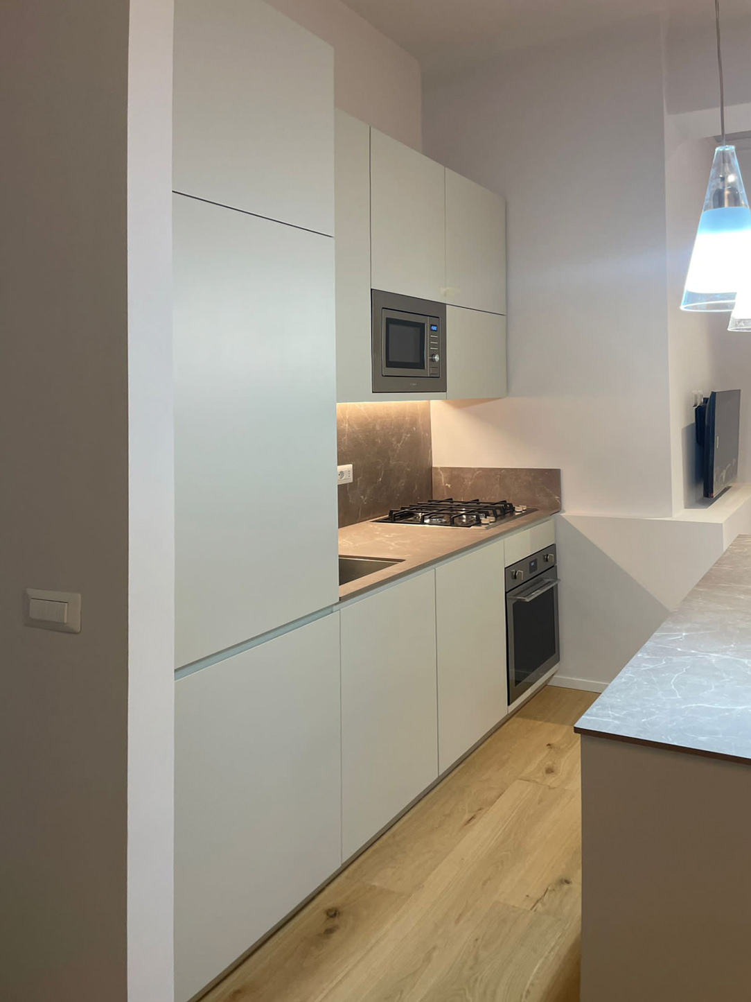
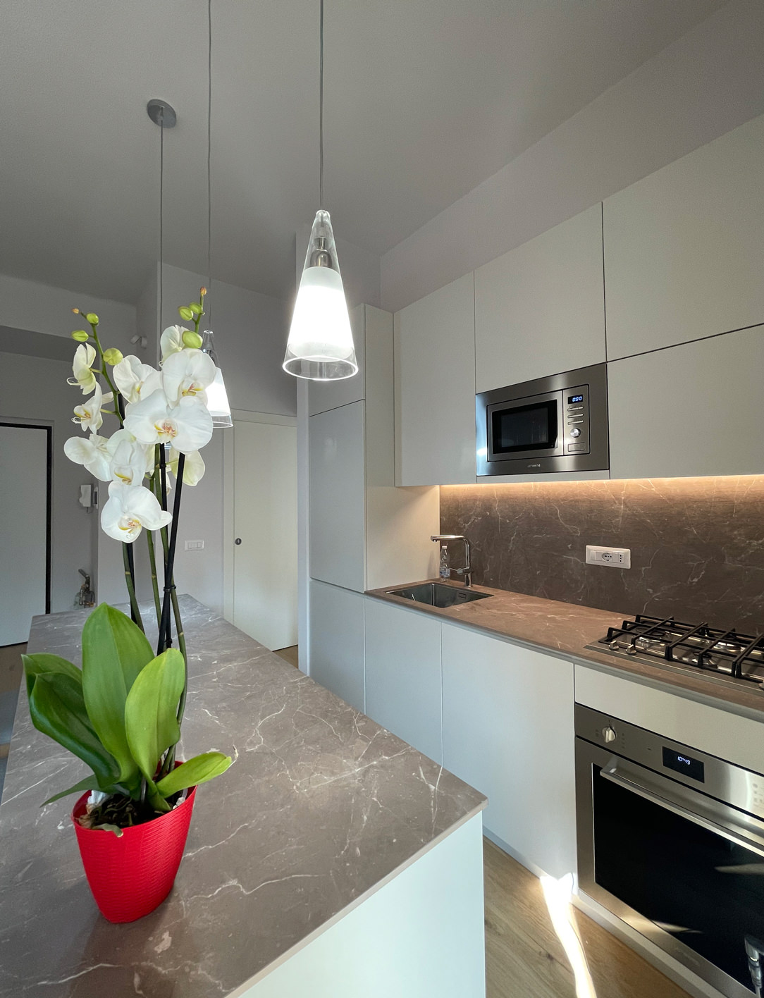
minimal kitchen lateral

​PHYSIOMY OF A MINIMAL KITCHEN

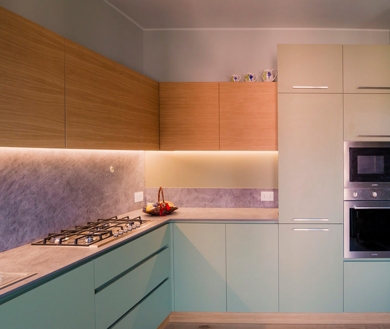
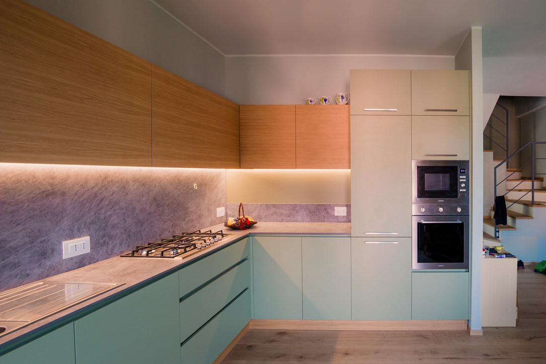
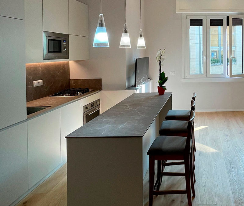
This kitchen, designed by Artecasa studio, optimize the most of the available space.
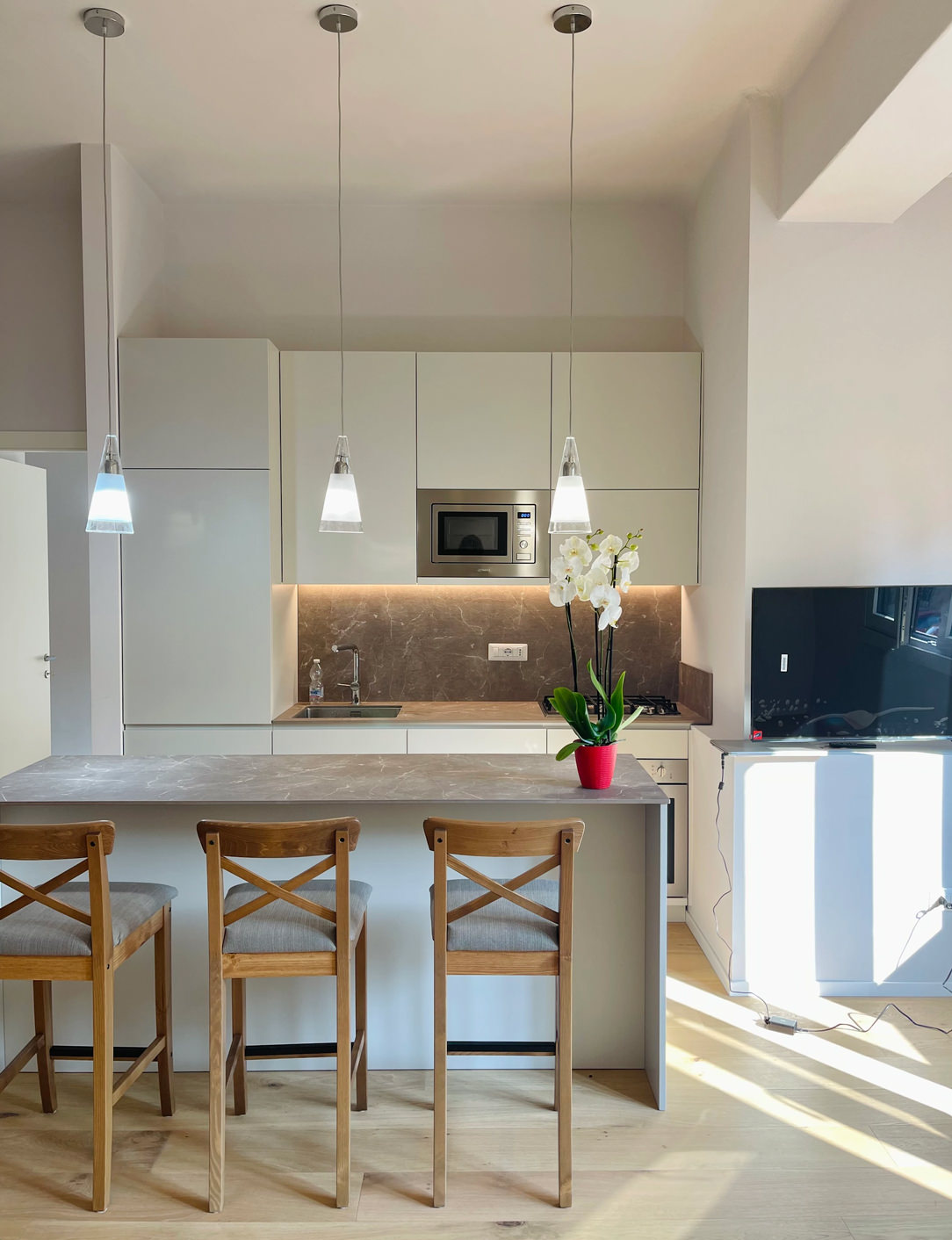
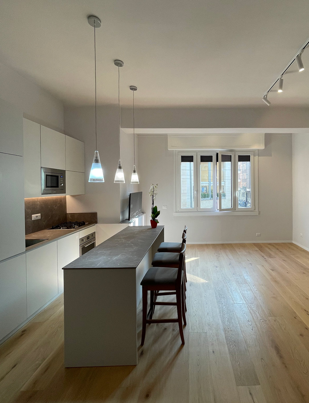
It develops in the niche of the side wall at the entrance with an equipped part and a front island that acts as an additional storage space and snack table for quick meals.
What can therefore be seen from the entrance are two horizontal gray stone floors, which develop parallel.
gray minimal kitchen countertops

In the equipped part in the niche there are all the appliances needed in a minimal kitchen: a refrigerator column, a dishwasher with a two-bowl sink, a hob with an oven and a tall microwave.
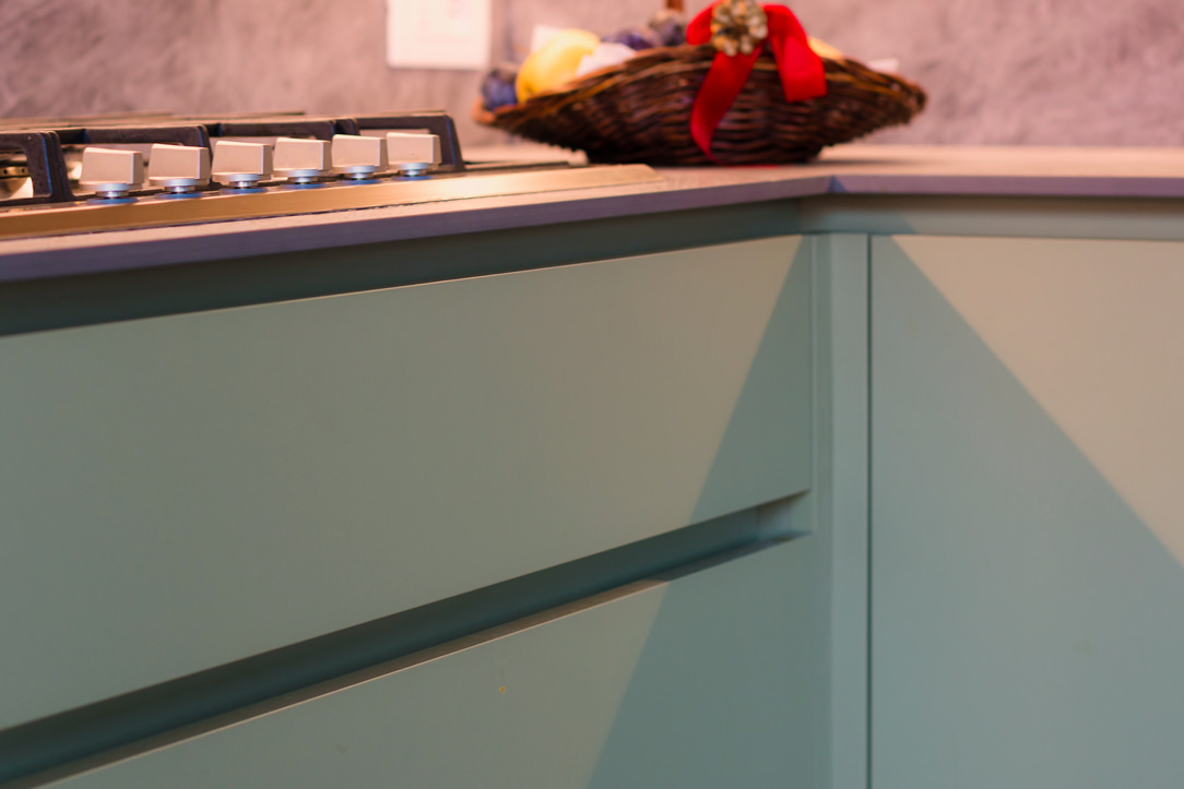
In the island, lots of storage space, drawers for cutlery, pots and crockery and the top that extends towards the living area becoming a snack top to accommodate at least 3 diners.
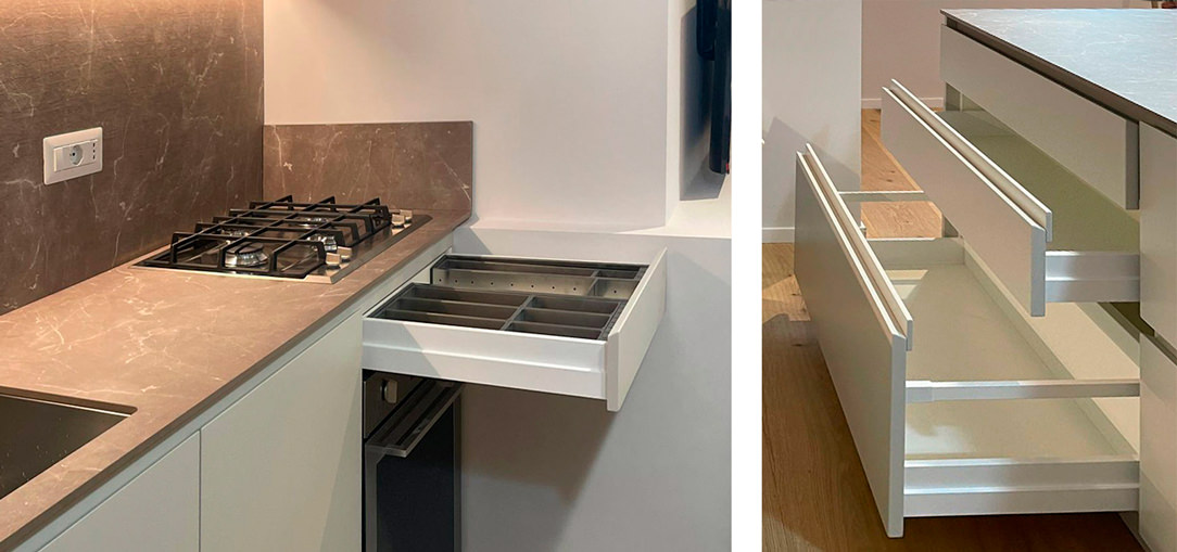
details drawers
The atmosphere is convivial, and the lights are skilfully designed to amplify this feeling of intimacy and warmth.
Three ceiling lights descend punctually on the Kitchen Snack Table, the backlit wall units remain at the service of the kitchen while a track with adjustable spotlights illuminates the relaxation area.
The colors are light and glow in the light from the large windows at the back of the room.
minimal kitchen lateral

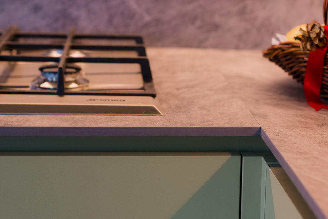
On the ground a natural oak parquet that matches well with the gray veined stone chosen for the countertops and the back of the kitchen and the light-colored furniture.
Here another minimal Milanese kitchen with similar combinations.

Furniture for children according to the Montessori Method

Furniture for children according to the Montessori Method

Building furniture in Montessori style means creating a child-friendly, comfortable and accessible environment. The lines that characterize these furnishings are simple and the materials are natural, such as wood.

THE MONTESSORI METHOD

The Montessori educational method is based on free activity within an environment tailored to the structural and cognitive characteristics of children and teenagers.
The function of the environment and of the furnishings that complete their spaces is to allow them to spontaneously develop autonomy in all evolutionary areas. The environment must therefore be built in proportion to the child.
It must be beautiful, harmonious and clean, it must facilitate movement and activities, while limiting the tools.
A space free of obstacles and minimal, free to be experienced independently, without the help or interaction of an adult.
Children in these environments are free to choose, create, invent and become aware of themselves and their potential in a process of self-education and self-control.
Montessori pedagogy starts from birth and develops up to adolescence with the aim of making the child not only independent, but also responsible and aware towards individual, but also social growth.

MONTESSORI FURNITURES

A fundamental prerogative of Montessori furnishings is the possibility for the child to reach the object easily and independently for sensory activities.
Then leave it free to be “called” by the object.
Furniture with an impact that is not only physical but also visual, fantastic and emotional.
Elements that become playmates and life companions where adults are guests or spectators in the environment.

BOOKSHELF

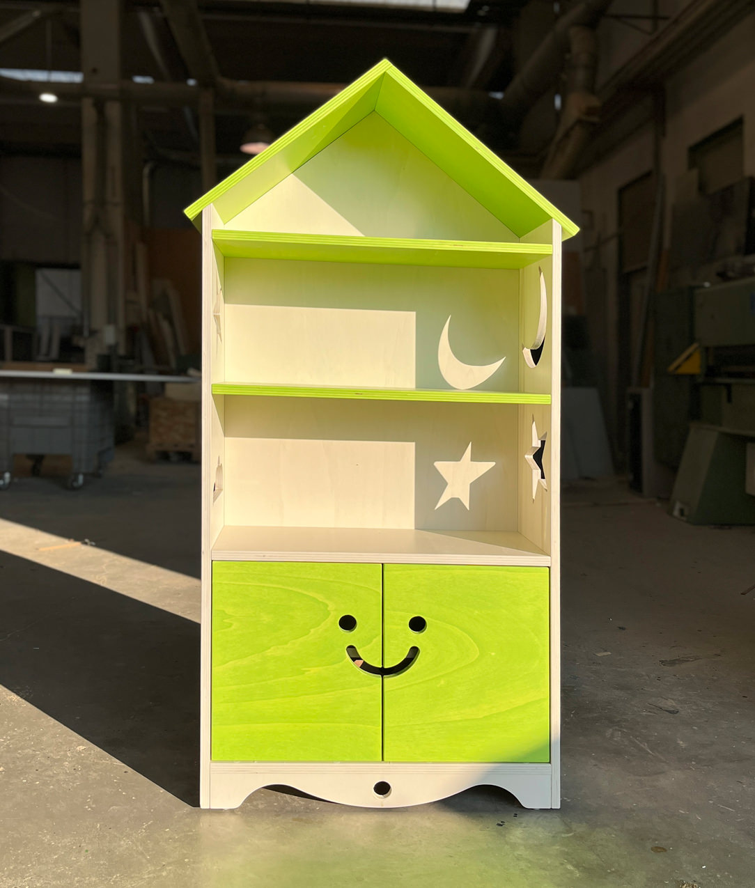
To marry the Montessori principles is this bookcase, made at child height in order to encourage the free choice of the favorite book.
All or most of the books are displayed in full view and in an orderly manner, even better if with the cover visible and not on the edge.
The shelves are easily accessible while the closed parts are designed to make opening easy and intuitive.

 Allegra Montessori Library
 Allegra Montessori Library
 Allegra Montessori Library

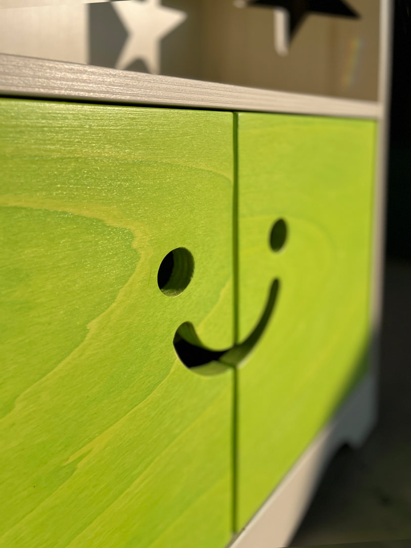
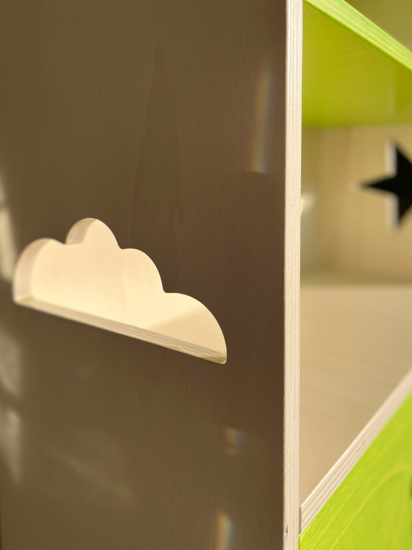
The “Little Cheerful Bookcase” in the shape of a house has shelves visible in the upper part and lower doors with a laser-cutted handle in the shape of a happy face.
The opening takes place precisely by inserting the fingers in the “voids” of the smiley, stimulating the touch for gripping the doors.
Internally, a shelf is available for any small items. Made of poplar wood it was subsequently painted with non-toxic water-based paints that still allow the natural grain of the poplar to be glimpsed.
All this to introduce the theme of colour, respecting the reference to nature present in the choice of material.

MONTESSORI TURRET

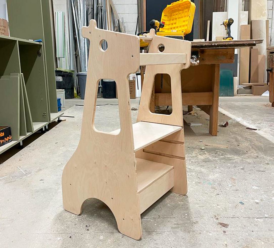
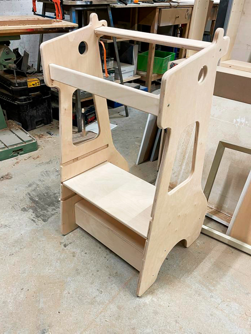
The Montessori turret is also called the Learning Tower.
This is essentially a wooden ladder that allows the child to stand up, in total safety thanks to the side bulkheads.
Thanks to this “elevation from the ground” all the adult furnishings, such as the kitchen top, tables or sinks, also become accessible for the child.
The latter thus manages to carry out, in complete autonomy, various actions such as brushing his teeth, hands or carrying out small household chores which allow him to acquire autonomy.
The steps of the Montessori tower also train the child in the actions of going up and down which he will have to deal with when dealing with higher stairs.

 Montessori giraffe turret

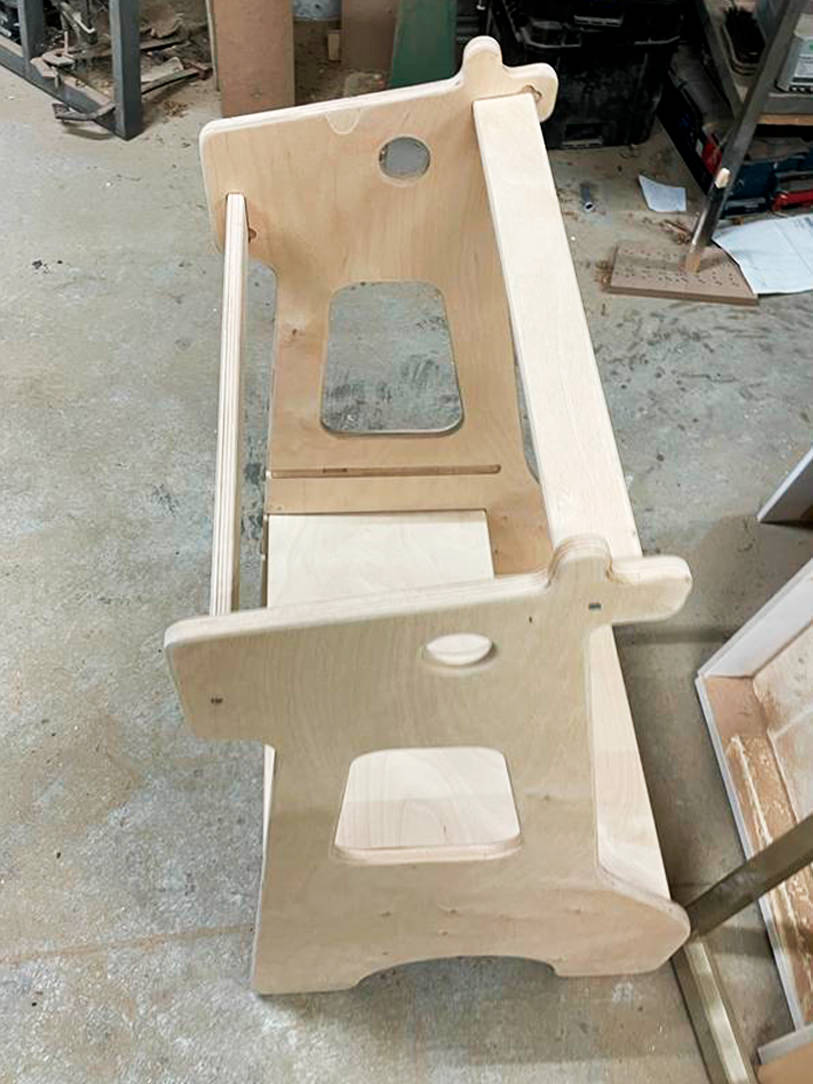
Here is our creation in the shape of a giraffe in which the second step is removable and can be raised according to the height of the child.
This turret is a useful accessory and can also be used as a stool; in fact, the child can sit on the first step and the second shelf acts as a back support.

Montessori giraffe turret detail

An example is our giraffe-shaped creation in which the second step is removable and can be raised according to the child’s height.
A multifunctional element, it can also be used as a stool using the first step as a seat, while the second shelf acts as a back support.

MONTESSORI BEDS

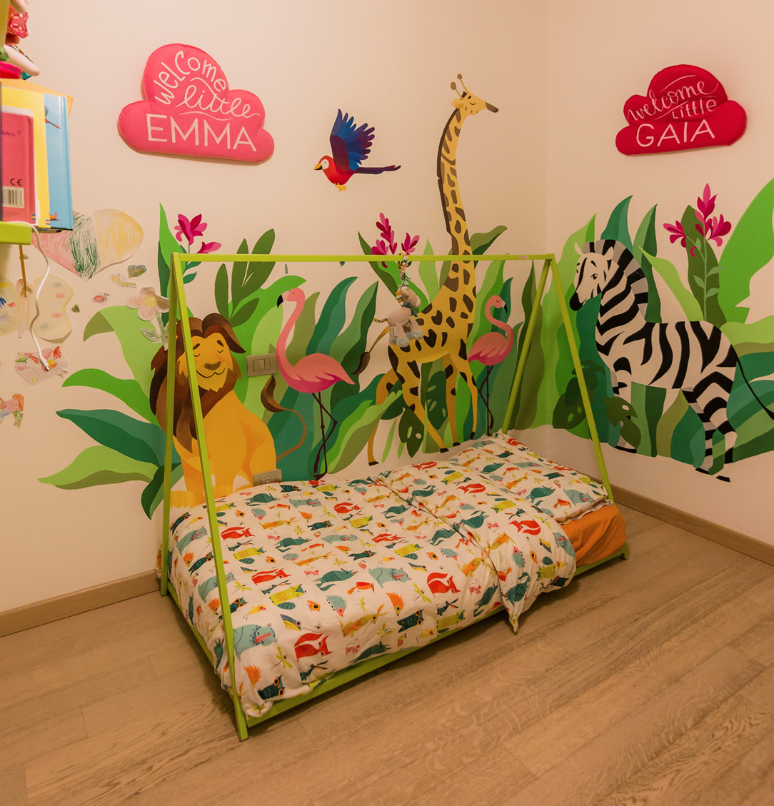
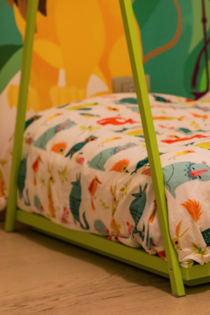
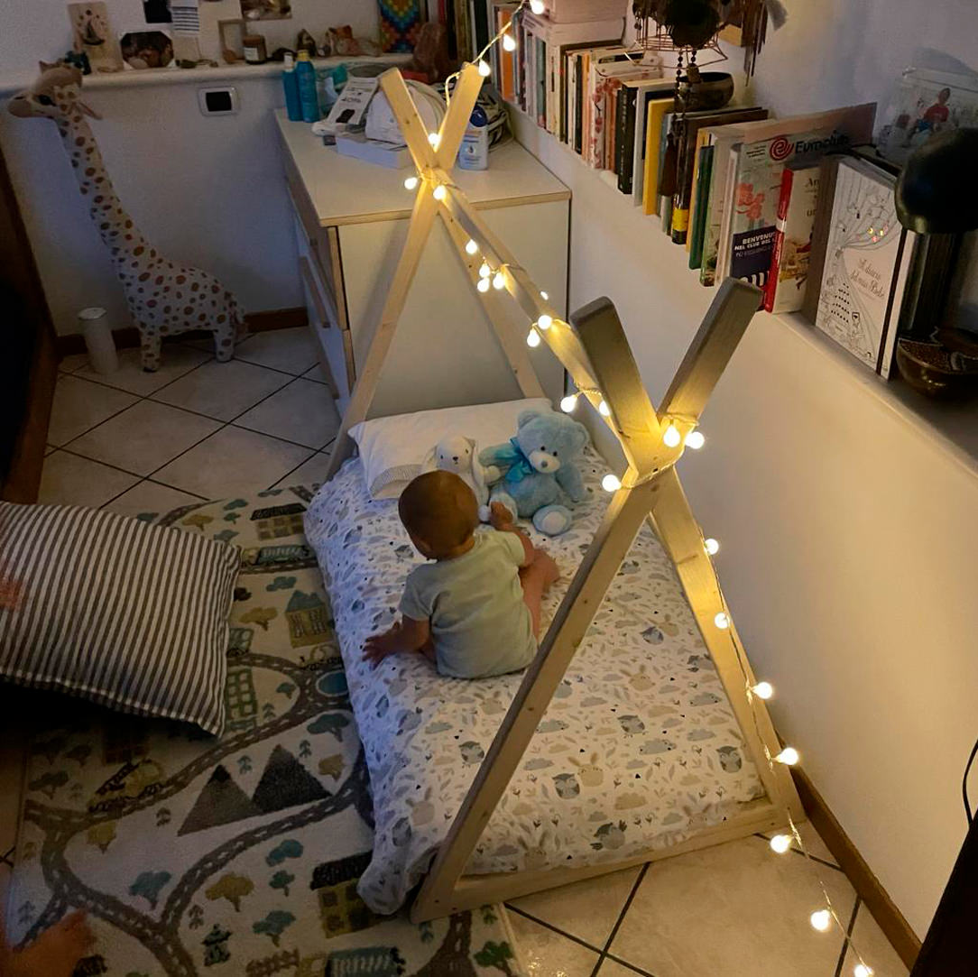
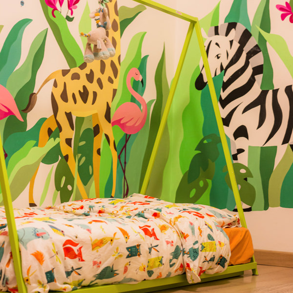
The Montessori bed is mainly characterized by its height designed to allow the child to get on and off in complete autonomy.
There are no side bars to impede movement, freedom becomes a design metaphor for essential and intuitive furniture.
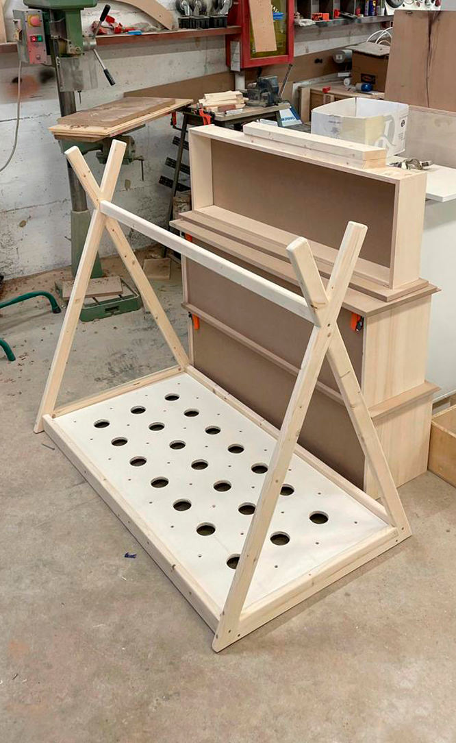
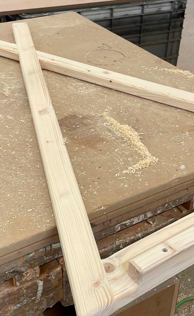
There is therefore no back headboard, but the mattress is rather embraced by the surrounding wooden structure.
Montessori cribs can have side bars that give them a cottage look or, as in these cases, an Indian hut.

Montessori bed
Montessori bed details

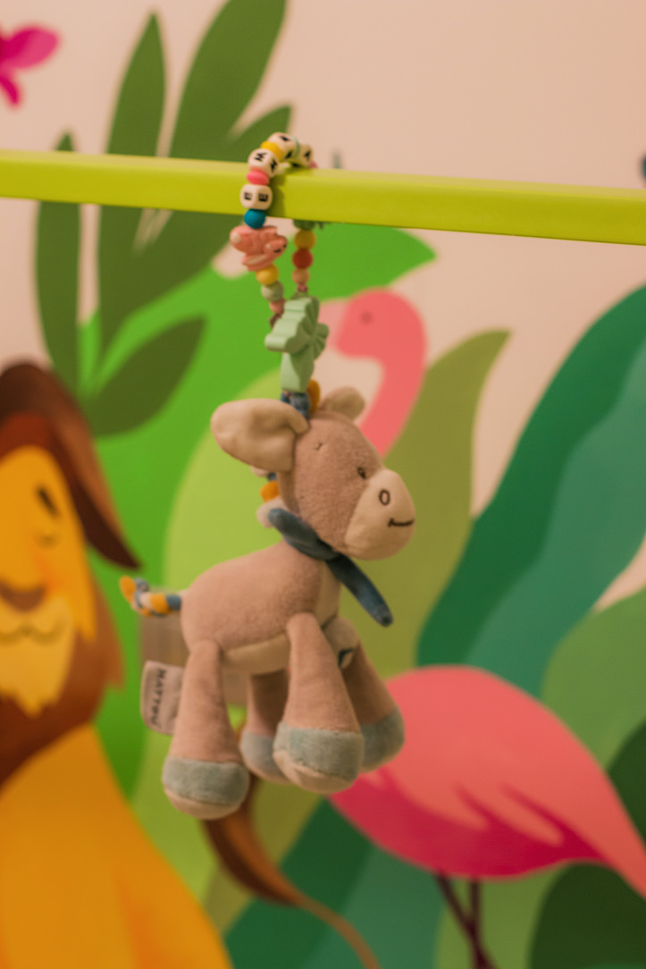
Lights, toys or possibly a sheet can be hung on the upper bar to underline the feeling of den and protection.
The vision and perception of the child inside his bedroom are therefore total visual freedom of the entire environment and his surroundings.

Montessori bed light
Montessori bed back
Montessori bed light

The bottom is rigid and breathable, becoming an excellent support for the development of the spine.
Although the Montessori bed is extremely safe, also thanks to the reduced height, a useful tip is to introduce it starting from the year of the child when he becomes independent in walking and moving.
Here is another of our articles dedicated to the safety of children in the home.

PIKLER TRIANGLE

The Pikler Triangle is a game-tool created by a Hungarian pediatrician, Emmi Pikler, based on the Montessori Method.
According to Pikler, it was important to follow the pace of development of each individual child, giving them the opportunity to move and experiment with the body and its movements in complete freedom.
In order to express their emotions, the child uses movement as the first means of communication.
For this reason, leaving them free to move and experiment is very important for growth and psychomotor development, as well as relational and emotional.

Triangol Pikler
Triangol Pikler
Triangol Pikler

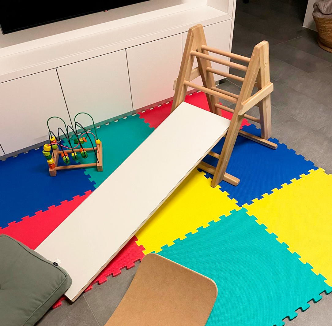
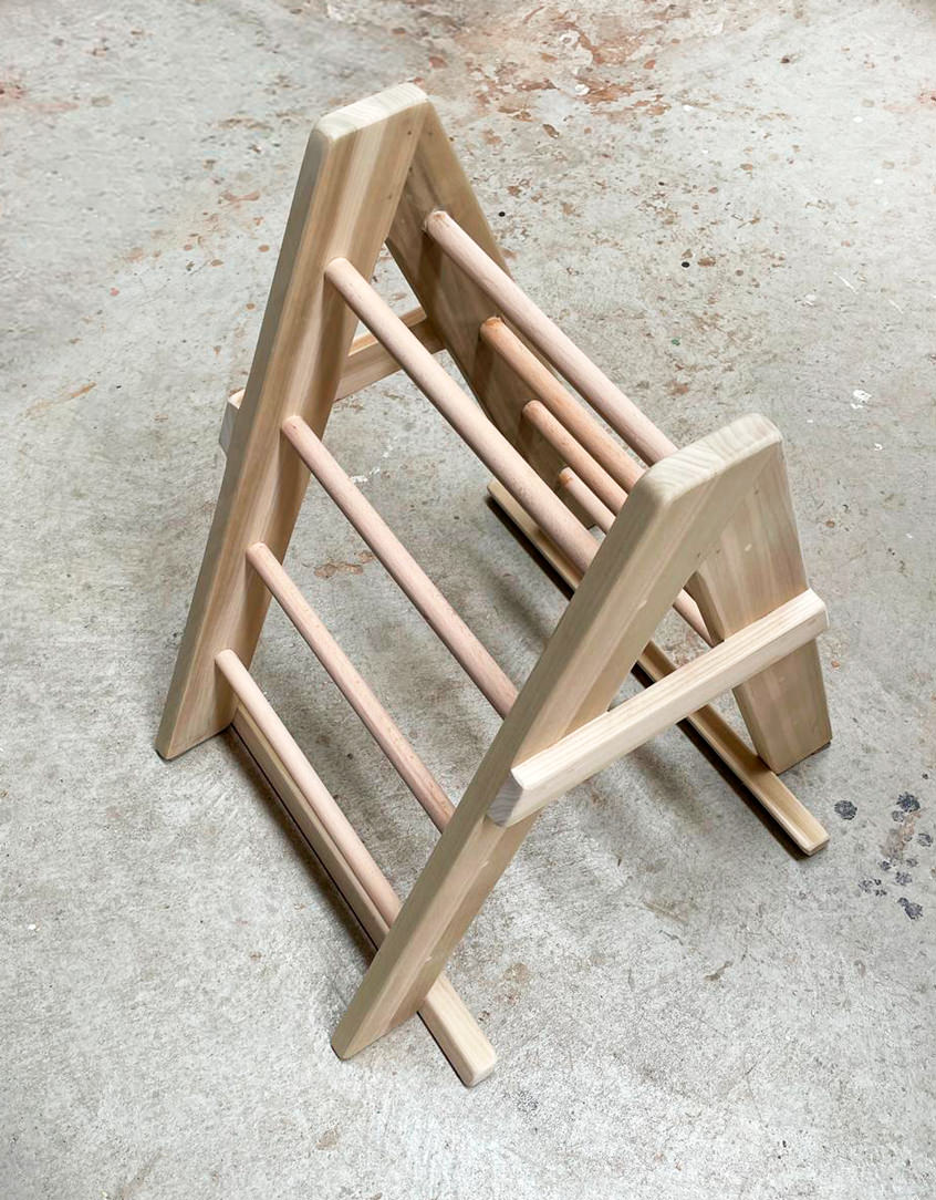
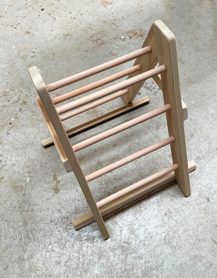
Here our Pikler triangle, characterized by a triangular-shaped wooden structure which can be associated with a platform-ramp, which hooks onto the pegs of the triangle. The latter can be used by the child to climb, go up or down and in a thousand other imaginative ways.
With this tool, children learn to discover and understand the movements of their body, control and manage movements, coordinate themselves.
It favors the development of the autonomous motor sense when used to climb, go up and down, but it is also an interesting stimulus for the imagination when used as a tunnel or hut, or much more.

CONCLUSIONS ON THE MONTESSORI METHOD

Montessori pedagogy is therefore not only based on independence, freedom and respect for the child’s natural physical, psychological and social development, but also on a sense of responsibility and awareness towards the network that links every small entity to a larger macrocosm.
Children deserve spaces where they can move, play and sleep, wake up and experiment.
Sometimes we think that a newborn baby is small, vulnerable and unable to open up to the world, but that’s not the case at all.
By trusting the child, right from birth, his growth will be balanced and independent and he will feel more secure in each new step.

AN OLIVE GREEN KITCHEN IN THE OROBIC PREALPS

AN OLIVE GREEN KITCHEN IN THE OROBIC PREALPS

Immersed in the woods of the Seriana Valley, a splendid villa with panoramic views has renovated its interiors and the living area with a new olive-green kitchen.
Opening doors white kitchen with island

A FUNCTIONAL AND MODERN PROJECT

The heat of these summers has made us rediscover how beautiful, cool, and relaxing our second mountain homes are.
There has been a real repopulation of our Valleys and the trend is increasing.

After so many years living away from our second homes, however, we also want to return to live there by renovating them, to fully enjoy them.
The customers’ request was to have a new modern kitchen, open to the living room in a large, functional, and capacious Open Space.
A kitchen able to marry with some wooden elements already present in the house and with the new living area with fireplace in shades of gray.

Our interlocutors were not a single subject but several families who use this second mountain home, so we tried to satisfy all of them with a project in harmony with the context.

green and wood kitchen
detail of green door hollow handles
gas hob detail

THE KITCHEN PROJECT

Once the dividing wall was knocked down and the old access to the room closed, the kitchen had the opportunity to develop into a corner, right in front of the bright French window that overlooks the external panoramic terrace.


A first column volume on the left acts as a large pantry with shelves (useful for several users).
In the center and taking advantage of the corner, a hollow with low wall units houses the sink with drainer, the gas hob, and a good worktop.
The refrigerator column and the oven column with service doors in the upper part close the opposite corner.

green and wood kitchen
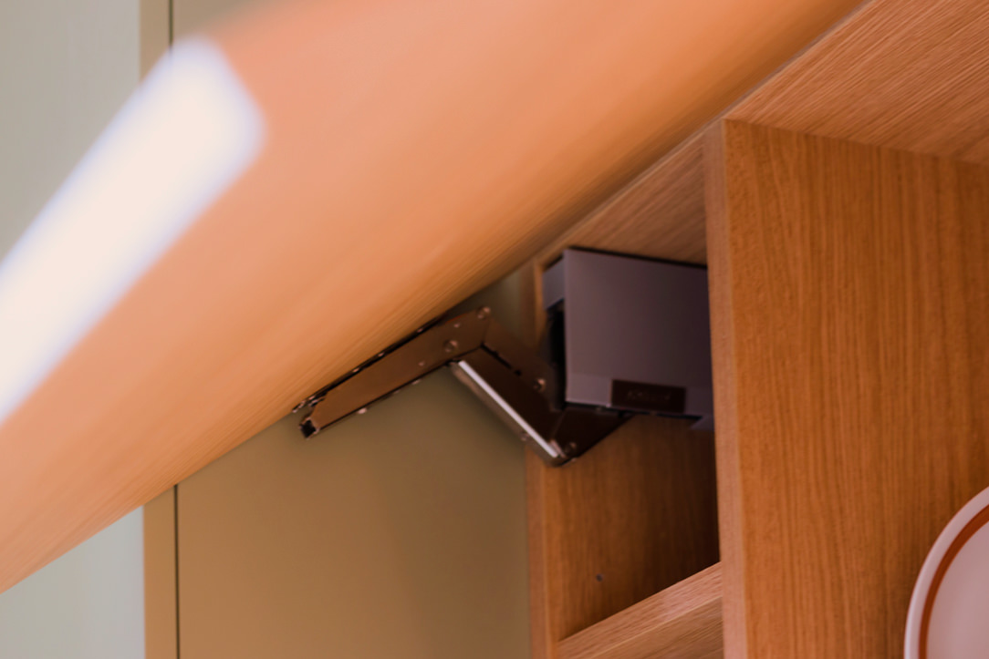
aventos detail
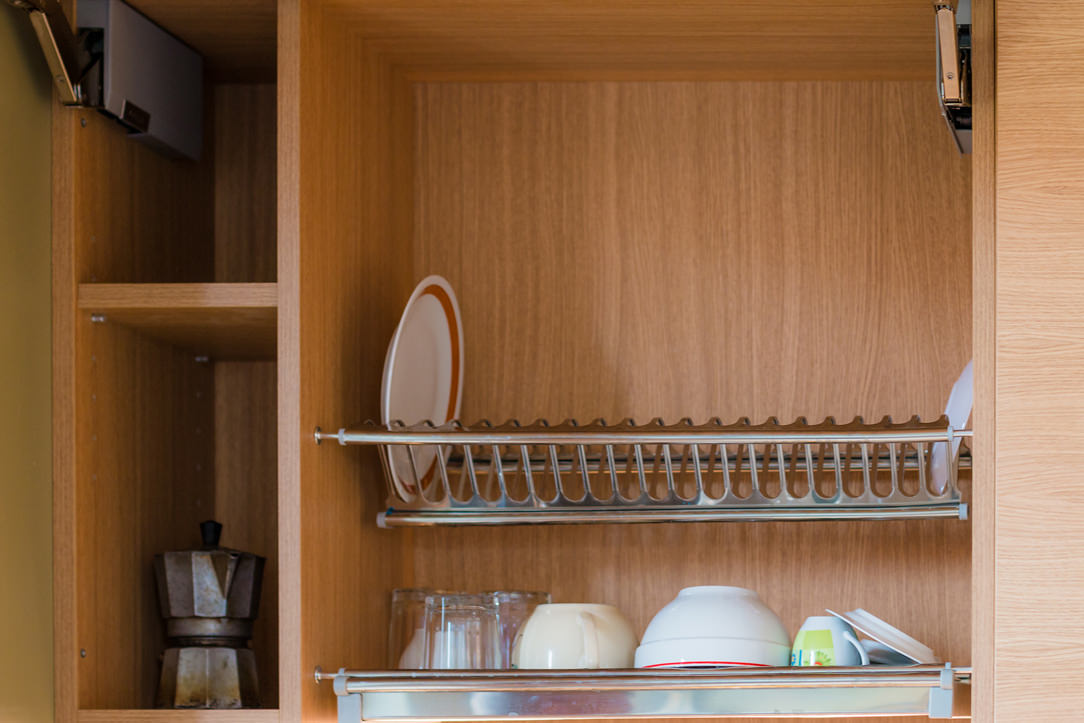
 dish drainer detail

GREEN KITCHEN: HARMONY BETWEEN INTERIORS AND EXTERIORS

The materials and colors was chosen to follow both the trends we found at the Salone del Mobile and, on a conceptual level, the external environment. The predominant color of the kitchen is in fact a very delicate olive green, which recalls all the forest green that can be glimpsed from the window. The walls are also in the same color tone but in a lighter shade. The floor is made of oak planks and rises to become the same plinth of the entire kitchen. In addition to aesthetics, however, a certain degree of resistance was required, as the house is used by several families, so both doors and wall units are made of plastic bilaminate. As far as the oak essence bilaminate is concerned, we sought the closest color to the parquet, but we preferred to move it away from the floor in a more linear rhythm and without obvious knots. The top is in HPL, that is a compound of cellulosic fiber impregnated with thermosetting resins, practical and resistant. The finish of the top is in Cardoso stone, in shades of gray, which incorporates the other elements in the living room and its irregularity, and its marked veins make it very similar to the sandstone rocks of the Valley. Green, wood, and rock, these are the harmonic references that we have chosen as the common thread between inside and outside and the result is really satisfying. Here the link to another renovated mountain apartment.

A SPACE DEDICATED TO FLORA AND UNDERGROUND

A SPACE DEDICATED TO FLORA AND UNDERGROUND

As citizens of the world we have the opportunity to live in contact with nature and its luxuriant flora. We can immerse ourselves in a natural environment that is there, has always existed and can be found a stone’s throw from home or a half-day trip if we live in a large metropolis. But do we really know how to recognize all this greenery that surrounds us?

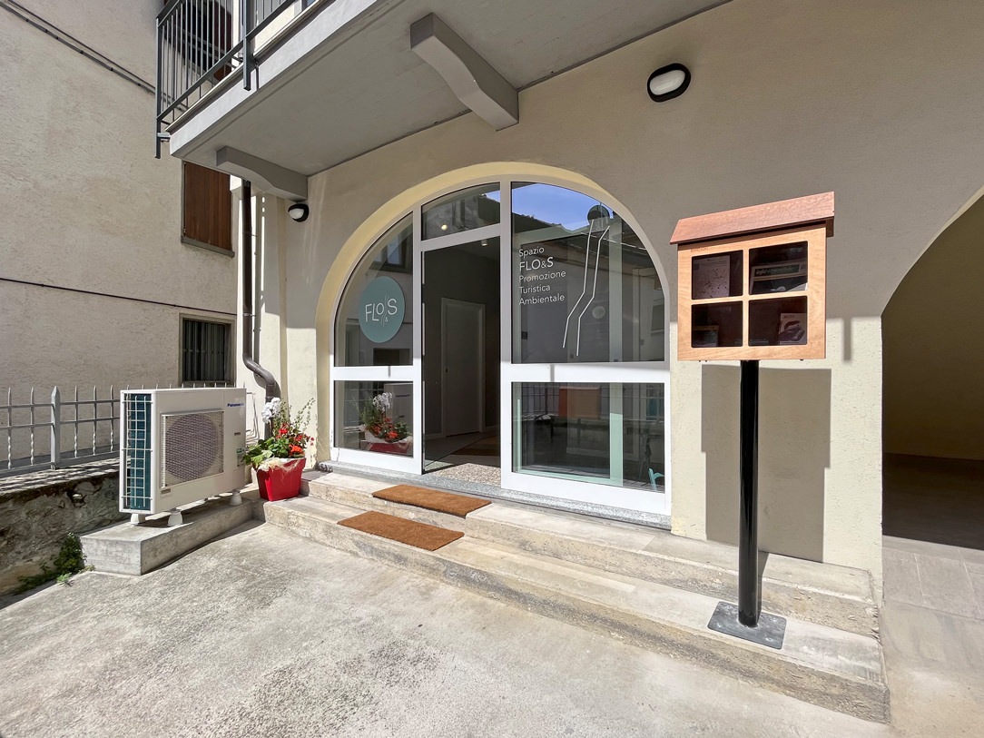
ingresso spazio Flo&s

THE MUNICIPAL OBJECTIVE

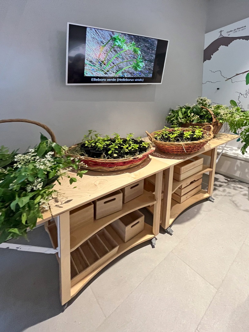
In the municipality of Ranica an ambitious project was born by the municipal council. Lapping the Parco dei Colli with all its splendor and beauty, the Ranica hill starts from a significant height and slowly descends towards the Serio river. In this very diversified panorama, given by the difference of heights and climatic conditions, we have the opportunity to find a variety of flora that characterizes the different areas concerned. Born from the desire to promote and encourage territorial discovery, a public space dedicated to this was born in the historic center of the town of Ranica and near the ascent to the hill.

FLORA AND UNDERGROUND SPACE

The FLO&S space (Flora and Underground) was born from the creative idea of ​​the architect Patrizia Berera, part of the Network of Botanical Gardens of Lombardy. Not far from our beloved Cartolibreria, it is located in the porch of via San Luigi in Ranica, an old renovated farmhouse in a foothill position. This has a raised access to the courtyard. Not being the multiplex space but developed for a long time as a large corridor, the project concept was able to optimize it by creating a sort of interactive path. Intended for a varied target, mainly school, it aims to show the various elements of flora and subsoil and to introduce their discovery through various communication methods.

entrace Floes space
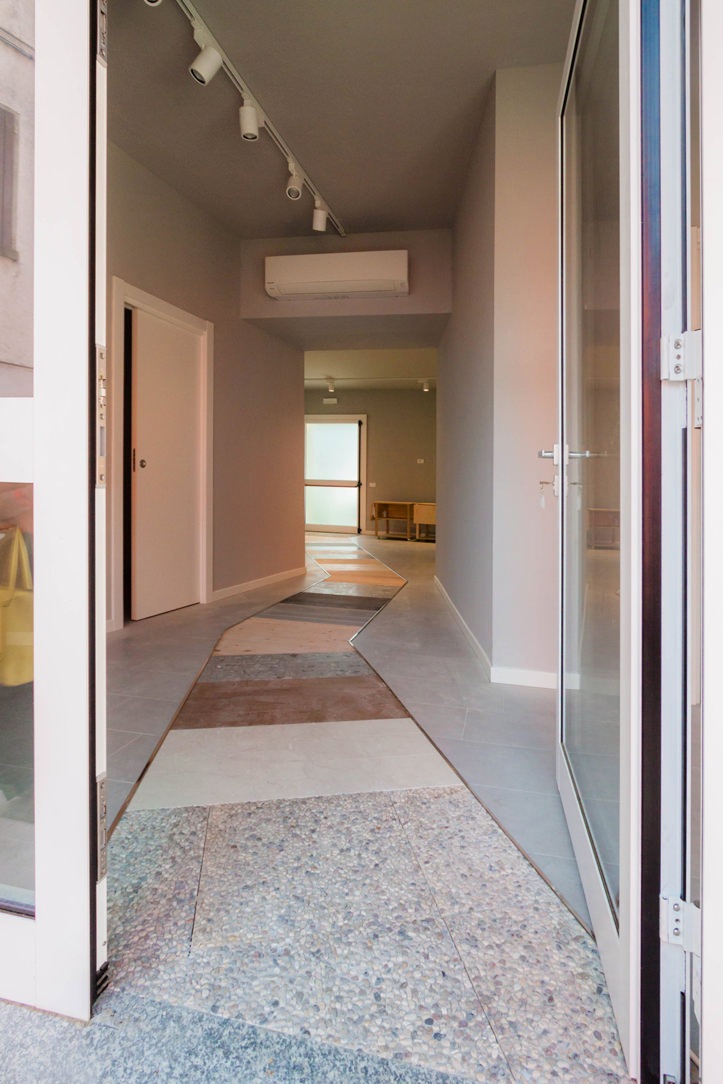
back Floes space
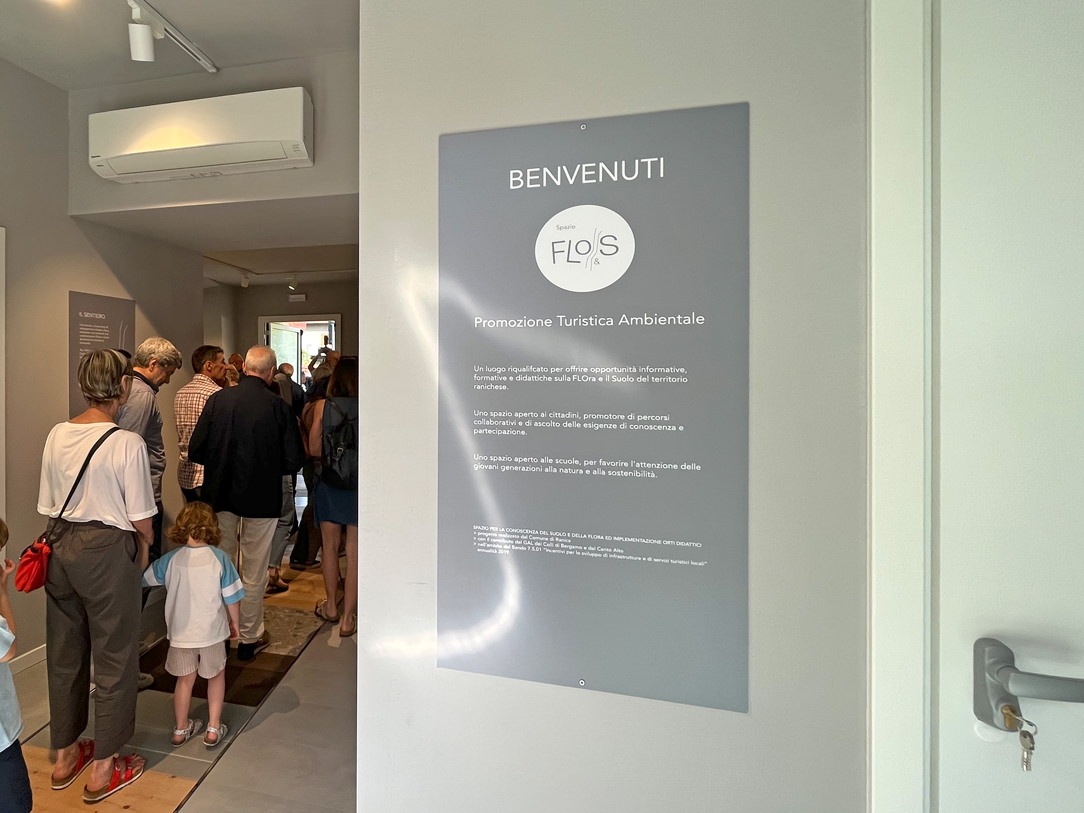
Welcome to Flo&S Space

THE PROJECT

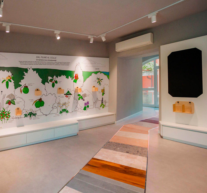
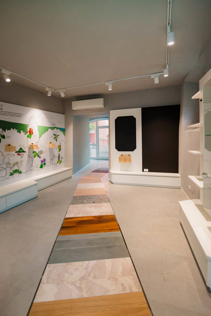
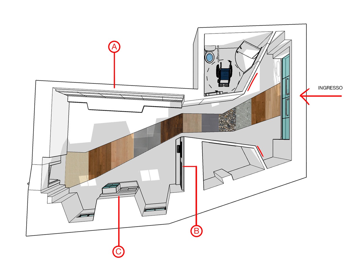
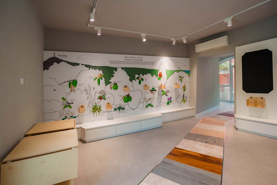
At the entrance, a walkway that cuts through the entire space guides the user inwards, making the visit even more immersive and evocative. This is made up of different types of stone and wood, the same ones that can be found, in their raw state, in the surrounding area. Among them, Zandobbio marble, Gré strain, cherry wood, oak and fir. The available walls have been divided into macro-areas:

space top view flora and subsoil

a top view of the hall with and the different exhibition areas.

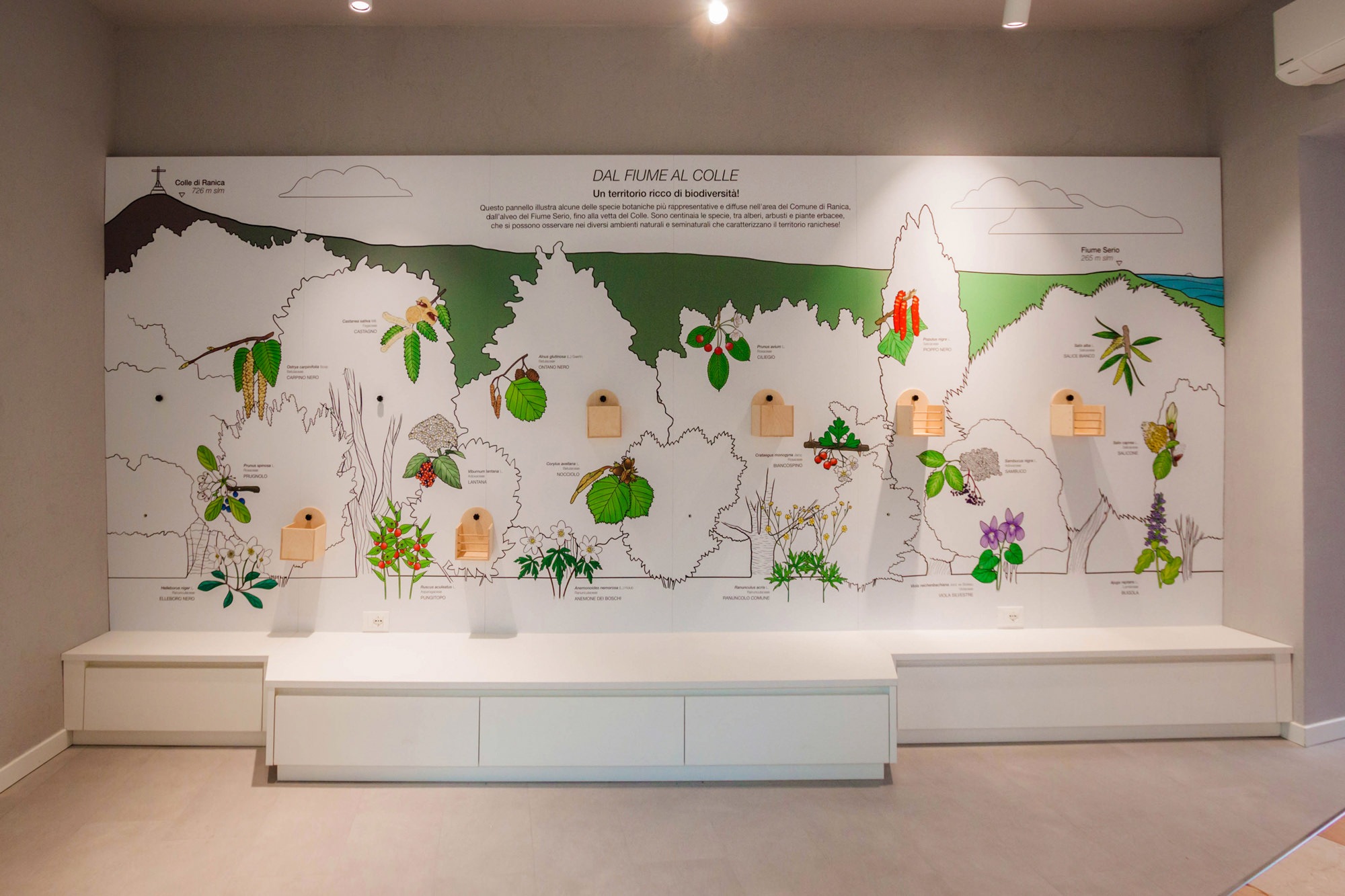
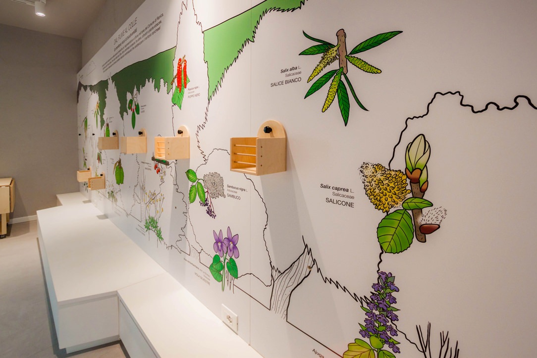
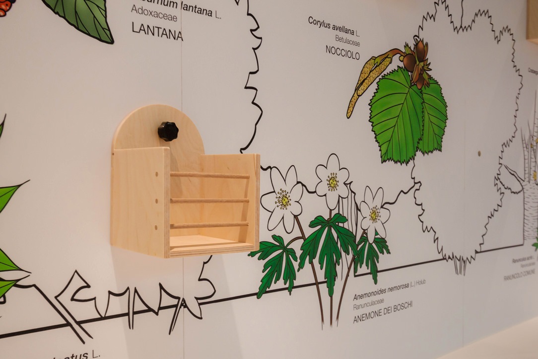
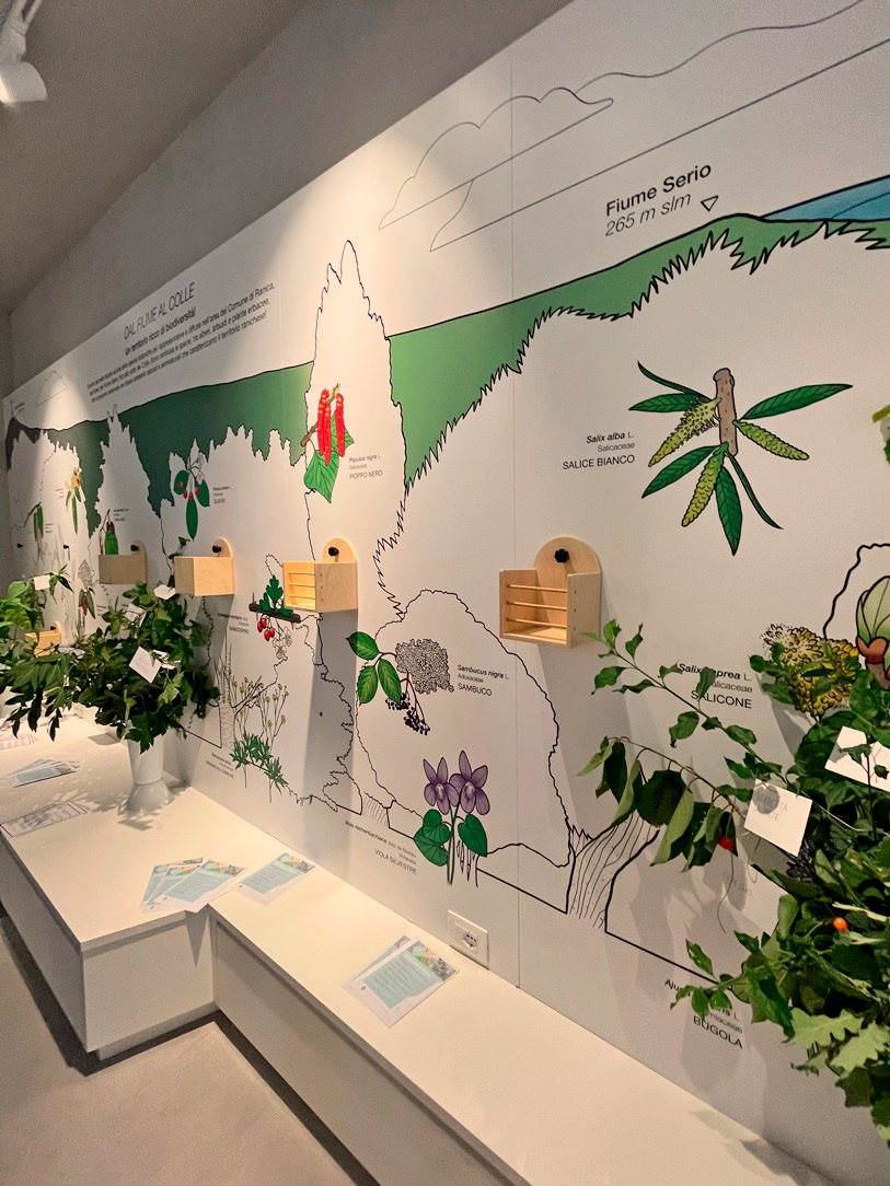
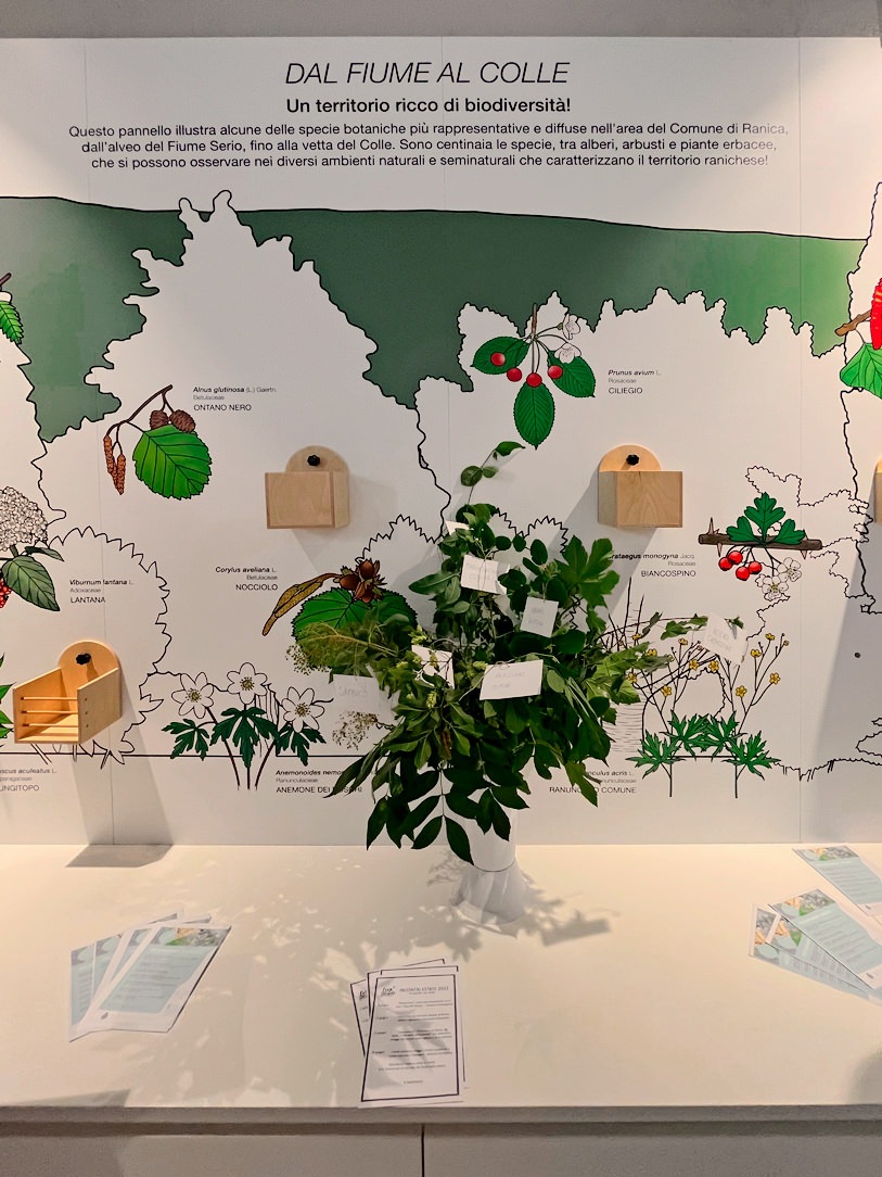
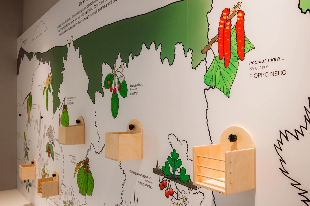
The entrance was dedicated to welcoming and on the two sloping front walls a small text will explain the objectives and the meaning of the space. On the side, relevant information material are provided. After crossing this corridor, which narrows like a funnel, on the right side (called A) we find a long wall where there is a full-height illustration. Here, based on the elevation of the hill, it shows the species of trees, shrubs and herbaceous plants found in the local flora. This large panel illustrated by us (more details on this here) presents the silhouette of the tree or shrub, the flower and the fruit that allow its recognition and all the flowers and herbs on the ground. Beside the elements we have created small wooden boxes accessible to all for what is tactile communication. In fact, depending on the reference season, there will be flowers, leaves or fruits with which it will be possible to interact. In this way, you will have the perception of the roughness, the smell and the fragility or softness of the blooms that can be better recognized in an excursion on the hill.

illustrated panel
lateral panel
box details
illustrated panels with flowers

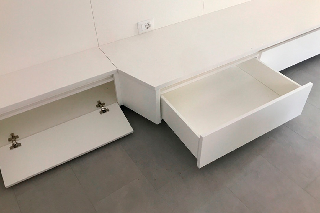
In the lower part, on the other hand, there are equipped furniture, which can either act as a “teaching room” or as service furniture for the storage of goods dedicated to space. These low seating elements, also present in the other two spaces that we will illustrate shortly, have drawers or flap opening.

drawers and flaps
image details

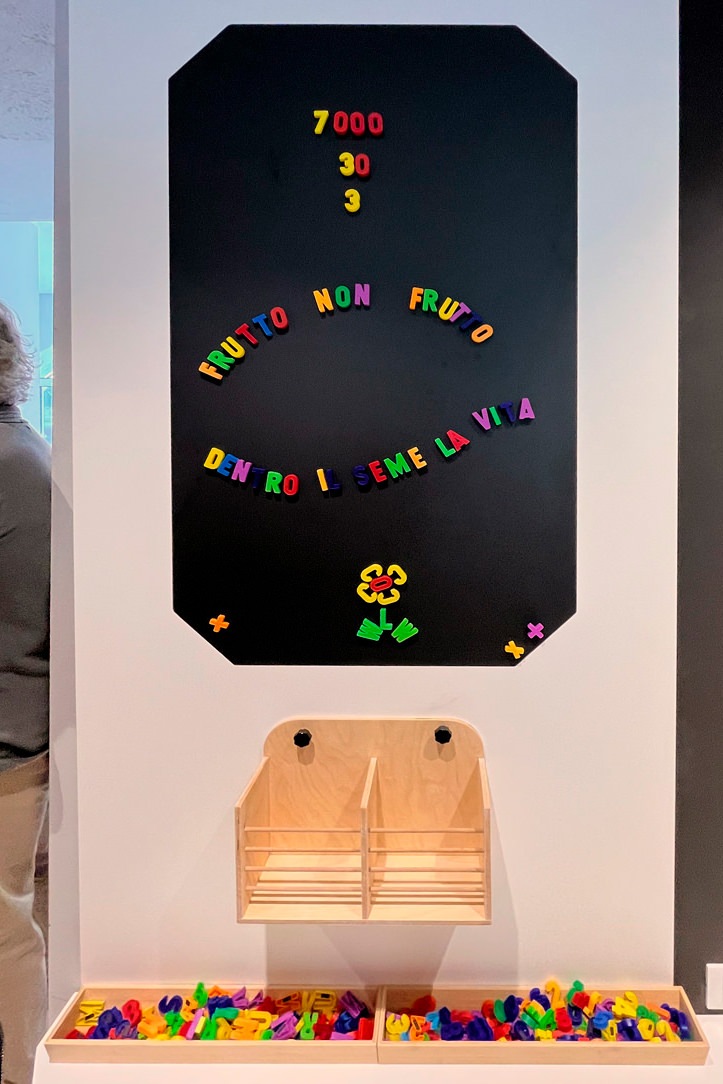
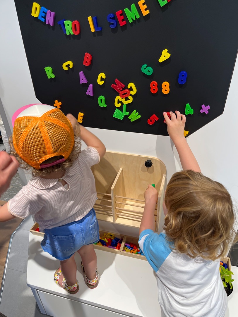
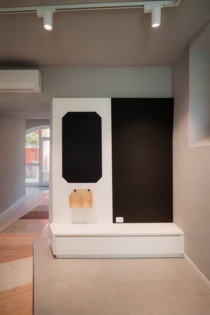
In the second wall (called B) the interaction is not only active but also “creative“. At the user’s disposal there is a blackboard surface and chalks with which to draw the favorite flora element. On the side, however, a box acts as a container for magnets or herbarium, inside magnetic letters or botanical cards that go into the whole theoretical part of the images found in the illustrated wall. This slate can be multifunctional, or at the service of the box with botanical cards or even useful for notices or seasonal thematic updates.

side chalkboard drawing
magnetic whiteboard

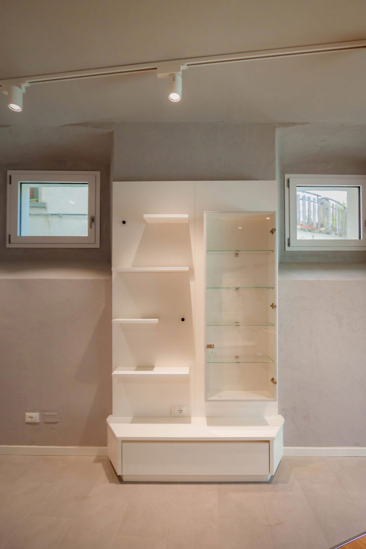
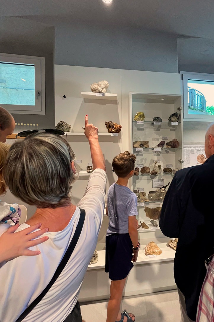
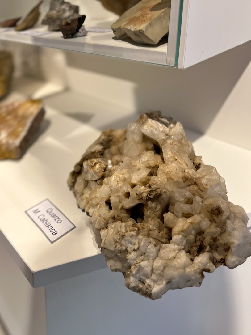
On the third wall (called C), on the other hand, all the issues related to the subsoil are explored. Inside the showcase and on the shelves, common minerals of the area are displayed in their pure state. The left side of the showcase has been deliberately designed with a “variable trim“. This means that the shelves can change their position within the space or be removed completely.

wall subsoil notice board
mineral panel

FINISHES AND MADE

Given the very neutral finishes of the space, which see a light gray stoneware floor and plastered walls in the same shade, our furnishings also wanted to be light and bright. Everything is white, with a wooden appeal in the display boxes. This is to let the images and the colorful central walkway be the protagonists of the space.

furniture neutral and light tones

MULTIFUNCTIONAL SPACE

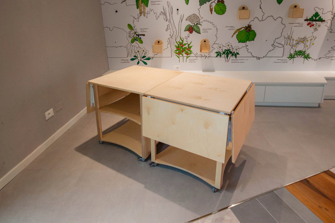
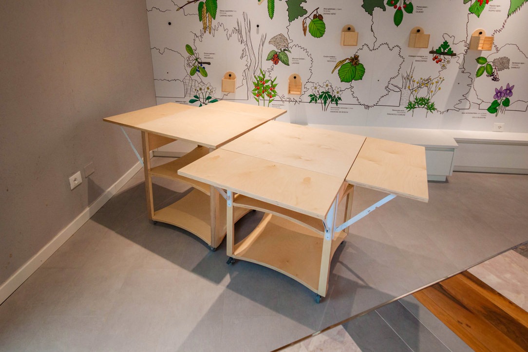
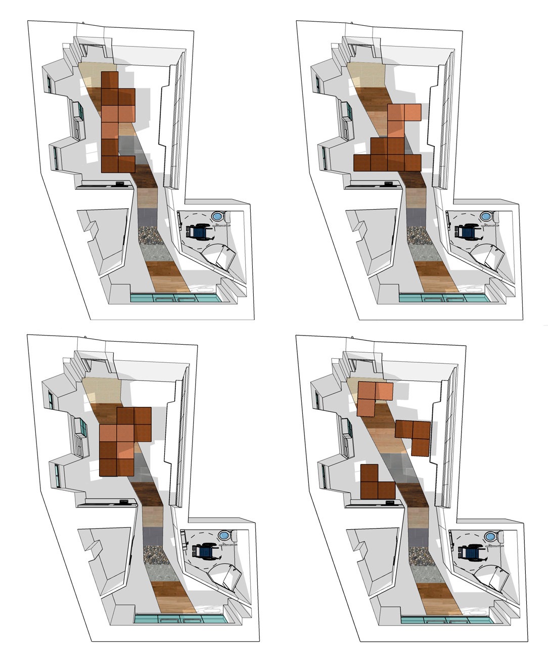
The space will not only be a mirror of the Ranica’s flora but can also be used as an educational space for workshops and lessons. It will in fact be linked to some projects of the local school circuit. In anticipation of this we have created square tables that can extend, opening crosswise with hinges, to accommodate more users. These tables will be free to stop and arrange themselves, in time of need, with different arrangements. Useful as mobile displays, they will be stored in the small warehouse located at the entrance, mirroring the bathroom.
closed tables
open tables
multifunctional tables
disposition in space

here some proposals for the spatial arrangement of the open tables

INAUGURATION

Last weekend the FLO&S space was publicly inaugurated by the Mayor and the junta of Ranica. All the actors who have set up the space and will take care of it in the future have intervened. The donations of rare minerals have been substantial and make the space even more valuable. In addition, a list of events is already active starting from summer until next year. We can only encourage participation in events and trust that this space becomes an integral part of our community. Good luck Spazio FLO&S!

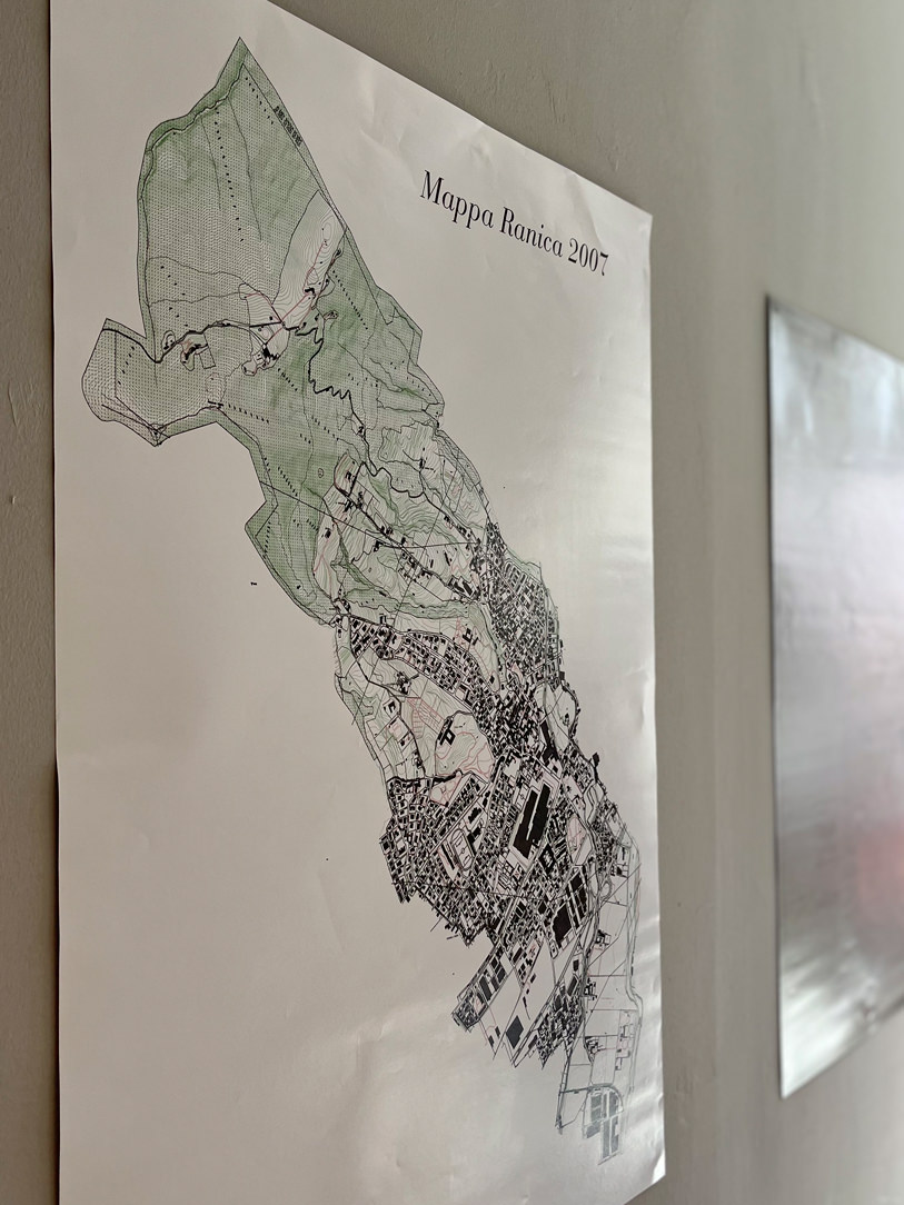
Ranica elevation relief
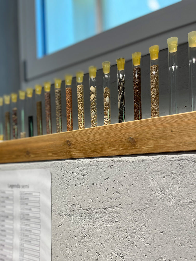
 seeds
interactive whiteboard
rare minerals

A wooden bedroom with warm natural tonalities. Functional passages and connected rooms.

A wooden bedroom with warm natural tonalities. Functional passages and connected rooms.

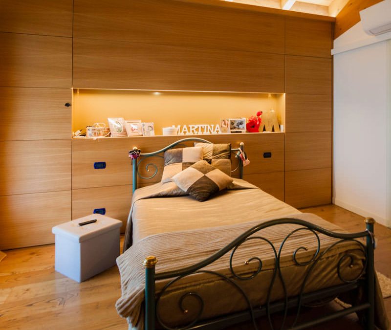
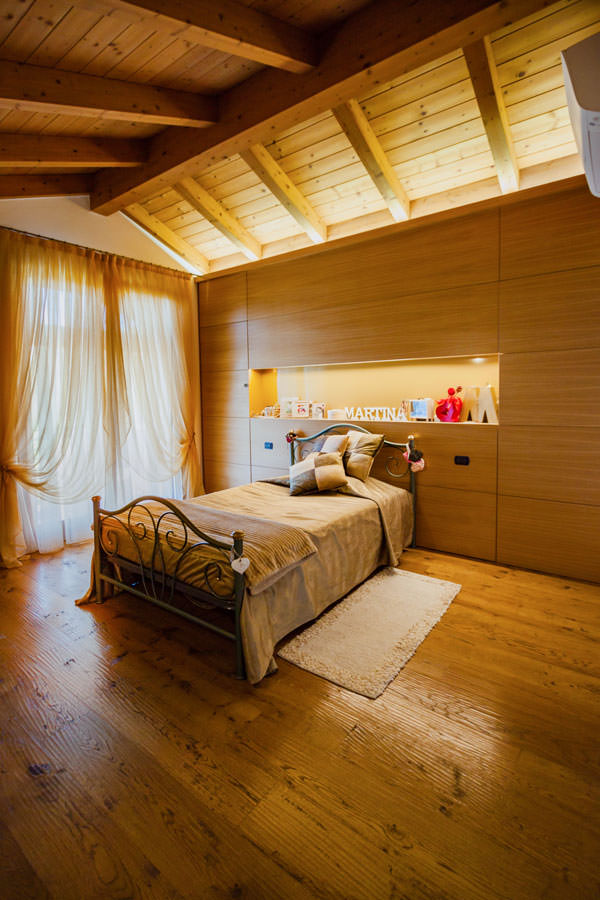
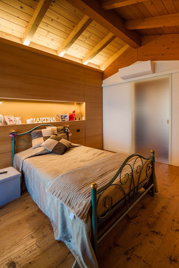
A large wooden room in natural tones picks up on the architectural elements of the attic sleeping area, also housing a walk-in wardrobe in the back structure. Adjacent to the bedroom, a textured glass sliding door leads to the large master bathroom, which also communicates with the study.

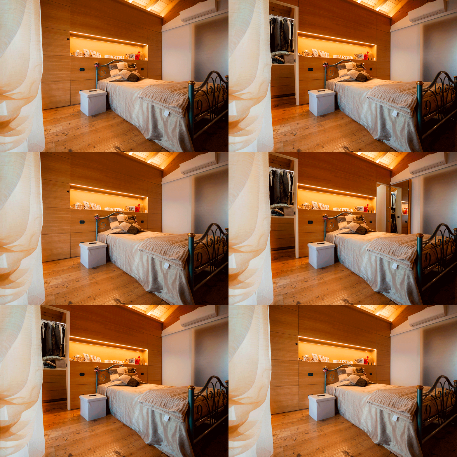
Curnis animation walk-in wardrobe door openings

The wooden master bedroom with a cosy atmosphere

The architectural context of this sleeping area responds to a well-defined character. On the floor is a parquet floor with a rustic look, with marked knots and grains and a light polish that emphasises its softness. The ceiling, on the other hand, is enriched by wooden beams in warm amber tones with a central ridge. On the sides, elegant draperies embrace the window with large windows, filtering natural light in favour of an intimate and cosy ambience.

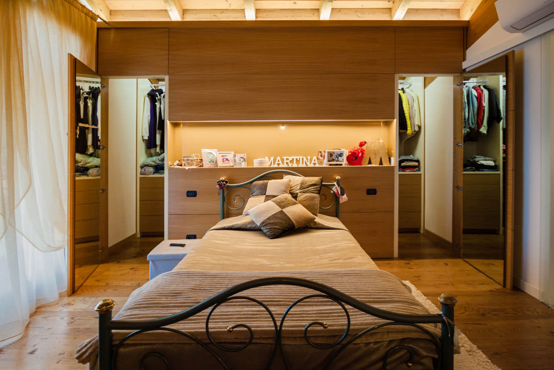
A combination of rustic and elegant elements, also echoed in the choice of the wrought iron bed frame, which is matched by important golden velvets. Picking up on the material choice of the architectural envelope, the structure behind the bed conceals the bilateral access to the walk-in wardrobe.

In fact, the doors and covering panels of the structure are concealed by a geometric composition that marks the visual rhythm of the wall.
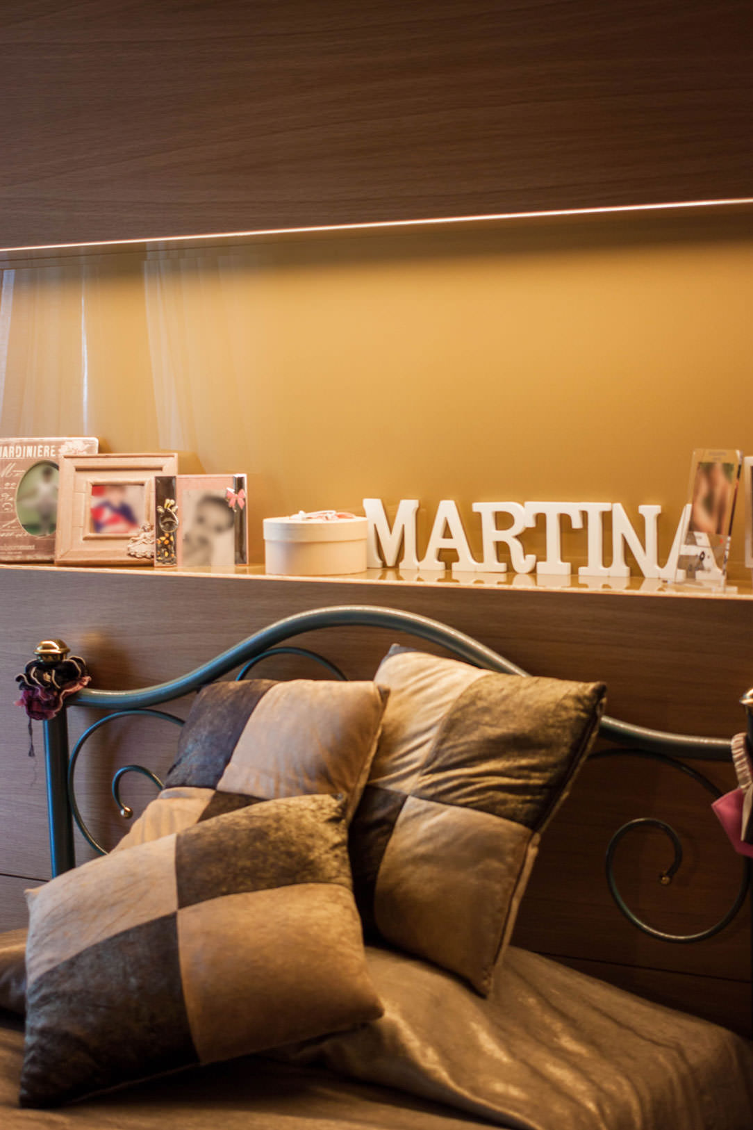
In the centre of this is an open compartment with an ochre lacobel bottom and base which, illuminated by a recessed LED strip in the upper part, is enriched with a golden hue.

dettaglio vano giorno lacobel ocra illuminazione LED superiore velluti letto
camera da letto in legno vista frontale retroletto attrezzato cabina armadio vista laterale destra
camera da- etto in legno vista frontale retroletto attrezzato cabina armadio vista laterale sinistra

A walk-in wardrobe created in the space behind the bed

In order to optimise space, having a large double bedroom, the solution that best meets functionality is to equip the back of the bed with a wooden structure that also serves as access to the walk-in wardrobe. This, as already realised in this classic villa, exploits the longitudinal layout to alternate hanging tubes, folding shelves and linen drawers.

The conformation of the walk-in wardrobe and its bilateral access define its user flow and usability. Also in this micro-environment, the material choice of the individual components plays a fundamental role in defining the overall aesthetic impact. In particular, the shoulders and vertical elements in general are characterised by matt white lacquering, while the horizontality is emphasised with wooden shelves and drawer fronts.

camera-da-letto-in-legno cabina armadio retroletto apertura ante
cabina armadio retroletto legno e bianco
cabina armadio retroletto legno e bianco fronte
cabina armadio spalle laccato bianco ripiani fronte cassetti legno aperti
cabina -armadio spalle laccato bianco ripiani fronte cassetti legno

The communicating bathroom in natural tones

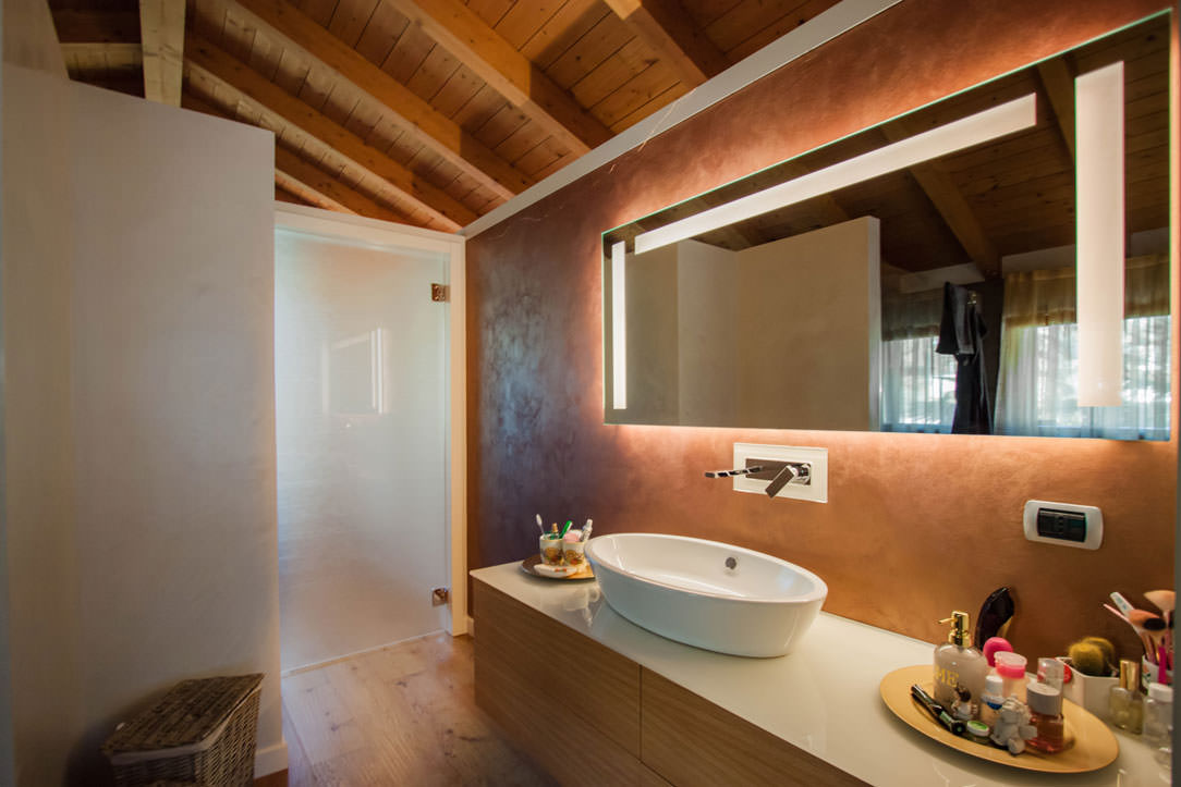
A sliding glass door leads from the wooden room to the bathroom, whose wooden furniture echoes the material choice of the entire bedroom area.
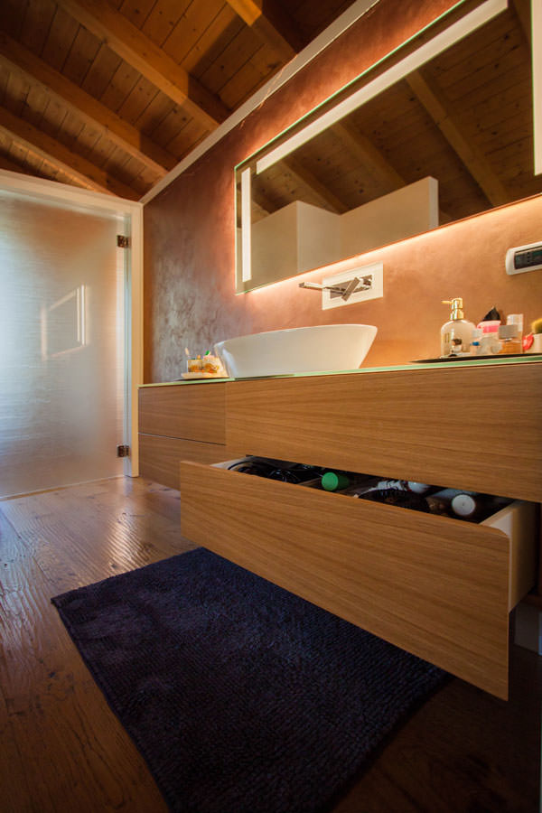
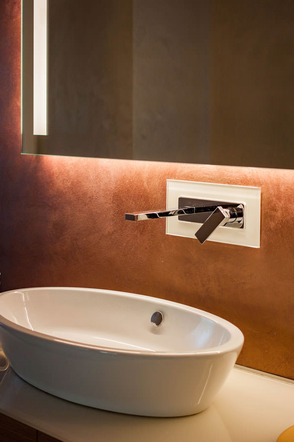
This is characterised by the presence of large push-open drawers surmounted by a white lacobel top with a ceramic countertop washbasin. The wall-mounted stainless steel tapware is framed by a white lacobel plate that echoes the bathroom vanity top.

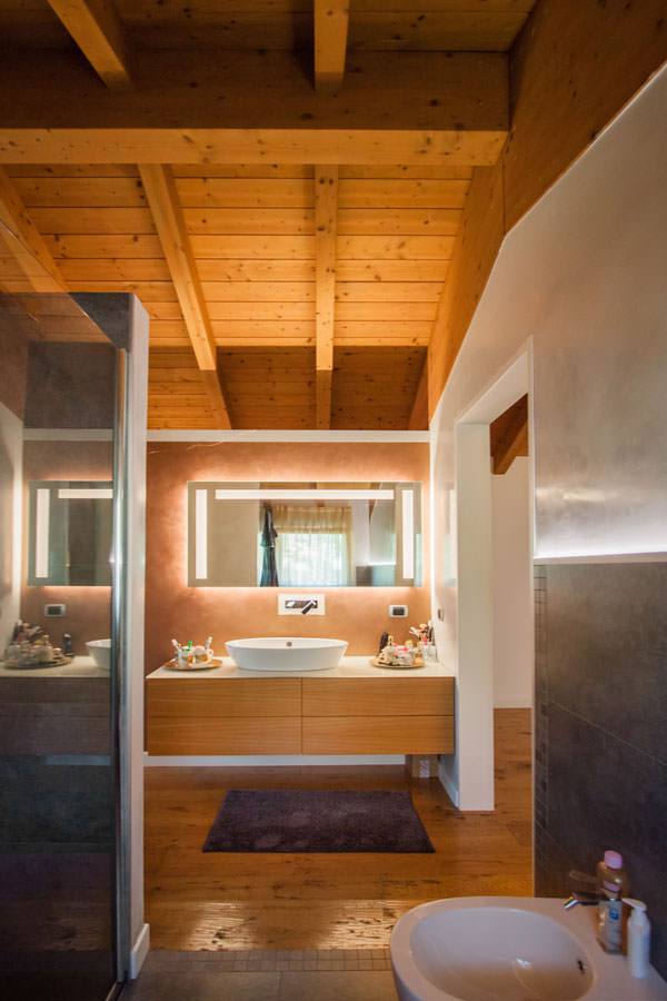
A large mirror with integrated lighting amplifies the perception of space, giving additional brightness to the room. The use of LED strips is also taken up in this room, emphasising the material transition between the tile covering and the wall.
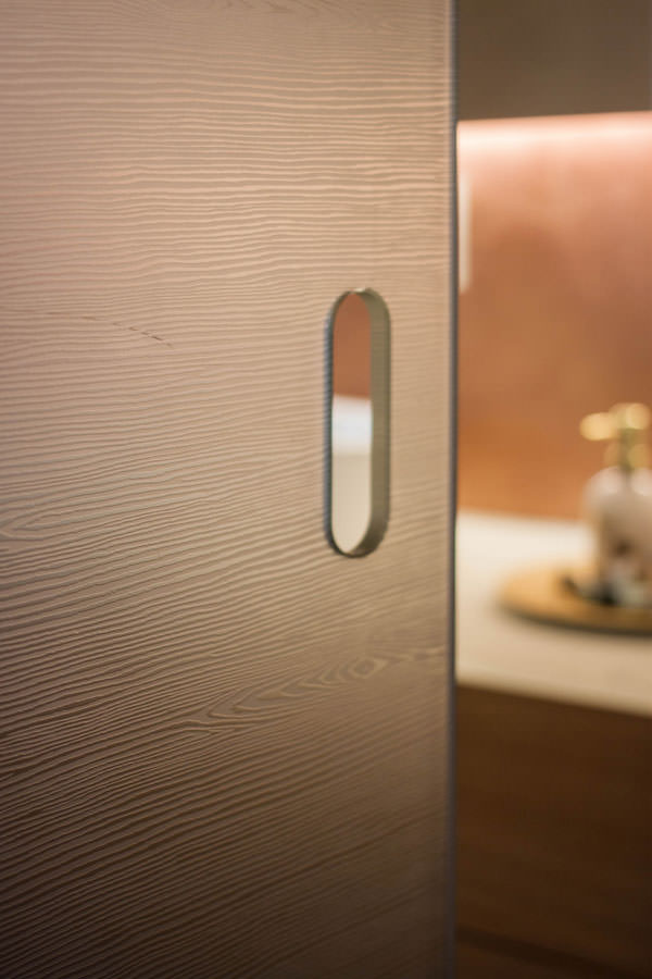
The bathroom becomes a communicating room between the bedroom and the study, exploiting the double side access. The latter is accessed from the bedroom side by means of a textured glass sliding door in wood effect, from the study side by means of a hinged door of the same aesthetic line.

mobile bagno comunicante cassettoni legno piano lacobel bianco
mobile bagno apertura cassetti fronte legno
mobile bagno comunicante cassettoni piano lacobel bianco lavabo appoggio specchio con illuminazione
dettaglio lavabo appoggio rubinettera inox a parete specchio con illuminazione
dettaglio maniglia porta scorrevole texturizzata legno vetro bagno comunicante

A wooden room with a natural feel uses the functionality of a walk-in wardrobe behind the bed to optimise space. The choice of natural materials and soft lighting, with a hint of Hygge, creates a relaxing and hospitable environment. To further explore the theme of the wooden sleeping area, here are two other realisations in which the natural material par excellence becomes the protagonist: Comfort among the peaks and a Shabby Chic studio apartment.