Vintage Reflections: A Journey into the Interior Design of an Apartment in Milan

Vintage Reflections: A Journey into the Interior Design of an Apartment in Milan

In the bustling heart of Milan, architect Lorenzo Visioli has breathed life into an apartment that seamlessly blends vintage charm with modernity through the skillful use of refined materials and details. Let’s explore how the soft reflections and captivating mirrors play a central role in this unique space that we’ve had the pleasure to furnish.
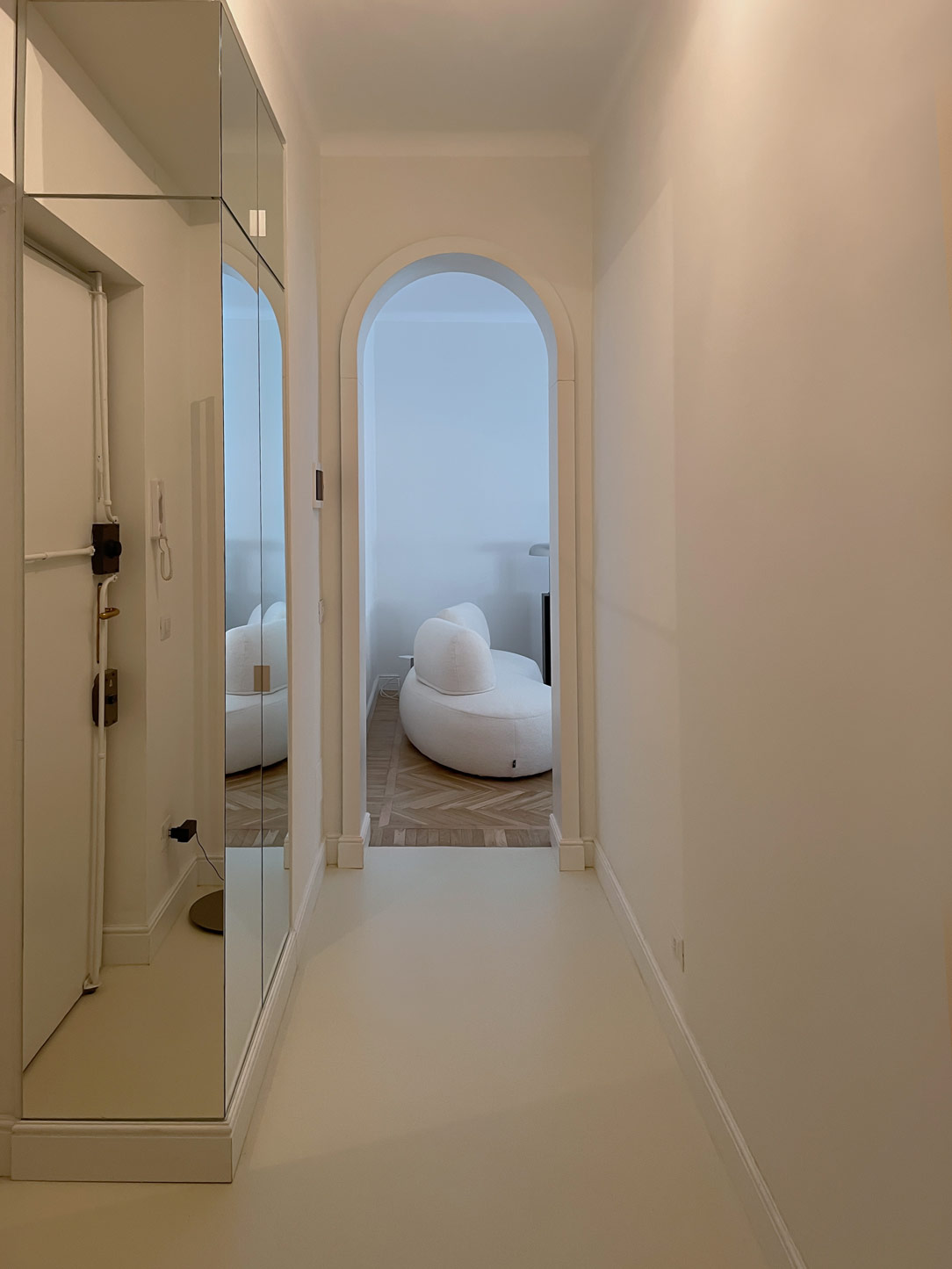
 Reflections, mirrors and roundness

ENTRANCE

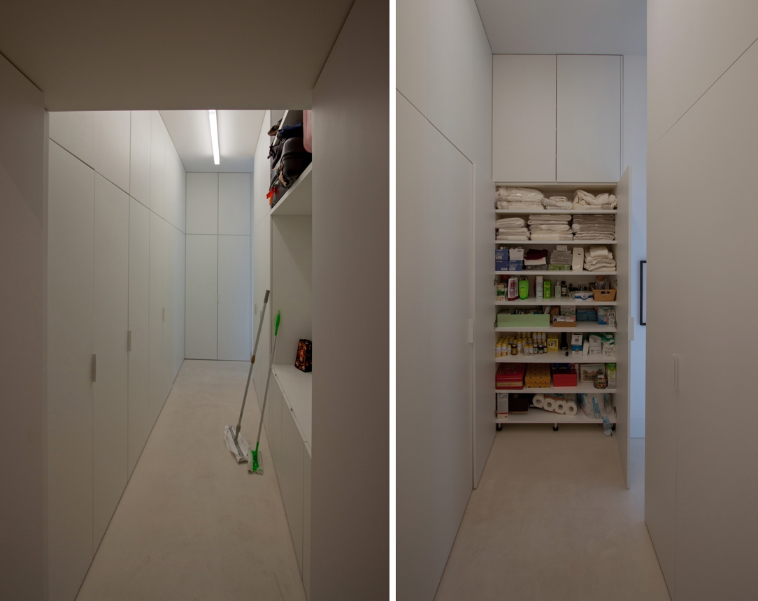
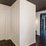
The entrance warmly welcomes guests with a floor covered in light gray mortar, illuminating a relatively narrow corridor. A service cabinet entirely clad in mirrors on one side visually expands this confined space, creating an effect of spaciousness and brightness. Inside the cabinet, shelves and hanging space add functionality without compromising style. 

Here’s another example of a mirror-clad cabinet welcoming at the entrance.
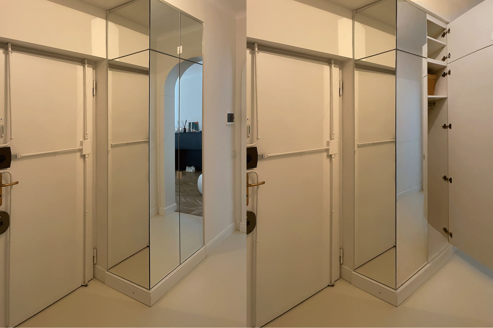
mobile entrance open closed
 handle detail

KITCHEN CORNER

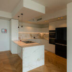
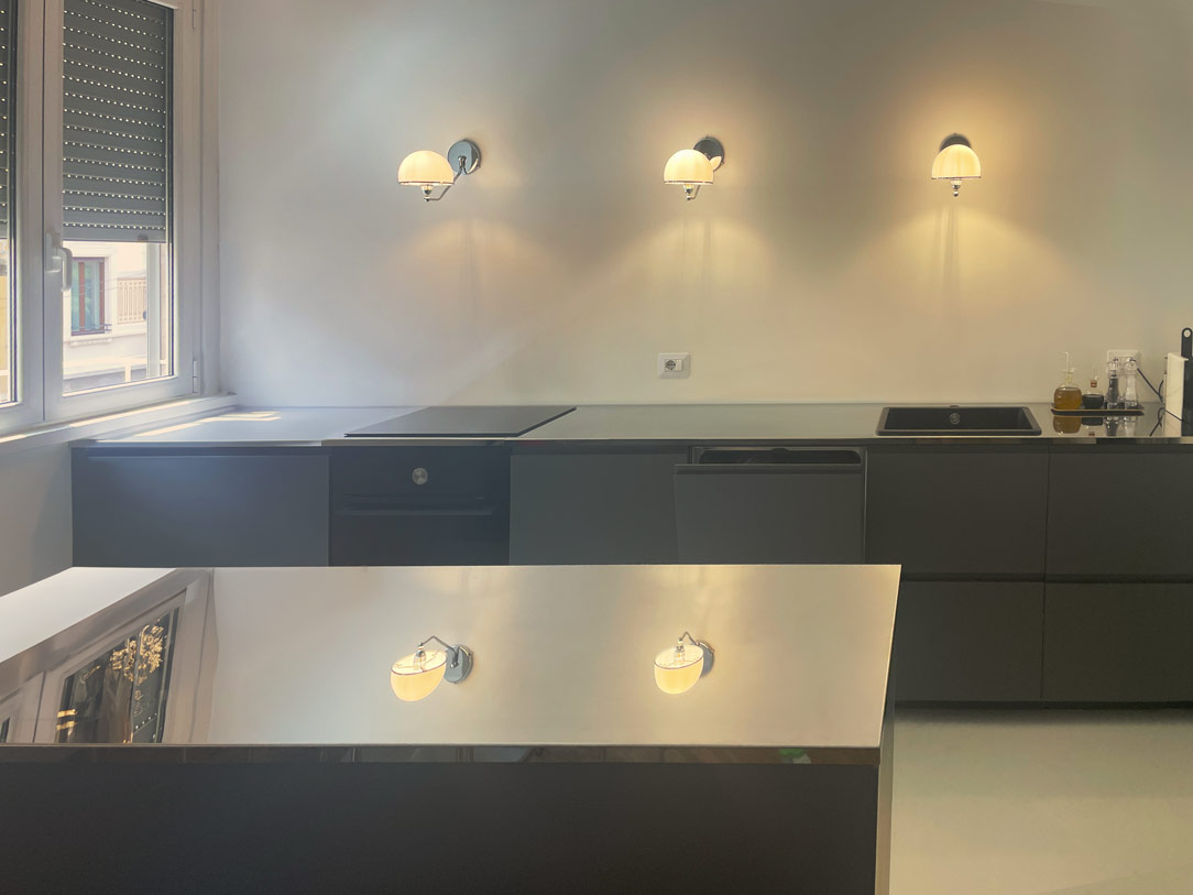
The kitchen, the heart of the home, embodies the fusion of style and functionality. Structured in a niche divided into two parts, with an equipped base and a frontal island, it stands out for the absence of conventional wall cabinets. In their place, vintage lamps in the style of “The Great Gatsby” illuminate the polished steel worktop, creating suggestive reflections that interact with the surrounding elements. The kitchen base, in a dark and clean tone, features concealed handles.
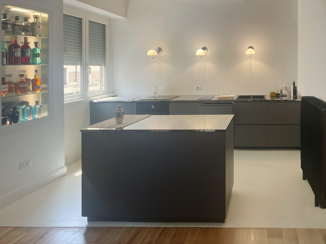
kitchen with island
kitchen zoom

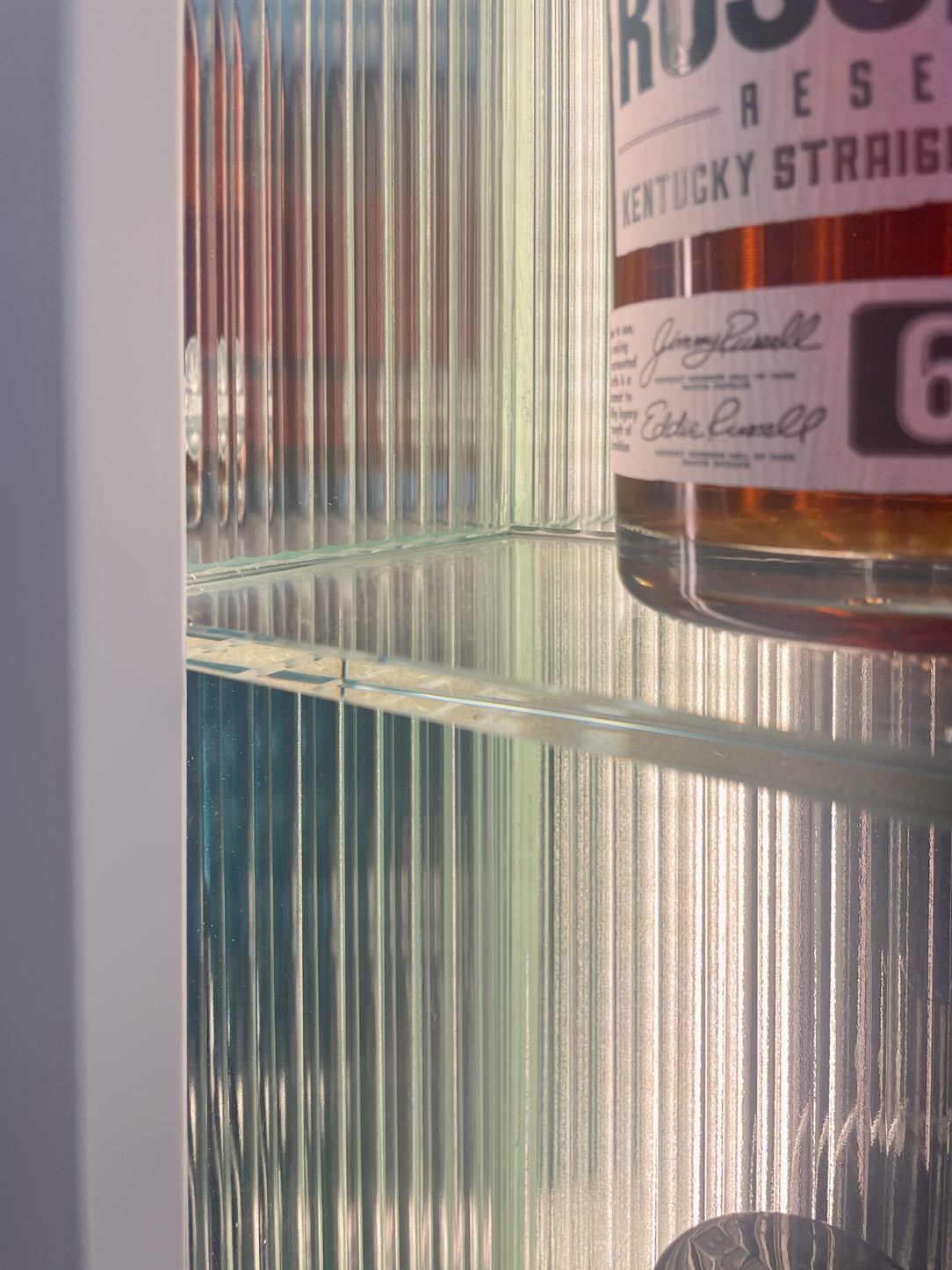
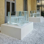
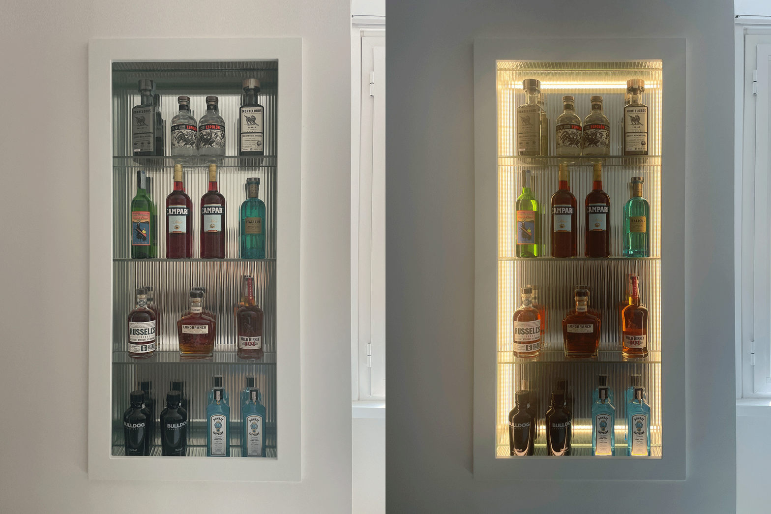
A touch of originality is introduced by the niche beside the window, transformed into an open bar with crystal shelves hosting selected spirits. The presence of undulated glass, now a major trend, on each side reflects bottles and liquids, adding a touch of color. Internal LED lights make this element even more captivating when switched on.
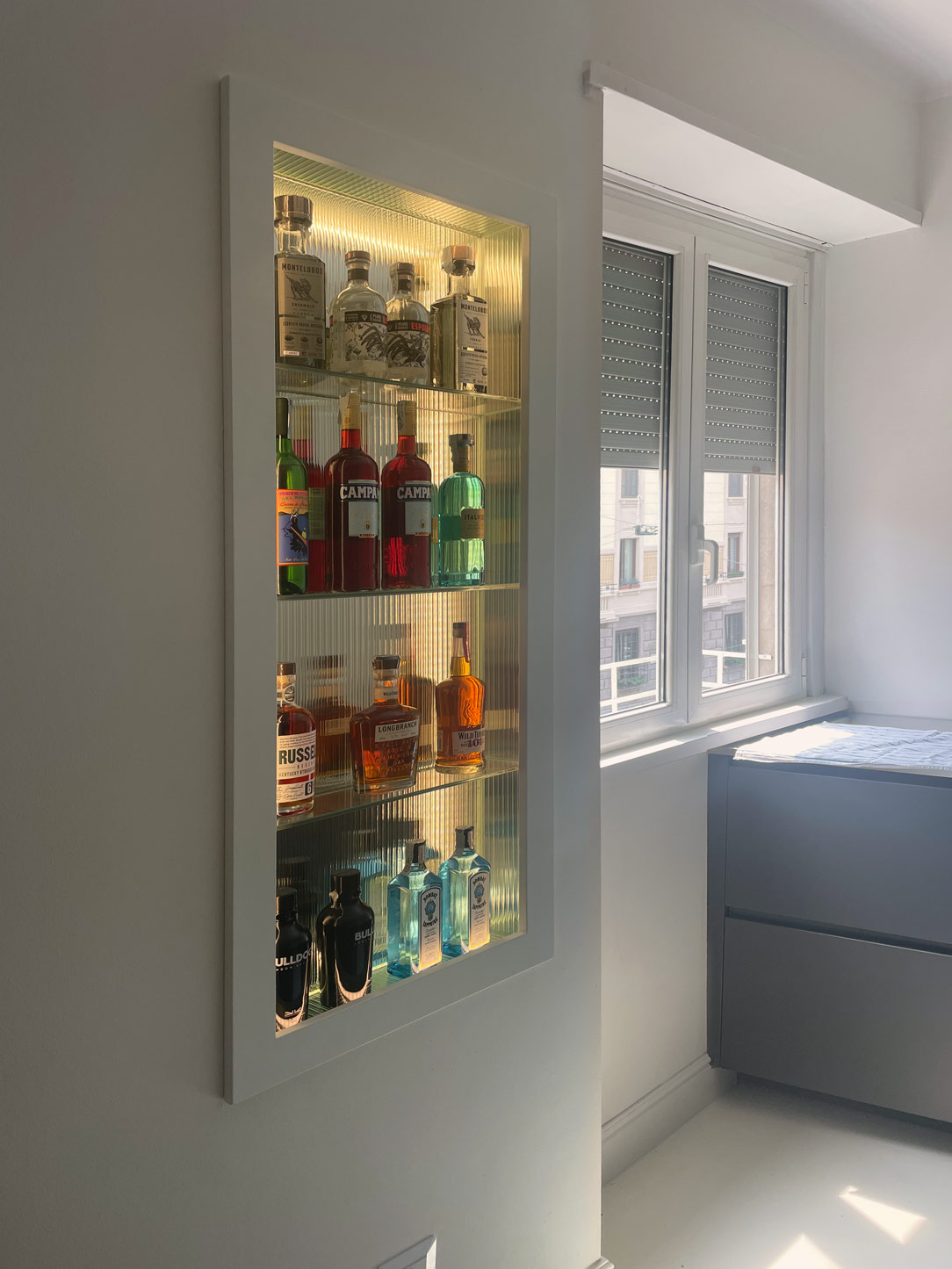
open bar niche and window
niche open bar
 wavy glass detail reflections

FUNCTIONAL STORAGE

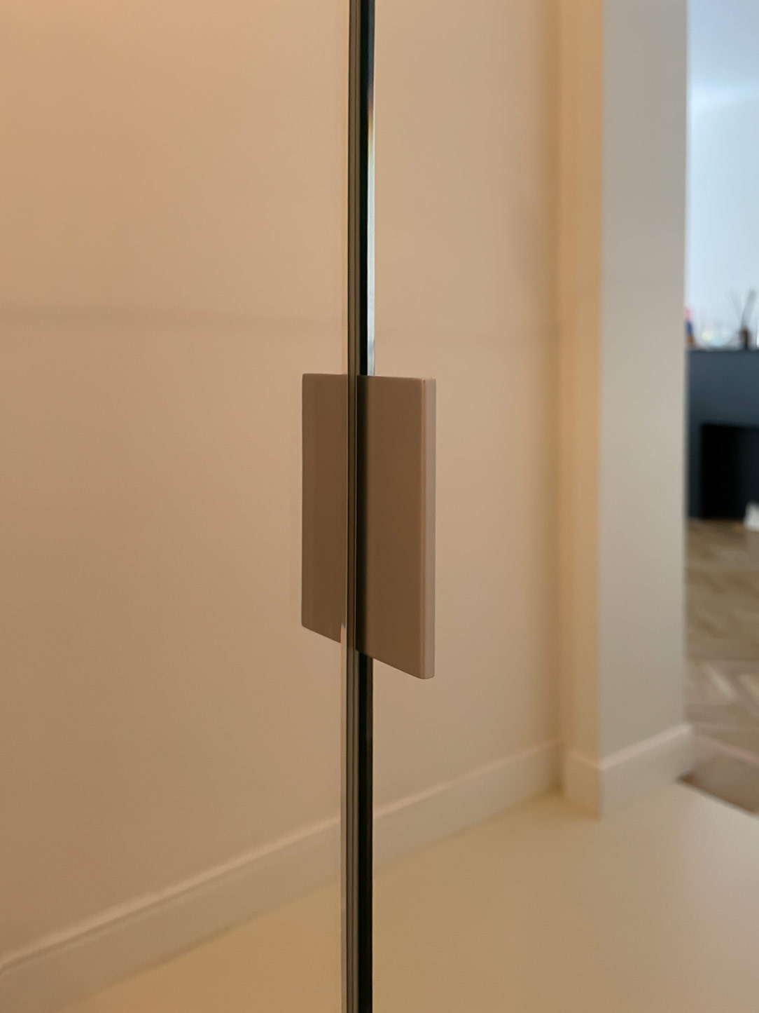
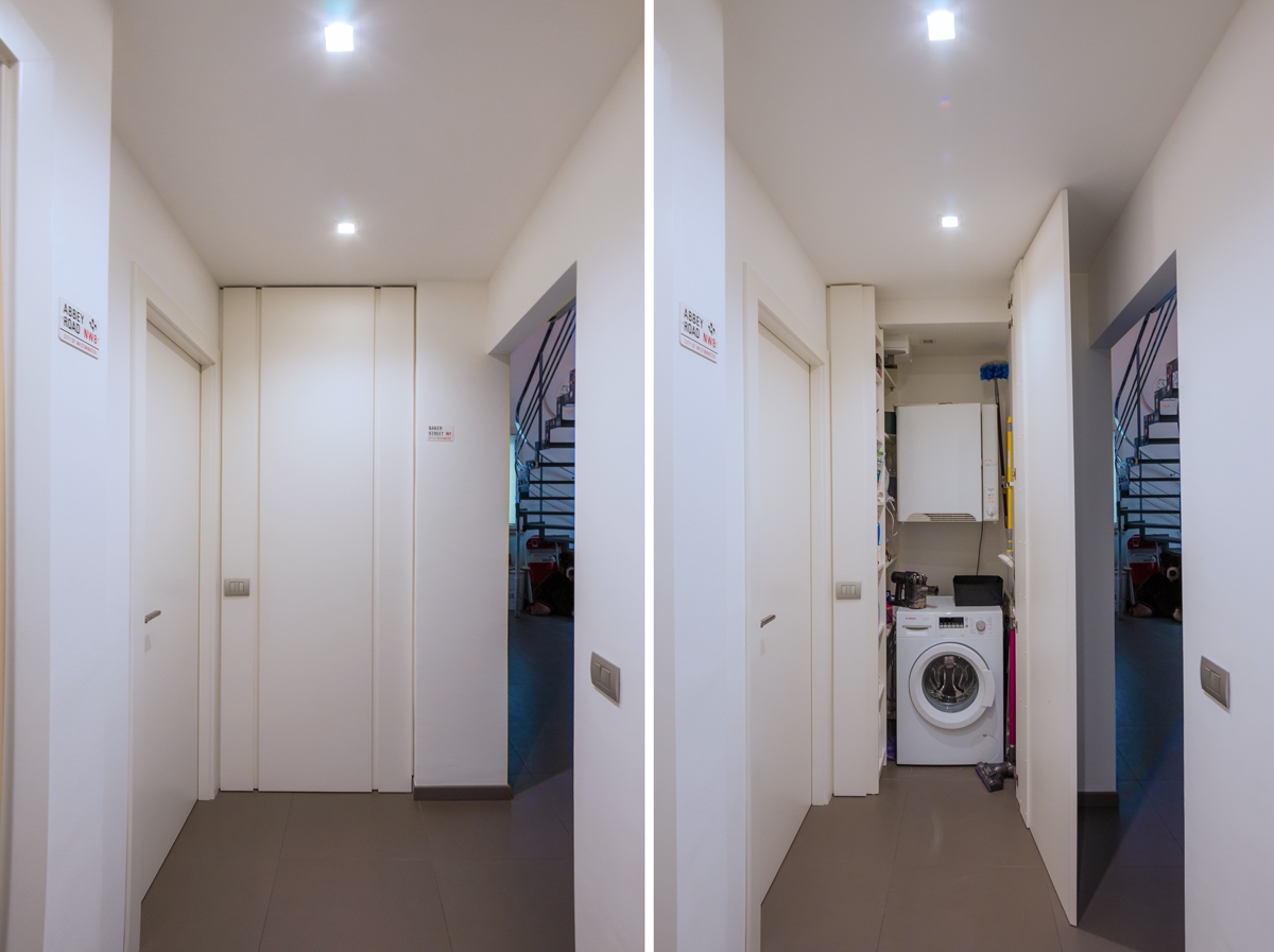
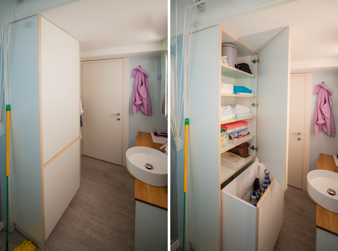
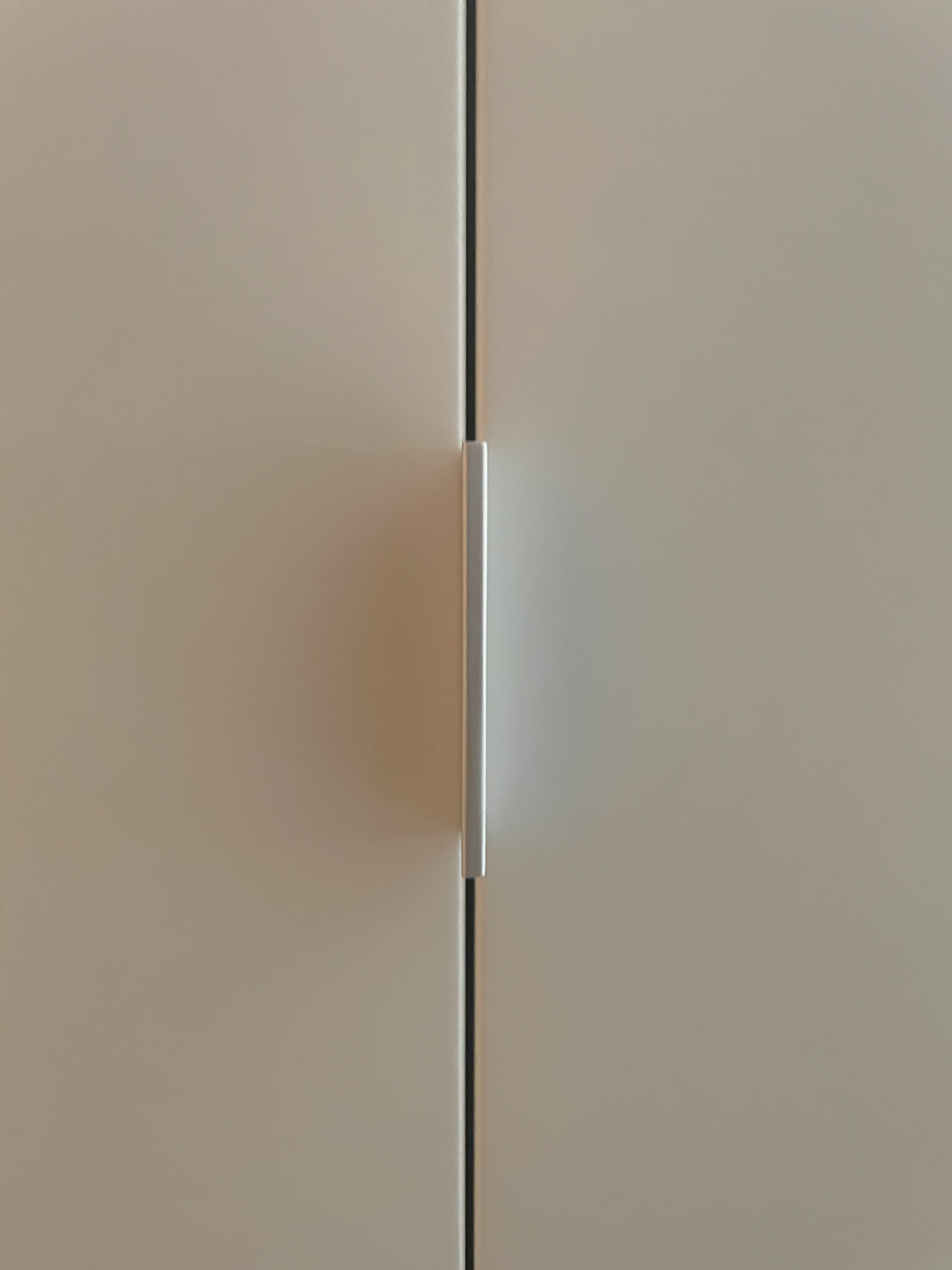
A key element of functionality and discretion is the integrated storage in the bathroom, where a washer and dryer find their place alongside all necessary household tools. Two tall, lacquered doors, matching the wall color, fold onto themselves, creating a visual effect that imparts continuity and harmony to the surrounding environment. This approach not only optimizes the available space but also adds a touch of sophistication to the overall design, thanks to slim handles and meticulous finishes.
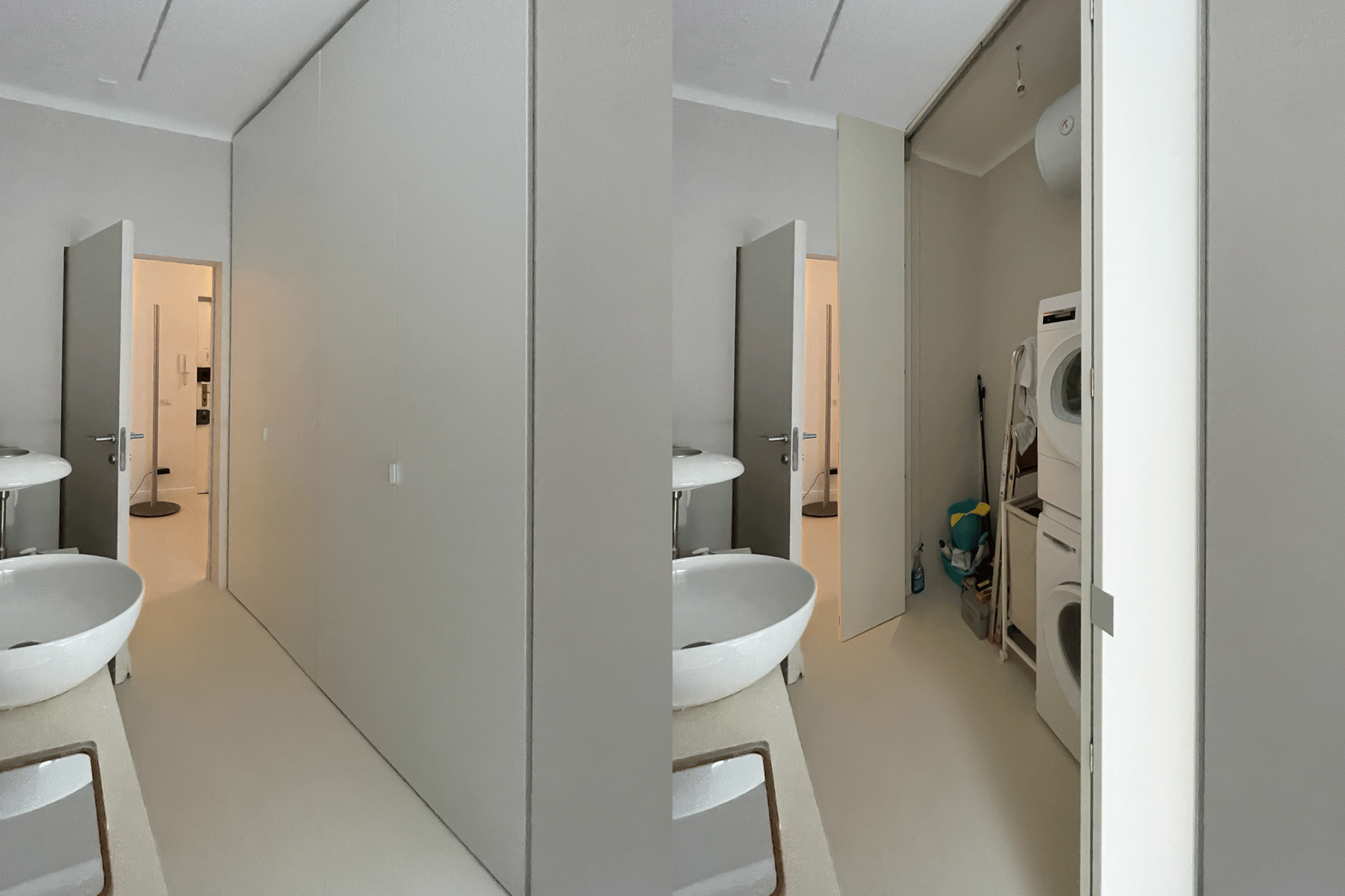
 functional storage room
 handle detail

LIVING AREA

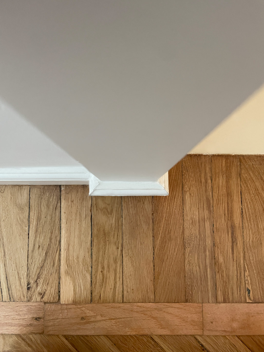
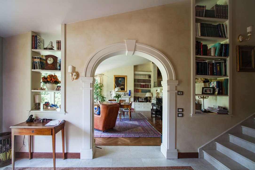
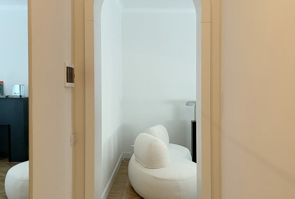
A delicate arch connects the entrance to the living and kitchen areas, introducing a sense of softness while emphasizing the importance of access. The flooring transitions from industrial mortar to vintage parquet, laid in three different patterns to enliven the pace. Refined details, such as reflections playing on materials and shapes, contribute to creating a dynamic and enveloping ambiance.

Here’s another example where reflective materials play a significant role in the project.
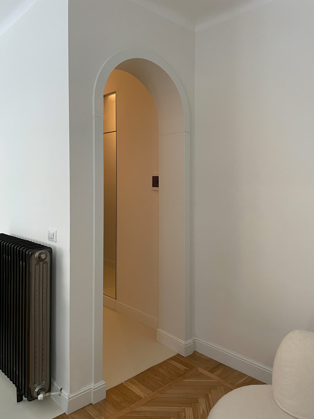
arch living area entrance
parquet detail

CONCLUSIONS

In conclusion, this vintage-inspired project distinguishes itself through the reflections generated by carefully chosen materials. Each element, from the luminous mirrors to the reflective surfaces, contributes to amplifying the spatial sense and creating a unique dynamism. A perfect blend of past and present, transforming living into an exquisite and timeless experience.

BLACK IRON IN FURNITURE

BLACK IRON IN FURNITURE

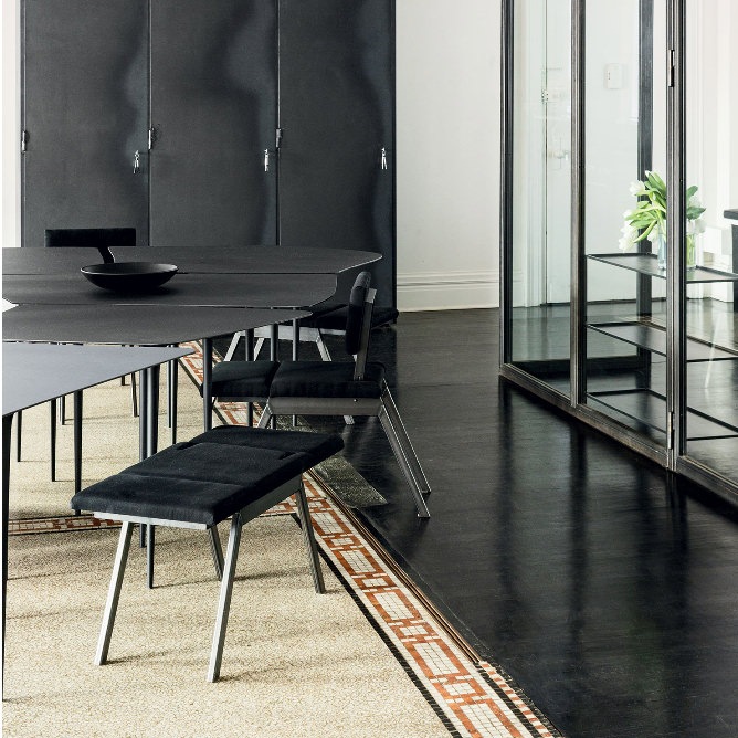
Nowadays the iron and the metals that are inserted in the furnishings have been returning to their natural finish, called in jargon “raw” (raw iron is commonly called black). This brings out the material with which the product was made and its natural imperfections make it even more alive and unique in its kind.

THE BLACK IRON

The word “iron” in common parlance is usually used to also indicate low strength “iron alloys” and mild steels which have a silvery-gray appearance. Very resistant, ductile and malleable, they are distinguished by black iron which is darker, more delicate and is used exclusively for indoor structures, therefore much less exposed to atmospheric agents. To preserve it from humidity and the risk of rust appearing even in sheltered environments, black iron is usually treated in a very natural way with beeswax or transparent varnish, both solutions make it slightly brighter and create a sort of film protective.

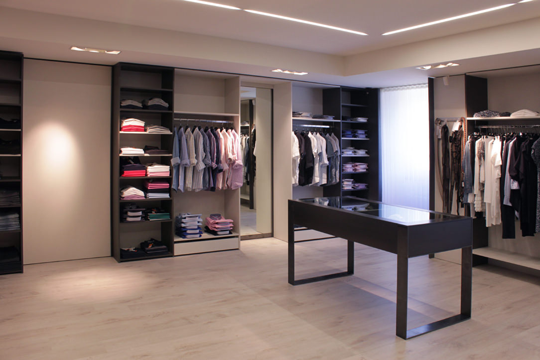
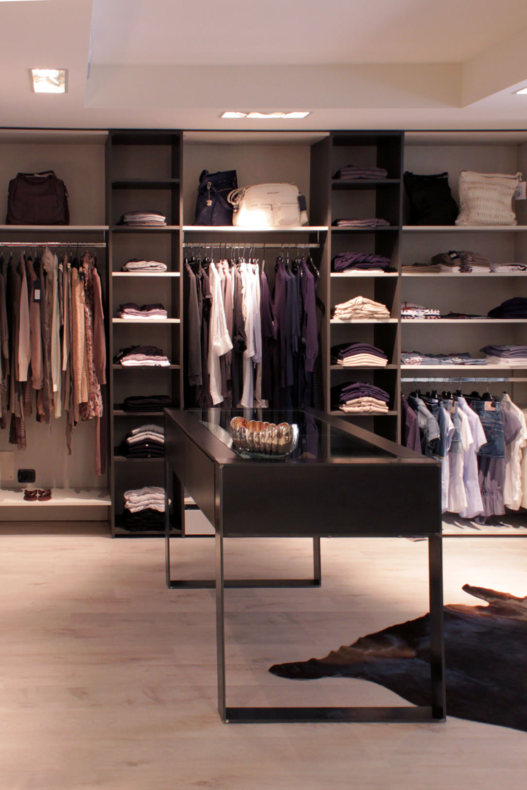
boutique made in black iron
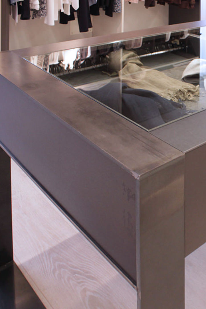
details black iron table

A Boutique realized where the concept Fil Rouge was precisely the combined black iron and material finishes

THE IRON IN THE STRUCTURES OF THE ELEMENTS

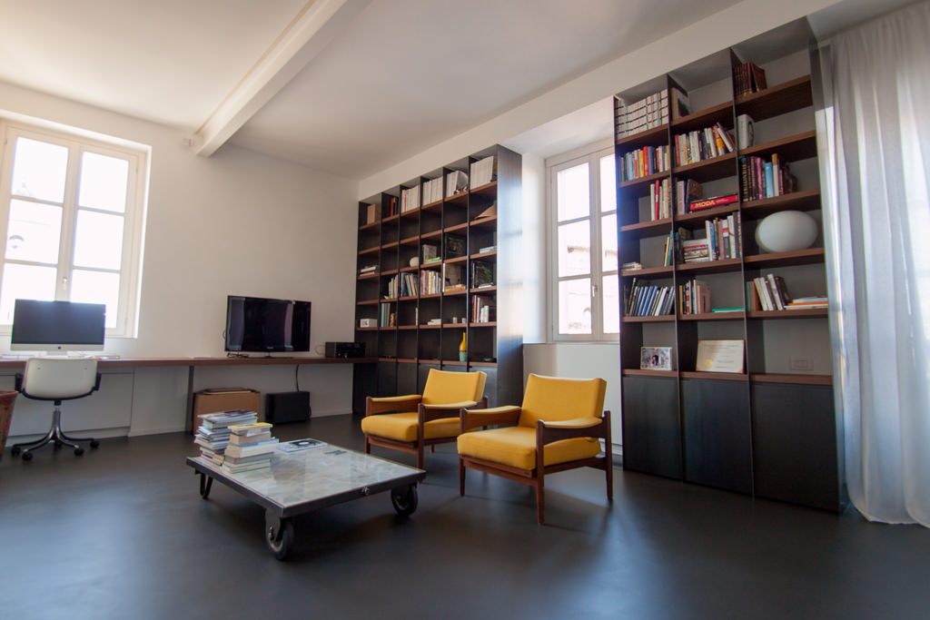
The peculiarity of polymaterial structures is that the different materials are harmoniously associated with their aesthetic and structural characteristics. In terms of resistance, what wood supports with its 2 cm, metal can do with a tenth of the thickness. This is why we like to use metals in load-bearing structures, such as the backs of bookcases or furniture. Black iron kept in its natural color can also act as a contrast with a very light lacquer or with a wood-colored essence. Below are some examples where you can see how the structure is light even if extremely dark.
bookshelf in black iron
environment in black iron
bookshelf in black iron

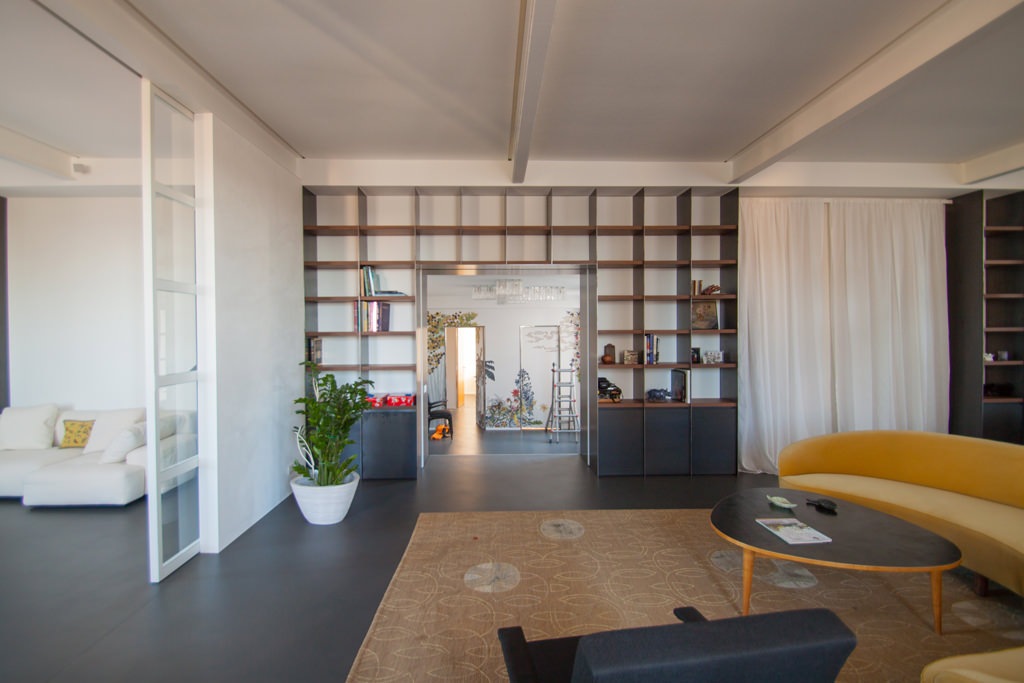
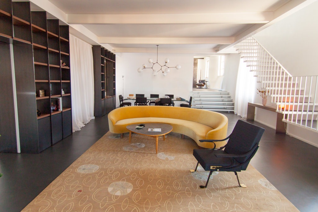
black iron bookcases populate the living area of this elegant apartment

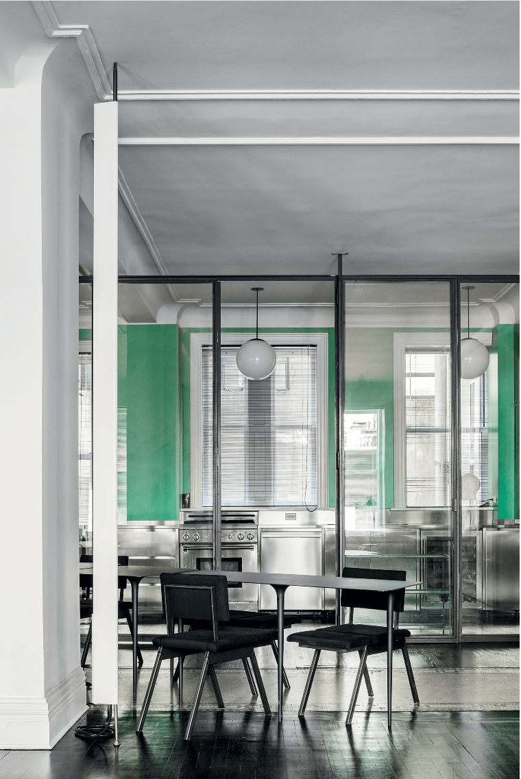
Also used for fixtures in its industrial spirit, it never abandons glass in combination with room dividers, as for the kitchen below which is separated from the living area. The shaped tops of the tables and the turned legs are also in very thin black iron sheet.

black iron fixtures and tables

partitions and tables in black iron in this Newyorkers Apartment

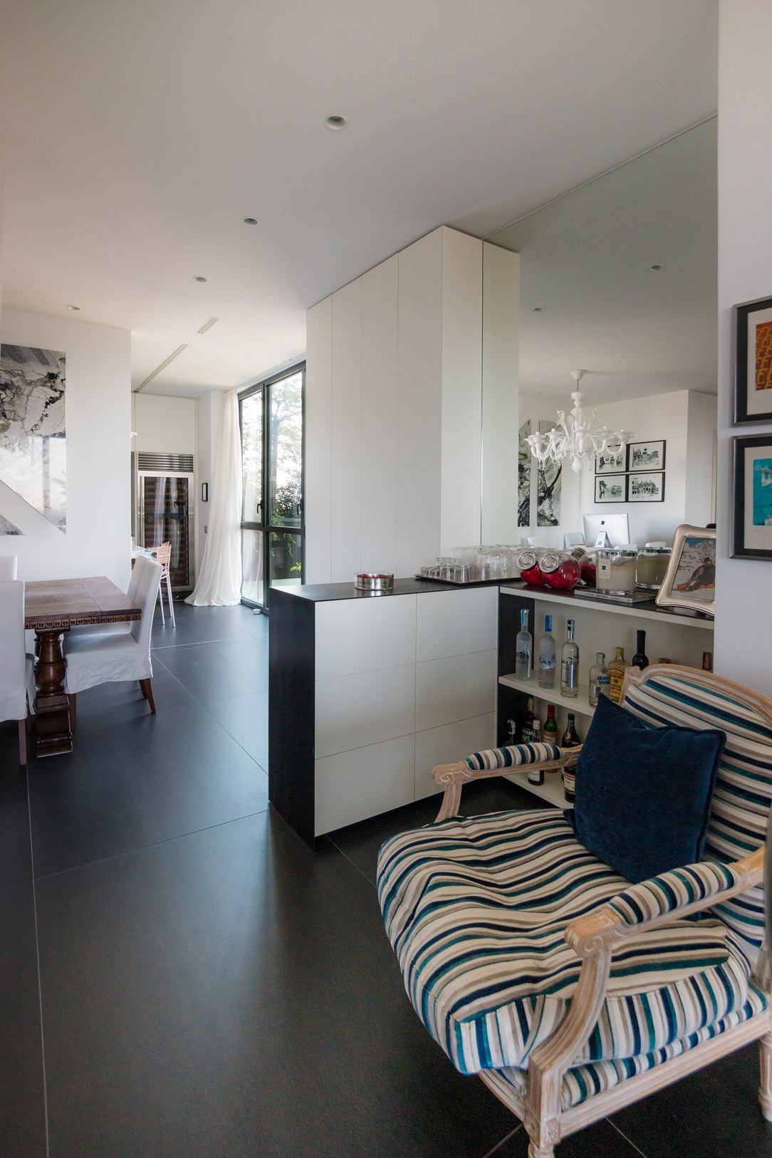
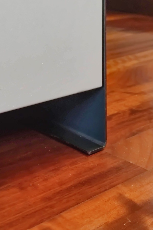
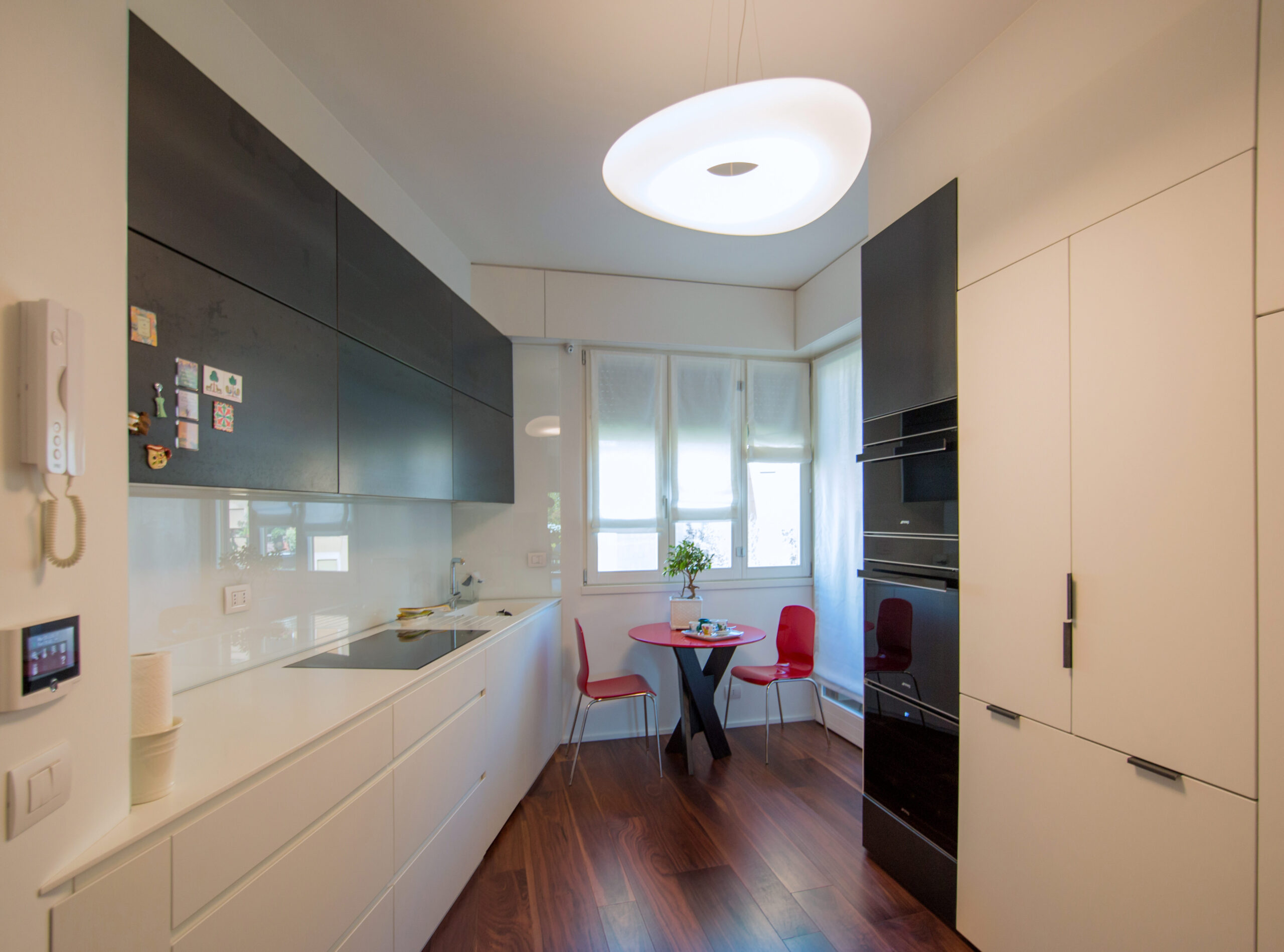
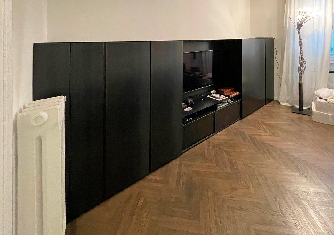
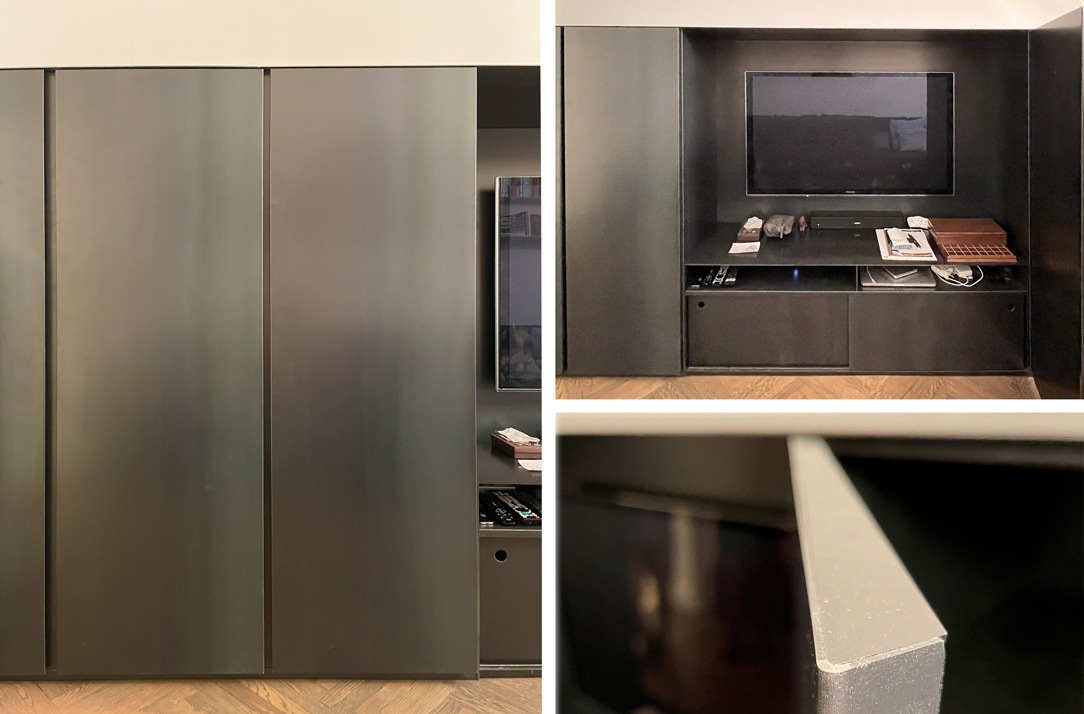
Black iron is also often used as a “lid” for furniture, a sort of thin blanket that envelops the entire element and sometimes reaches the floor, becoming a base. An example are the doors and the column of this kitchen and in the bar cabinet below, where the iron in addition to supporting it repairs the support surface, which, like all horizontal surfaces, is more subject to wear than vertical ones.

living room bookcase iron black
Iron and lacquered bar cabinet
 iron base detail
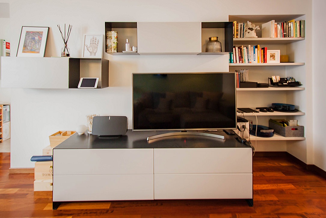
iron tv cabinet

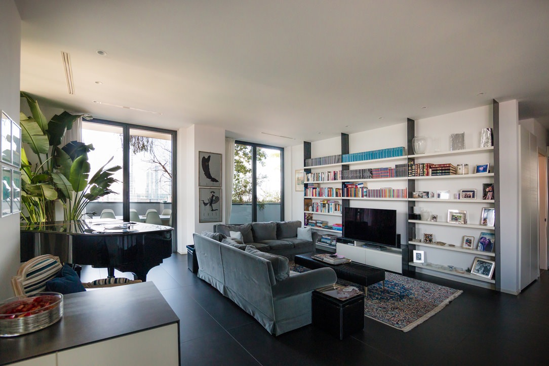
Two Apartment, one in the center of Milan and one in Bergamo, where black iron structures bookcases and the top of the TV and bar cabinets.

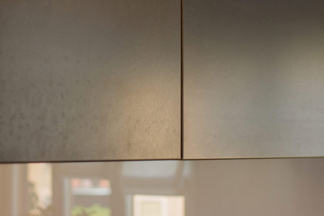
Here, on the other hand, it is used as a covering for the doors and the niche of an elegant Kitchen in Milan.

 kitchen doors covered with black iron
covered doors detail
handles in black iron

THE BLACK IRON IN THE COVERINGS

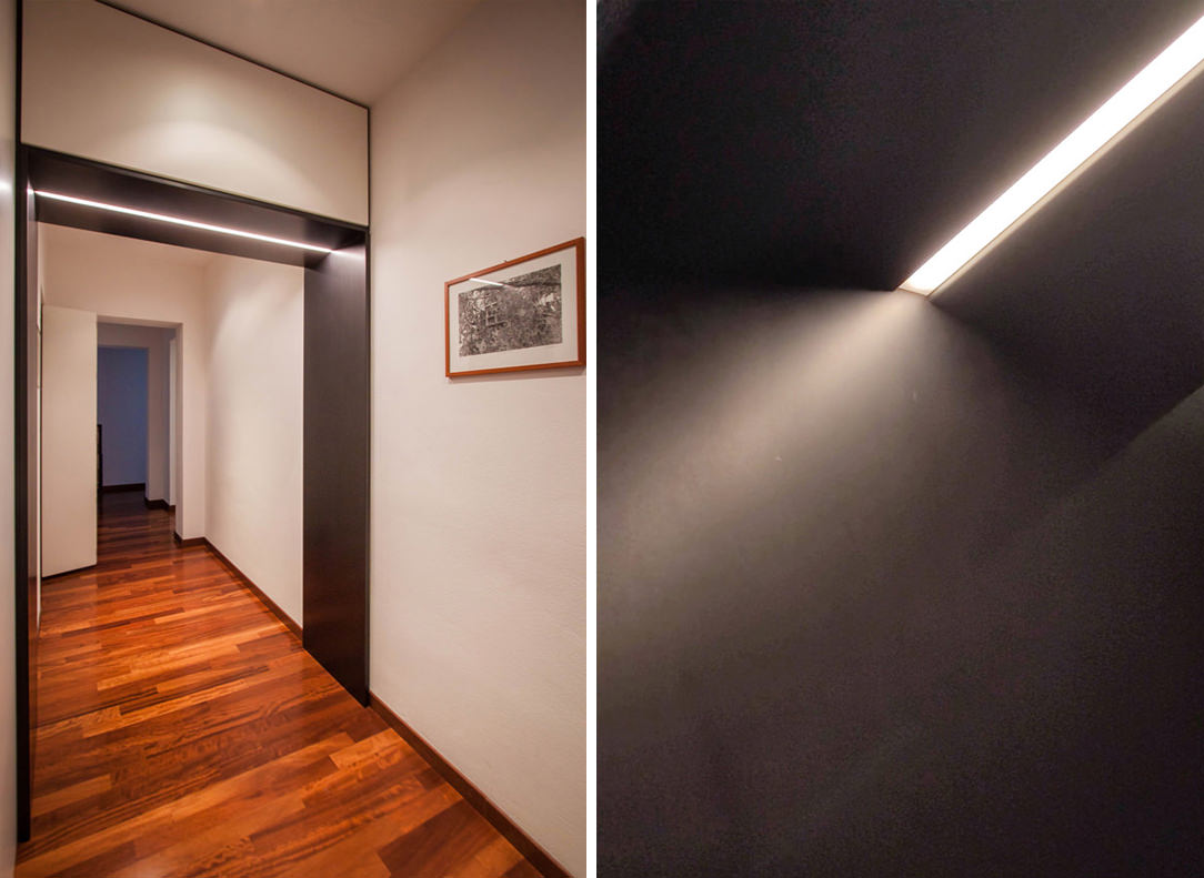
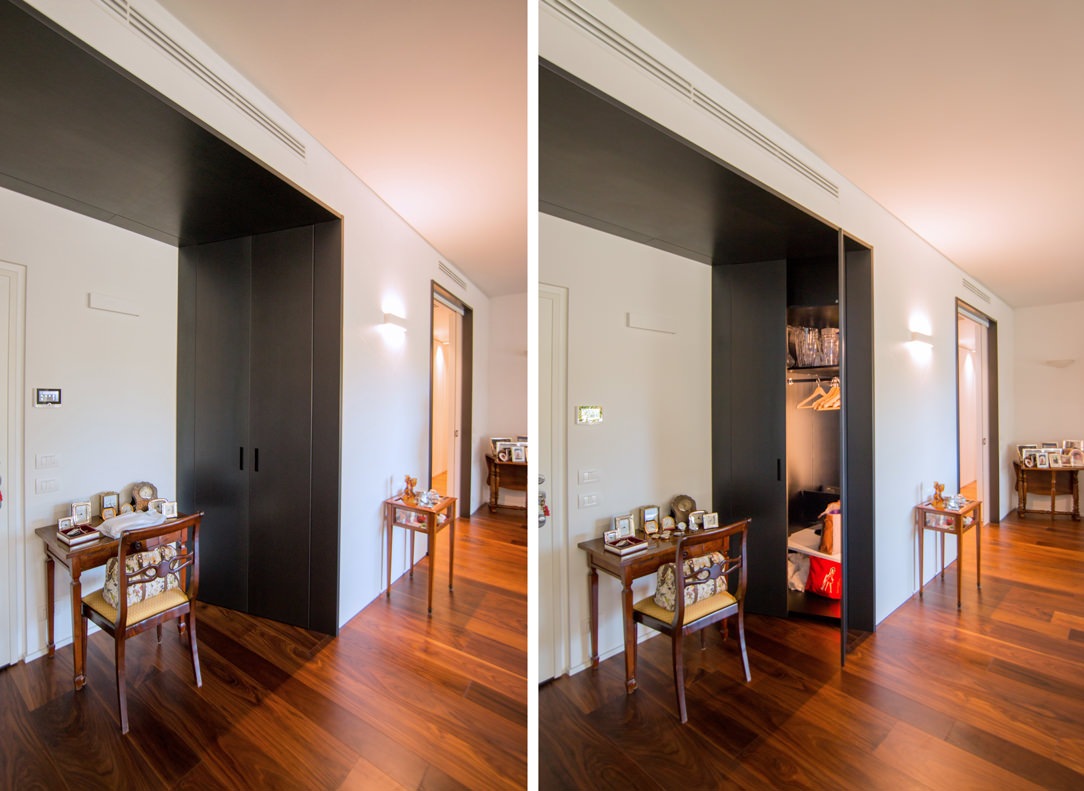
Due to its dark and irregular color, very masculine and elegant, black iron can also be used as a wall covering to create a sort of partition or portal. A portal to divide the rooms inside the house, at a symbolic level to make the user cross towards a place that will be able to express himself only when he crosses the black threshold, many times illuminated from above or sideways with LED strips. Here are some examples of portals, some inserted only in the doorway and others much more structured, with also an equipped part in which to hide some furniture at the service of the house.

lighted portals
equipped portal

Portals that act as partitions and equipped portals

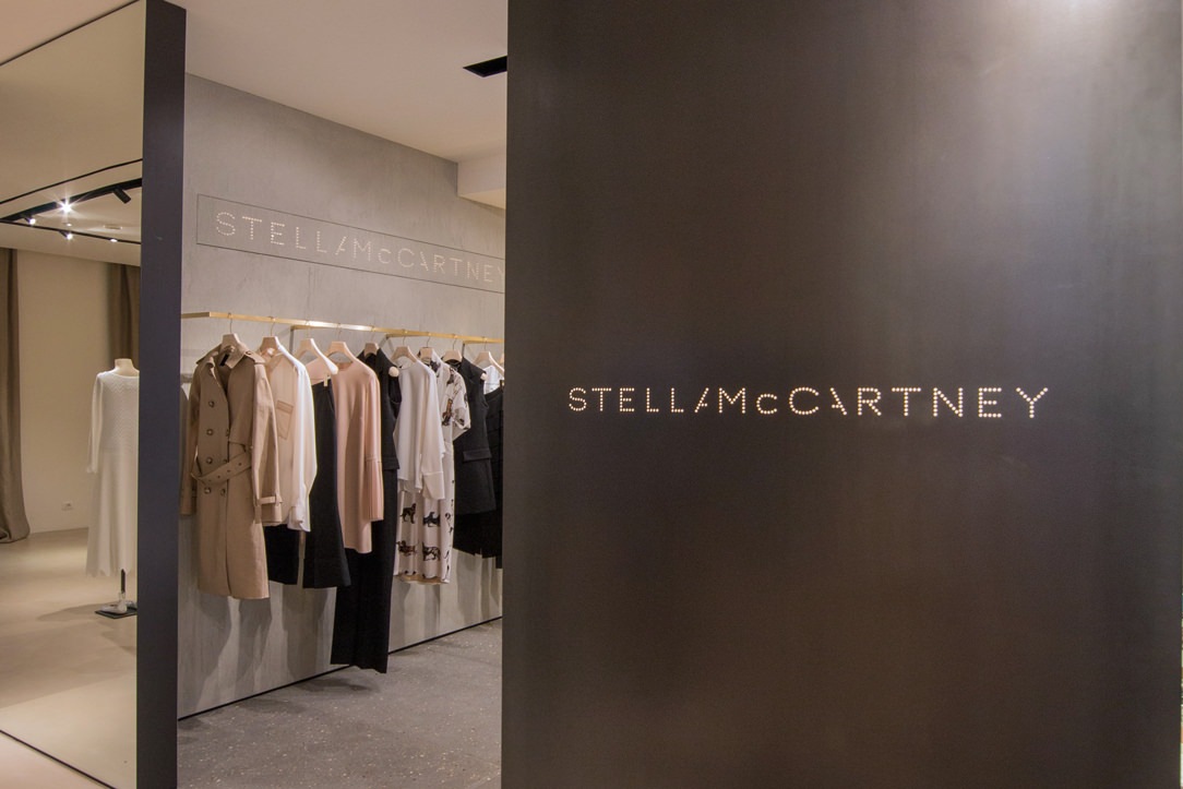
Branding paneling, on the other hand, is very common in the Retail sector, for example the corners of the Tiziana Fausti shop, in which the black iron panels visible from the central space have externally the laser engraved logo of the Brand which is located inside the box used for it.

brand logo in iron
external panel black iron

Laser cutted Brand’s logo on black iron partitionsin the Tiziana Fausti shop in Bergamo

ALL BLACK

Having a furniture completely made of black iron is not only possible, but sometimes it is the right choice for certain types of environments and goes well with the rest of the furniture. Here is our realization of a niche furniture in which doors and structure, both external and internal, are covered or structured in black iron.

iron covered furniture
details black iron furniture

Here is also another example of a black iron structure with desks and tables in the same material made by Locatelli & Partners inside a church, their old operational headquarters. The contrast of the cold and dark material inserted in a context that does not belong to it, as in this case a Baroque church with warm tones and completely frescoed walls enhances the material and turns out to be a harmonious union.

THE BLACK IRON IN THE DETAILS

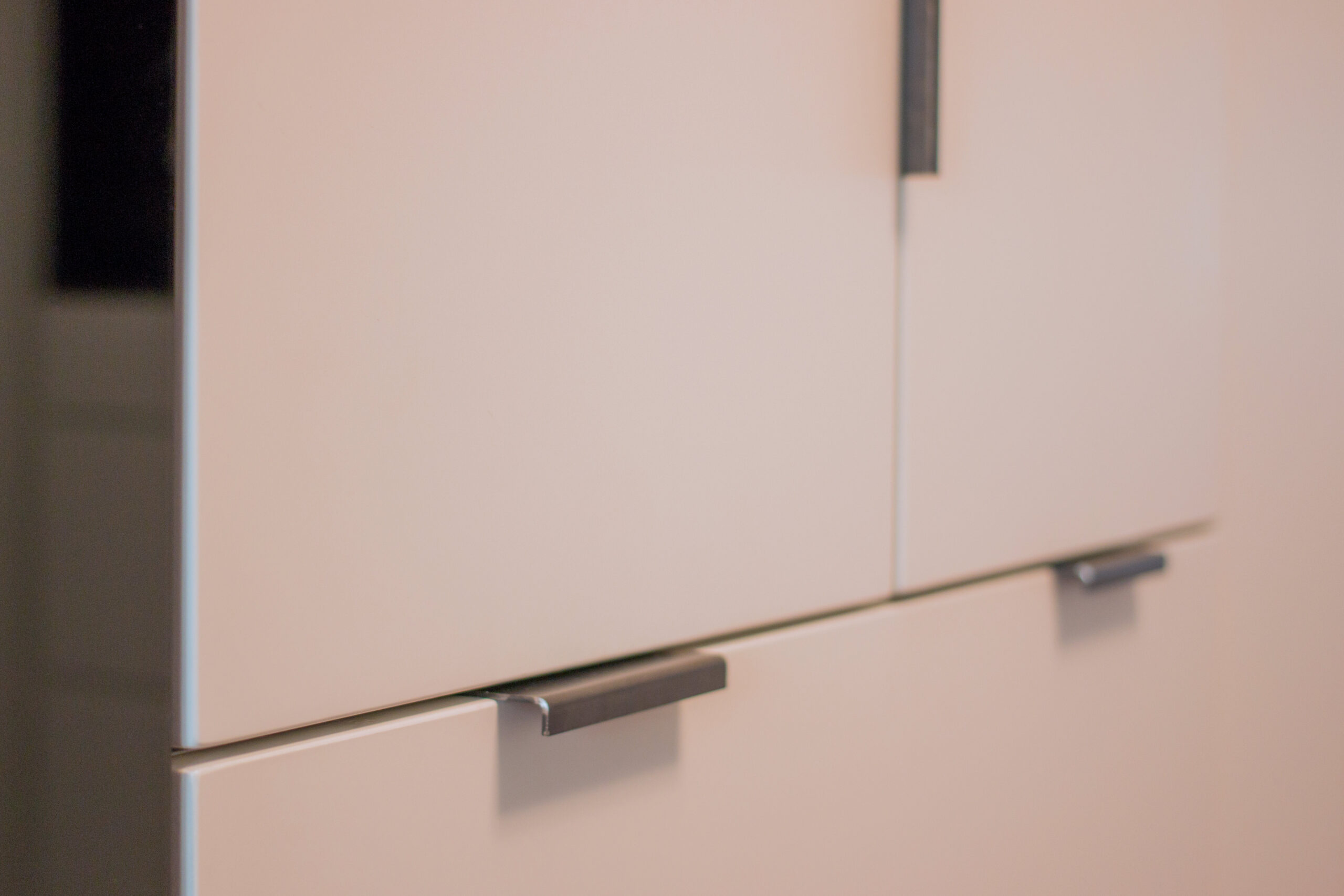
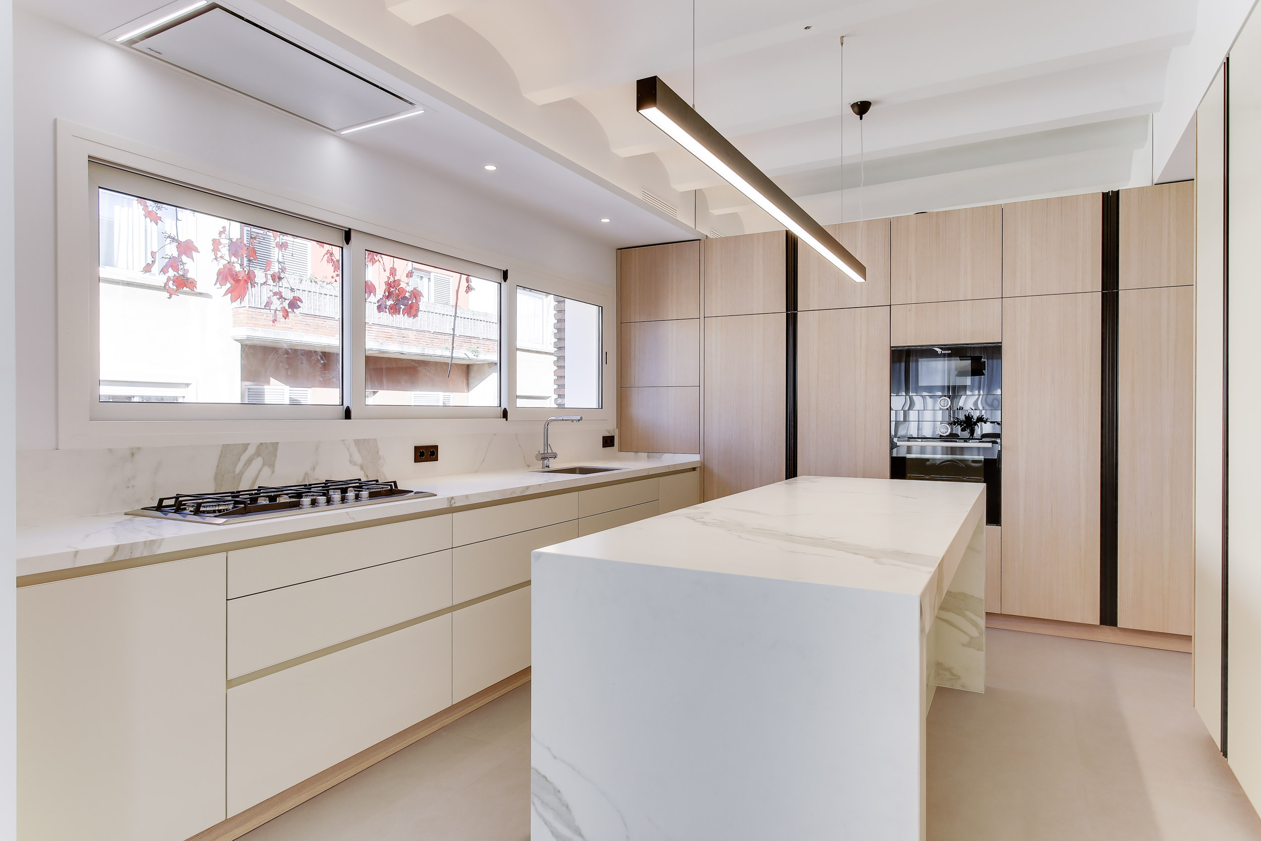
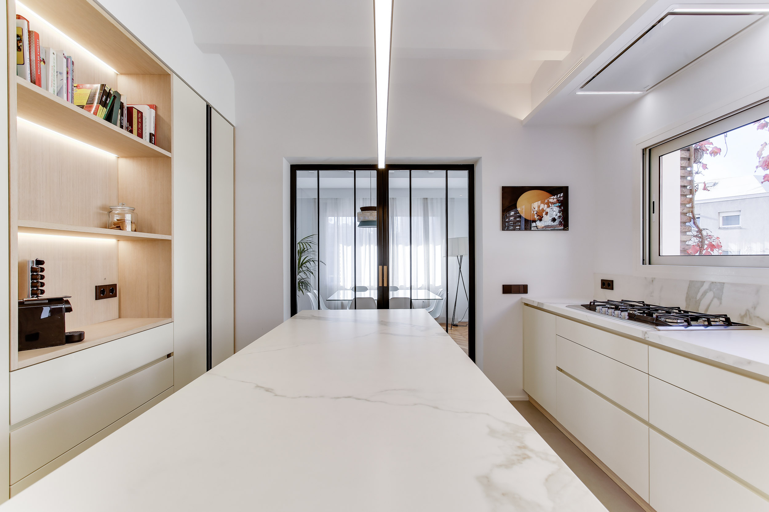
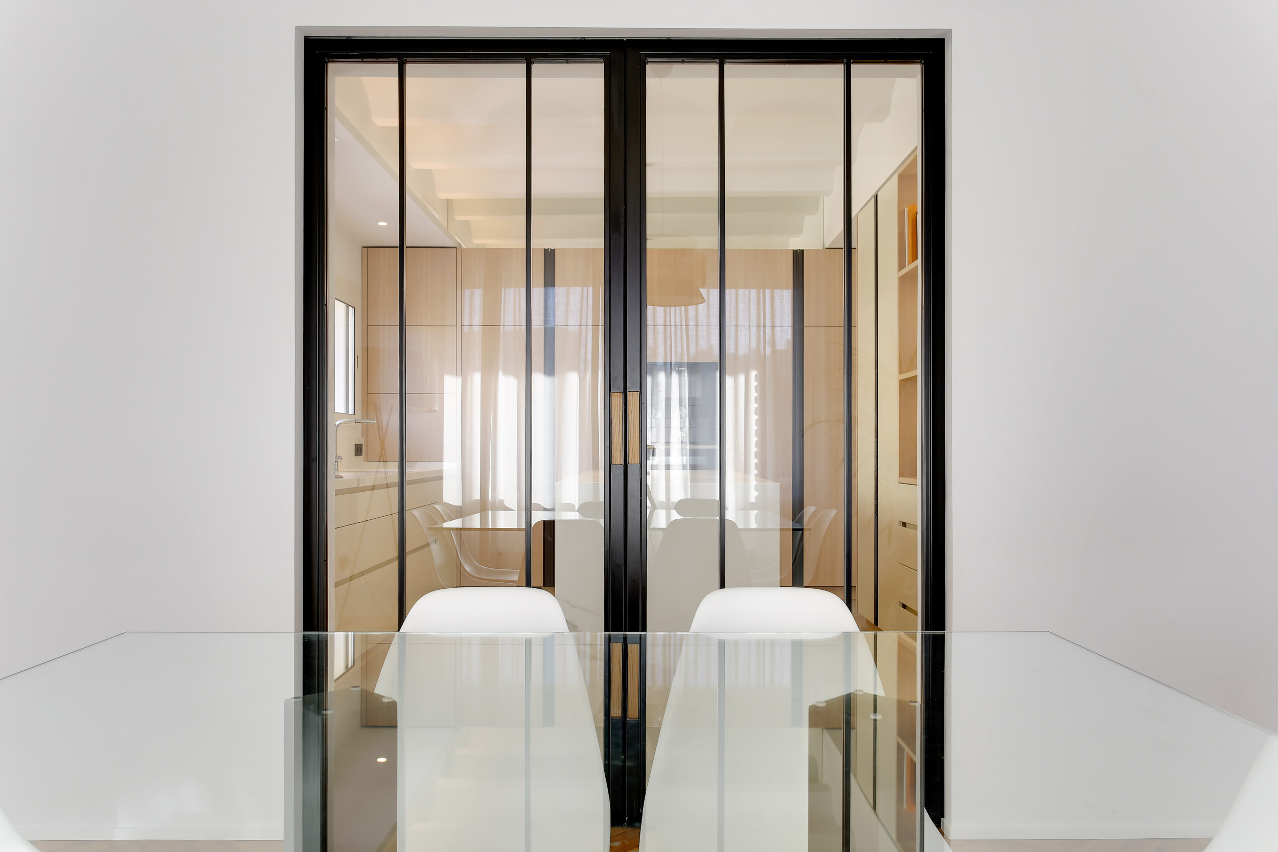
Black iron can also be found in small details and accessories, such as handles and frames. They turn out to be a touch of color and a detachment of fundamental material for some very clear and bright environments. The detail gives an extra touch of elegance to the environment and characterizes it, an example are these full-height handles that reflect the frame of the glass partition of this splendid kitchen made in Barcelona.

kitchen Barcellona black iron details
black iron handel
black iron kitchen details

MATERIAL FINISHES

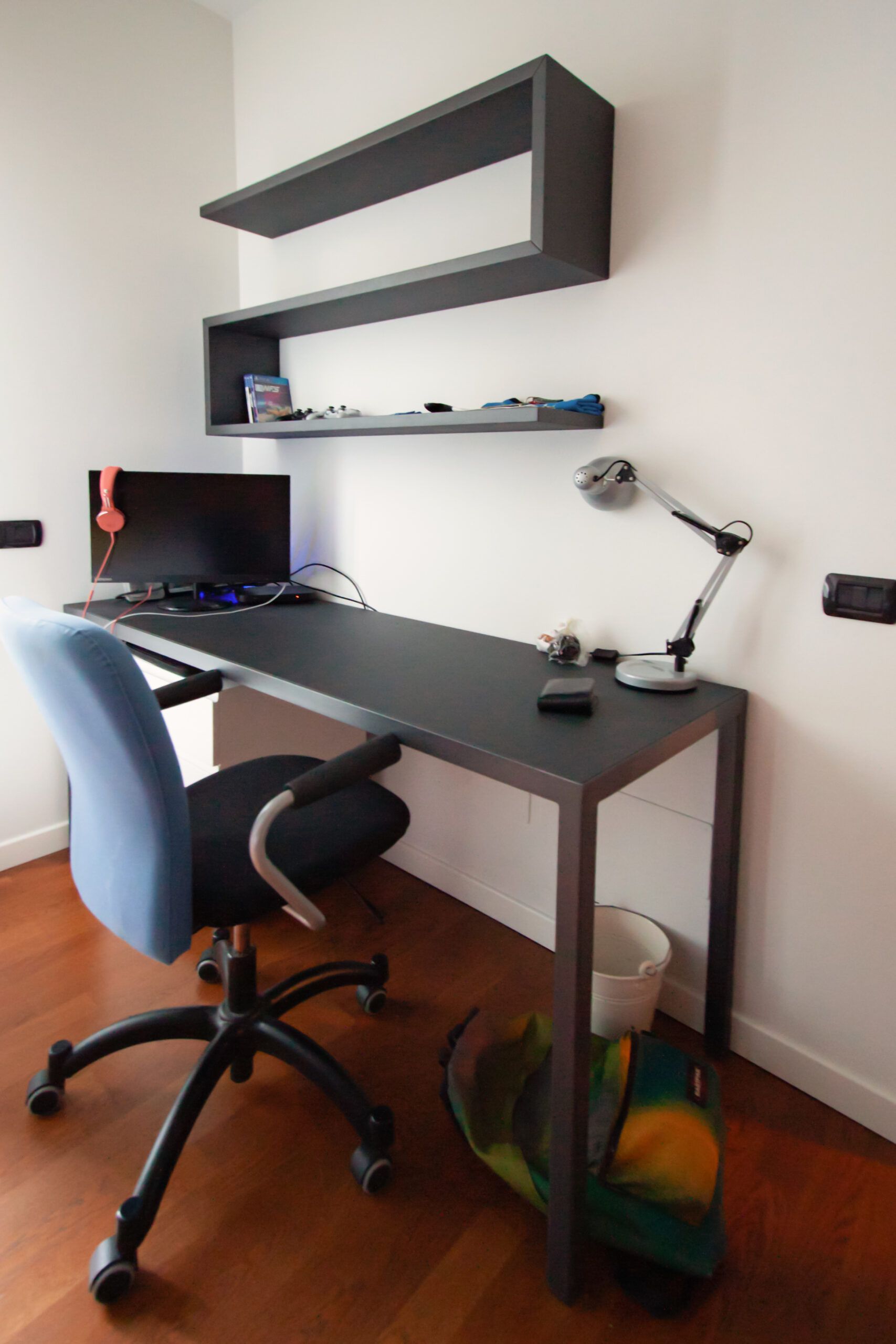
We have previously said that the surfaces of raw materials can be non-uniform and have defects such as scratches or changes in tone in the plate. Excellent for industrial-style interiors, black iron was in fact very common in production workshops at the height of the industrial revolution, sometimes even rusty and together with oxidized brass, ceramics, knotty solid wood and antiqued glass it became the symbol of those years. This raw effect of raw materials has become a trend of companies and design and architecture studios and in recent years it is in great demand. Precisely for this reason, numerous products have been created that reproduce the textures inspired by the essences of wood, black iron or natural stones for exclusive wall coverings or home furniture. The important thing about these finishes in addition to the visual aspect are the tactile emotions capable of arousing thanks to rough and often irregular surfaces, which together are called material finishes. Together with black iron, an anthracite-colored textured paint can give a hint of color and roughness to other elements in which iron is not present but which are in the same environment. An example are these shaped shelves associated with a black iron desk with a Linoleum desktop in the same shade of gray in the center of the top.

desk and shelves
bookshelf in dark gray

THE BLACK IRON IN THE PROJECTS

After all these examples we can only break a lance in favor of raw black iron, like a dark dress that is always in fashion its use, which is both bold and bold or minimized in small details in home furnishings makes it alive, vintage and fascinating at the same time.

Renewed classic furniture with contemporary kitchen

Renewed classic furniture with contemporary kitchen

The classic style furnishings of this villa built about thirty years ago rediscovers its eternal charm even after many years.
To rejuvenate it and make it current, a contemporary style kitchen with essential lines has been added. The harmonious combination of the two styles refreshes the rooms and softens the features of the predominant style.

classic living room

Classical furniture between past and present

The passage of time and the succession of different historical periods has allowed a wide development of furnishing styles. Over the course of history these have known their maximum expression with distinct characters, while in the contemporary era they have been reinterpreted, giving life to continuously updated variants.

This house, built between the late eighties and early nineties, responds to a classic style at the time very popular among villas and elegant apartments. Revived today, it discovers its contemporary meaning with an elegant kitchen with essential lines. The warm tones of the lacquers soften the design lines of these interiors, in perfect harmony with contemporary trends.

entrance passage with classic arch
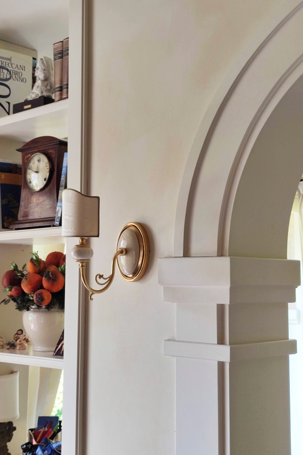
classic style entrance details arch moldings
detail of the villa entrance light blades

The living area in classic style

The classic furnishings already develop in the entrance area with moldings that emphasize the architectural lines of this villa.
On the left, an arch with shaped profiles marks the entrance to the living area, flanked by a pair of blades of light that allow a glimpse of the large interior living room.
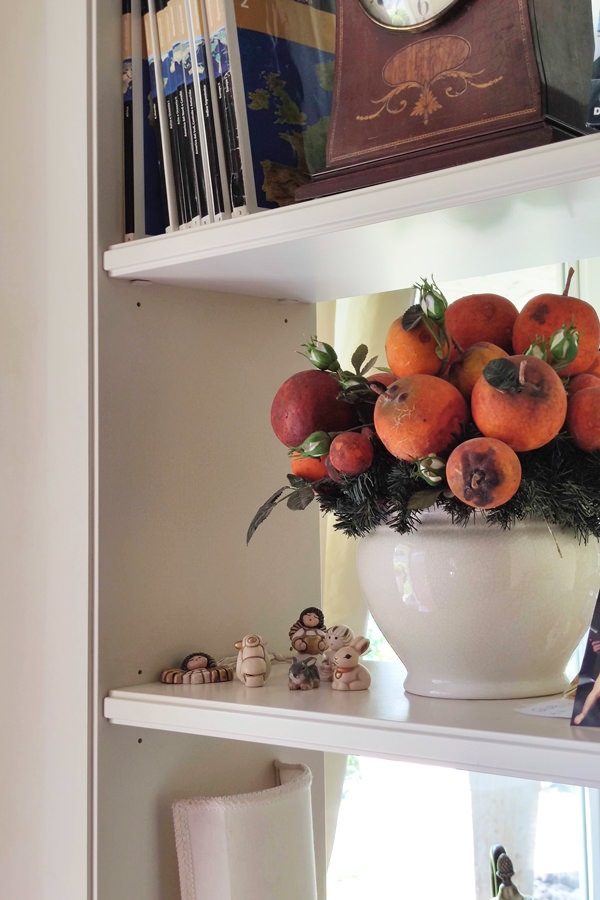
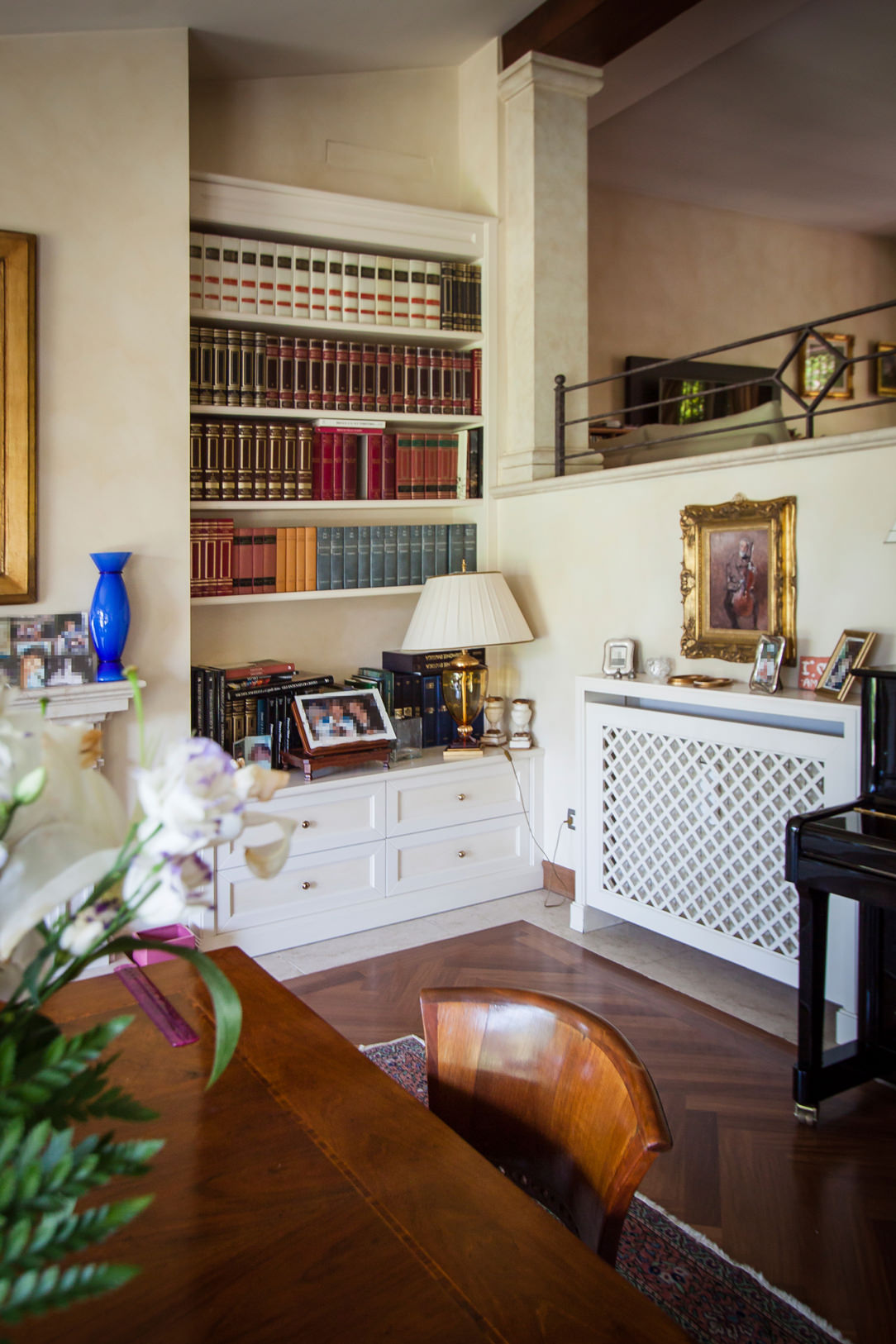
The profile of the internal shelves, slightly recessed, is a shrewdness that makes the aesthetic impact of the element lighter, recalling the characteristics of the classic style.
The painting of the walls in a warm slightly cloudy tone acts as a leitmotif in the different rooms, enhancing the light furnishings.

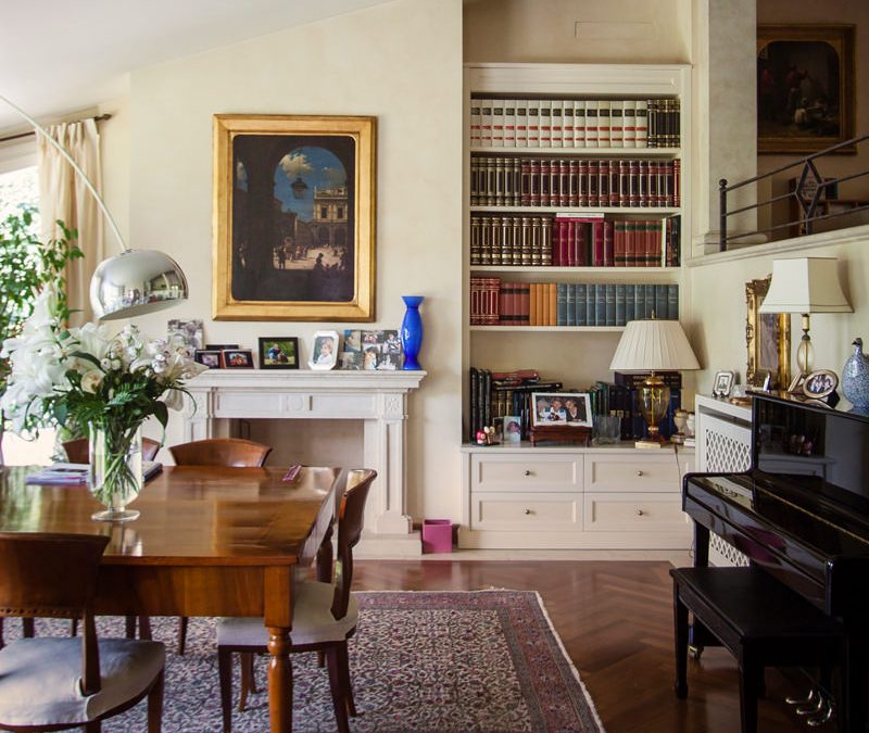
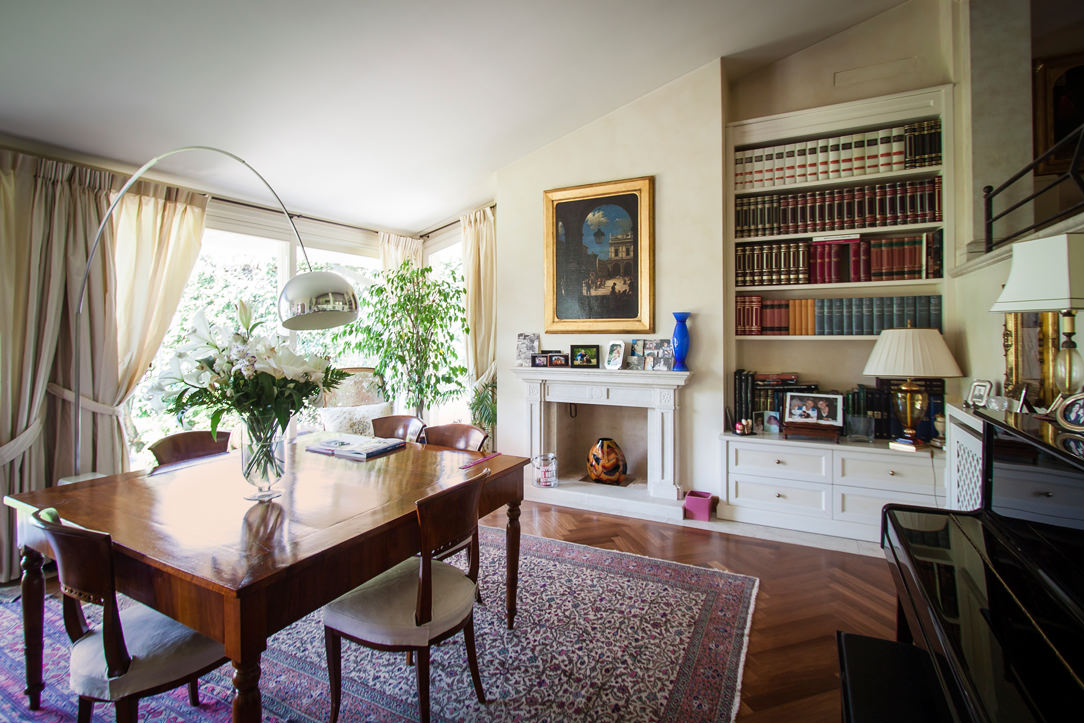
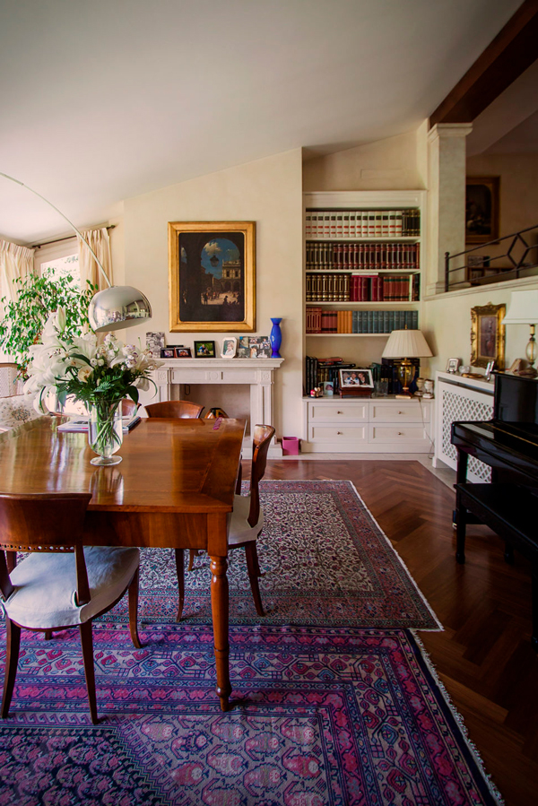
The living room has a central solid wood main table matched with other antiques that give elegance and prestige.
Among these, the large damask carpet, the adjacent wall piano and the Arco lamp by Castiglioni, a timeless design icon.
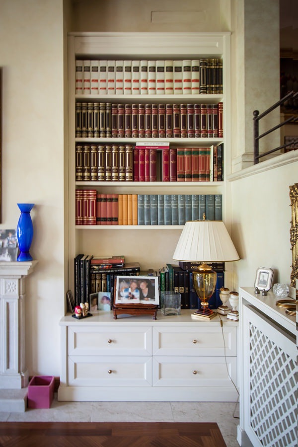
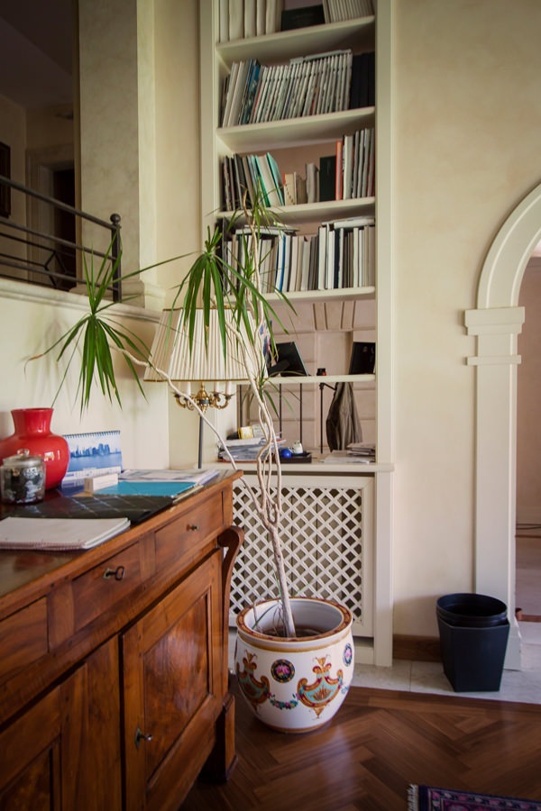
Low cabinets, honeycomb radiator covers and niche bookcases with recurring aesthetic characteristics accompany them. Moldings, doors decorated with tone-on-tone knockouts and brass knobs are in perfect classic style.
The chosen color of a light cream makes the interiors elegant, softening their features.

bookcase in niche details classic furnishings in the living area
details equipped windows bookshelves wooden furniture
classic style living room wood table
living room furniture classic niche bookcase
front molded drawers in classic style, tone-on-tone
bookcase niche living room classic furniture shelves

From the equipped corridors to the sleeping area

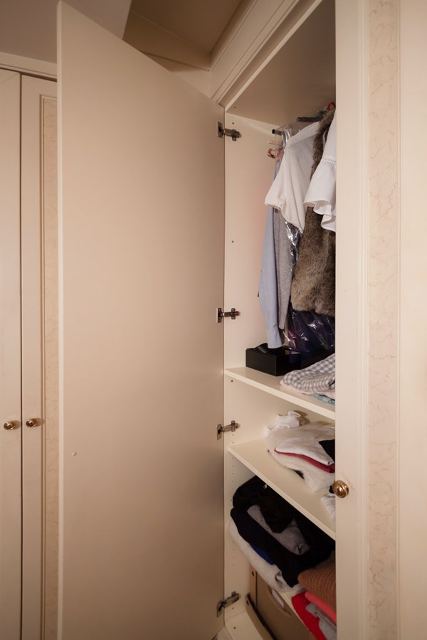
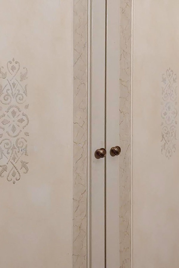
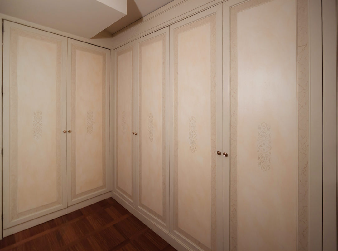
To anticipate the sleeping area, the corridors and passageways are equipped with full-height service wardrobes. These reproduce the characterizing lines of classic style furnishings, enriched with decorative floral motifs in a slight chromatic contrast.
The warm tone of the walls is echoed by the knock-out of the doors in a delicate tone-on-tone play. Internally, shelves and hangers alternate to make the most of the environments.

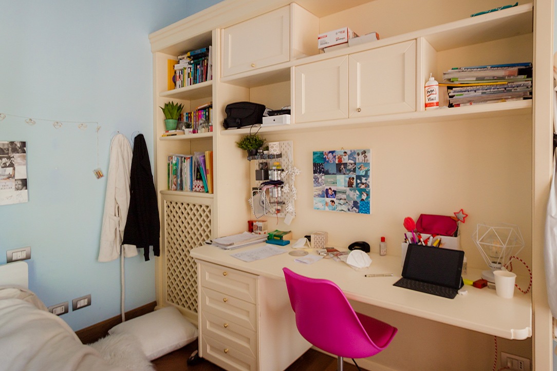
In the sleeping area, the bedroom uses a double-sided wardrobe that fits into the dividing wall between the sleeping area and the study corner, now equipped for distance learning. A structure with delicate warm tones which, combined with the light blue walls, is even brighter and fresher. Classic-style doors accommodate internal shelves and hangers, while in the terminal part they incorporate open compartments for small objects.
At the front, the equipped wall alternates shelves with wall units with molded doors, creating a dynamic visual rhythm. In the lower part there is a desk with a chest of drawers incorporated into the structure.

classic style bedroom bed
classic style bedroom desk
classic style wardrobes interior
detail decoration doors classic style furniture
classic style wardrobes decorated cream colored doors

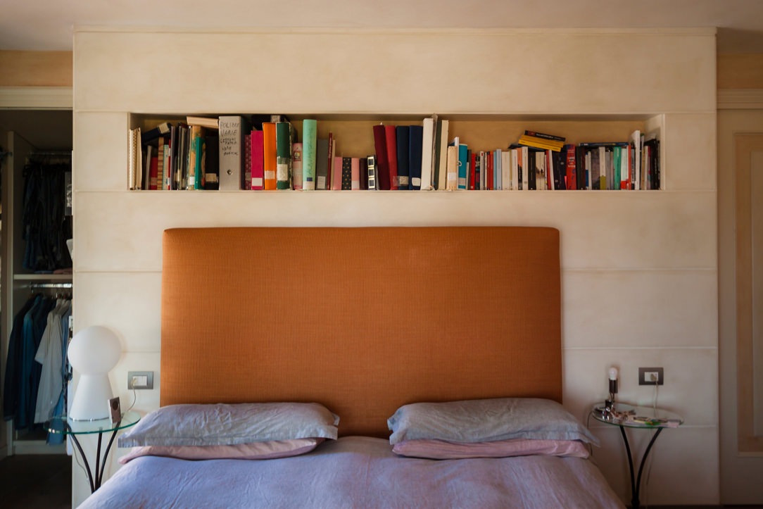
The master bedroom stands out for its contemporary elegance that only delicately hints at the classic tones of the remaining rooms. The caramel-colored padded headboard of the large double bed rests on the rear structure equipped with a front day compartment and bookcases along the side shoulders. To recall the classic style of the furniture is the linear aesthetic of the back wall with panels spaced at a fixed distance.
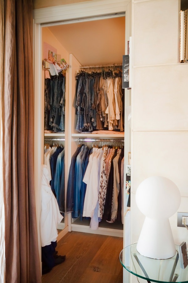
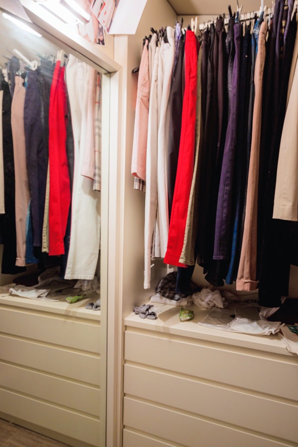
On both sides of the bed there is the access to the walk-in closet, contemporary in its design lines but with light tones that reflect the colors of the remaining furnishings.

cream colored shaped kitchen lacobel wall units
walk-in closet retro bed classic contemporary style
niche bookcase detail with headboard thickness
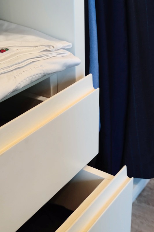
detail handles hollow linen drawers walk-in closet rear bed
internal walk-in closet chest of drawers hanging mirror
horizontal classic bathroom

The introduction of the contemporary style through the refurbishment of the kitchen

The timeless beauty of classic furniture, rediscovered even today, is confronted with the desire to renovate the interiors.
In terms of functionality and typology, the kitchen is the environment that best lends itself to a stylistic change with a contemporary flavor. Here then, after simplifying the existing doors with a linear aesthetic, this room also fits harmoniously into the existing complex.
A touch of lightness that balances the stylistic imprint of the villa.

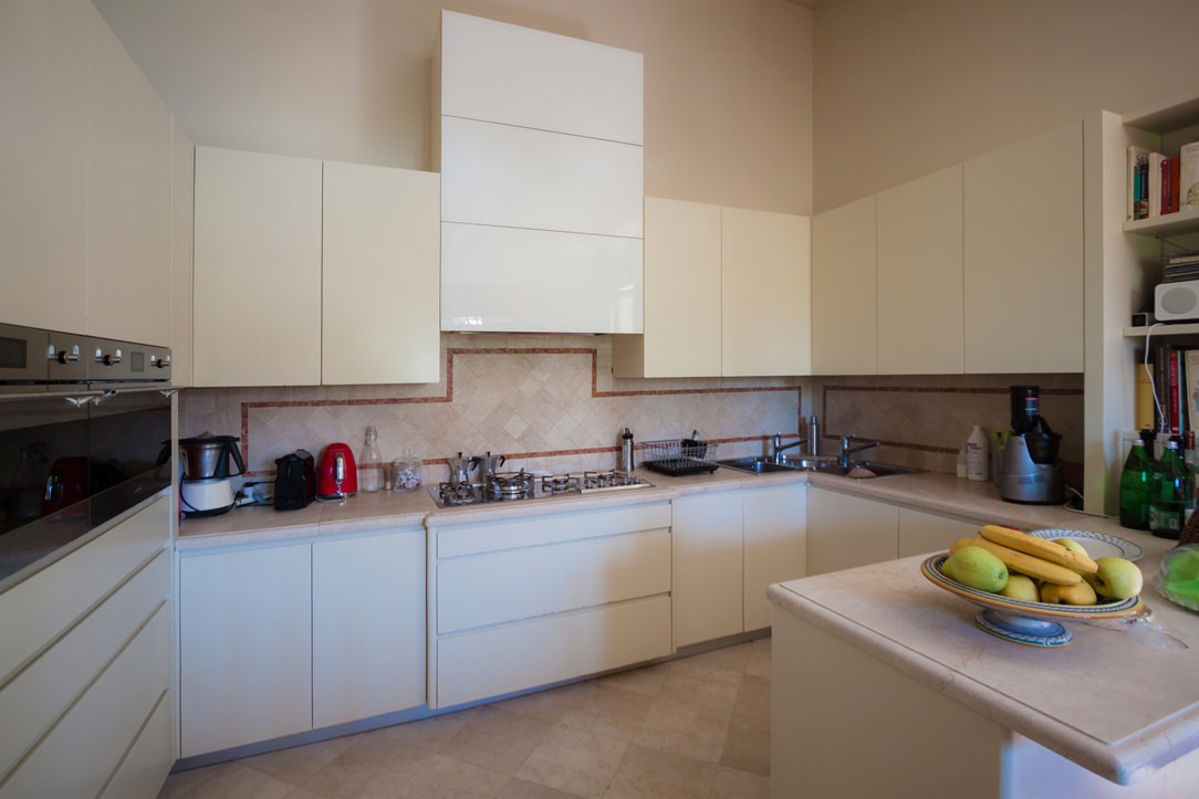
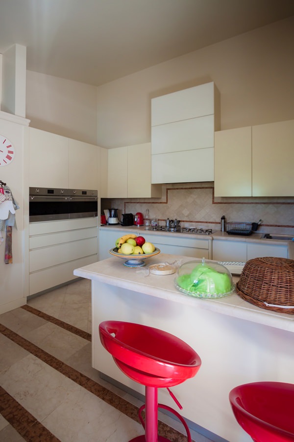
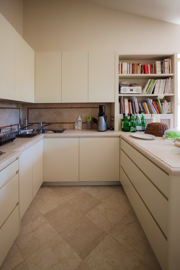
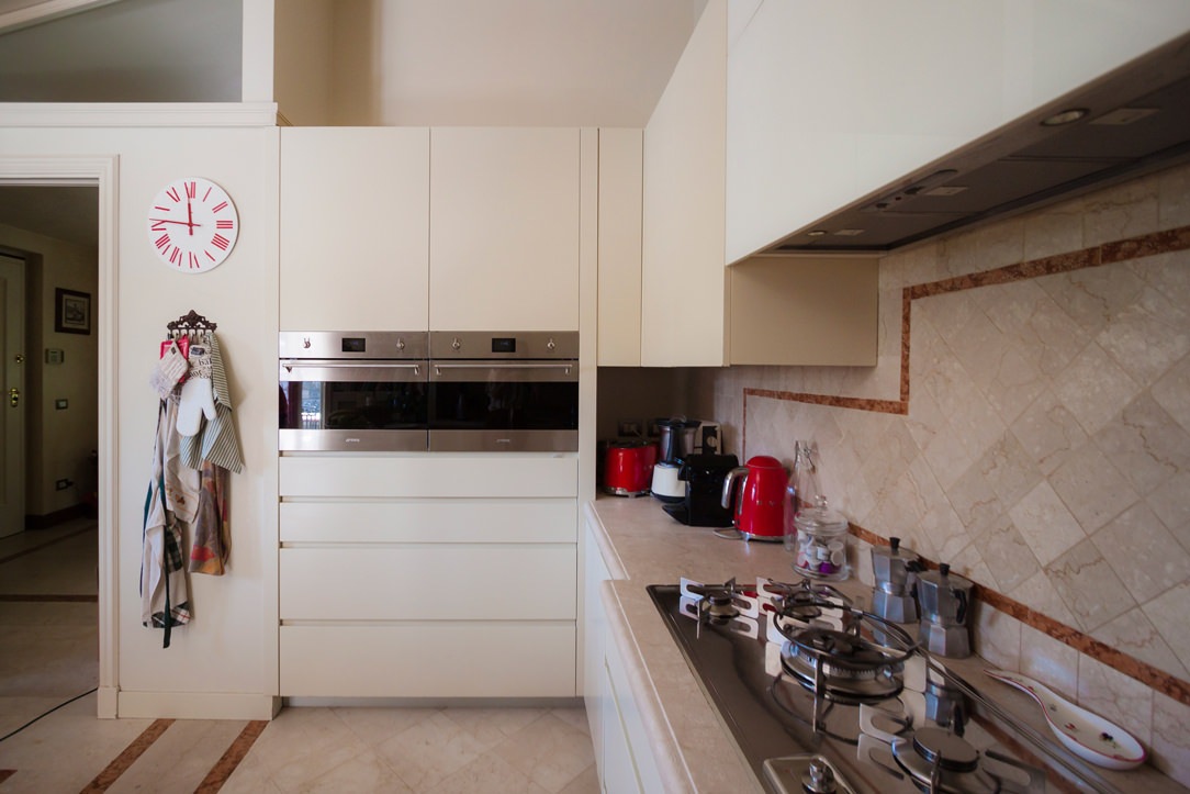
Preserving the top and the back surface of the terracotta kitchen with brick-colored geometric decorations, the refurbishment involved doors and front drawers of both the base units and the upper wall units. Recessed handles with a linear aesthetic and matt lacquer in full contemporary style are spread over the entire kitchen and the volume of the peninsula used as a snack bar placed at the front.
The hood, previously chosen as a “design” type, was inserted in a built-in structure entirely covered in white Lacobel, capable of giving brightness to the environment.
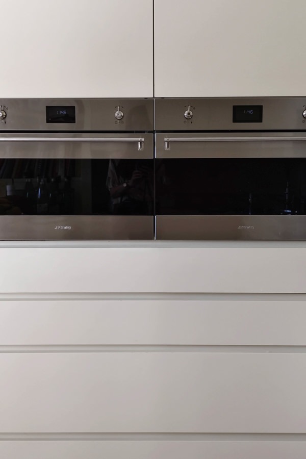
Appliances are also being renovated, including the built-in refrigerator and the pair of Smeg column ovens.

tubular horizontal hangers optimize coats space
contemporary style kitchen top snack bar red stools
modern classic style kitchen renovation on the peninsula side snack bar
modern classic kitchen 4
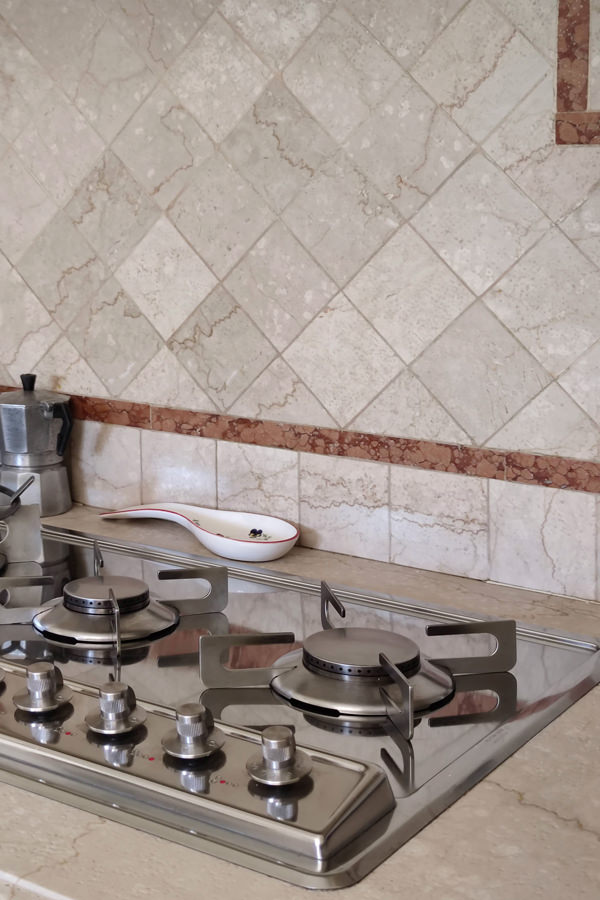
gas hob kitchen kitchen makeover
column ovens smeg contemporary kitchen drawers hollow handles

Conclusions: customize the classic furniture

The classic style, which today is witnessing a rediscovery, is easily combined with the essentiality of the contemporary style, creating an interesting combination. Restoring the stylistic balance of the interiors can also mean finding the right combinations between different styles, giving a decisive impression to the house.
To learn more, another example of a house with contemporary style and classic kitchen.

How to equip a bathroom with laundry corner

How to equip a bathroom with laundry corner

A functional and aesthetic analysis of the laundry corner. An environment that in contemporary reality is forced to give up its autonomous room to blend in a small bathroom or equipped corridor. The aim is giving space to the services that define our daily life, making them aesthetically interesting.

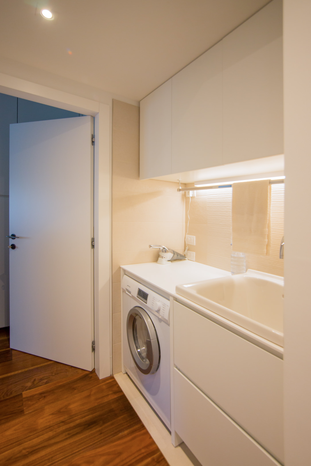
laundry corner

Laundry corner with showed washing machine, basin and compartments furniture

equipped corridor

Optimize spaces equipping corridors with serviced wardrobes View the project

Space to services

Speaking of interior design, we are used to imagine elegant living rooms and modern kitchens, contemporary bedrooms and essential-style dining rooms. Over the past few years , the interior design has increasingly taken on the aesthetic meaning of architecture. Let’s remember, however, that design was born as the perfect combination between aesthetics and functionality. The morphology of furniture is nothing else than the natural result of perfect efficiency. It is exactly with this spirit that we want to highlight those “corners of the house” that we usually tend to hide because they are not “beautiful” even though they are basics in the functionality of our domestic spaces. The project layout of each house gets us used to dividing rooms between “living area” and “bedrooms”. The first includes all those rooms that are used to welcoming guests, designed with the aim of return the best public images of the owners. In the “sleeping area”, the most intimate and personal rooms of the owners come to life. However, in this typological distinction are missing all the rooms which, whether private or public, carry out a real function. Among these, just think of the laundry room, which over the years has changed its conformation adapting to the needs of the time.

washing machine recess

A laundry niche uses the available passage corner to house the washing machine and shelves View the project

From public washrooms to bathrooms equipped with laundry corners

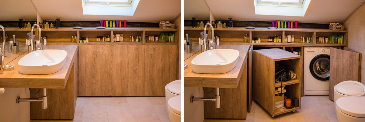
Over the years, the home laundry has become increasingly important in private houses. Whole rooms were equipped with basins and ironing corners, which gradually witnessed the coming of appliances capable of simplifying manual work and obtaining excellent results. Private rooms that replaced the traditional public lavatories for an increasingly elitist concept of personal care and cleaning. The widespread use of washing machines, and modern dryers, has meant that laundry rooms take up less and less space inside private houses. Furthermore, in the contemporary vision of the house, open spaces have swarmed the architectural panorama more and more, reducing the functional closings to the bare minimum. As a consequence, to optimize space, the laundry room is often eliminated in favor of bathrooms equipped with washing machines, dryers and service cupboards. Making the appliances “invisible” was the next step. Here then come equipped wardrobes able to hold not only washing machines and dryers but also baskets and pull-out compartments for cleaning products.

laundry bathroom detail

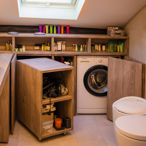
A bathroom with contemporary wooden surfaces hide extractable functional elements. View the project

Composition of a laundry-corner

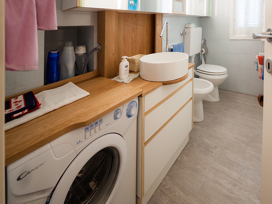
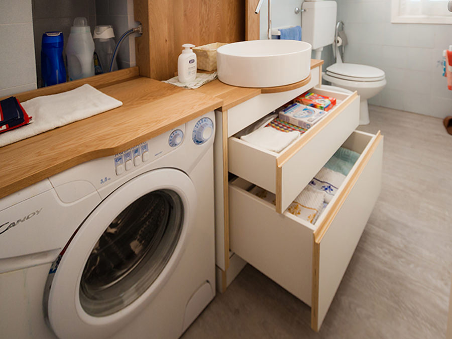
Equipping a bathroom with a laundry corner first of all means providing an insertion point for the washing machine. This can remain visible, favoring the opening of the porthole without interfering with any surrounding doors or being built-in the washbasin cabinet. To better hide the washing machine, however, it is necessary to provide a service cabinet that rests on the ground. It means excluding suspended solutions or light supports, and study a customed solution that allows the opening of the tray and the easily maintenance of the appliance. To this is often added a service cabinet with internal shelves and removable baskets that can contain cleaning products and accessories of different sizes. Often these latter two solutions come together in one, with folding or sliding doors, which act as a closure for the furniture element. Internal accessories such as dividers and hanging elements are additional options that can make the space more functional and optimize the overall dimensions.
bathroom with washing machine in view

The bathroom cabinet with wooden top and finishes houses the washing machine View the project

bathroom cabinet with open drawers

Drawers of different heights are extremely functional elements for organizing personal products View the project

bathroom service closet

A large service cupboard with internal shelves and removable basket for the bulky products View the project

It is the functionality that defines the composition of these equipped corners. Our task is to optimize spaces in the best possible way by creating practical and aesthetically satisfying solutions. Whether they are service points hidden in other rooms or clearly visible and recognizable elements, it is essential to be able to organize them in the best way, using all the available centimeters without however giving shape to narrow solutions.

Organize rooms with a secret library

Organize rooms with a secret library

Organize the room can be a difficult task, especially if this room is small and not very functional, but often the solution is just around the corner: in this case, around a corner library which hosts a secret door. THE PROBLEM ANALYSIS THE PROJECT PROPOSAL COLOURS, SHAPES AND MATERIALS THE ADVICE  

THE PROBLEM ANALYSIS

Living in big cities often means to interacts with the lack of space and environments with small dimensions. In those contexts, the functionality it’s an indispensable design element: It allows us to take the most advantage from each room without sacrificing comfort and aesthetic values, while at the same time it solves important problems. The functionality is not just the added value to our interiors, but first at all a stylistic key. A proof of that is this Milan’s apartment. The entrance overlooks a comfortable and contemporary living room characterized by light colours of walls and furniture which create a contrast with an elegant wooden dark floor with which it harmoniously communicates. The design challenge provide for two mainly solutions: on one hand the lack of a real library, which can easily become a characterized element of the room showing at the same time small design object and souvenir able to describe the personality of its inhabitants. On the other hand, the need of hide the bath entrance which is more intimate and private, whose door faces directly in the living room, in a contact view with the entrance hall.  

THE PROJECT PROPOSAL

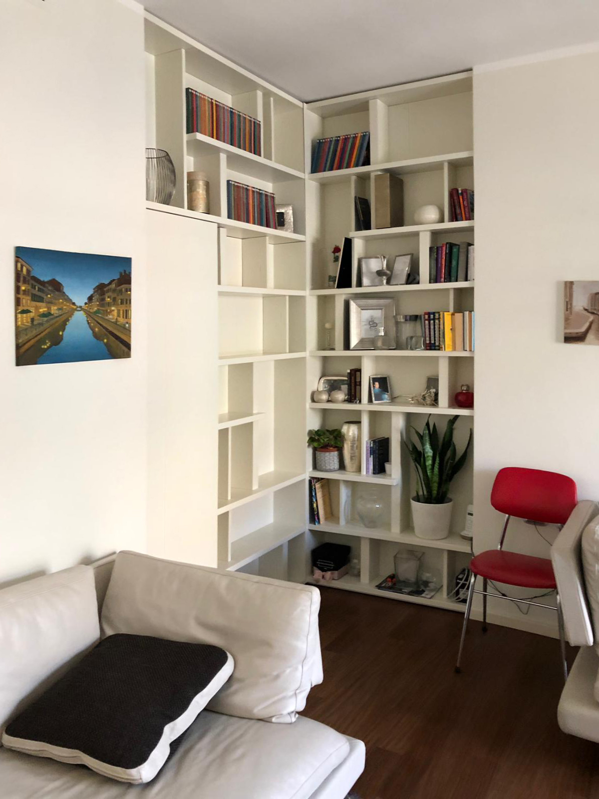
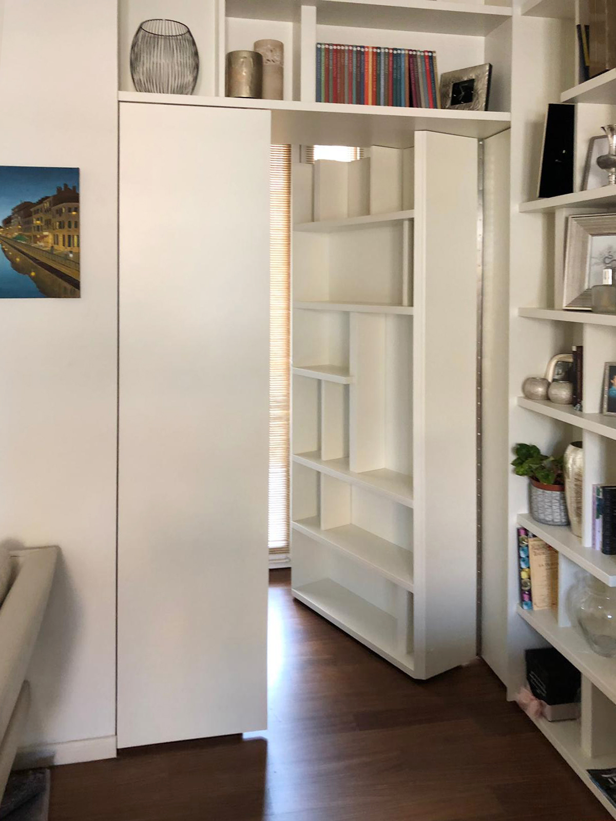
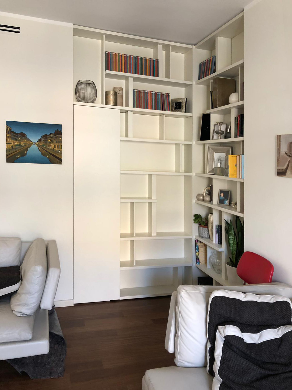
The design solution manages to solve both problems in a single functional element: a wall unit able to provide display support for books and small objects and, at the same time, combines the real bathroom’s door. A dynamic bookcase that reflects the intentionally asymmetric layout in both corner elements. Taking advantage from the corner position, in fact, the two different components of the bookcase are organized as autonomous elements whose shelves could easily become the stylistic line enable to give rhythm and harmony.  This, defines the internal recess of the library which allows the management of exposed elements as a costumed setting, a sort of display windows of the inhabitants’ personalities. The entrance to the bathroom takes place with complete discretion, as a sort of a real “secret passage”, activated by pressing. In particular, the door consists of a fixed narrower shutter, even equipped in the bathroom’s ambient, and a main shutter that in its external side has a considerably bigger thickness than the traditional in order to accommodate books and small objects.  

COLOURS, SHAPES AND MATERIALS

The contemporary imprint is visible both in the graphic layout of the library, which combines full and empty space in perfectly harmony as in a typographic composition, but above all for the material and chromatic choice. In particular, a white opaque lacquered MDF was chosen to create the partition wall. This because it allows a better versatility clearly visible for example, in the different thickness with which were made the numerous internal shelves. The 9010 white recalls the dining’s wall and the contemporary furniture, inserting itself without intrusiveness in the room but at the same time managing to define the stylistic print.  
THE ADVICE

No problems had to remains unsolved! Sometimes a furniture element becomes the custom-made solution able to solve in the best way different problems, as it can be the lack of space or the need to divide rooms.

The wall units perfectly combine elegancy and functionality and can also contain hidden mechanism to take the most advantage from its practicality. A mechanism that can also be fun! Divide the rooms has never been so easy, a library with a secret door it’s enough.

 
corner secret library
open door corner library
closed door corner library