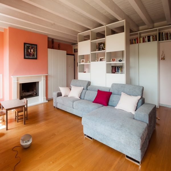
An interior between soft pink, white and gray
A warm and welcoming interior characterized by soft pink shades, capable of warming hearts of those who live there. Containing elements that divide the spaces match to these.

CONCEPT
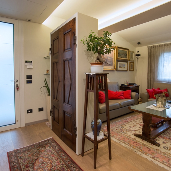
For the project we worked mainly on the very large and square-cut living room, which represents the most airy and used room in this apartment of a young family. We divided it into zones, a total of four, by identifying the activities that should have been carried out there. The first, at the entrance, is dedicated to the hospitality, with a two faces furniture: on one side, a pocket tray and shelves, for keys and objects to be placed as soon as you arrive home and on the other, a coat rack, for the coats and shoes of the family and guests. The second zone is reserved at the symbolic play of the childrens and their intimate reading moment. The third one is intended for the mother, as a work area. A retractable desk combined with storage elements on the side that can be used to serve the kitchen. The fourth, last but not least, is dedicated to relaxation. A large central island sofa that is illuminated by external light and frontally a cabinet with retractable TV and storage compartments. The need was also to have open libraries available in which to dispose of the wide range of family books and also storage spaces where to put games, but also everyday objects. For this reason, we have created a corridor at the entrance that screens the activities of the living area and welcomes the visitor and directs him to the other areas of the house.


COLORS AND MATERIALS
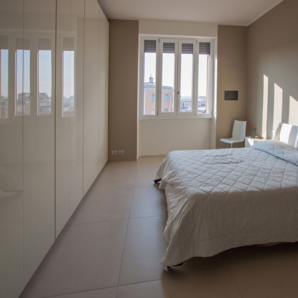
The main color chosen for the walls of the entire apartment is a soft pink, matches with walls of a slightly more decisive antique pink. Become fashionable once again, it is associated with positivity and the ability to drive away negative thoughts, from a symbolic point of view. In combination with it, for the furnishings of the living area, very modern elements have been chosen, with hidden recessed handles and push compartments. The shades of white with some soft gray inserts perfectly fit with pink illuminating the environment and making it timelessly elegant. In the master bedroom, on the other hand, the wardrobes facing the bed that go to the ceiling are soft pink like the rest of the walls and seem to disappear in the general environment; only the bedside tables with their strongest pink focus attention.