When a white kitchen with an island becomes a functional element of a youthful two-room apartment

When a white kitchen with an island becomes a functional element of a youthful two-room apartment

In the centre of Milan, a youthful flat is spread over two levels, welcoming a white kitchen with a functional island in the centre. On the upper floor, the elegance of total white is accompanied by a niche wardrobe with mirrored doors that amplify the perception of the sleeping area. Practical elements with linear and elegant aesthetics that define the look of the entire flat. Let’s discover together this realisation designed by architect Stefano Belotti!

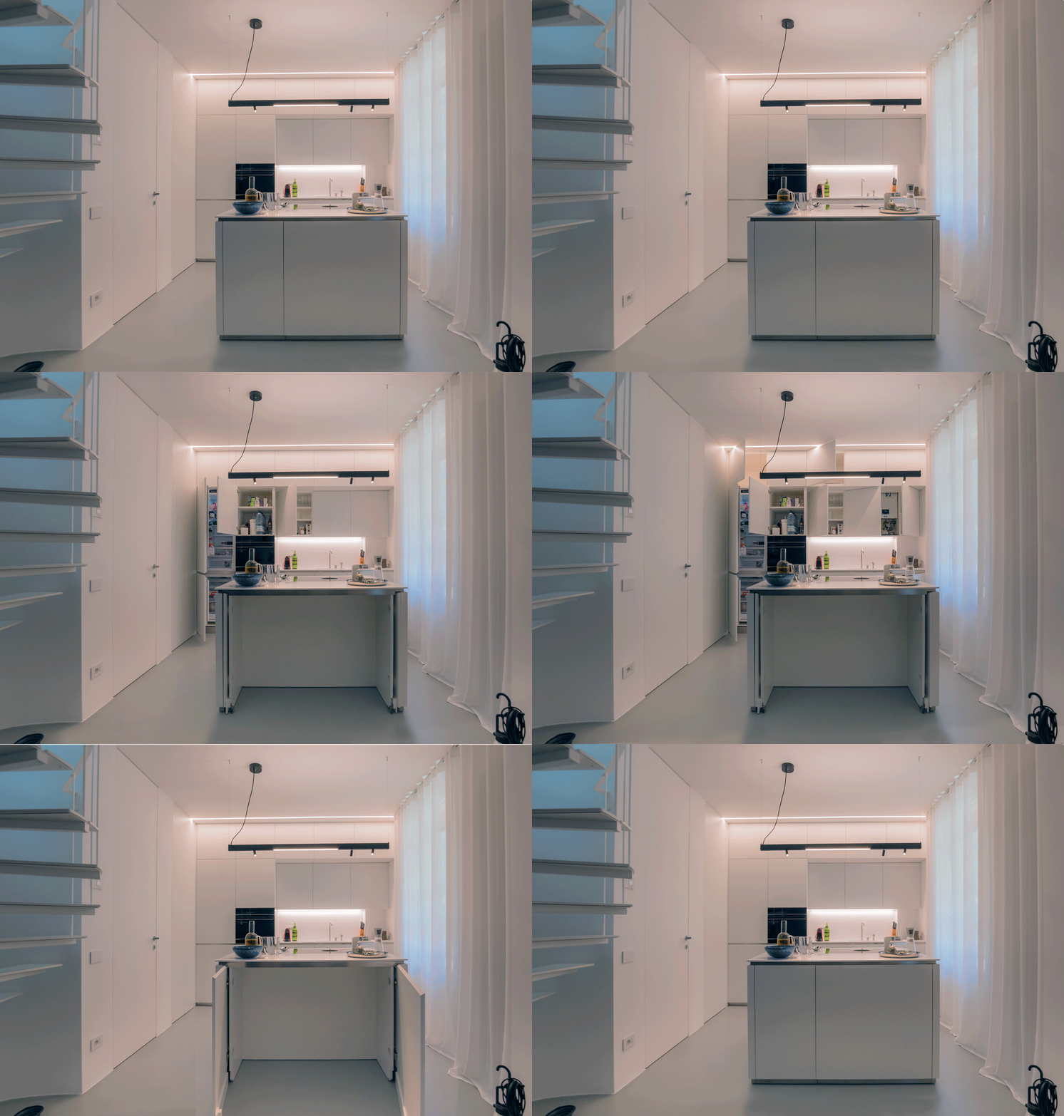
Opening doors white kitchen with island

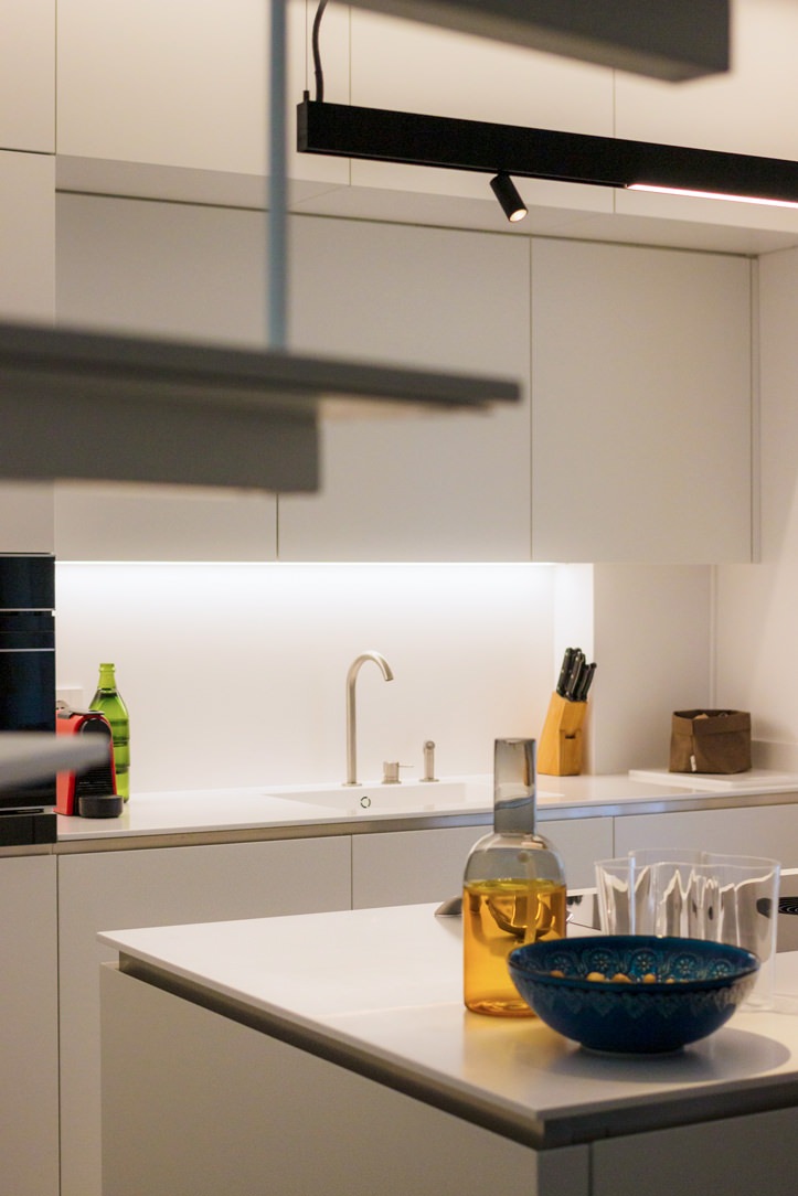
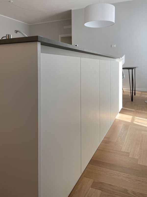
A white central island dominates the kitchen area

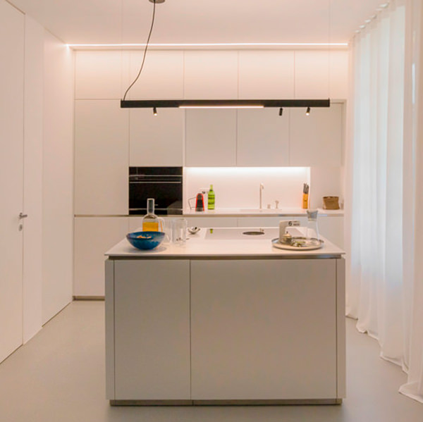
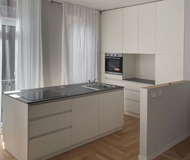
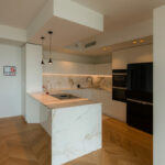
Upon entering the flat, with its small but practical dimensions, the view is projected onto the kitchen, the layout of which makes full use of the available height with storage compartments. Acting as a visual filter, but at the same time as a functional element for the cooking area, is the central island that echoes the white aesthetics of the kitchen.

The worktop, in matt white Corian, becomes not only a work surface, but also a convenient snack top for aperitifs and quick meals.
In this respect, the folding mechanism that allows the (future) service stools to be concealed plays a key role.
The front closure panels, in fact, rotate sideways to then be incorporated into the main structure and almost completely disappear.

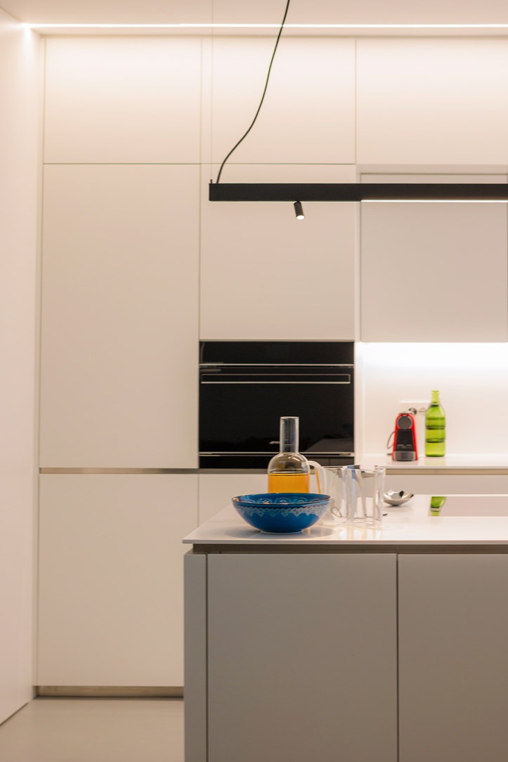
white kitchen with island oven combination column
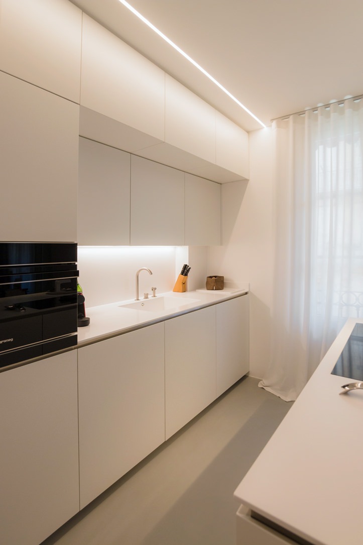
white kitchen with island wall units integrated lighting
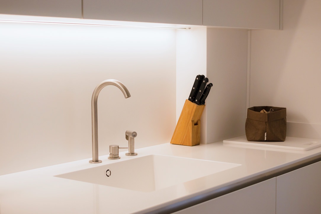
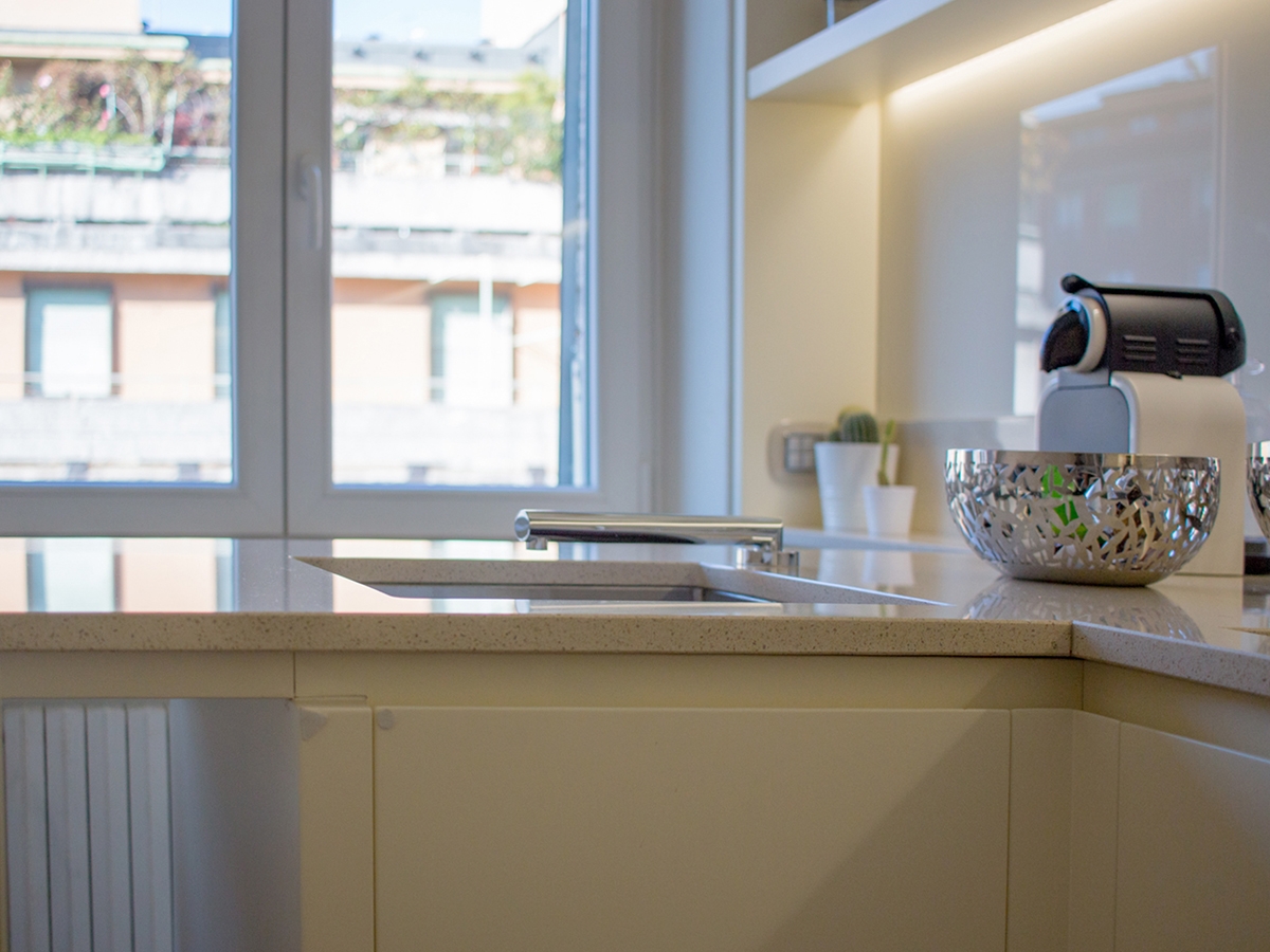
detail Corian worktop integrated basin aluminium mixer
aluminium chain Corian top
white kitchen with combined oven island hidden door laundry area

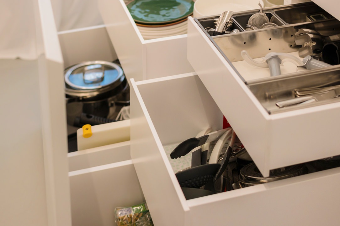
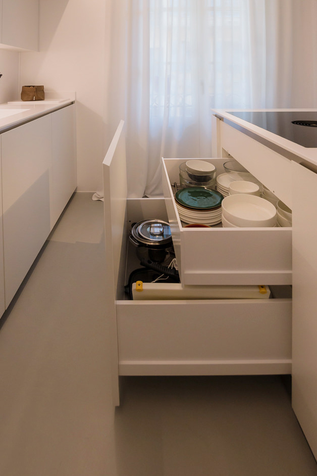
The volume of the island consists of front-extension doors with internal drawers of different heights.
A solution that has now become predominant in the recently concluded edition of the Salone del Mobile, as well as clearly recognisable in previous editions.
The main advantage is certainly the more elegant and minimal aesthetics, in which horizontal cuts resulting from the division into drawers are eliminated in favour of a single door.

detail of internal drawers in white lacquered kitchen with island

From the wall unit to the laundry corner: functionality marries total white aesthetics

The adjoining wall unit is made up of multi-level volumetric plays.
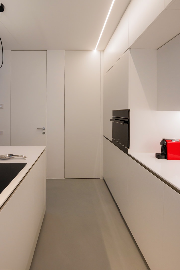
The service columns, incorporating the built-in refrigerator on one side and the combi-oven to its right, are accompanied by compartments with hinged doors that extend across the entire upper part of the kitchen.
On the same depth level, matt lacquered doors with a dishwasher in the central area and internal shelves in the surrounding compartments.
The central area, on the other hand, is characterised by a break-out with worktop and sink, upper wall units with vertical partitioning and built-in lighting with a smaller depth.

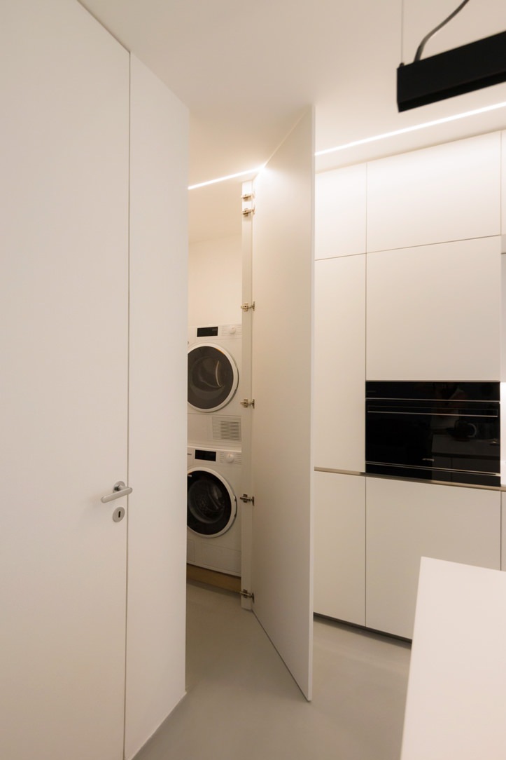
To ensure the best functional configuration, the side wall to the kitchen and the central island accommodates a white lacquered door that covers the entire height of the room.
This conceals inside the laundry area with a washing machine and tumble dryer with columns accompanied by practical shelves for cleaning products.

The linear aesthetics are emphasised both in the choice of lighting, pendant above the white central island and LED strip lighting in the back wall of the kitchen, and also in the joining chain between the Corian top and doors below.
The material detachment through an aluminium profile becomes the horizontal reading element both for the back wall, joining the two side ends, and embracing the central island with kitchenette.

white kitchen with laundry corner island
White kitchen with island pull-out front drawer doors

A wardrobe with mirrored doors embellishes the sleeping area

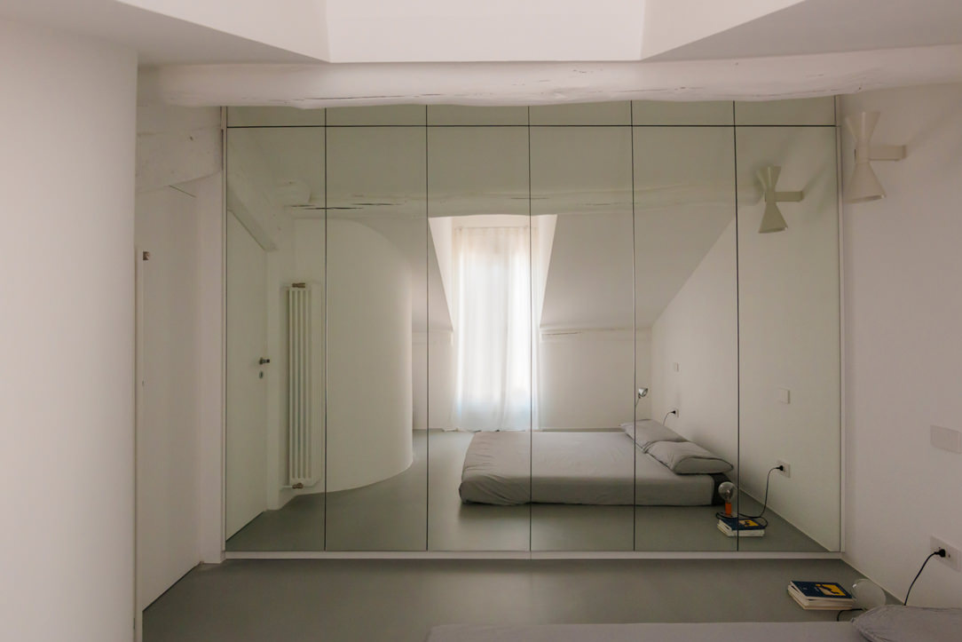
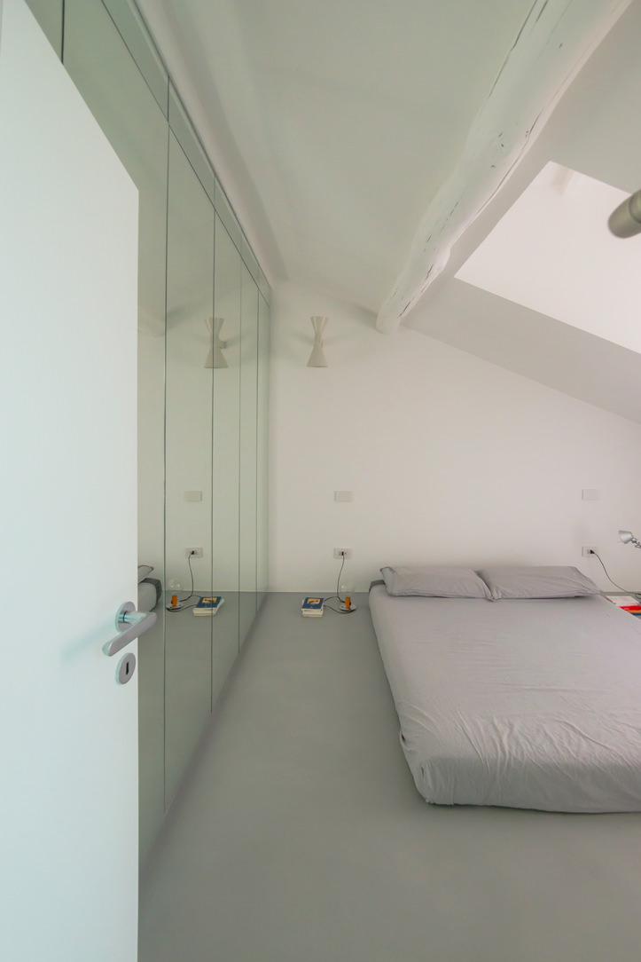
On the upper floor, accessible via a white painted spiral staircase, a wardrobe with six mirror-covered doors dominates.
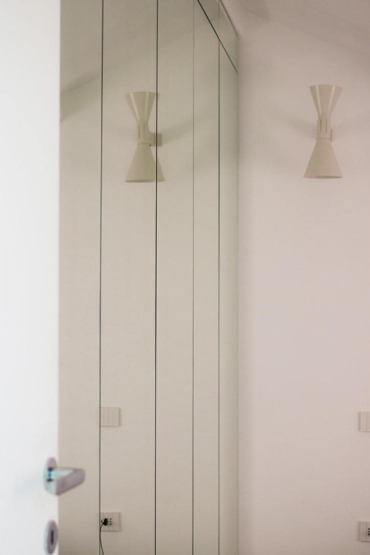
The rhythmic vertical division is interrupted by a single horizontal cut at the top, creating an interesting geometric subdivision in the overall aesthetics. The choice of mirrored doors on the one hand amplifies the brightness and perception of the room and at the same time enhances the overall aesthetics.

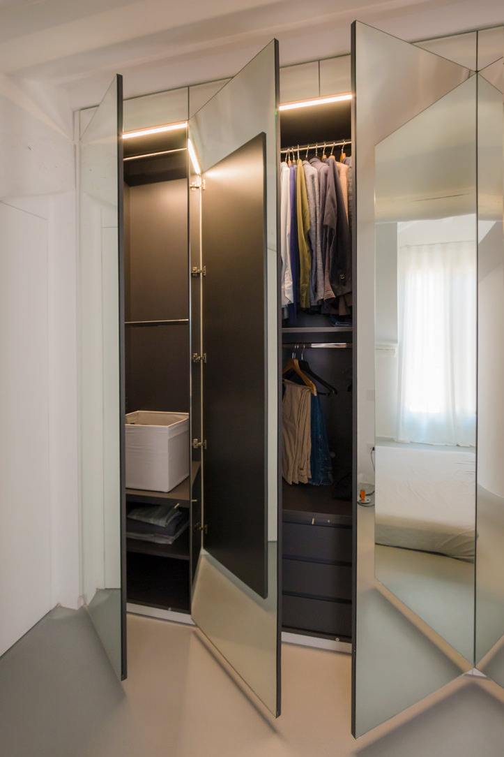
The division into six doors is reflected internally in a symmetrical composition with double central compartments accompanied by two single compartments at the ends.
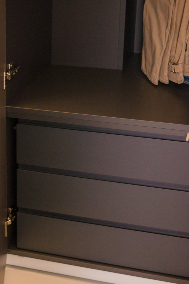
Compartments with hanging tubes are favoured, but there are also internal drawers and adjustable shelves for better organisation of clothing.

If for the lower level the kitchen with central island favours a uniform white aesthetic, the sleeping area, on the other hand, marries contrasting aesthetics.
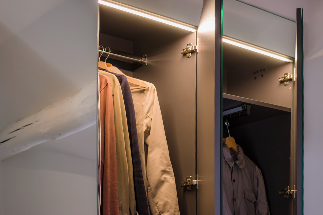
The bright exterior of the mirrored doors is in fact contrasted by the elegance of a matt black whole on which the elegant chrome hanging tubes can be seen.

mirrored door wardrobe
wardrobe mirror doors dark laminate interior drawers
Niche wardrobe with dark interior mirror doors
detail mirror cabinet doors interior lighting
two-room mirror-door wardrobe
detail of mirrored wardrobe doors in niche

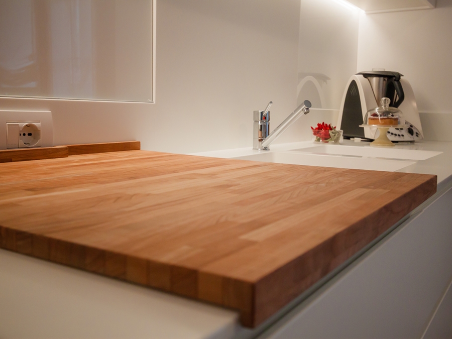
The choice of a total white kitchen is always a contemporary and elegant solution. Its simplicity makes it easily adaptable to the surrounding context, whether it has a retro feel, as in this example, or contemporary pop, as in this realisation. It can also be combined with natural wood elements, such as chopping boards and snack tops, thus adding a hint of warmth, here’s an example! Or exploit plays of opacity and shine through different materials, making the room look fresh and bright, perfect for seaside homes!

Minimal style furniture for a youthful apartment in the city center

Minimal style furniture for a youthful apartment in the city center

An apartment in the city center shows all its freshness with bright interiors and light colors, while the minimal style furniture defines its elegance. Functional environments suitable for various needs and therefore excellent for short and long-term rentals. The geometric patterns and essential design lines return the idea of ​​freshness, presenting themselves as excellent companions in everyday life.

minimal style kitchen central island service columns

The living area: a minimal style kitchen with an industrial touch

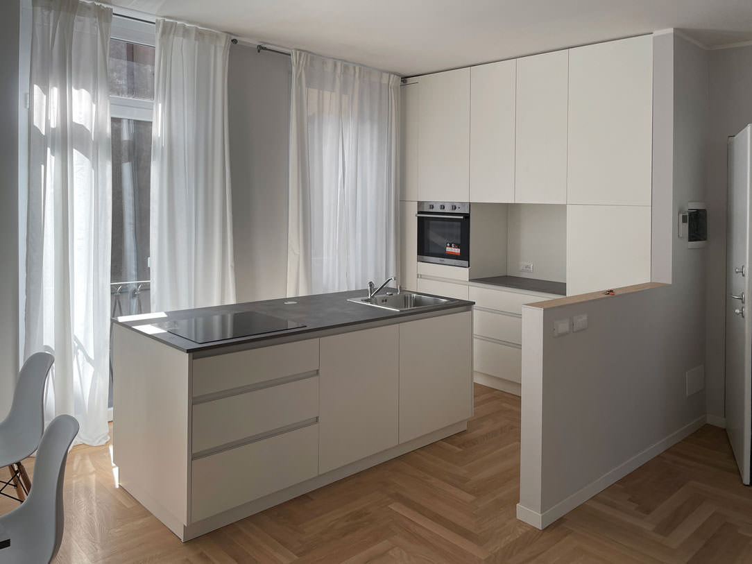
The entrance to this apartment overlooks the living area illuminated by large windows located along the right side of the room.
The minimal kitchen also finds space here, divided from the living area by a half-height wall that acts as a conceptual filter for the two environments.

The development of the kitchen occupies the side adjacent to the entrance area with full-height columns and a central island. This becomes the functional element par excellence, acting as a pivot in the distribution of transit flows and welcoming the preparation, cooking and washing areas.
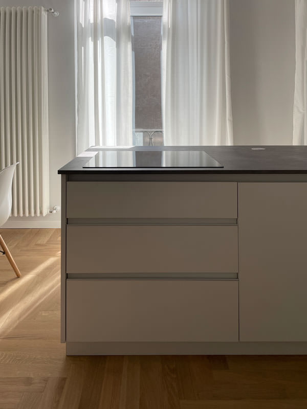
In the lower part, large drawers are placed under the induction hob, to house pots and accessories useful for cooking.
Beside them, two lacquered MDF doors house the countertop sink and the lower compartment for the differentiated waste bins.

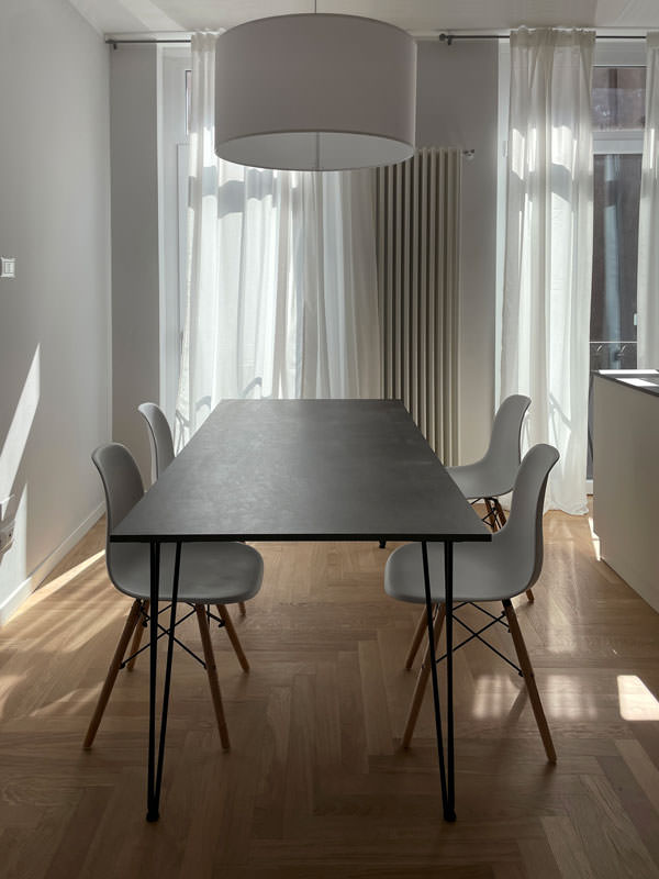
The worktop in practical bilaminate in a medium gray tone recalls the industrial scent of the dining table with its material surface.
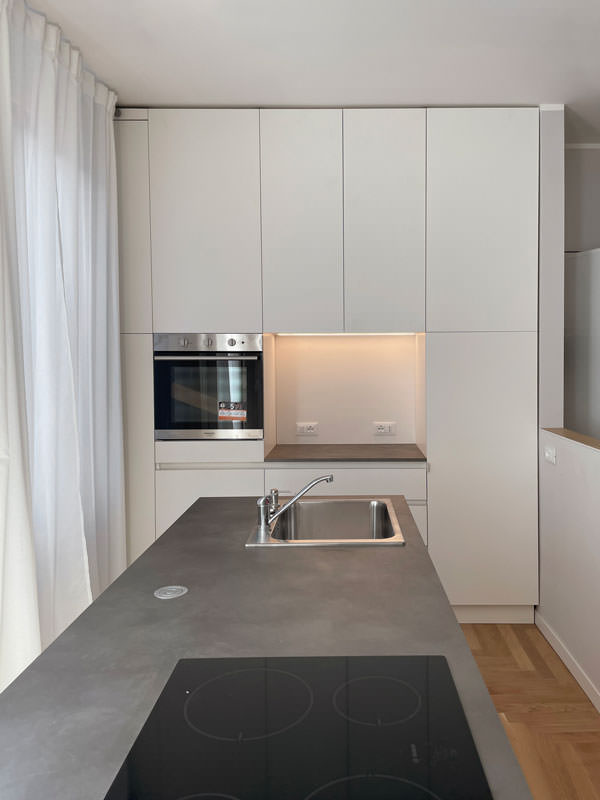
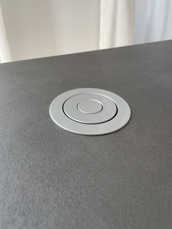
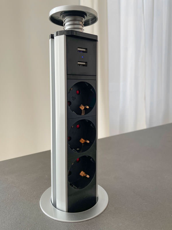
In the center between the cooking area and the washing area, the top is left free to allow the preparation of dishes. To facilitate the use of small appliances, a retractable socket tower.

On the column side, the built-in oven positioned at a comfortable height embrace, together with doors with internal shelves, the open compartment with bilaminate top and lacobel top. Element that acts as a useful support on the side of the oven or can be equipped with small appliances such as coffee machine and mixer, or Thermomix.
At the same time, it is also a significant aesthetic element, capable of attracting attention for the brightness that characterizes it.

The lacobel bottom reflects the light coming from the LED strip embedded in the upper part, giving further brightness.

 dining table metal structure industrial style top
furniture columns kitchen service minimal style bilaminate top lacobel day compartment
front view island drawers pans accessories induction cooking
white kitchen island retro doors detail
detail of the disappeared turret took a closed position
detail of the disappeared turret took the position of use

The functionality of the sleeping area with white furniture

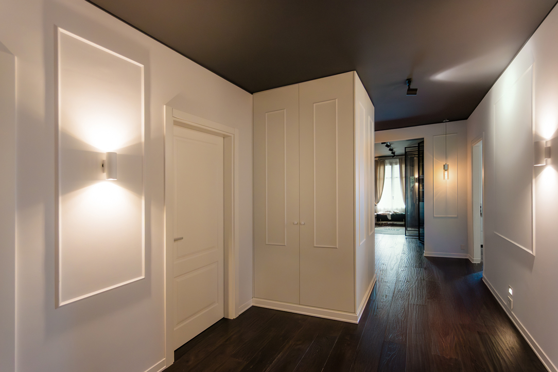
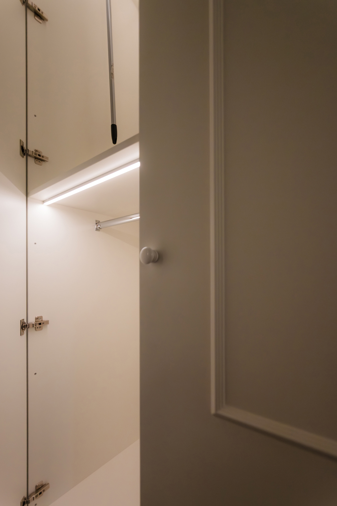
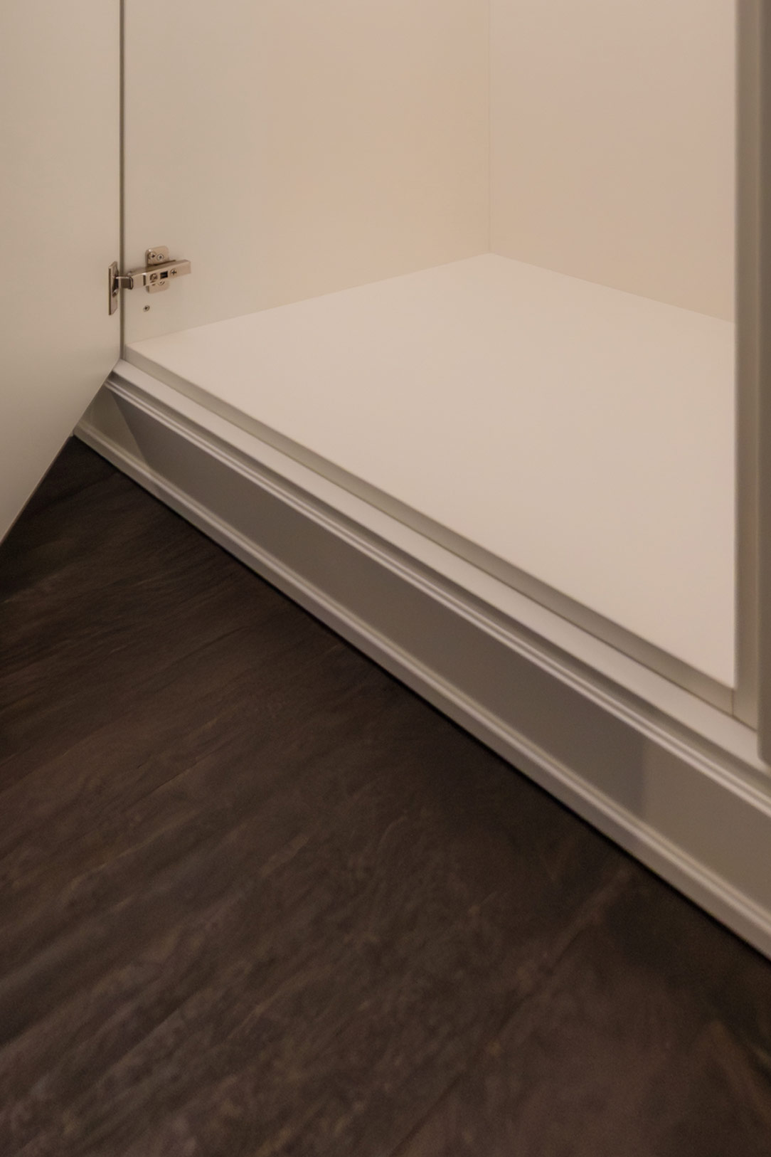
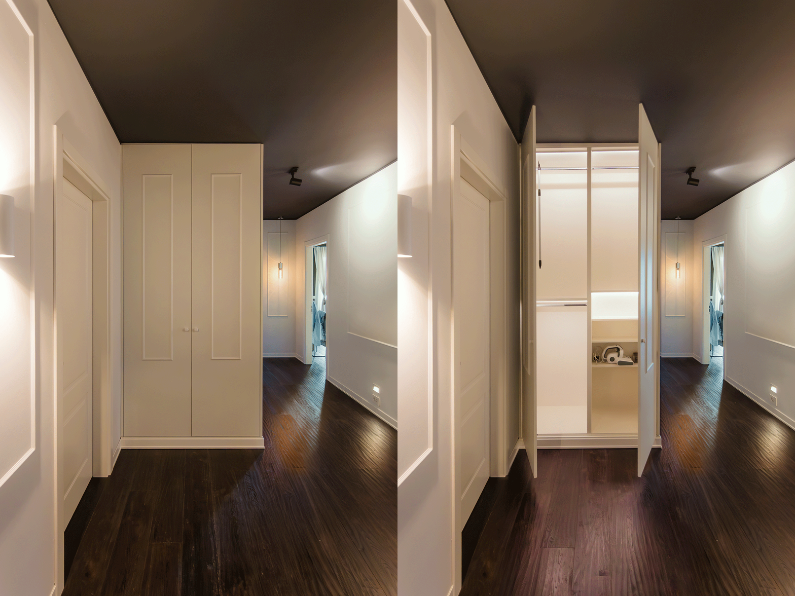
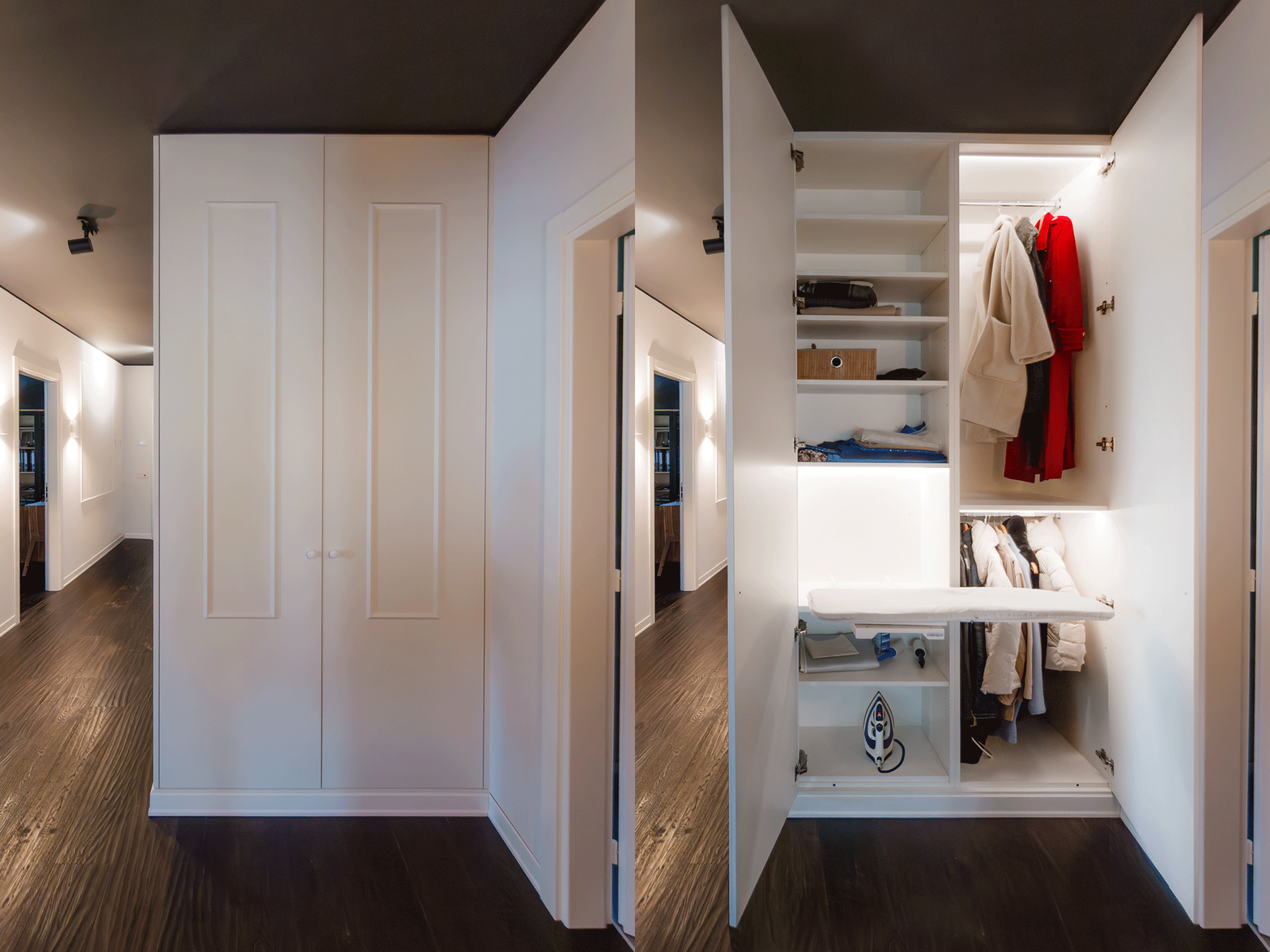
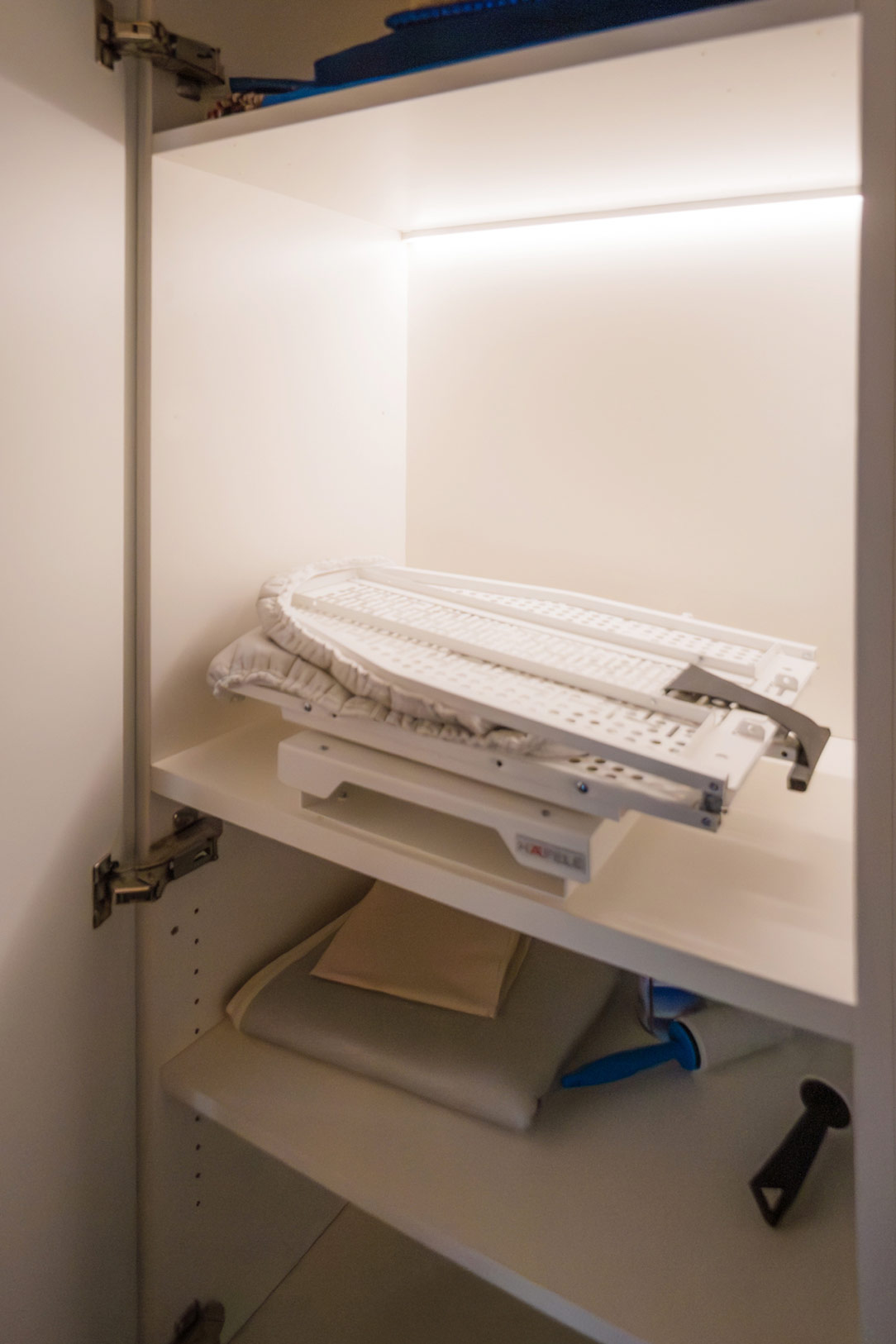
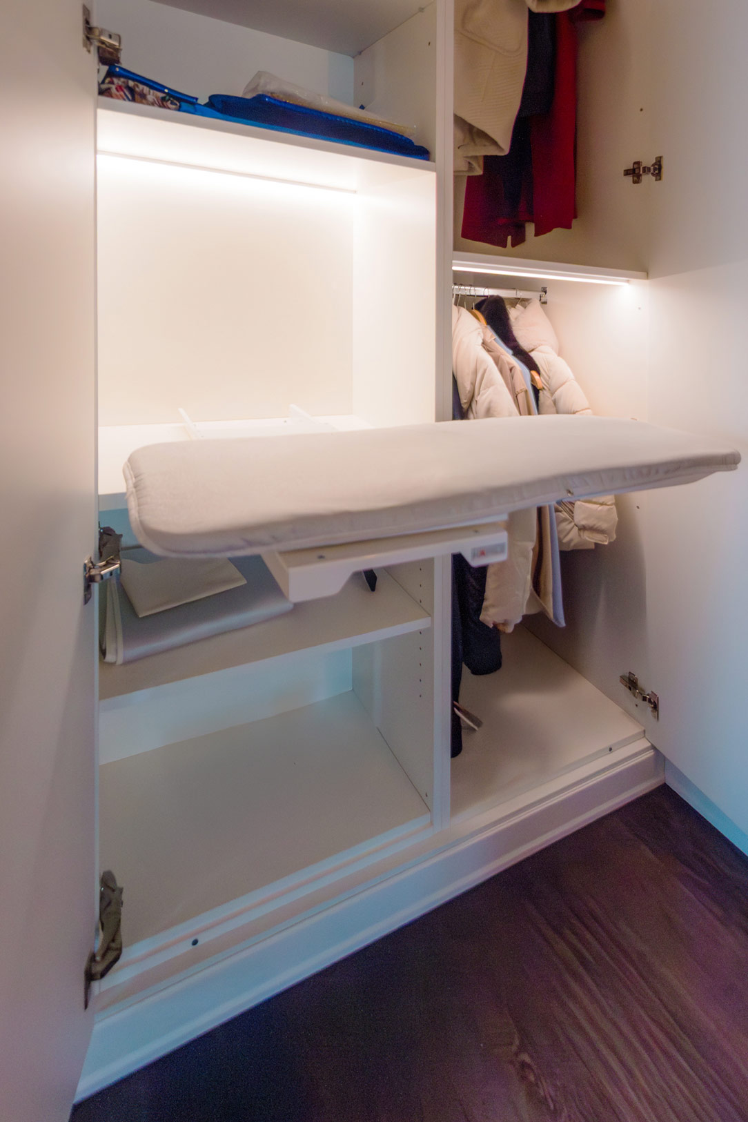
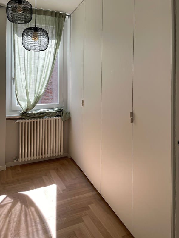
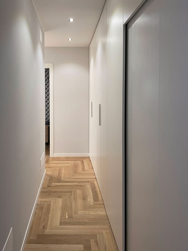
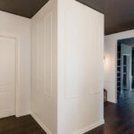
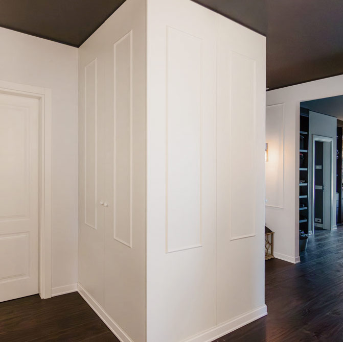
The access corridor to the sleeping area is equipped with a full-height wardrobe shaped internally to restore the correct alignment of the rear walls. Internally, shelves of different heights allow the organization of household products while respecting the existing electrical arrangements and the counter compartments.
A functional element capable of blending into the minimal furnishings of the apartment and at the same time serving as an equipped piece of furniture in a closet.

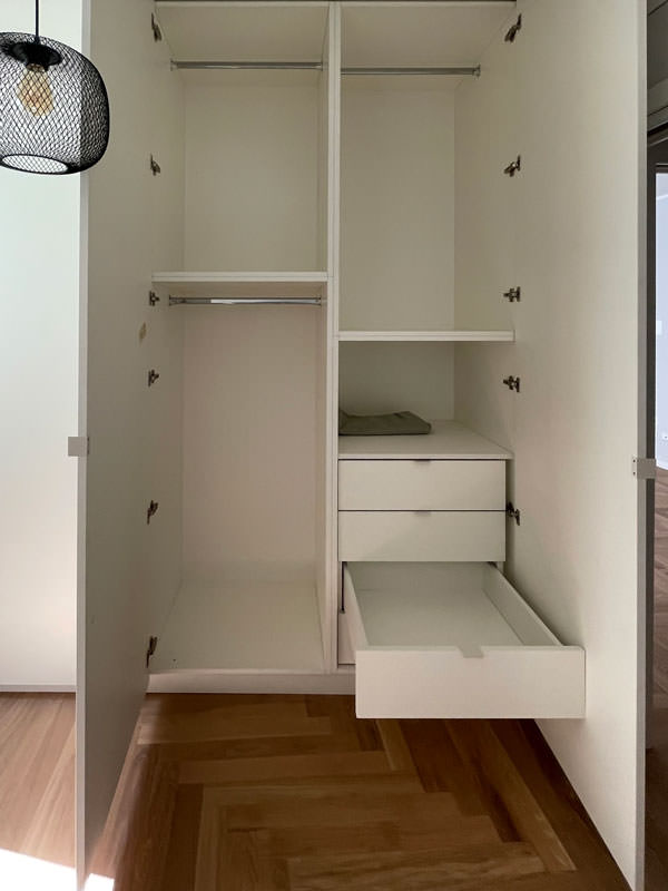
To complete the sleeping area, a second full-height wardrobe with white lacquered doors and handles in white folded sheet metal with a minimal look.
This internally houses hanging tubes and drawers for linen allowing you to keep the garments in order.
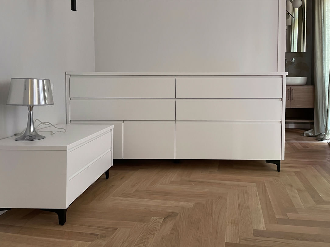
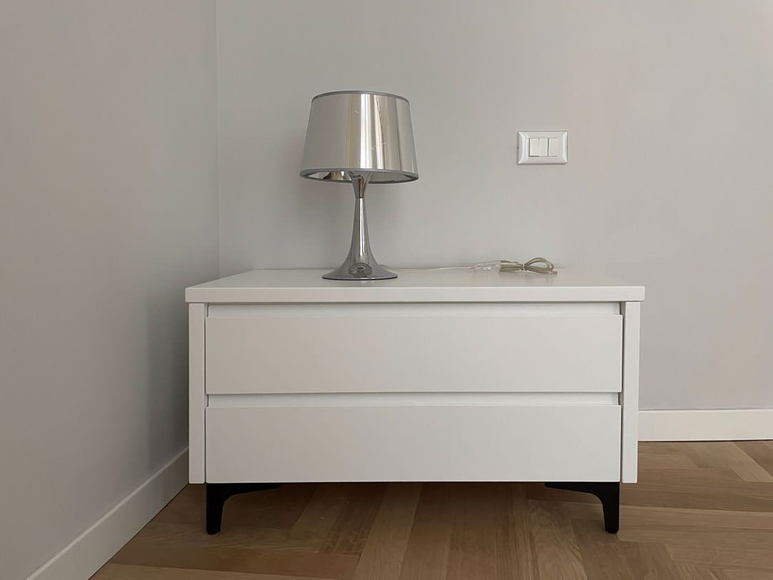
In the master bedroom, essential white lacquered furnishings placed including a pair of bedside tables with storage drawers and a large side chest of drawers with recessed handles.
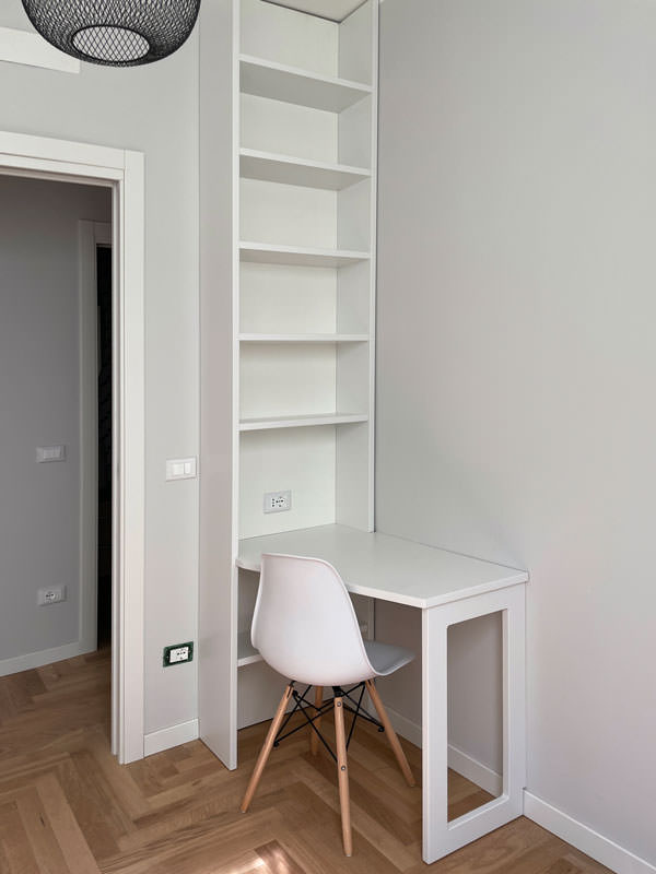
A desk, on the other hand, is inserted into a game of joints in a wall bookcase, creating an equipped point for smartworking.

full-height wardrobe doors sheet metal handles minimal furniture
internal wardrobe drawers linen tubes hangers
equipped corridor mobile closet minimal furniture
study corner bookcase wall desk shaped
chest of drawers bedroom minimal furniture white bedside tables
bedside table front view white lacquered handles hollow drawer black feet
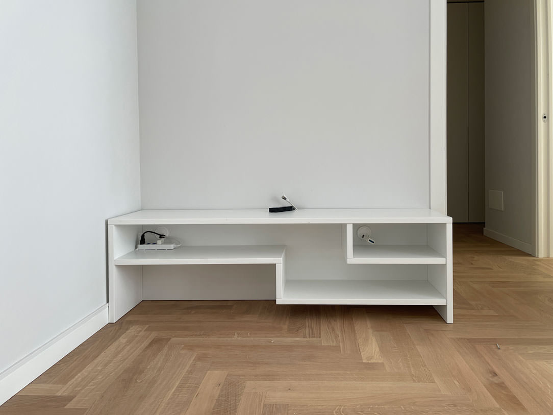
white lacquered shaped shelves furniture minimal style furniture

The natural touch of the bathrooms

The two bathrooms with bold graphics reflect the minimal style of the furniture, giving a touch of freshness.
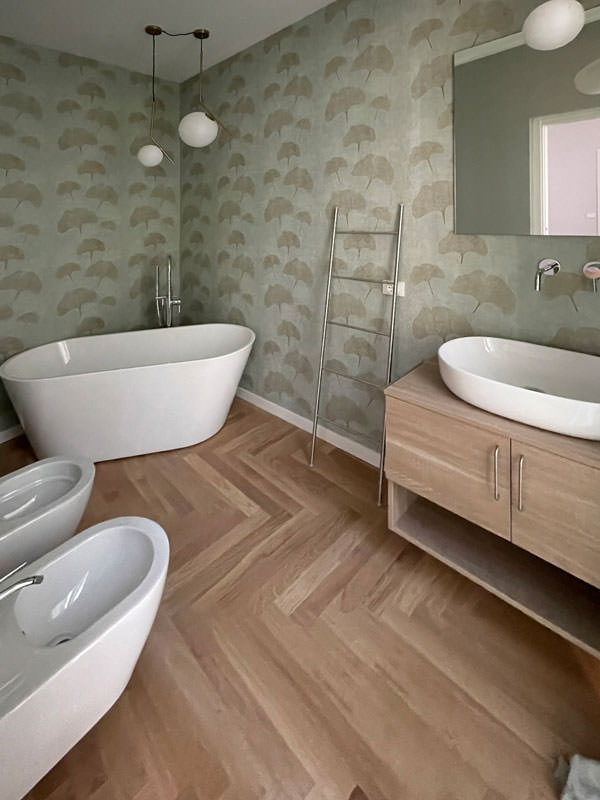
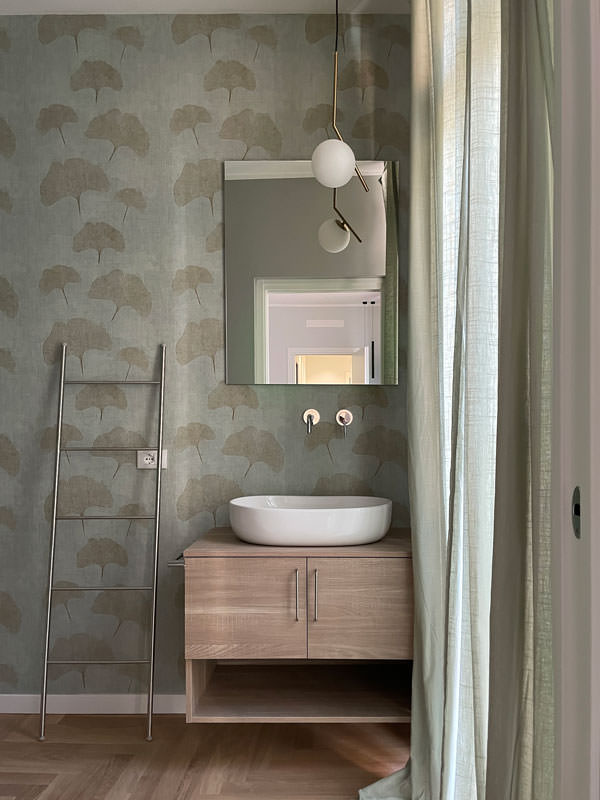
One, next to the master bedroom, incorporates the natural tones of green with a wallpaper with a vintage flavor. This is equipped with a cabinet with wooden finishes combined with a countertop washbasin with sinuous shapes. It is accompanied by a large designer bathtub that masters the corner of the bathroom and elegant furnishings.
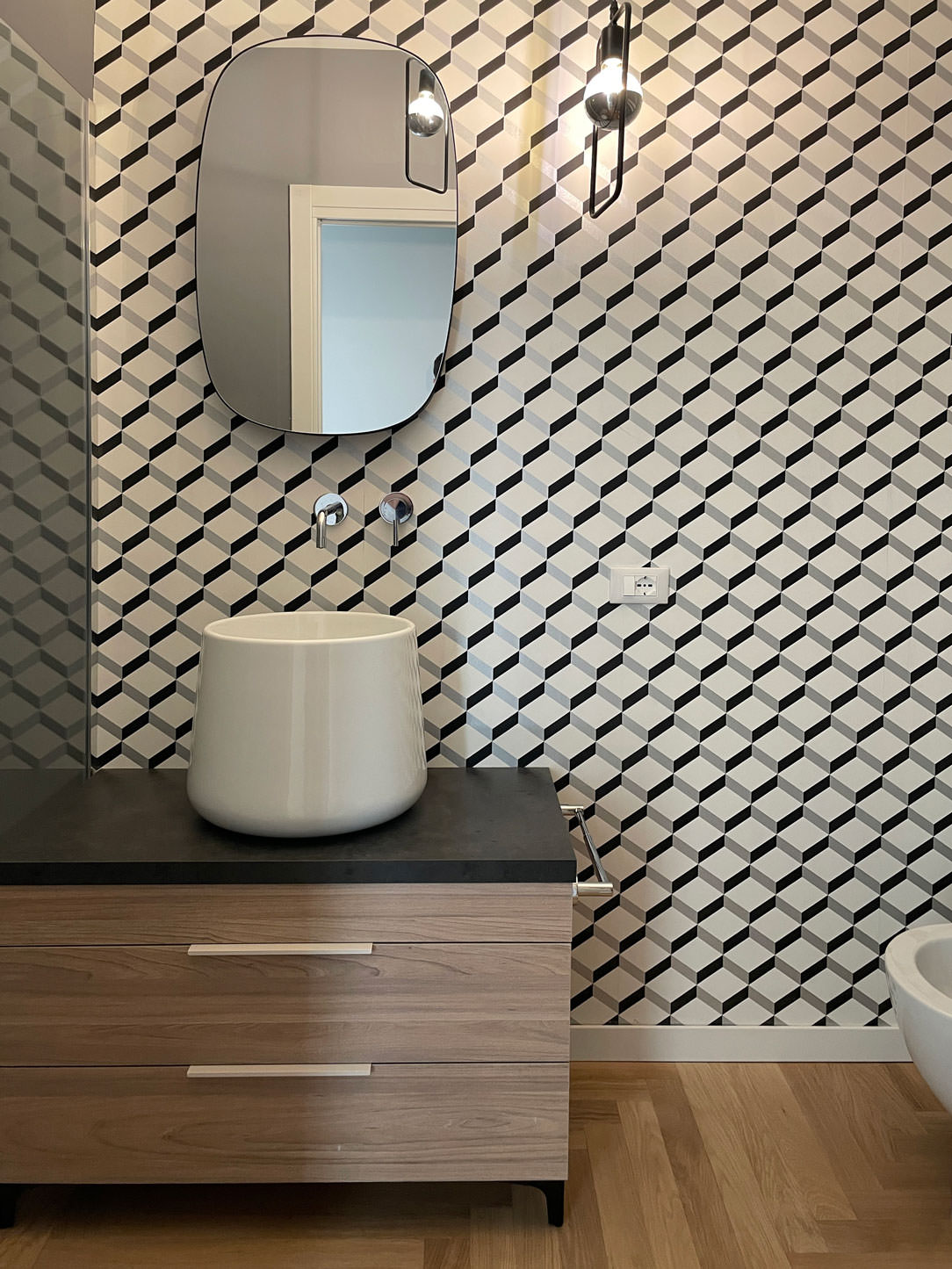
The second bathroom, on the other hand, plays on the geometric textures of the wallpaper with more decisive colors, matched with a bathroom cabinet with the same characteristics as the first.

bathroom tub design natural colors vintage wallpaper
bathroom cabinet wood white countertop washbasin green wallpaper
bathroom furniture wood sink design support wallpaper vintage geometric pattern

City apartments require flexibility from both a functional and aesthetic point of view.
For this reason, the minimal style is perfectly suited to satisfy the tastes of future tenants. Another example of this type is this studio apartment in the center of Milan!
To deepen the minimal style instead, we can delve into the retail world with this shop in the center of Bergamo. Enjoy the reading!

One kitchen a week, part 4: essential and elegant

One kitchen a week, part 4: essential and elegant

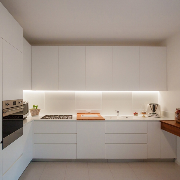
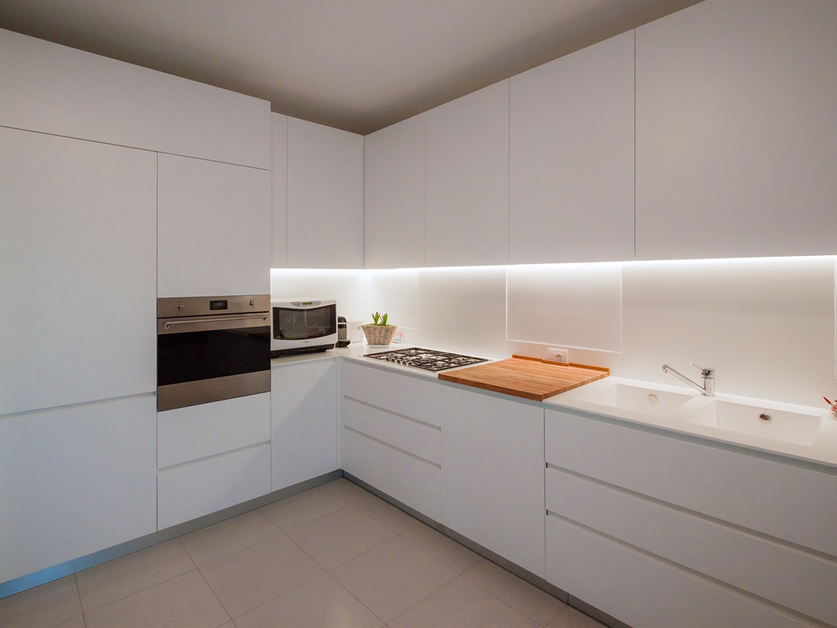
A contemporary and essential kitchen, which minimal lines define an elegant interior total white.

prospective essential elegant kitchen

THE PROJECT

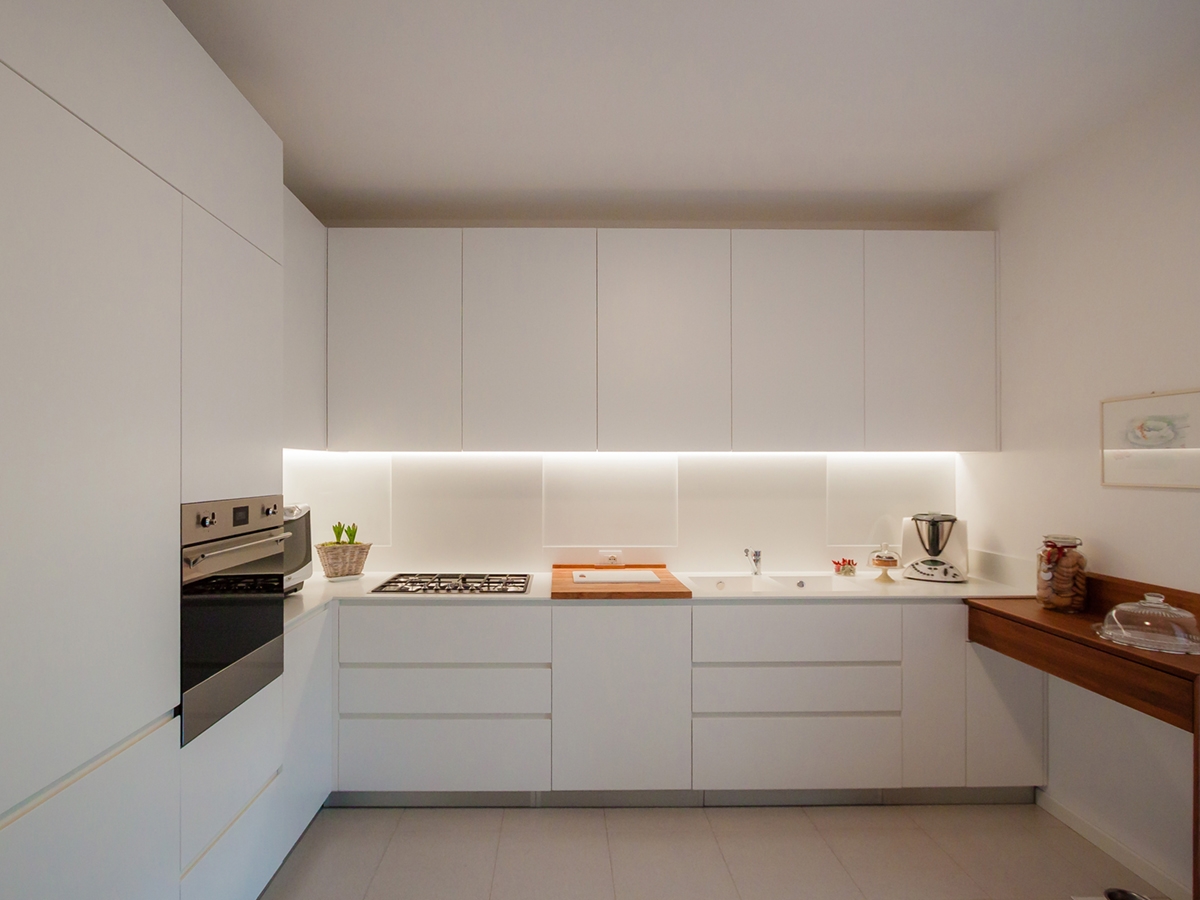
The most elegant contemporary interiors are characterized by simplicity, created with opaque surfaces often white.

It’s the case of this kitchen, which essential setting does not give up contrasting elements such as the central cutting board and the snack bar on the right.

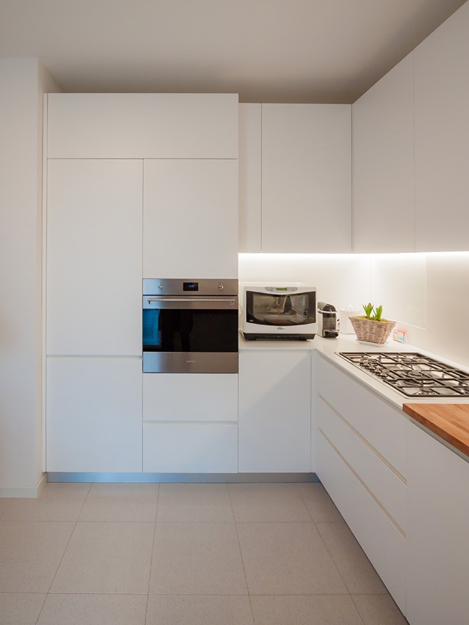
Placed at the angle, it has a visual and conceptual asymmetry that creates different visual solutions: on one side the full-height door holds containing shelves and drawers in a continuous visual surface.  The recess oven occupies the lateral part in communication with the countertop that uses the internal corner.

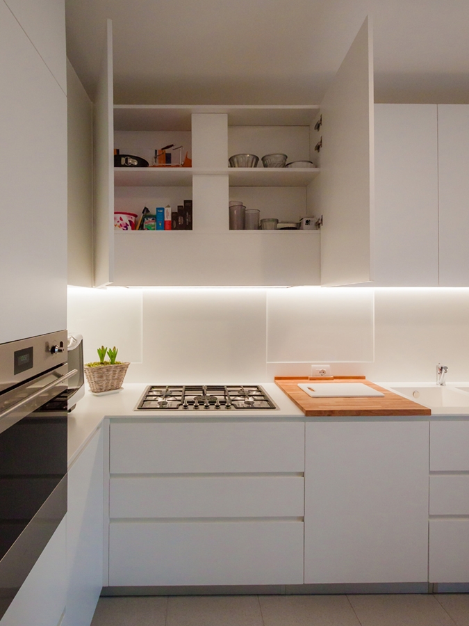
The main side is instead occupied by the horizontal subdivision between the upper wall units and the lower containing volumes. The linear lighting, hidden in the edge of wall units, creates a feeling of emptiness able to give lighten to the room’s perception.

In particular, the upper wall units are made up of fixed-width doors with an extremely elegant profile, spaced from each other by a visual line obtained with a small slot. The lower part instead consists of two drawers with recessed handles symmetrically mirrored to the central door. This takes up the width od the warm-coloured wooden cutting board which creates an essential and extremely elegant contrast in the choice. On the right wall, ending the kitchen project, a wooden support takes origin whose abutment reaches the floor. It is precisely the latter that gives greater dynamism to the room by inserting a chromatic element in contrast with the surrounding neutrality. It also recalls  the finishes of the fixtures chosen for French-door on the side.


SHAPES, COLOURS AND MATERIALS

The elegance of this project lies precisely in the choice of essential stylistic lines: privileging straight lines to curved and dynamic shapes, the resulting visual composition is extremely simplified. Essentiality has therefore become the key-word to design furniture, which renounce exposed handles in favour of recessed edge. These are visible through the play od shadows created by the use of different depths.

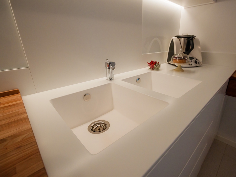
In an extremely contemporary project like this one, Corian is the obvious choice fot the kitchen countertop, which allows to hide edges, returning the idea of a very clean and elegant continuous surface.

The Corian countertop also continues on the back surface of the hob and sink, creating an interesting material alternation with the white lacobel. For the remaining surfaces, a textured matt lacquered MDF was chosen.

 
open wall units matt lacquered MDF
essential elegant kitchen ovens
wood cutting board essential kitchen
Corian sink essential kitchen
frontal view essential elegant kitchen

One kitchen a week, part 2: fresh, gritty and lively

One kitchen a week, part 2: fresh, gritty and lively

lively kitchen front vew

A lively kitchen with a gritty character and a touch of freshness between games of bright reflections and alternation of full and empty spaces.  

THE PROJECT

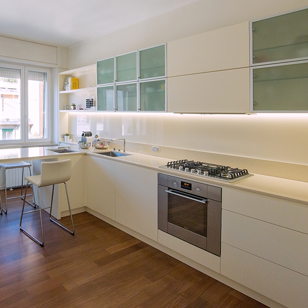
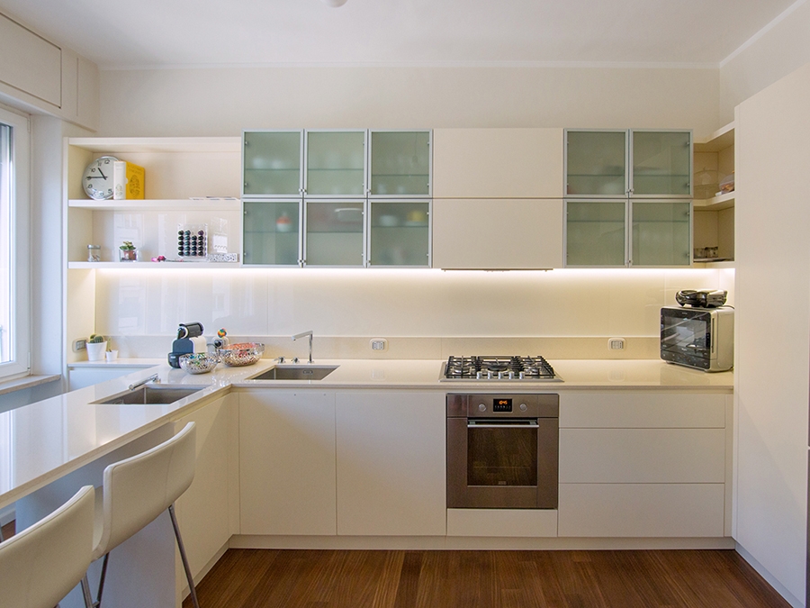
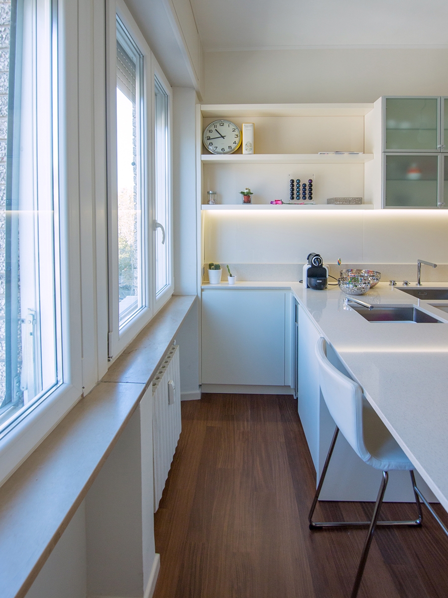
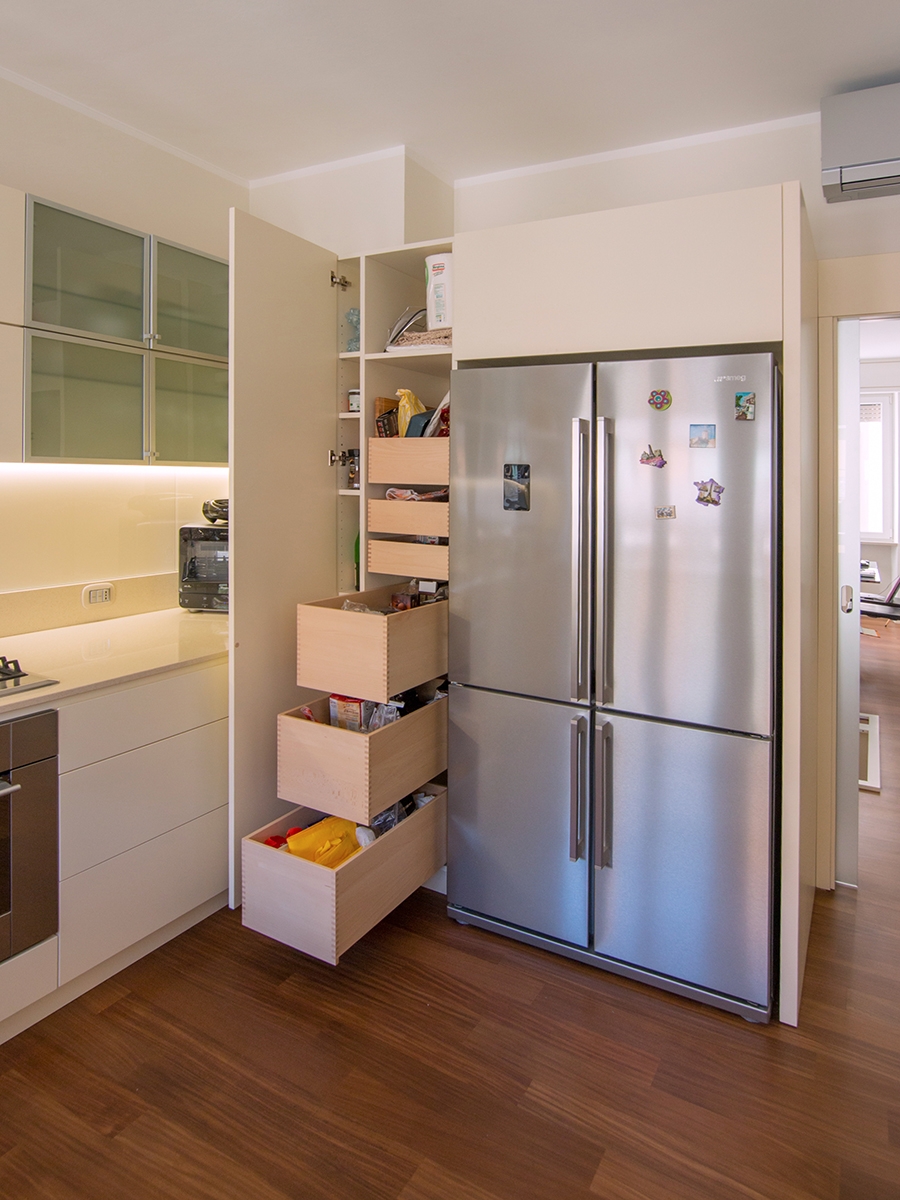
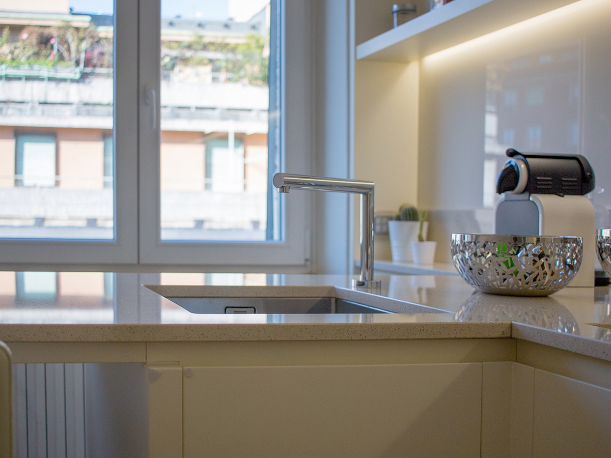
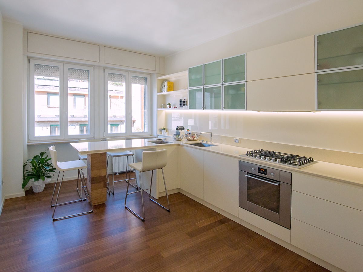
Added in the context of the always dynamic Milan, the kitchen is reckonable for its lively and fresh imprint, with both a gritty and elegant soul. A kitchen with a thousand resources, capable of keeping attention in all its parts. Starting from the wall units, which alternate empty and full volumes in which a game of transparencies is played on several levels. The shelves visually lighten the volume in the kitchen in both ends: in the area adjacent to the window, from which natural light radiates, and in the inner corner between the two sides of the room. This last one, also takes advantage of what could considered a critical point for comfort and functionality. Instead, arranged in asymmetrical geometric volumes on both sides of the extractor fan, there are the opal glass wall units able to give a touch of fresh colour and dynamism from which the contests can be glimpsed. The central wall unit hiding the extractor fan and the lower containing volumes are instead reckonable for their extremely elegant simple lines. The fitted sinks are arranged on the corner, taking advantage of the attachment point of the snack bar. This is equipped to accommodate up to 4 sitting using both sides. The gritty setting is also visible in the choice of details, such as the hidden tap able to allow the opening of the back window. As always, functionality is a fundamental requirement, which is also visible in the door alongside the large design refrigerator. This houses inside functional shelves with different heights and six drawers with a wooden finish.   THE MATERIAL CHOICE The games of brightness and reflections able to restore the idea of restoring the idea of liveliness and freshness are obtained especially thanks to the choice of materials. In particular, a quartz granulate topping was use for the countertop. It is able to capture and mirror the light, recalling the cream tones on the kitchen. While for the remaining elements it is the glossy lacobel that gives elegance and contemporaneity.
snack bar lively kitchen
lively kitchen with drawers and shelves
lively kitchen high tap
lively kitchen hidden tap
lively kitchen perspective

Compare this kitchen with the contemporary pop’s one.


Living in small spaces: a minimal apartment in Milan

Living in small spaces: a minimal apartment in Milan

Living in small spaces means living the contemporaneity. Functionality is the key-word: knowing how to add take advantage of the interiors while being able to use all its potentialities.  
THE CONTEMPORARY PANORAMA THE CONTEXT THE WORK SHAPES, COLOURS AND MATERIALS


THE CONTEMPORARY PANORAMA

The increase in the number of the population necessarily interfaces with the problem of lack of space. In the contemporary architectural panorama, the solutions adopted use the verticality of the buildings, which tend to develop in height rather than in planimetry. An example of all is the spread of “capsule hotels” in the eastern continent. Without reaching the maximum expression of this architectural trend, even in the cities of our country there are various examples of reduction to minimum spaces. Living in small spaces means being able to optimize the rooms in the best way, managing to fit the different functions and reducing the furniture to the essentials. The minimal style perfectly interprets this need, succeeded in giving an aesthetic value to the most essential interiors.  
THE CONTEXT

Integrated in a contemporary residential context focused on the shades of gray and green, the studio apartment in Corso San Gottardo is suitable for a space optimization project, because it is extrapolated from an existing apartment. In particular, it consists of a single room with small kitchenette and a mezzazine for the sleeping area, extracted from one of the main rooms of the old apartment. Being able to organize at the best the room without sacrificing comfort and aesthetic taste was the design challenge with which we interfaced to. The characteristic that allowed to reach the goal is the very wide height on the interior enhanced by suggestive exposed beams.

small spaces sofa and snack bar
entrance minimal apartment Milan

THE WORK

Taking advantage of the reduced spaces, it was possible to design the plan layout focused on a living area in visual contact with the small equipped kitchen with snack bar, and an elevated bedroom accessible through a service ladder. The kitchen is reduced to the essentials, but not for this reason is poorly equipped: in fact, it has a kitchenette with induction hobs of the minimum size, flanked by a built-in sink and container units in the remaining parts. A dividing wall with snack bar attached divides the kitchen from the living room, keeping at the same time the spaces visually open. This is also thanks to the presence fs the service windows, which creates a dynamic and contemporary cut in the room.  The surface used as a snack bar accommodates up to 3/4 people, and the shaped profile with a 45° cut is able to make it look more welcoming. The living room with a two-seated sofa leads to the upper level use as bedroom with a double bed and containing niches. The storage compartment is accessible as the mezzazine with a service ladder that leans against special rails. The mezzanine is back-lit by a linear profile capable of providing the correct illumination both the bedroom area above and the lower living room.

small spaces apartment Milan
kitchen apartment Milan
living room apartment Milan
double bedroom small spaces

SHAPES, COLOURS AND MATERIALS

The contemporaneity of the apartment is visible both in the choice of clean linear shapes and in the material’s one. In fact, Corian was chosen for the snack bar and the kitchen too. It is an extremely fashionable material nowadays due to its elegance reached with the uniform surfaces with hided joints. Made in the same light-shades, the kitchen furniture in textured white lacquered MDF refers itself to the idea of an essential but well-designed space.

bedroom access step-ladder

Functionality and small spaces transform this studio apartment into a reality of its own. It leads to becoming a love nest for its inhabitants, but it is also perfect to be used as a B&B for tourists and short stays.