An interior between soft pink, white and gray

An interior between soft pink, white and gray

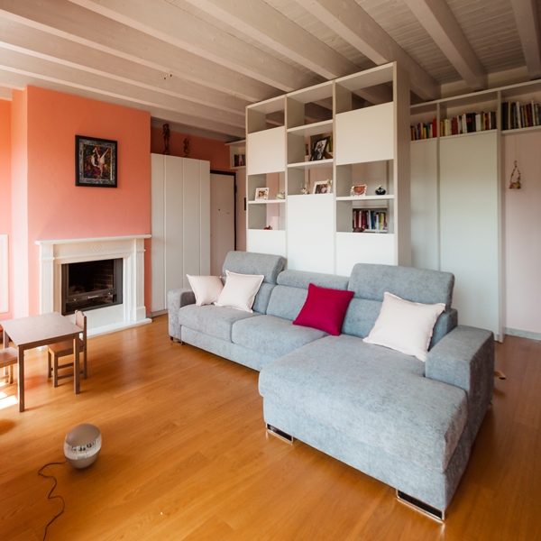
A warm and welcoming interior characterized by soft pink shades, capable of warming hearts of those who live there. Containing elements that divide the spaces match to these.
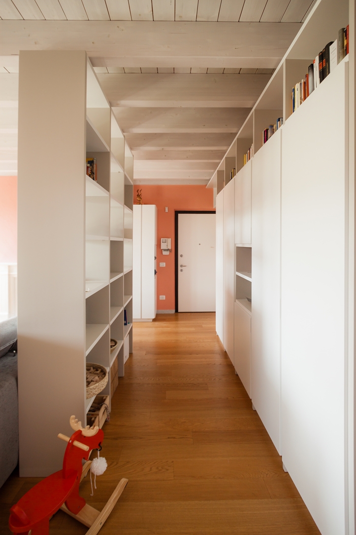
entrance hall pink and white with divider

CONCEPT

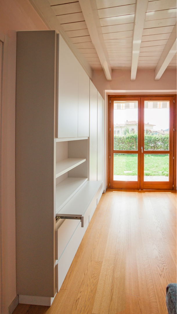
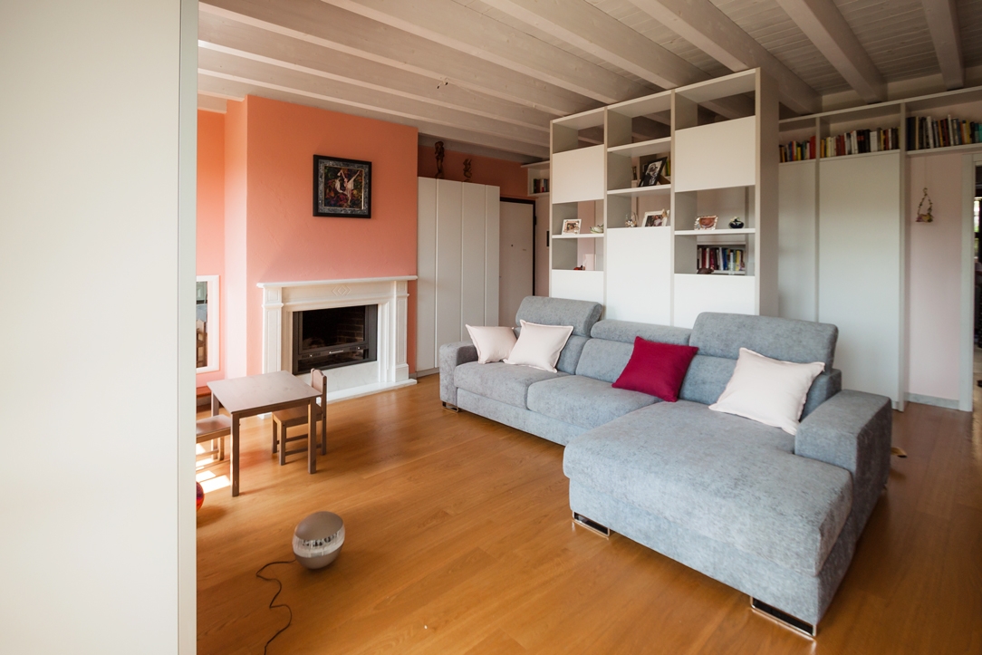
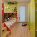
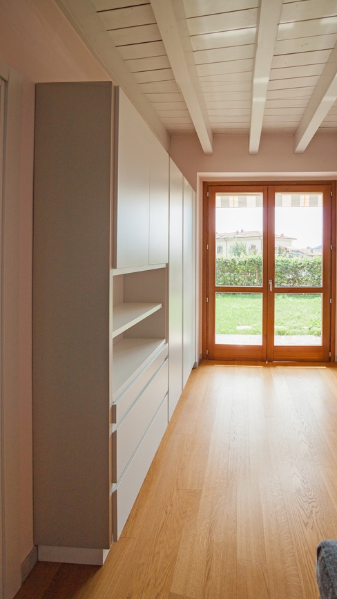
For the project we worked mainly on the very large and square-cut living room, which represents the most airy and used room in this apartment of a young family. We divided it into zones, a total of four, by identifying the activities that should have been carried out there. The first, at the entrance, is dedicated to the hospitality, with a two faces furniture: on one side, a pocket tray and shelves, for keys and objects to be placed as soon as you arrive home and on the other, a coat rack, for the coats and shoes of the family and guests. The second zone is reserved at the symbolic play of the childrens and their intimate reading moment. The third one is intended for the mother, as a work area. A retractable desk combined with storage elements on the side that can be used to serve the kitchen. The fourth, last but not least, is dedicated to relaxation. A large central island sofa that is illuminated by external light and frontally a cabinet with retractable TV and storage compartments. The need was also to have open libraries available in which to dispose of the wide range of family books and also storage spaces where to put games, but also everyday objects. For this reason, we have created a corridor at the entrance that screens the activities of the living area and welcomes the visitor and directs him to the other areas of the house.
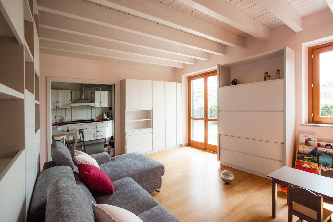
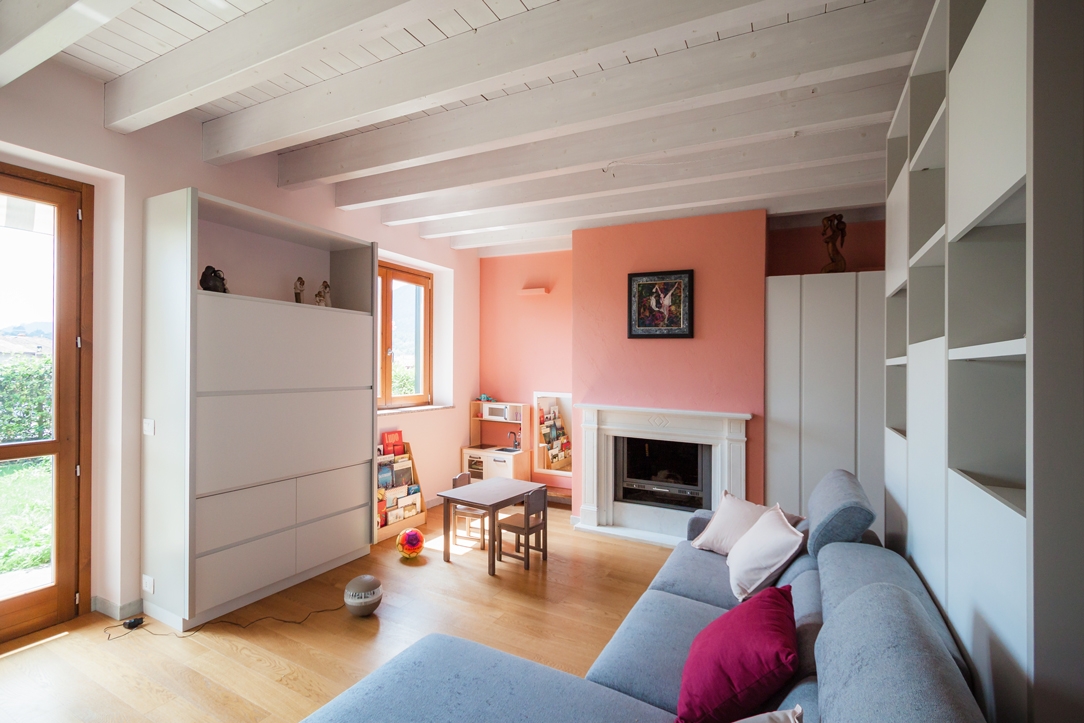
living room pink and gray
living room pink and gray 02

COLORS AND MATERIALS

The main color chosen for the walls of the entire apartment is a soft pink, matches with walls of a slightly more decisive antique pink. Become fashionable once again, it is associated with positivity and the ability to drive away negative thoughts, from a symbolic point of view. In combination with it, for the furnishings of the living area, very modern elements have been chosen, with hidden recessed handles and push compartments. The shades of white with some soft gray inserts perfectly fit with pink illuminating the environment and making it timelessly elegant. In the master bedroom, on the other hand, the wardrobes facing the bed that go to the ceiling are soft pink like the rest of the walls and seem to disappear in the general environment; only the bedside tables with their strongest pink focus attention.
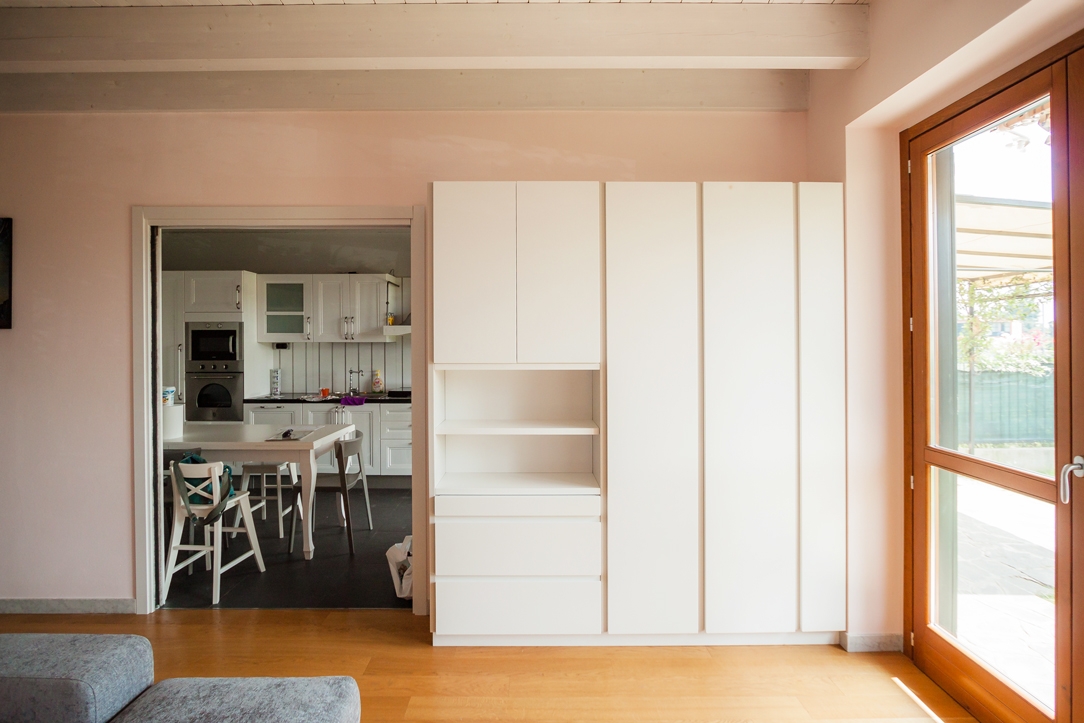
forniture living room
forniture living room close
forniture living room open
living room pink white gray

Restyling of the living room between ancient and contemporary

Restyling of the living room between ancient and contemporary

The ancient and the contemporary styles harmonize in the renovation of the living area of this house with a classic taste. An intervention that revised the layout of the entrance in favour of greater functionality and visual elegance of the external façade. A new interior layout of the living room has also been designed and a new look in order to communicate with the antique furniture existing. The old layout of this classic style private residence had the main entrance raised above the remaining rooms. The landing took place on a mezzanine level in correspondence with the staircase leading to the night area.  In doing so, an entrance area was certainly identified, separating from the rest of the rooms. The raised position compromised its functionality.

new entrance ancient contemporary 01

THE NEW ENTRANCE

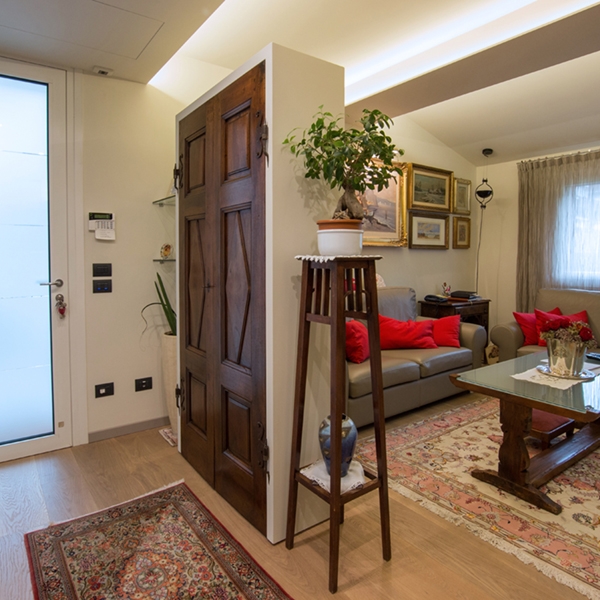
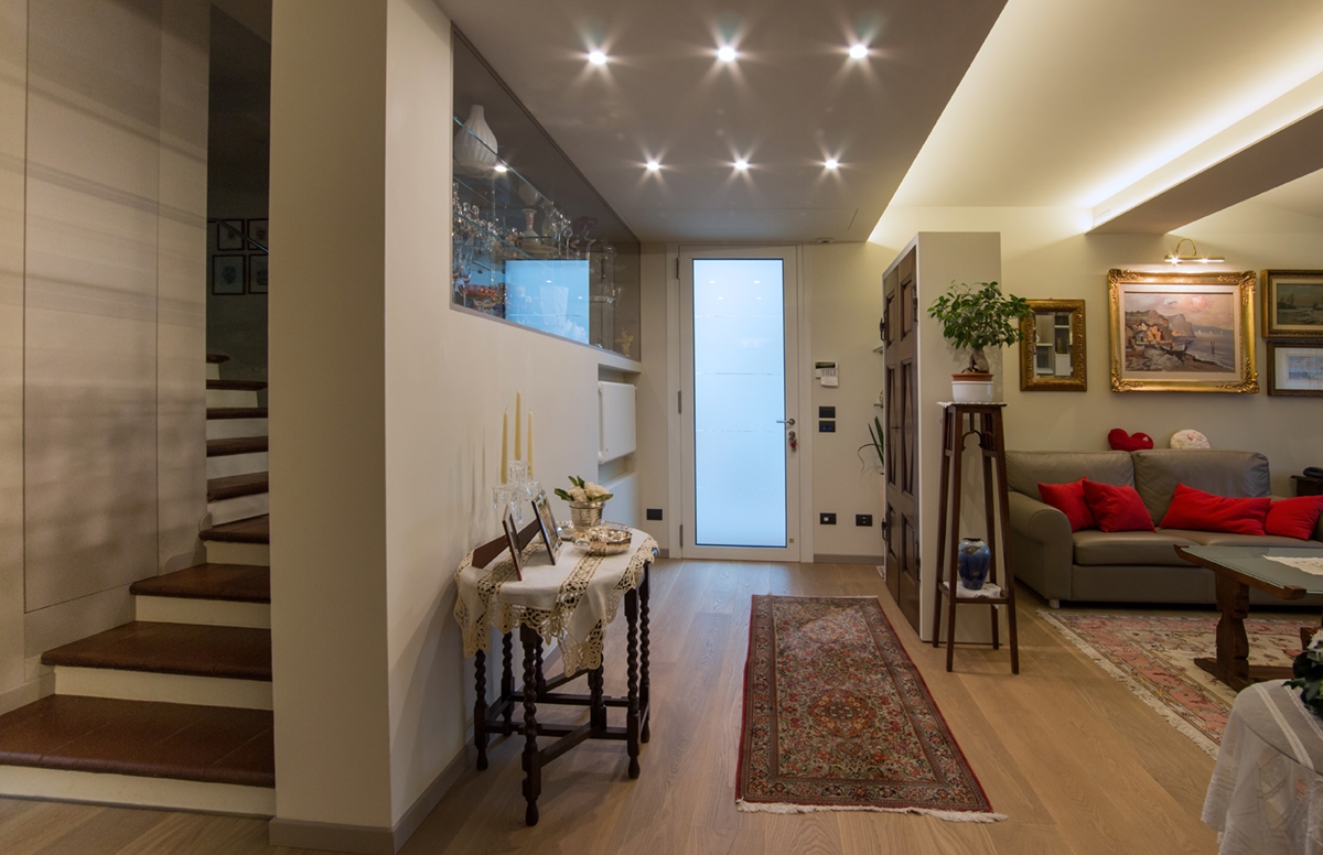
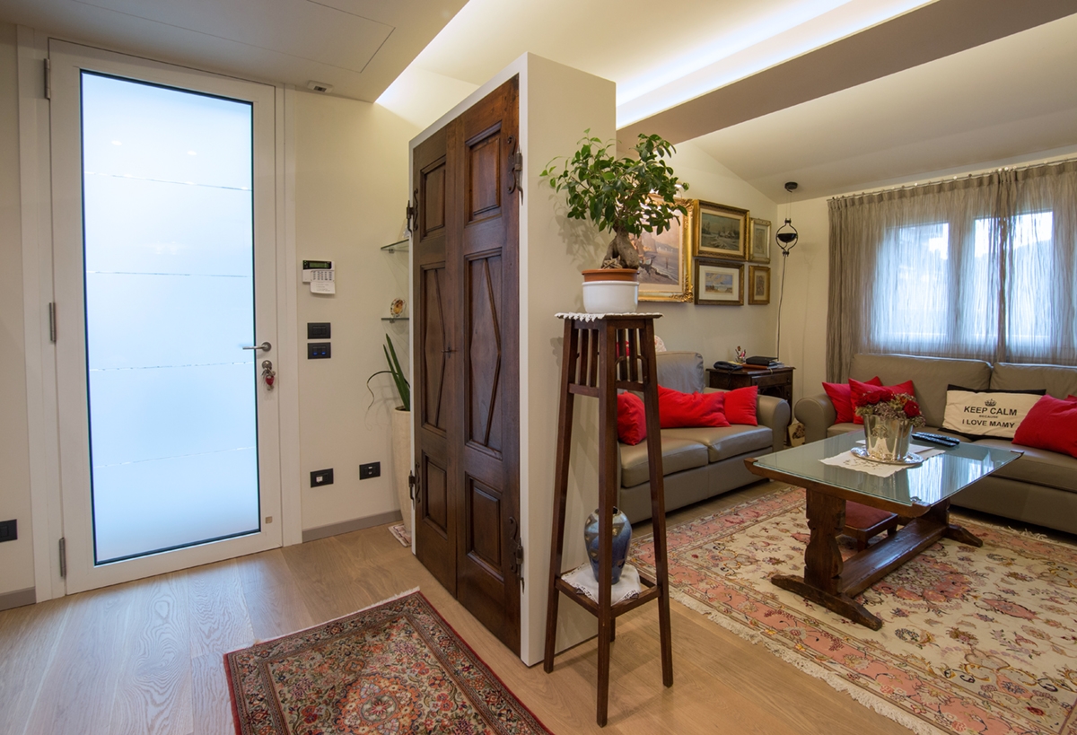
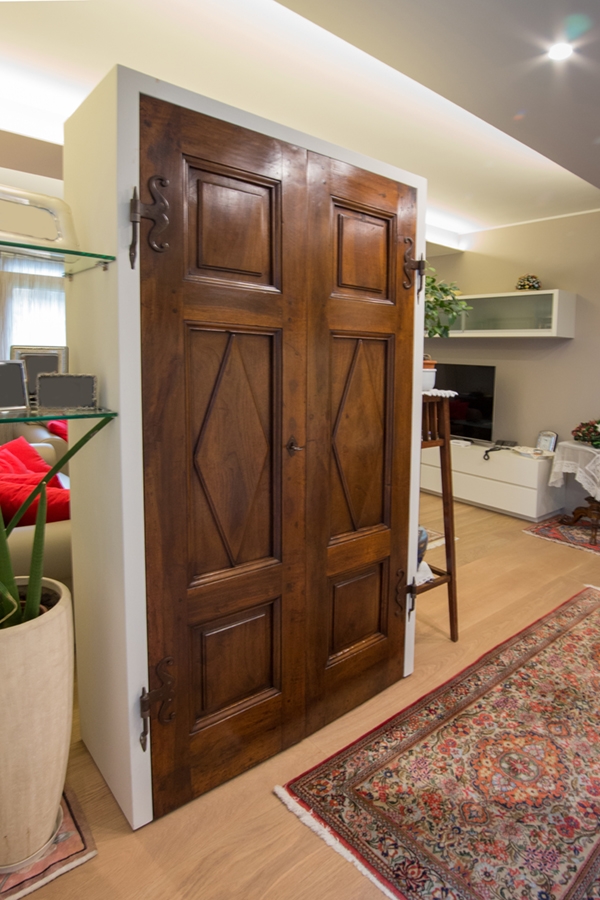
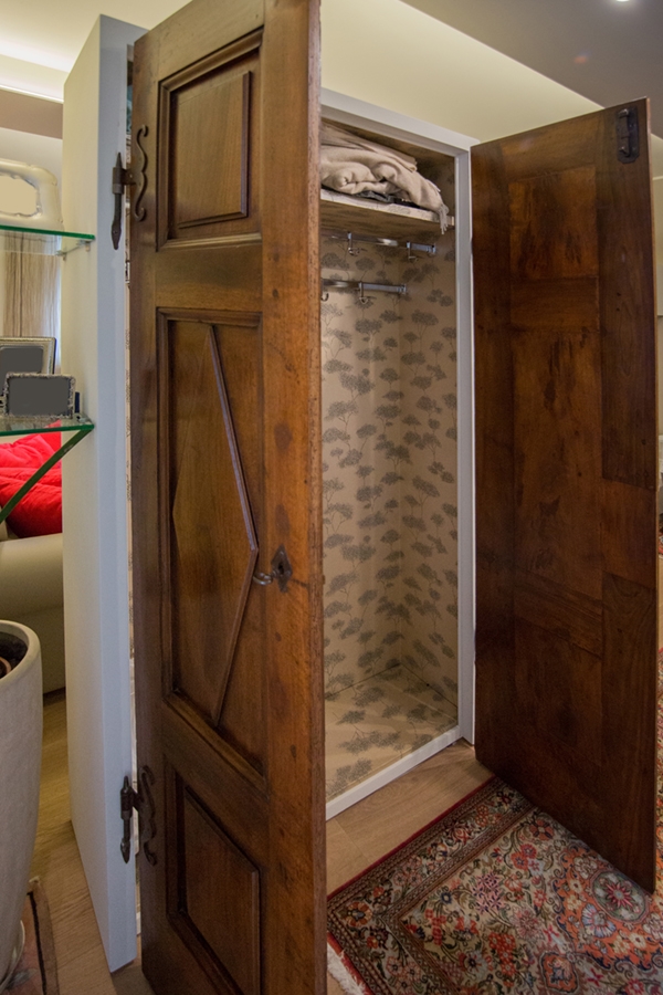
By bringing the main entrance to the ground floor, on the same level as the living room, the renovation also involved the appearance of the external façade, restoring visual balance. A wall equipped with a recessed showcase therefore closed the previous entrance area. This showcase is in an extremely essential style, with glass shelves and closure in order to show small collectibles.  At the same time, it lightens the closing wall and constitutes an excellent protection element considering the raised position. To define an area that can act as a filter between the exposure of the external space and the privacy of the internal rooms, we chose a false ceiling with punctual lights. This visually detaches itself from the remaining ceiling both for a difference in the real and perceived height, and for the backlight, that underlines its borders. In order to delimit this room with the adjacent living room, a wardrobe took place with doors salvaged from an old wardrobe. The plasterboard structure gives more solidity to the furniture that naturally fits into the context as a sort of equipped dividing wall. The dark wooden doors of the eighteenth century, in addition to being an antique furniture to deserve greater visibility, relates consistently to the other old existing furniture. Like a sort of chamber of wonders, a wunderkammer to resume historical and artistic terminology, the interior holds a surprise. A gold wallpaper recovers all walls whit its contemporary graphics but classic in style. The best representation of the match between contemporary and ancient that characterizes the project concept. Glass shelves are attached to the external structure and act as a connection with the entrance wall, recalling the style of the showcase.

 
entrance ancient wardrobe
wardrobe closed doors
wardrobe open doors

LIVING ROOM

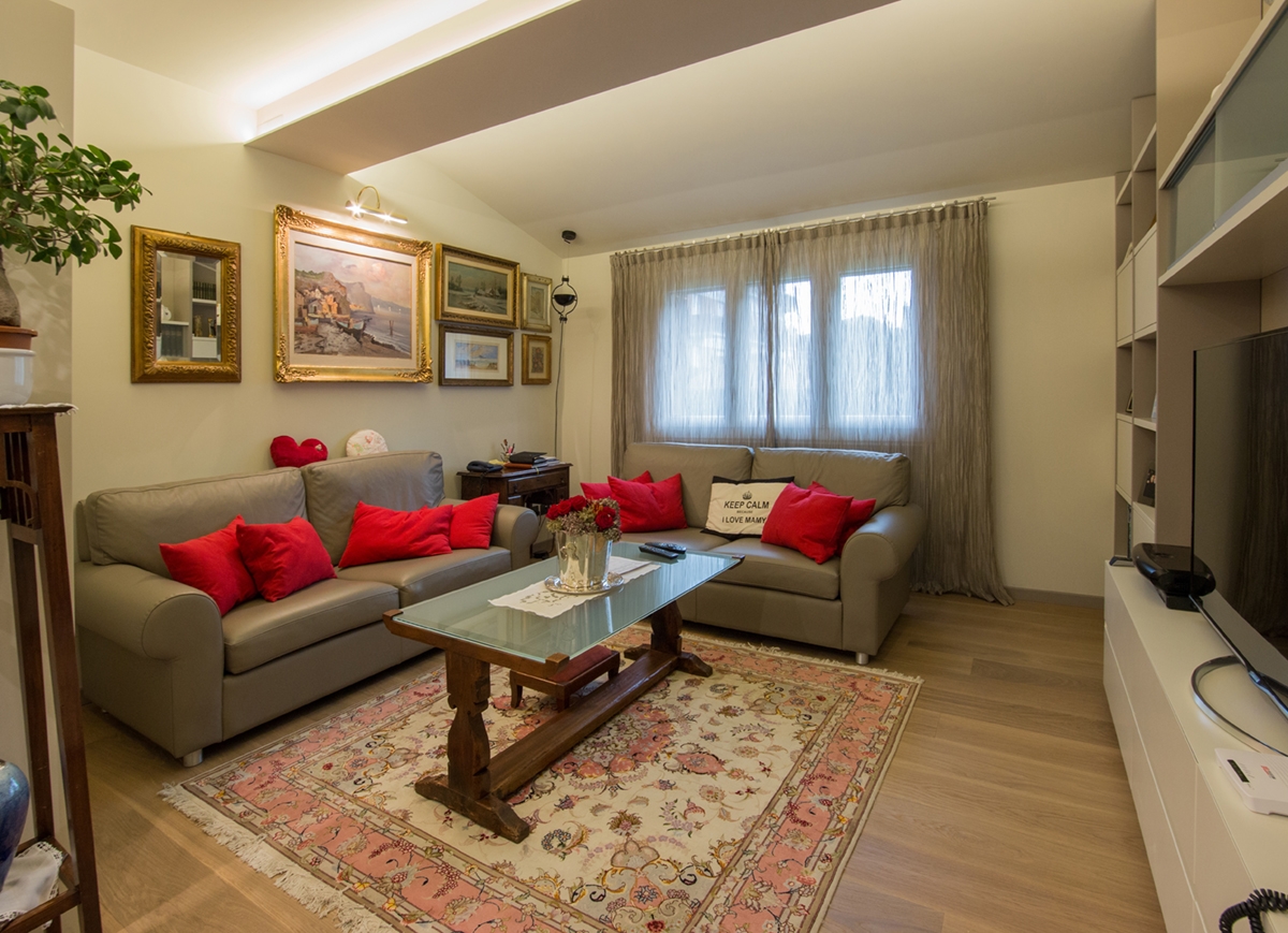
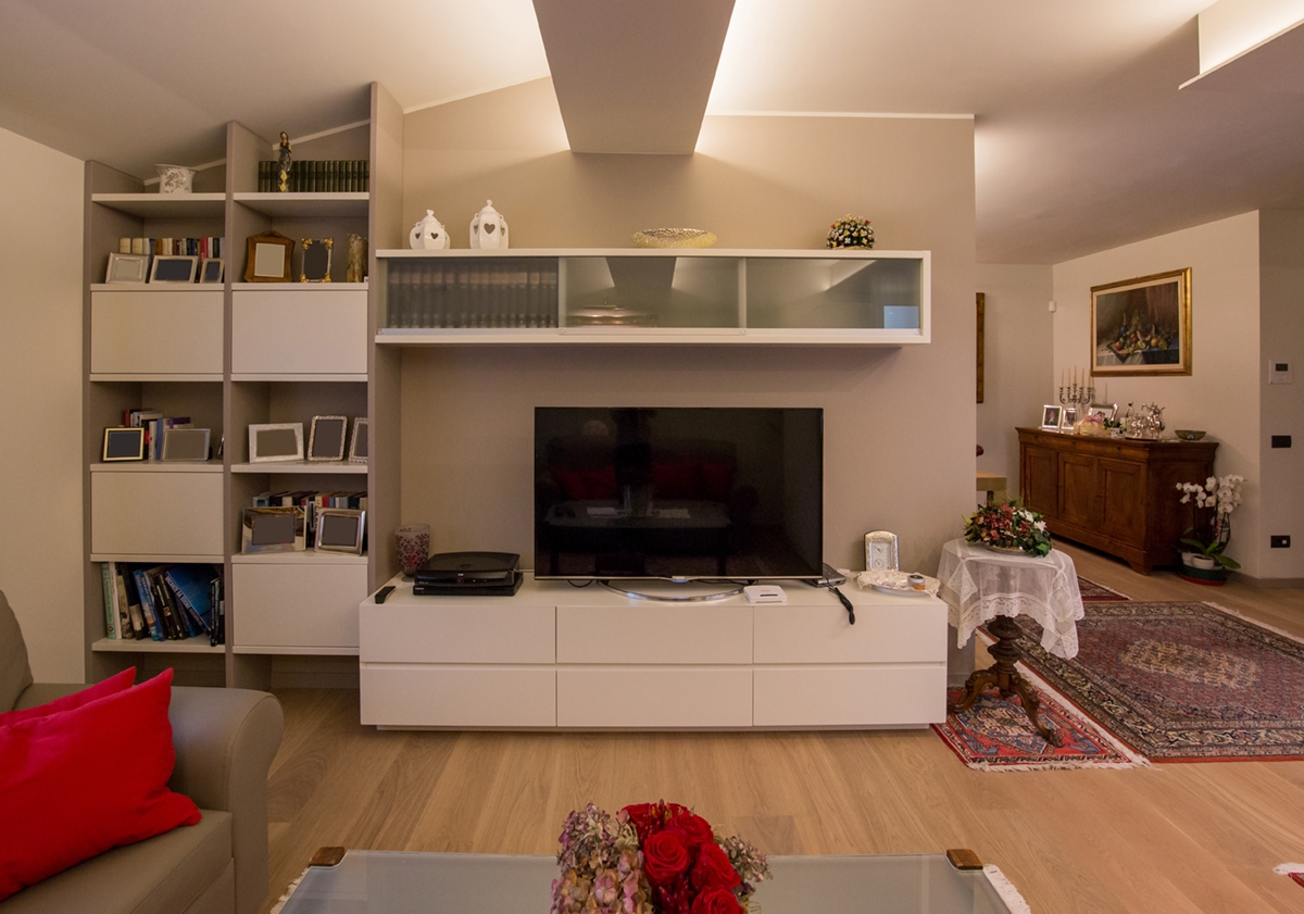
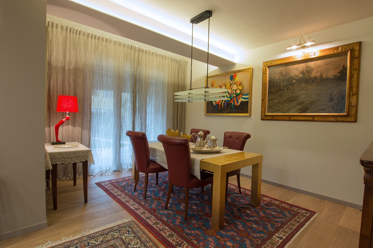
The living room has been modifies in its layout and slightly enlarged. This meant that the dividing wall with the dining room could be equipped with contemporary furniture capable of perfectly fit with the room. In particular, it consists of an essential TV cabinet n white lacquered MDF with upper glass wall units. A recurring material in the entrance and living room. Placed on the corner, instead a library alternates empty elements with full volumes whose colours reflect the medium gray of the plaster and the white of the contemporary furniture. An often-winning combination, both as concerning the reinterpretation of modern classic style, and in a contemporary perspective. The colour match is also visible in the choice of the new gray leather sofas that stand out against the white back wall. Beyond the dividing wall of the living room, there is the dining room with an important, linear and extremely elegant dining table covered with gold leaves. The real treasure of this room. It matches with classic dark leather seats that perfectly relate to the colour choice. An antique dark walnut storage units recovered from other rooms, relates to these, further enhancing the dining room.

 
living room ancient contemporary
tv cabinet library living room
dining room table golden leaves ancient furniture

Ancient and contemporary can perfectly match creating suggestive environments. Here is another example, in this case surrounded by a citrus grove in Sicily. Click here to be fascinated by.