A wooden bedroom with warm natural tonalities. Functional passages and connected rooms.

A wooden bedroom with warm natural tonalities. Functional passages and connected rooms.

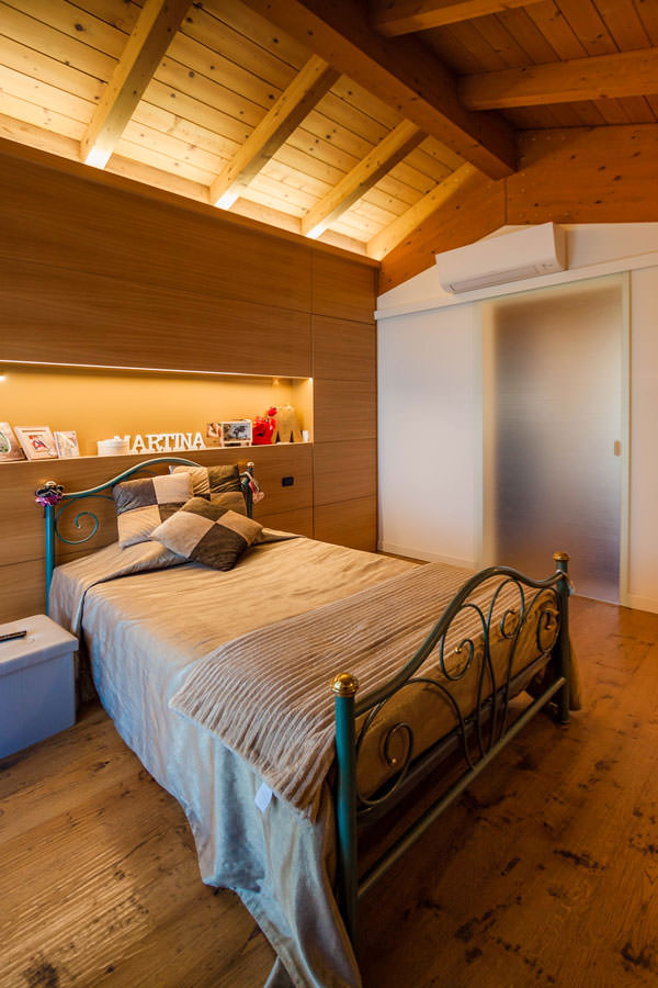
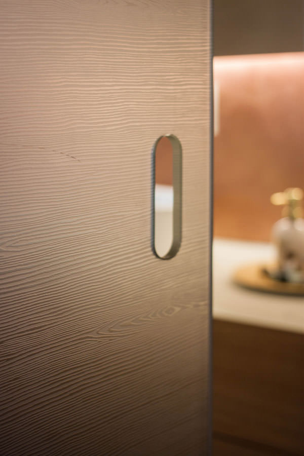
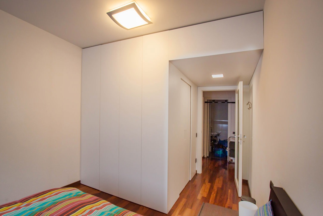
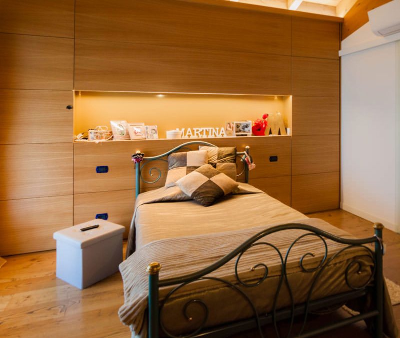
A large wooden room in natural tones picks up on the architectural elements of the attic sleeping area, also housing a walk-in wardrobe in the back structure. Adjacent to the bedroom, a textured glass sliding door leads to the large master bathroom, which also communicates with the study.
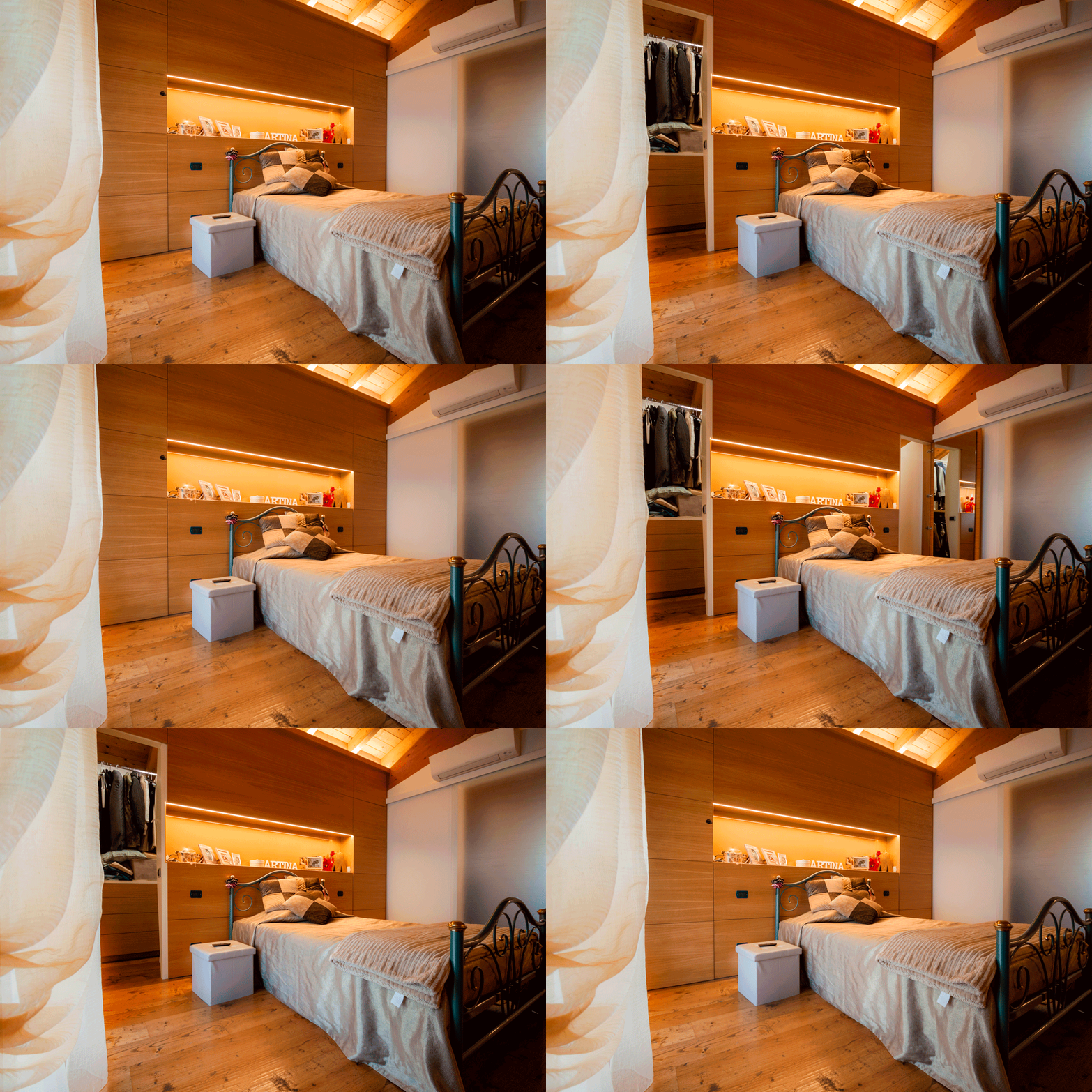
Curnis animation walk-in wardrobe door openings

The wooden master bedroom with a cosy atmosphere

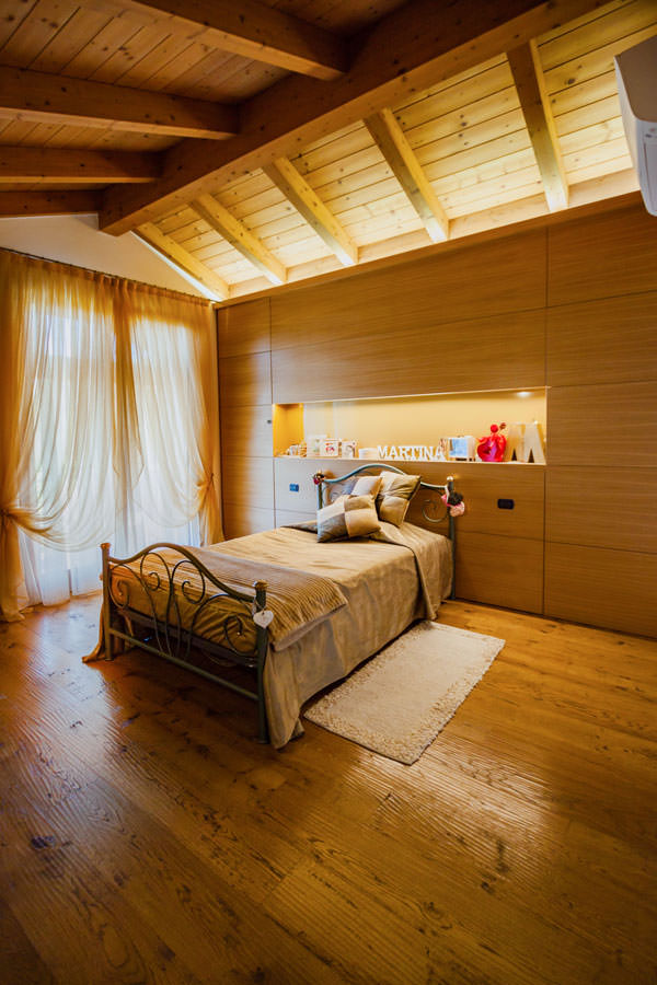
The architectural context of this sleeping area responds to a well-defined character. On the floor is a parquet floor with a rustic look, with marked knots and grains and a light polish that emphasises its softness. The ceiling, on the other hand, is enriched by wooden beams in warm amber tones with a central ridge. On the sides, elegant draperies embrace the window with large windows, filtering natural light in favour of an intimate and cosy ambience.

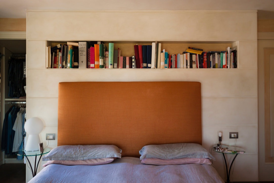
A combination of rustic and elegant elements, also echoed in the choice of the wrought iron bed frame, which is matched by important golden velvets. Picking up on the material choice of the architectural envelope, the structure behind the bed conceals the bilateral access to the walk-in wardrobe.

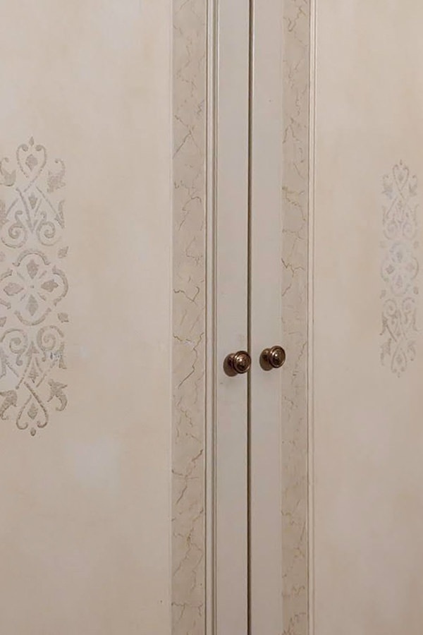
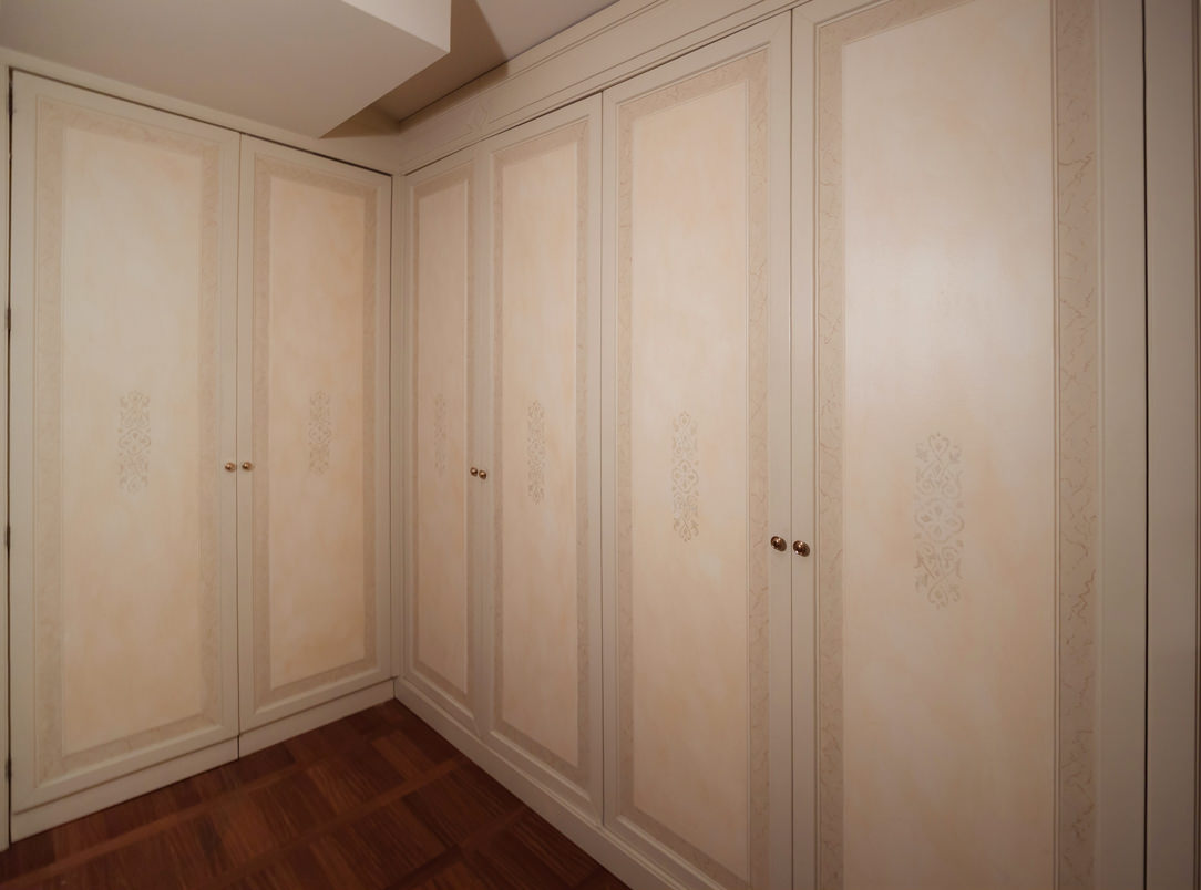
In fact, the doors and covering panels of the structure are concealed by a geometric composition that marks the visual rhythm of the wall.
In the centre of this is an open compartment with an ochre lacobel bottom and base which, illuminated by a recessed LED strip in the upper part, is enriched with a golden hue.
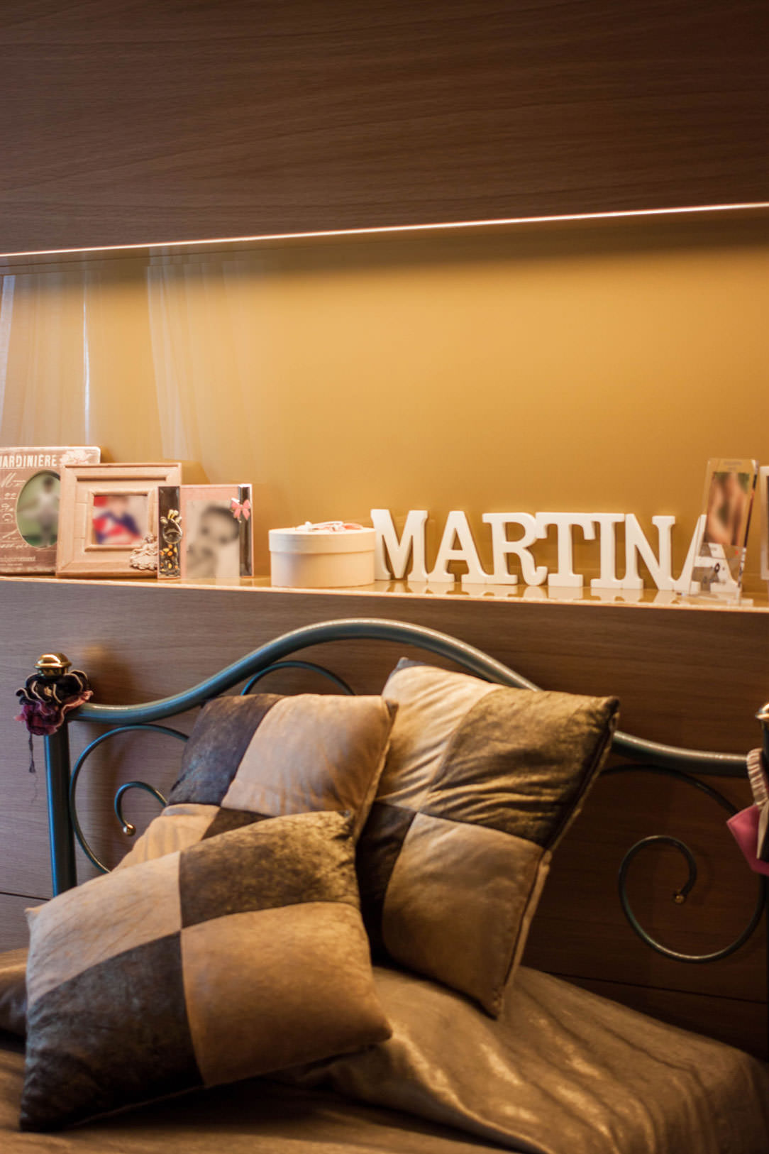
dettaglio vano giorno lacobel ocra illuminazione LED superiore velluti letto
camera da letto in legno vista frontale retroletto attrezzato cabina armadio vista laterale destra
camera da- etto in legno vista frontale retroletto attrezzato cabina armadio vista laterale sinistra

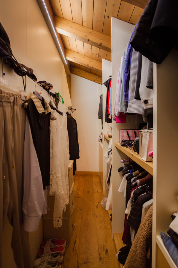
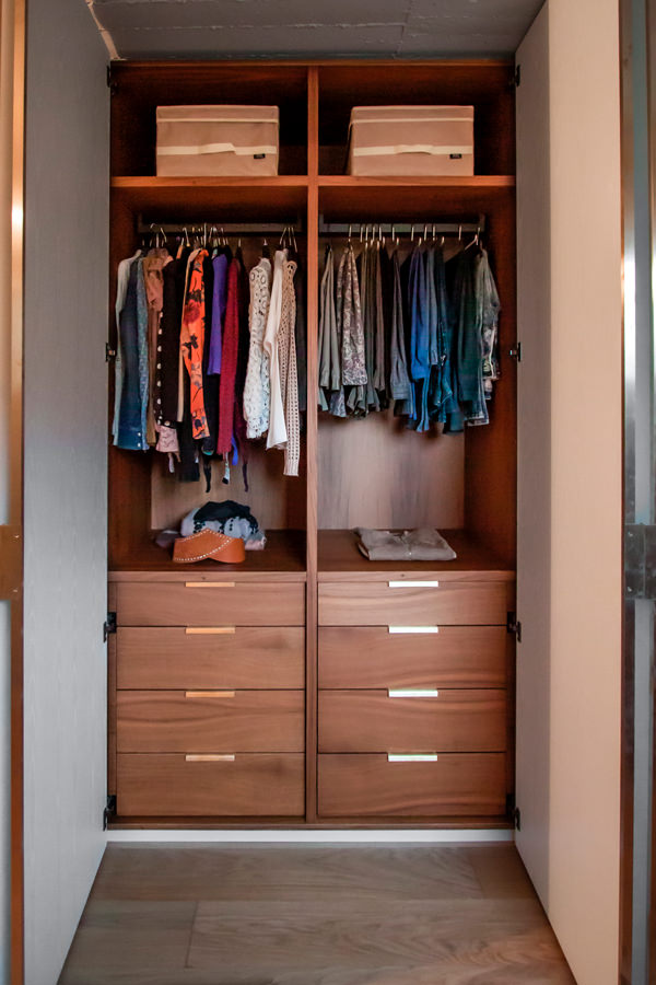
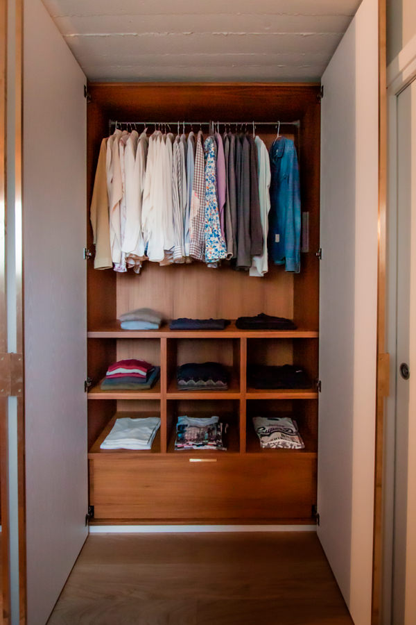
A walk-in wardrobe created in the space behind the bed

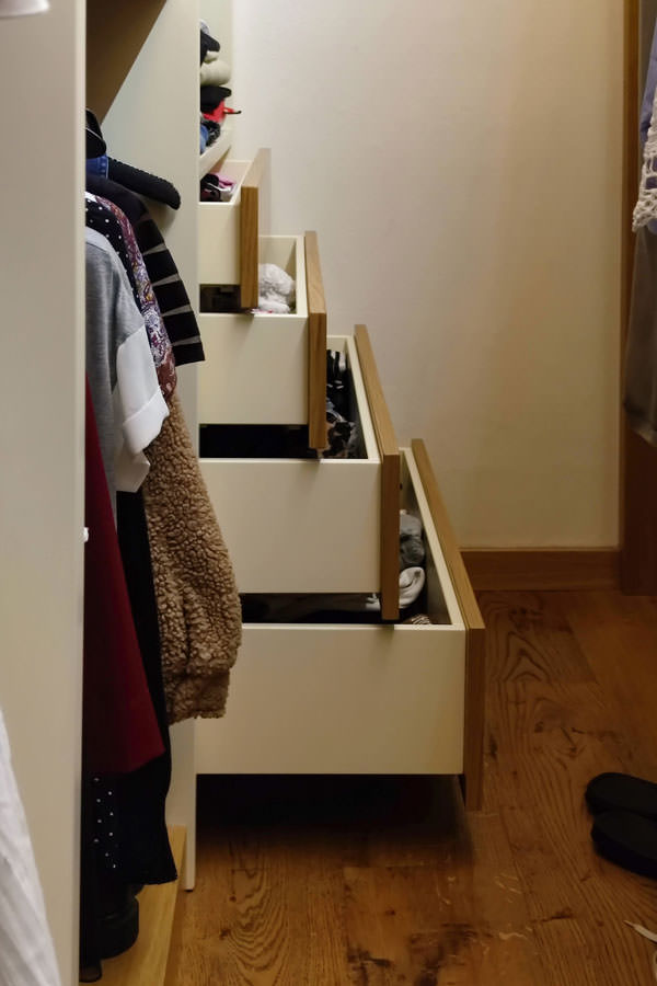
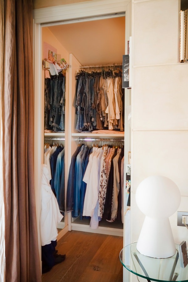
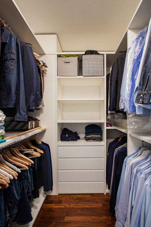
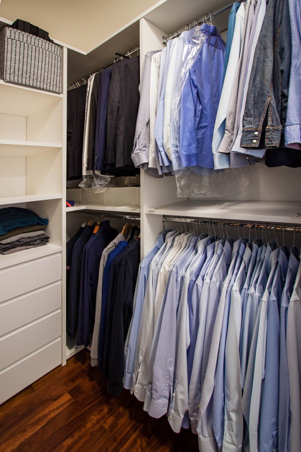
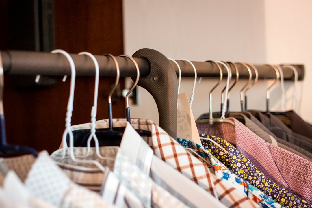
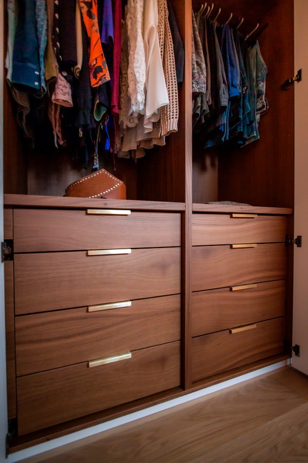
In order to optimise space, having a large double bedroom, the solution that best meets functionality is to equip the back of the bed with a wooden structure that also serves as access to the walk-in wardrobe. This, as already realised in this classic villa, exploits the longitudinal layout to alternate hanging tubes, folding shelves and linen drawers.

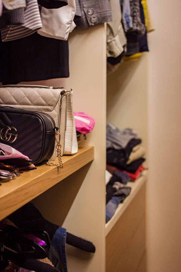
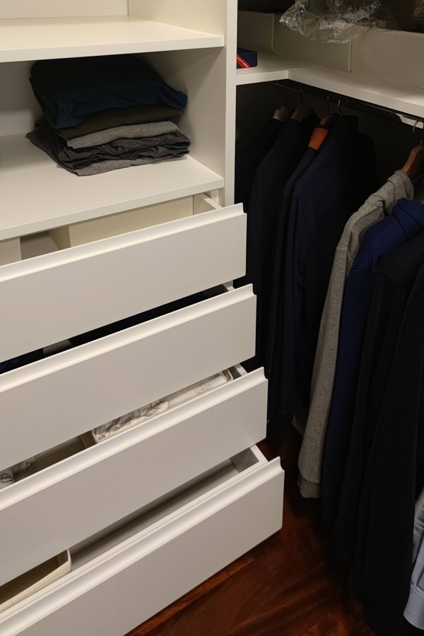
The conformation of the walk-in wardrobe and its bilateral access define its user flow and usability. Also in this micro-environment, the material choice of the individual components plays a fundamental role in defining the overall aesthetic impact. In particular, the shoulders and vertical elements in general are characterised by matt white lacquering, while the horizontality is emphasised with wooden shelves and drawer fronts.
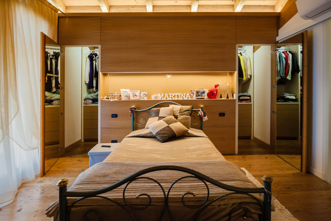
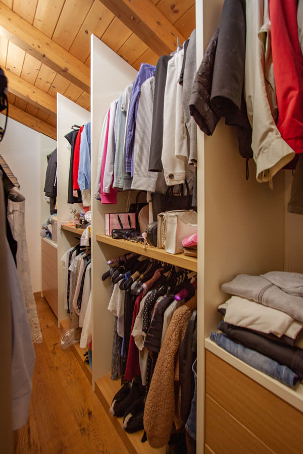
camera-da-letto-in-legno cabina armadio retroletto apertura ante
cabina armadio retroletto legno e bianco
cabina armadio retroletto legno e bianco fronte
cabina armadio spalle laccato bianco ripiani fronte cassetti legno aperti
cabina -armadio spalle laccato bianco ripiani fronte cassetti legno

The communicating bathroom in natural tones

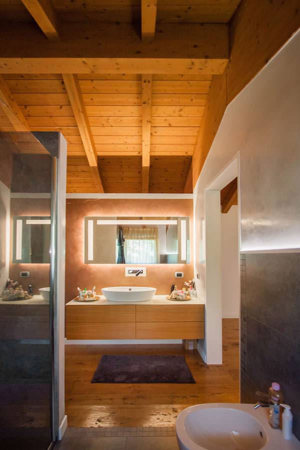
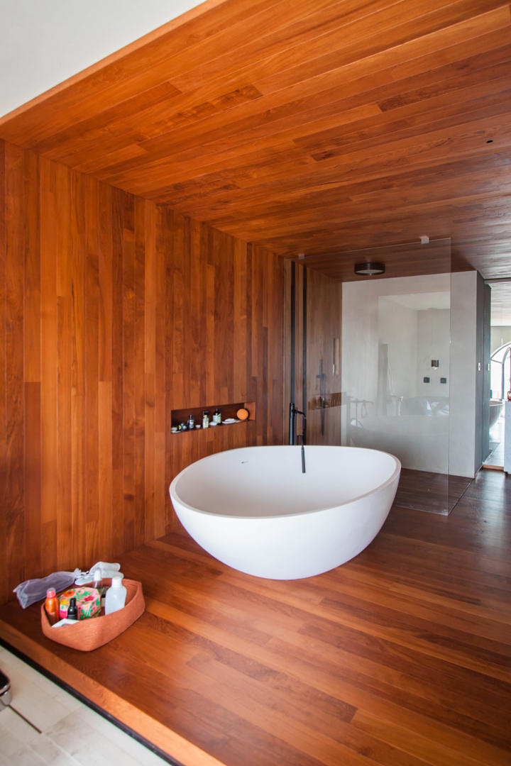
A sliding glass door leads from the wooden room to the bathroom, whose wooden furniture echoes the material choice of the entire bedroom area.
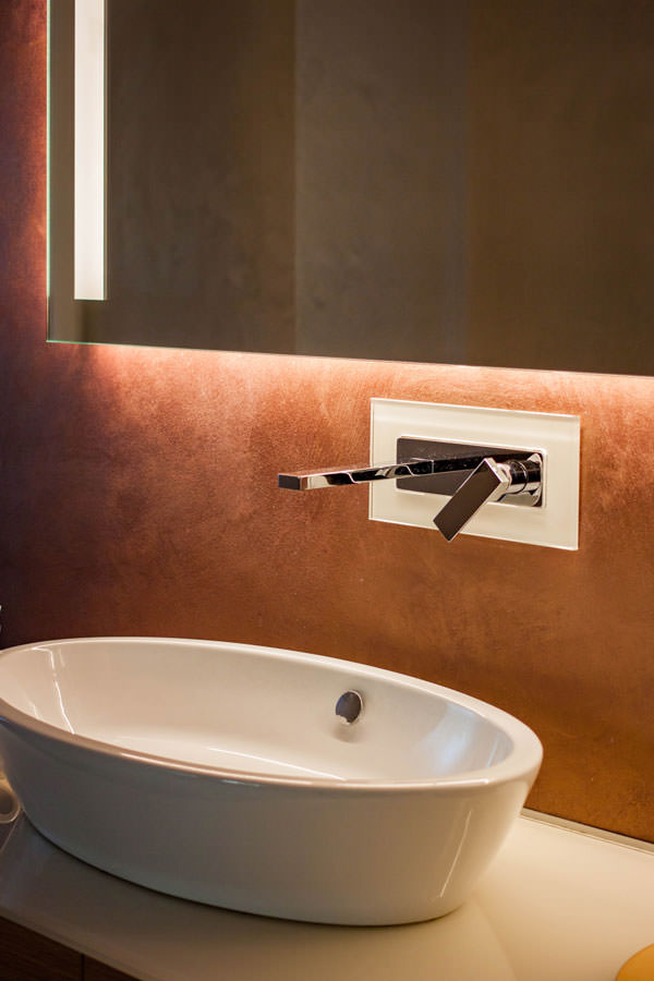
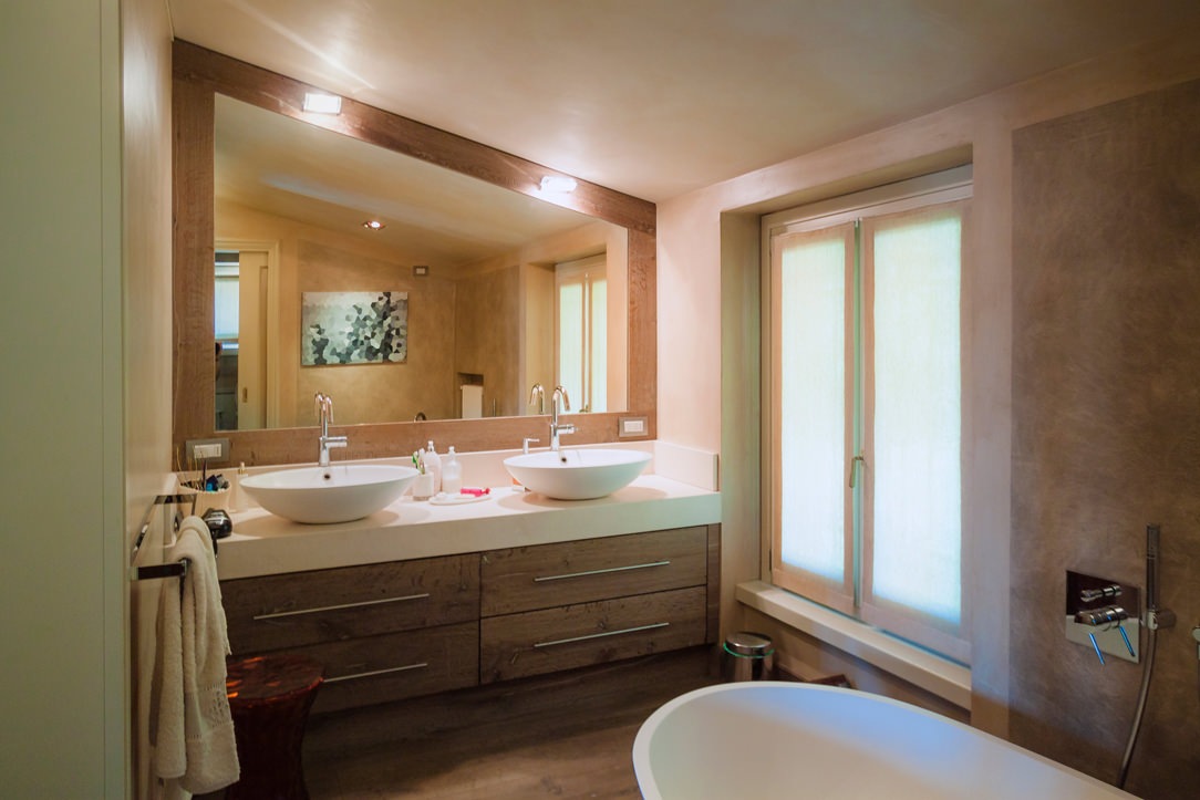
This is characterised by the presence of large push-open drawers surmounted by a white lacobel top with a ceramic countertop washbasin. The wall-mounted stainless steel tapware is framed by a white lacobel plate that echoes the bathroom vanity top.

A large mirror with integrated lighting amplifies the perception of space, giving additional brightness to the room. The use of LED strips is also taken up in this room, emphasising the material transition between the tile covering and the wall.
The bathroom becomes a communicating room between the bedroom and the study, exploiting the double side access. The latter is accessed from the bedroom side by means of a textured glass sliding door in wood effect, from the study side by means of a hinged door of the same aesthetic line.
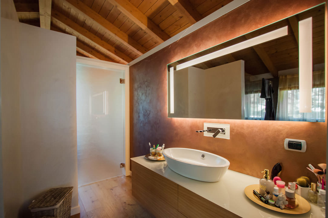
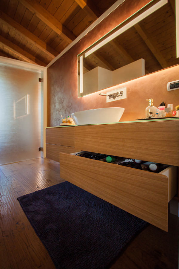
mobile bagno comunicante cassettoni legno piano lacobel bianco
mobile bagno apertura cassetti fronte legno
mobile bagno comunicante cassettoni piano lacobel bianco lavabo appoggio specchio con illuminazione
dettaglio lavabo appoggio rubinettera inox a parete specchio con illuminazione
dettaglio maniglia porta scorrevole texturizzata legno vetro bagno comunicante

A wooden room with a natural feel uses the functionality of a walk-in wardrobe behind the bed to optimise space. The choice of natural materials and soft lighting, with a hint of Hygge, creates a relaxing and hospitable environment. To further explore the theme of the wooden sleeping area, here are two other realisations in which the natural material par excellence becomes the protagonist: Comfort among the peaks and a Shabby Chic studio apartment.

Renewed classic furniture with contemporary kitchen

Renewed classic furniture with contemporary kitchen

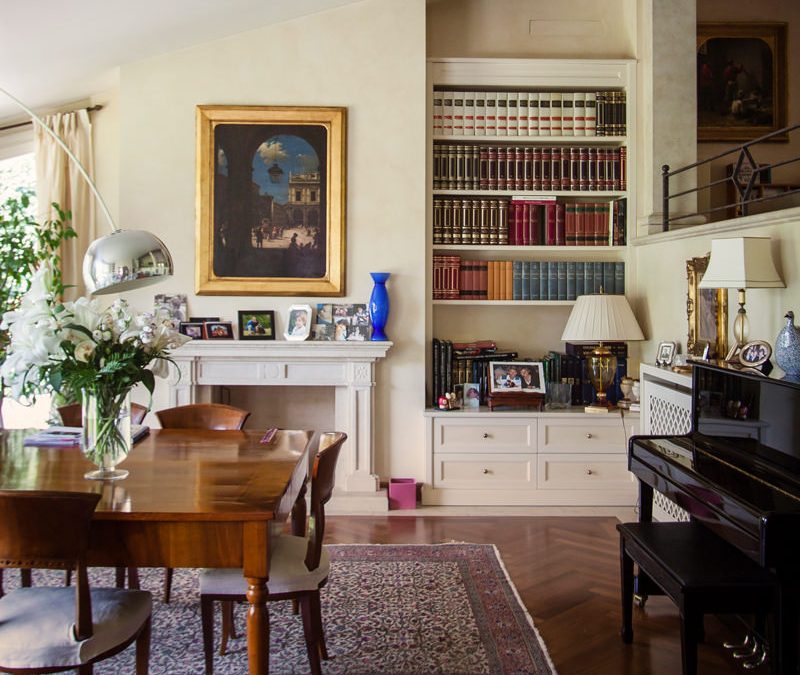
The classic style furnishings of this villa built about thirty years ago rediscovers its eternal charm even after many years.
To rejuvenate it and make it current, a contemporary style kitchen with essential lines has been added. The harmonious combination of the two styles refreshes the rooms and softens the features of the predominant style.

classic living room

Classical furniture between past and present

The passage of time and the succession of different historical periods has allowed a wide development of furnishing styles. Over the course of history these have known their maximum expression with distinct characters, while in the contemporary era they have been reinterpreted, giving life to continuously updated variants.

This house, built between the late eighties and early nineties, responds to a classic style at the time very popular among villas and elegant apartments. Revived today, it discovers its contemporary meaning with an elegant kitchen with essential lines. The warm tones of the lacquers soften the design lines of these interiors, in perfect harmony with contemporary trends.

entrance passage with classic arch
classic style entrance details arch moldings
detail of the villa entrance light blades

The living area in classic style

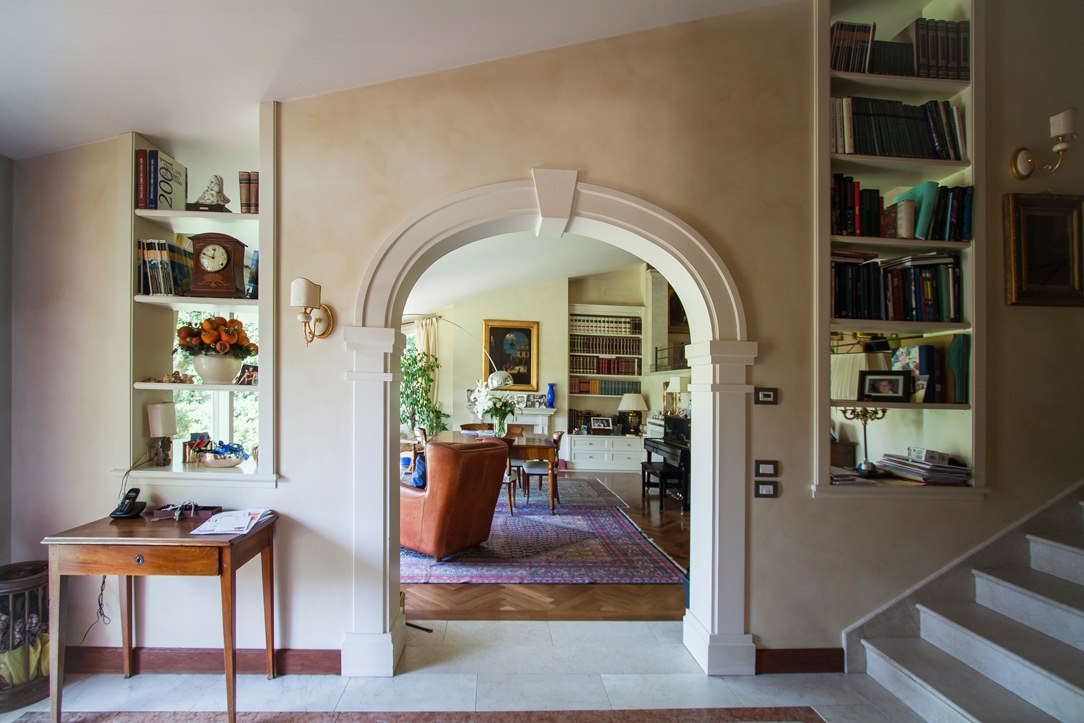
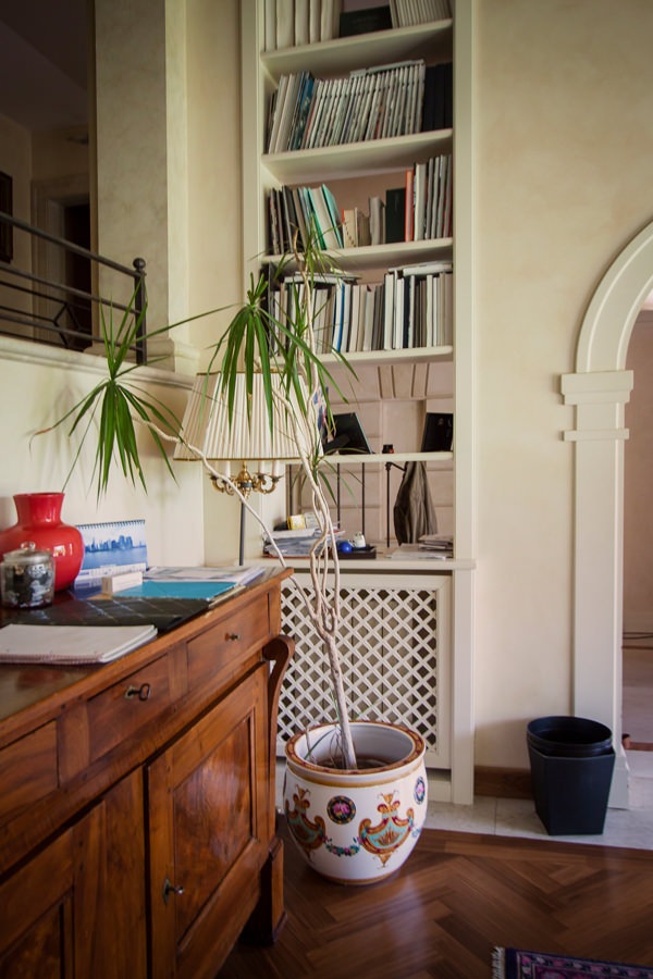
The classic furnishings already develop in the entrance area with moldings that emphasize the architectural lines of this villa.
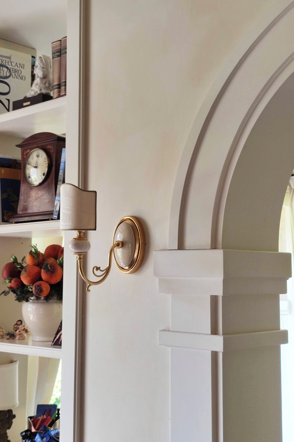
On the left, an arch with shaped profiles marks the entrance to the living area, flanked by a pair of blades of light that allow a glimpse of the large interior living room.
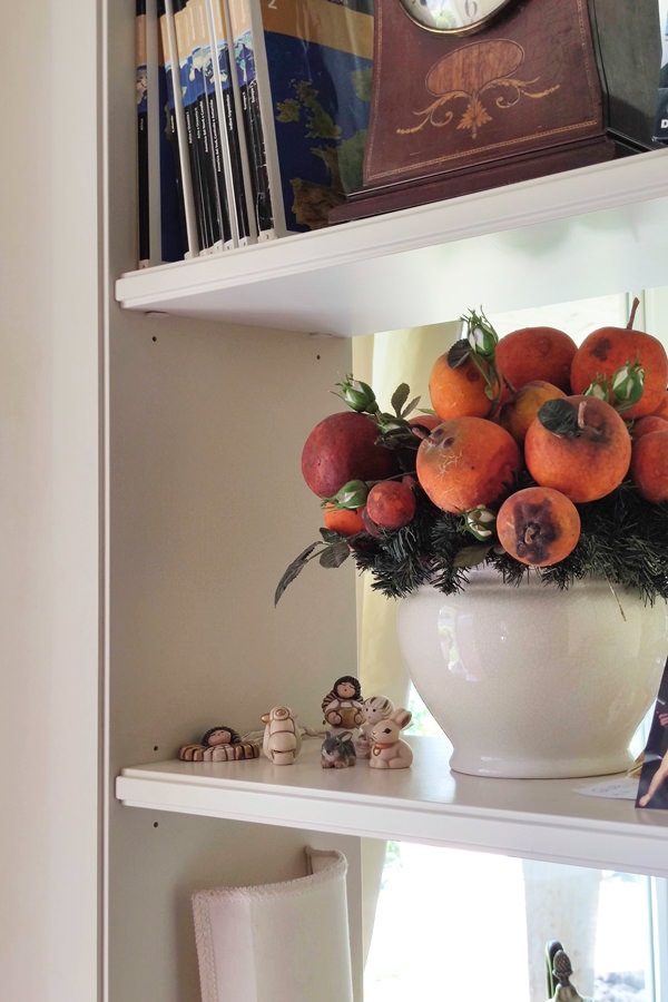
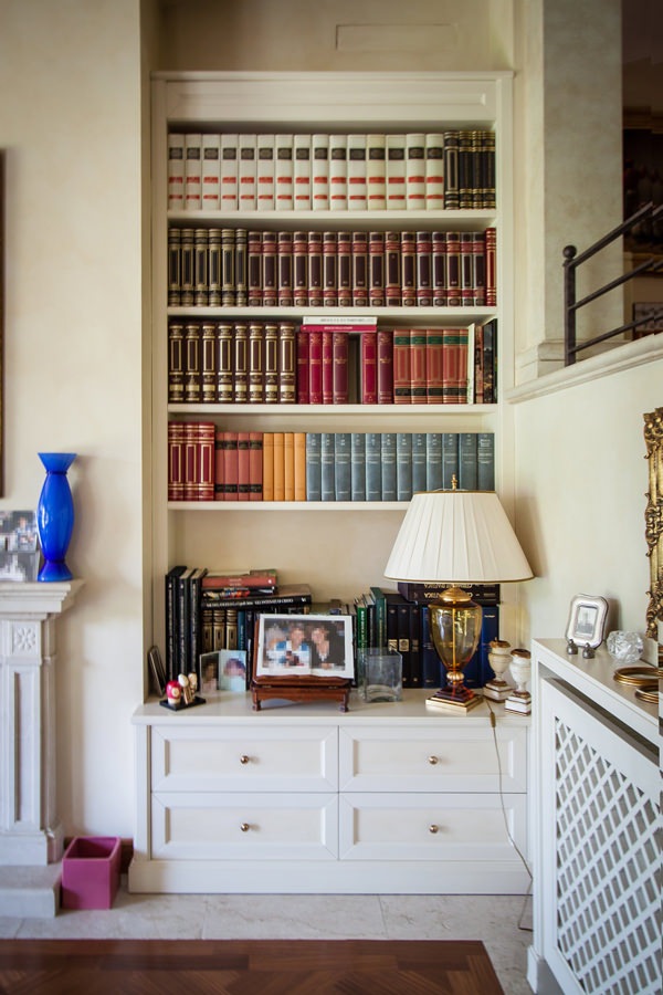
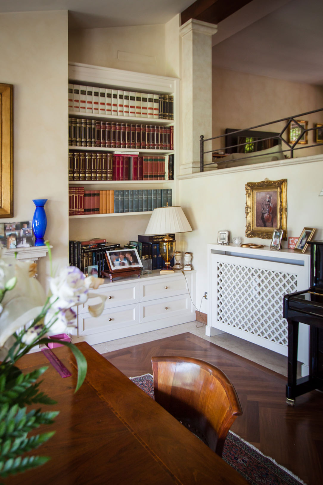
The profile of the internal shelves, slightly recessed, is a shrewdness that makes the aesthetic impact of the element lighter, recalling the characteristics of the classic style.
The painting of the walls in a warm slightly cloudy tone acts as a leitmotif in the different rooms, enhancing the light furnishings.

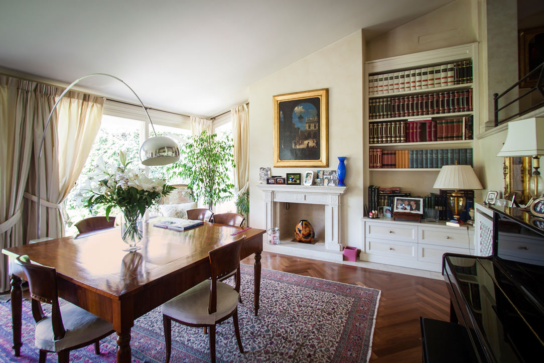
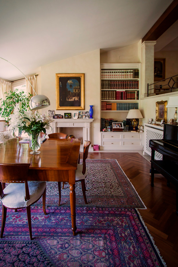
The living room has a central solid wood main table matched with other antiques that give elegance and prestige.
Among these, the large damask carpet, the adjacent wall piano and the Arco lamp by Castiglioni, a timeless design icon.
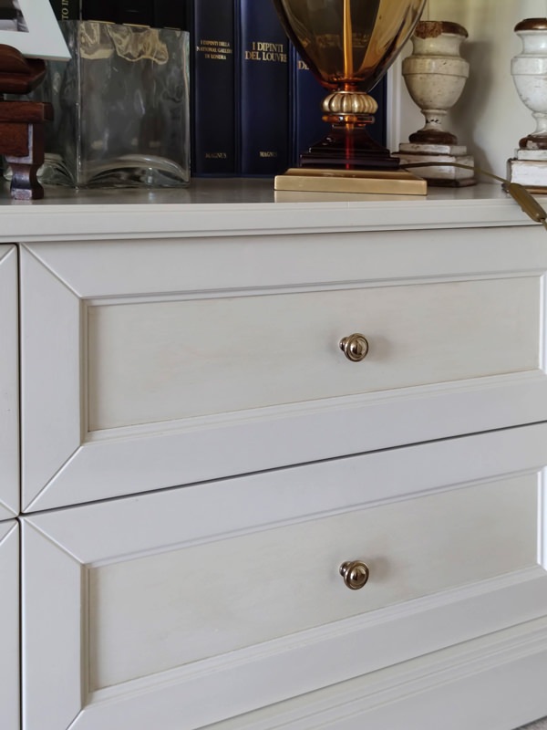
Low cabinets, honeycomb radiator covers and niche bookcases with recurring aesthetic characteristics accompany them. Moldings, doors decorated with tone-on-tone knockouts and brass knobs are in perfect classic style.
The chosen color of a light cream makes the interiors elegant, softening their features.

bookcase in niche details classic furnishings in the living area
details equipped windows bookshelves wooden furniture
classic style living room wood table
living room furniture classic niche bookcase
front molded drawers in classic style, tone-on-tone
bookcase niche living room classic furniture shelves

From the equipped corridors to the sleeping area

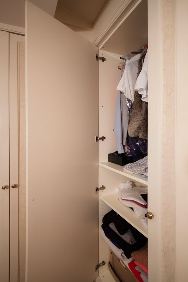
To anticipate the sleeping area, the corridors and passageways are equipped with full-height service wardrobes. These reproduce the characterizing lines of classic style furnishings, enriched with decorative floral motifs in a slight chromatic contrast.
The warm tone of the walls is echoed by the knock-out of the doors in a delicate tone-on-tone play. Internally, shelves and hangers alternate to make the most of the environments.

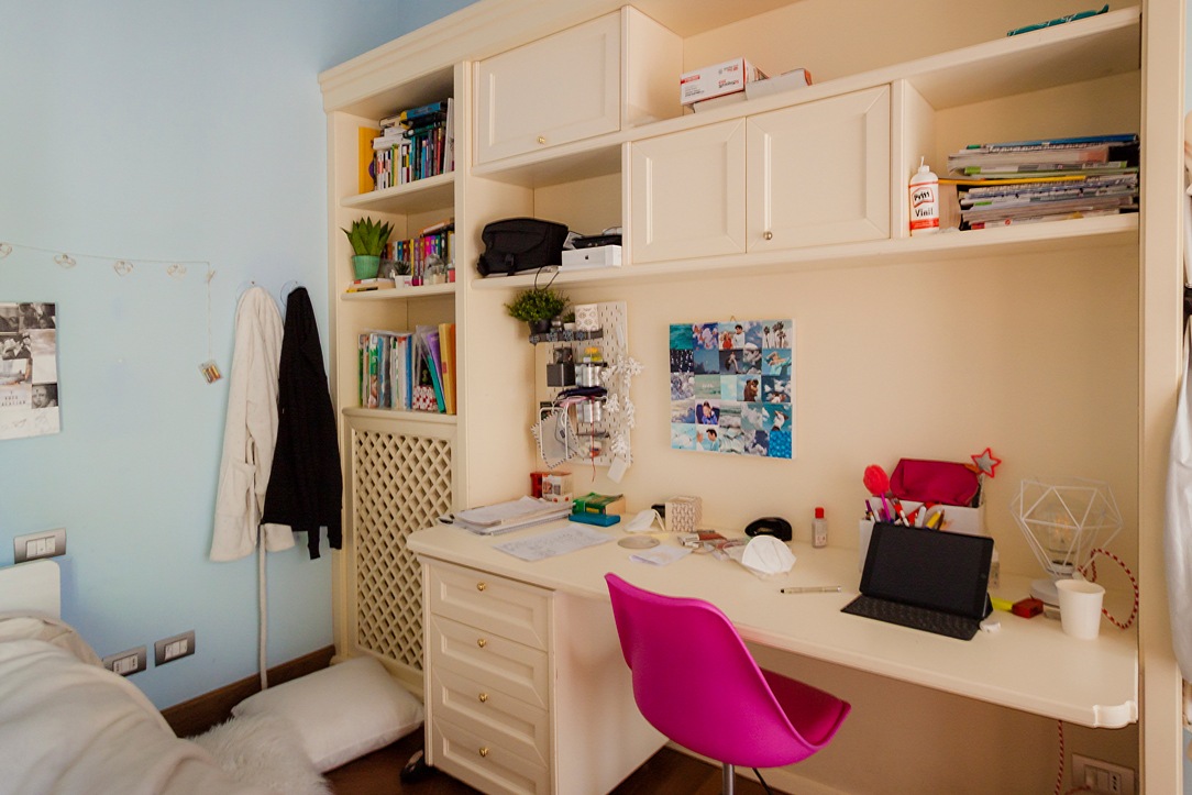
In the sleeping area, the bedroom uses a double-sided wardrobe that fits into the dividing wall between the sleeping area and the study corner, now equipped for distance learning. A structure with delicate warm tones which, combined with the light blue walls, is even brighter and fresher. Classic-style doors accommodate internal shelves and hangers, while in the terminal part they incorporate open compartments for small objects.
At the front, the equipped wall alternates shelves with wall units with molded doors, creating a dynamic visual rhythm. In the lower part there is a desk with a chest of drawers incorporated into the structure.

classic style bedroom bed
classic style bedroom desk
classic style wardrobes interior
detail decoration doors classic style furniture
classic style wardrobes decorated cream colored doors

The master bedroom stands out for its contemporary elegance that only delicately hints at the classic tones of the remaining rooms. The caramel-colored padded headboard of the large double bed rests on the rear structure equipped with a front day compartment and bookcases along the side shoulders. To recall the classic style of the furniture is the linear aesthetic of the back wall with panels spaced at a fixed distance.
On both sides of the bed there is the access to the walk-in closet, contemporary in its design lines but with light tones that reflect the colors of the remaining furnishings.

cream colored shaped kitchen lacobel wall units
walk-in closet retro bed classic contemporary style
niche bookcase detail with headboard thickness
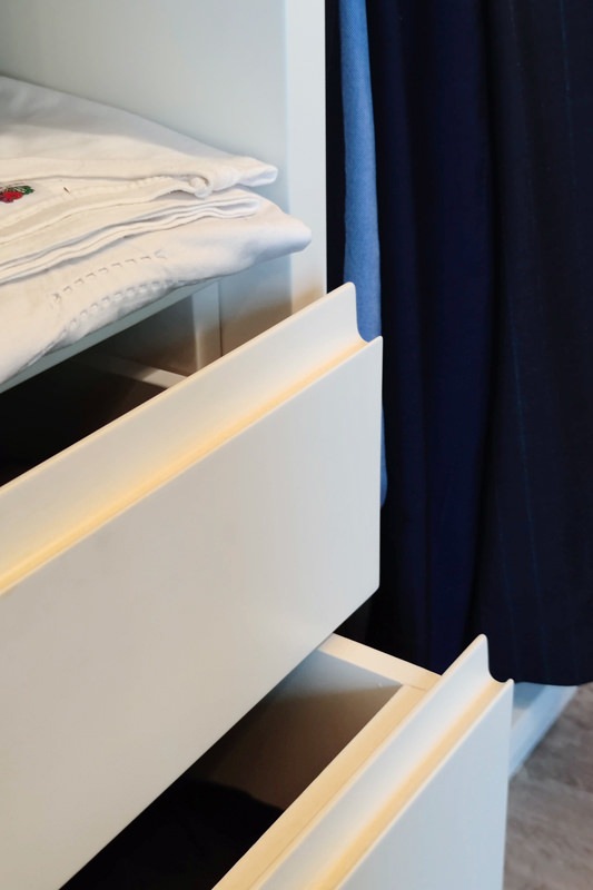
detail handles hollow linen drawers walk-in closet rear bed
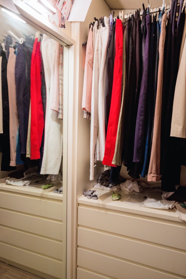
internal walk-in closet chest of drawers hanging mirror
horizontal classic bathroom

The introduction of the contemporary style through the refurbishment of the kitchen

The timeless beauty of classic furniture, rediscovered even today, is confronted with the desire to renovate the interiors.
In terms of functionality and typology, the kitchen is the environment that best lends itself to a stylistic change with a contemporary flavor. Here then, after simplifying the existing doors with a linear aesthetic, this room also fits harmoniously into the existing complex.
A touch of lightness that balances the stylistic imprint of the villa.

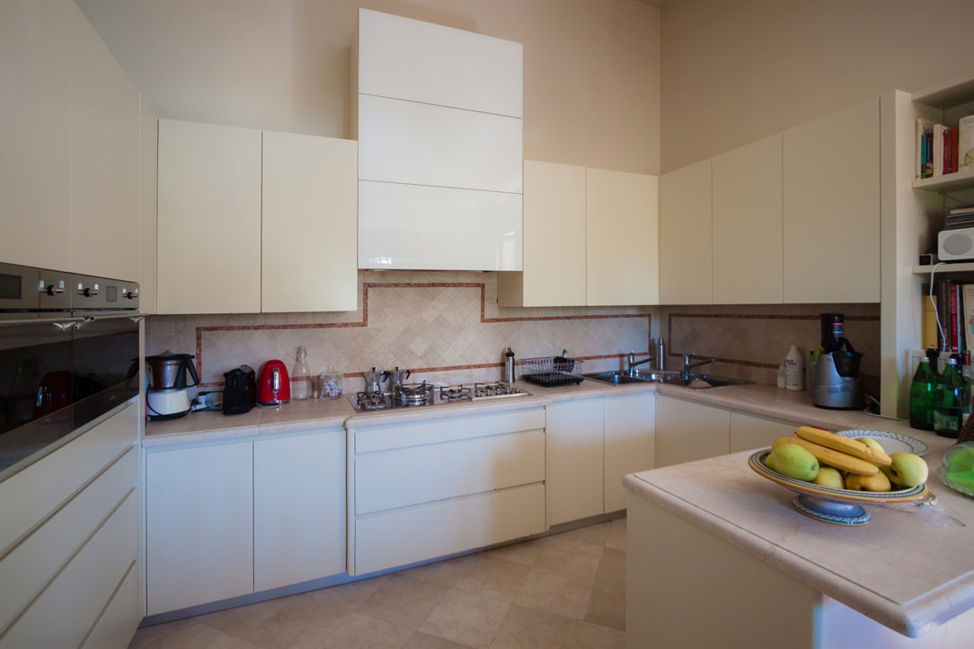
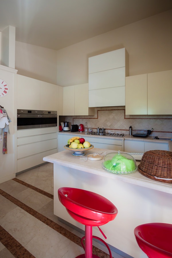
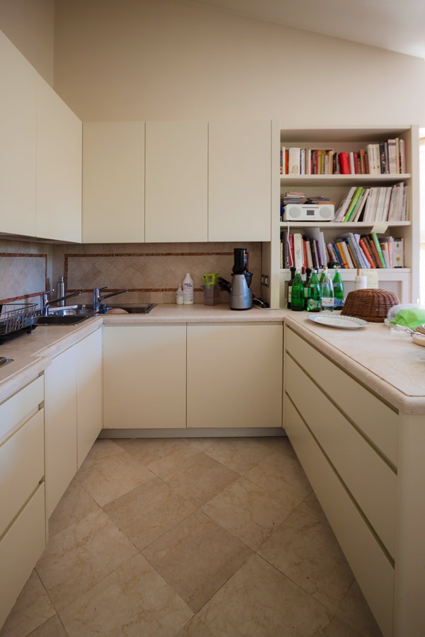
Preserving the top and the back surface of the terracotta kitchen with brick-colored geometric decorations, the refurbishment involved doors and front drawers of both the base units and the upper wall units. Recessed handles with a linear aesthetic and matt lacquer in full contemporary style are spread over the entire kitchen and the volume of the peninsula used as a snack bar placed at the front.
The hood, previously chosen as a “design” type, was inserted in a built-in structure entirely covered in white Lacobel, capable of giving brightness to the environment.
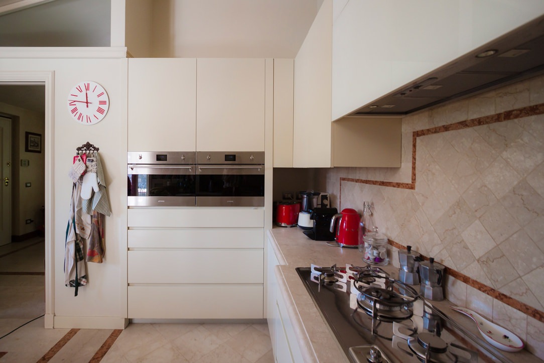
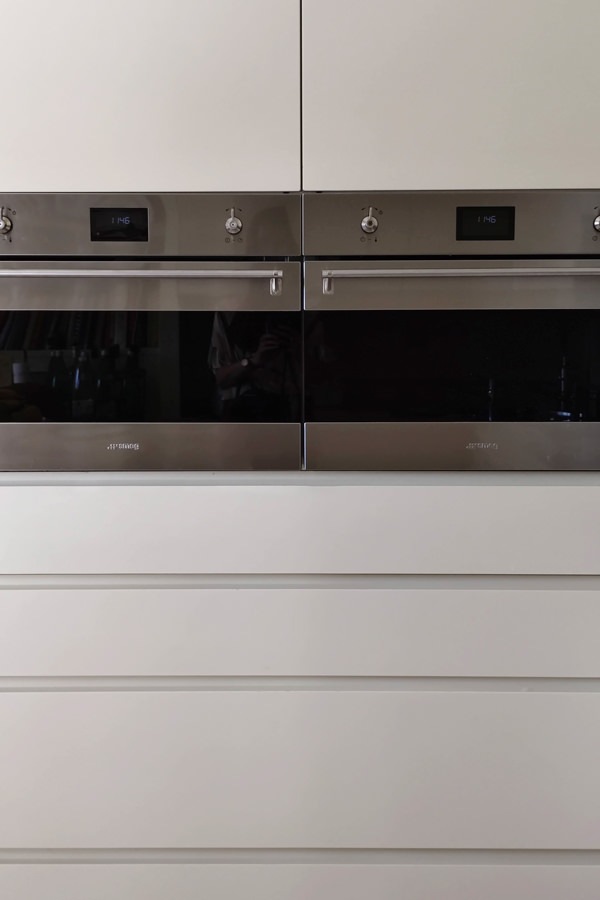
Appliances are also being renovated, including the built-in refrigerator and the pair of Smeg column ovens.

tubular horizontal hangers optimize coats space
contemporary style kitchen top snack bar red stools
modern classic style kitchen renovation on the peninsula side snack bar
modern classic kitchen 4
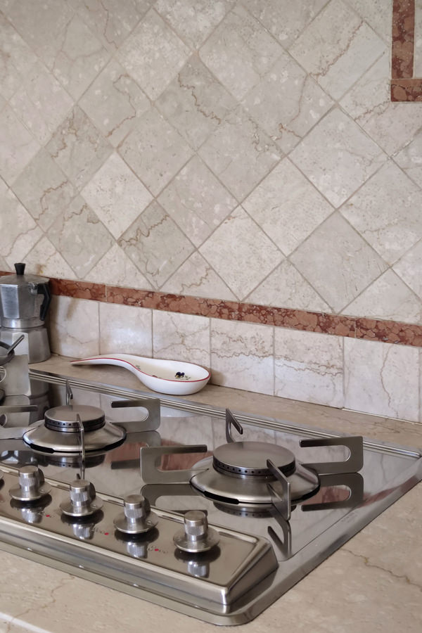
gas hob kitchen kitchen makeover
column ovens smeg contemporary kitchen drawers hollow handles

Conclusions: customize the classic furniture

The classic style, which today is witnessing a rediscovery, is easily combined with the essentiality of the contemporary style, creating an interesting combination. Restoring the stylistic balance of the interiors can also mean finding the right combinations between different styles, giving a decisive impression to the house.
To learn more, another example of a house with contemporary style and classic kitchen.

Iron furniture for a contemporary style apartment with refined details

Iron furniture for a contemporary style apartment with refined details

Iron details constitute the leitmotif for the contemporary style furniture of this city apartment. From the living area to the bedroom, passing through the passageways that underline the threshold of each room. In the bedroom, a walk-in closet located on the side of the entrance is a compact but capacious structure.
details-iron-cabinet-TV-portal-entrance

The passageways: the iron portals to underline the threshold

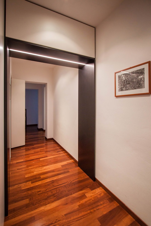
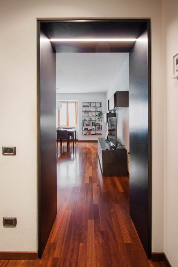
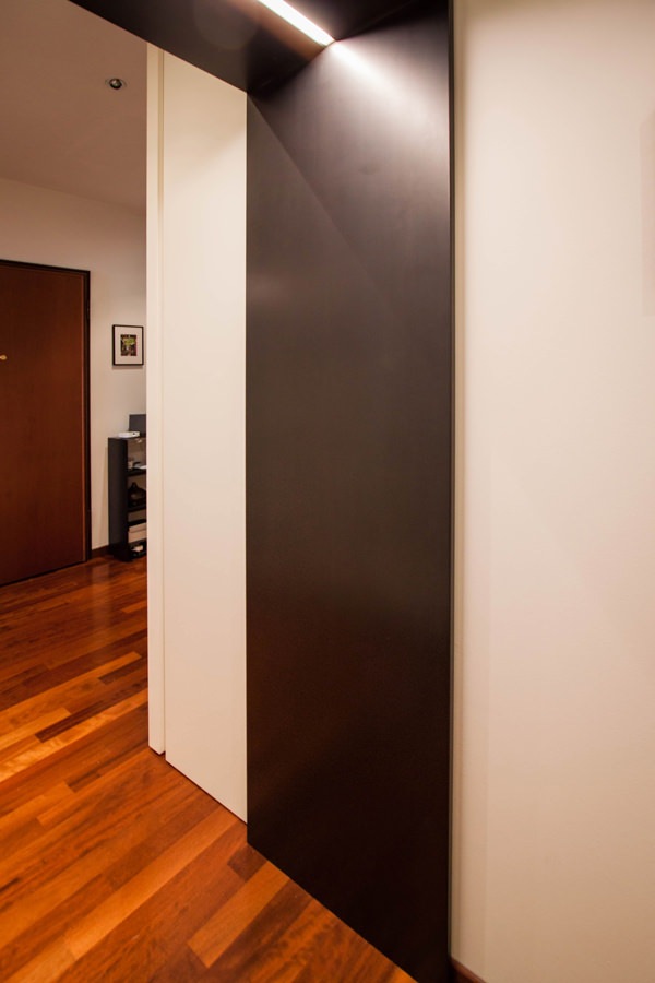
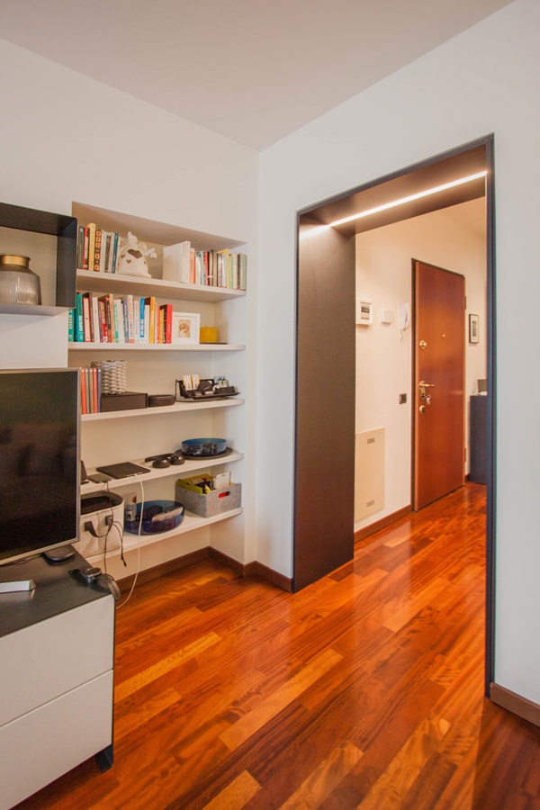
From the entrance, the corridor unfolds, joining the living area with that night. To delimit the passage, emphasizing the threshold of each room, an iron portal with integrated lighting.
These accompany the passage between the different environments with a coating that laterally flows from the top.

A portal that visually and conceptually marks the crossing point, characterizing each room.
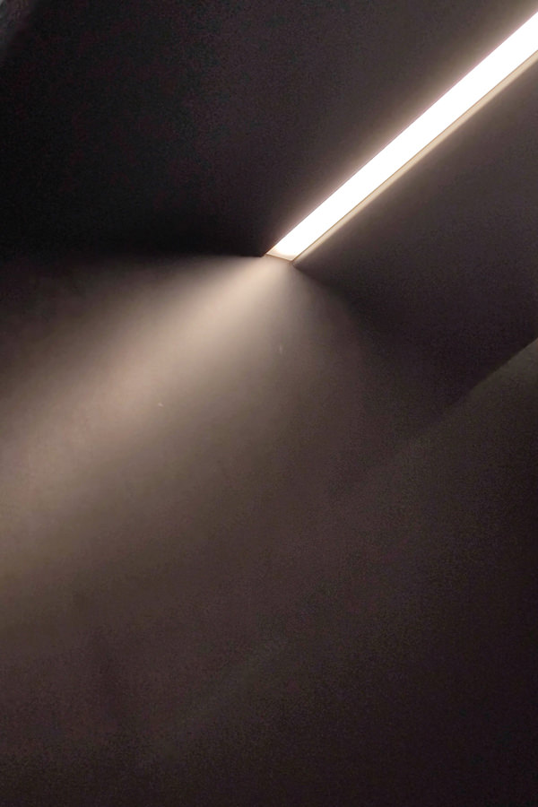
Recessed in the upper part there is also a LED strip able to horizontally illuminate the portal.

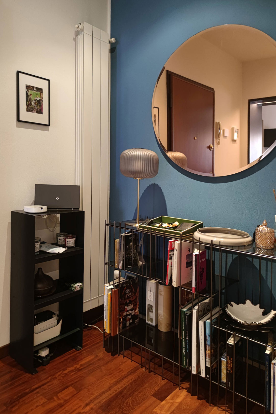
The choice of black waxed iron is echoed in the cabinet serving the entrance, the Metrica Console by Mogg. This is accompanied by a custom-made cabinet empties pockets entirely made of iron.

portal-iron-corridor-integrated-lighting
entrance-portal-hall-iron-black-waxed-recessed-lighting
furniture-in-iron-entrance-apartment-contemporary-style
detail-lighting-LED-portals-iron-corridor
corridor-portal-passage-iron-waxed-lighting

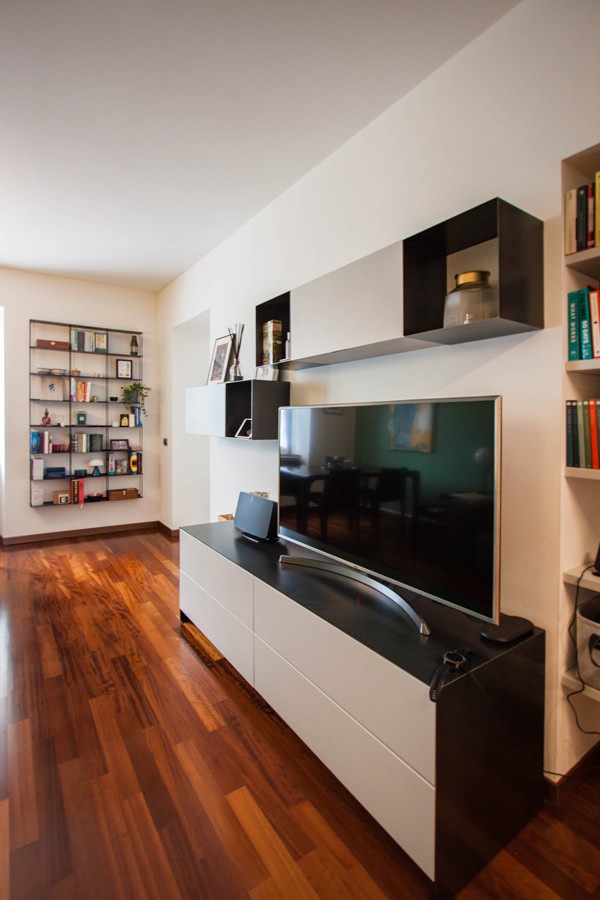
The living area. TV cabinet and wall units with iron details

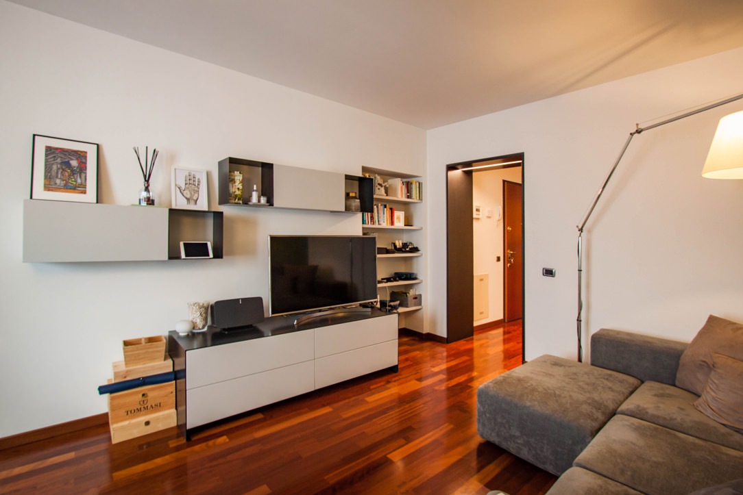
From the entrance, the iron portal with integrated lighting marks the passage to the living area.
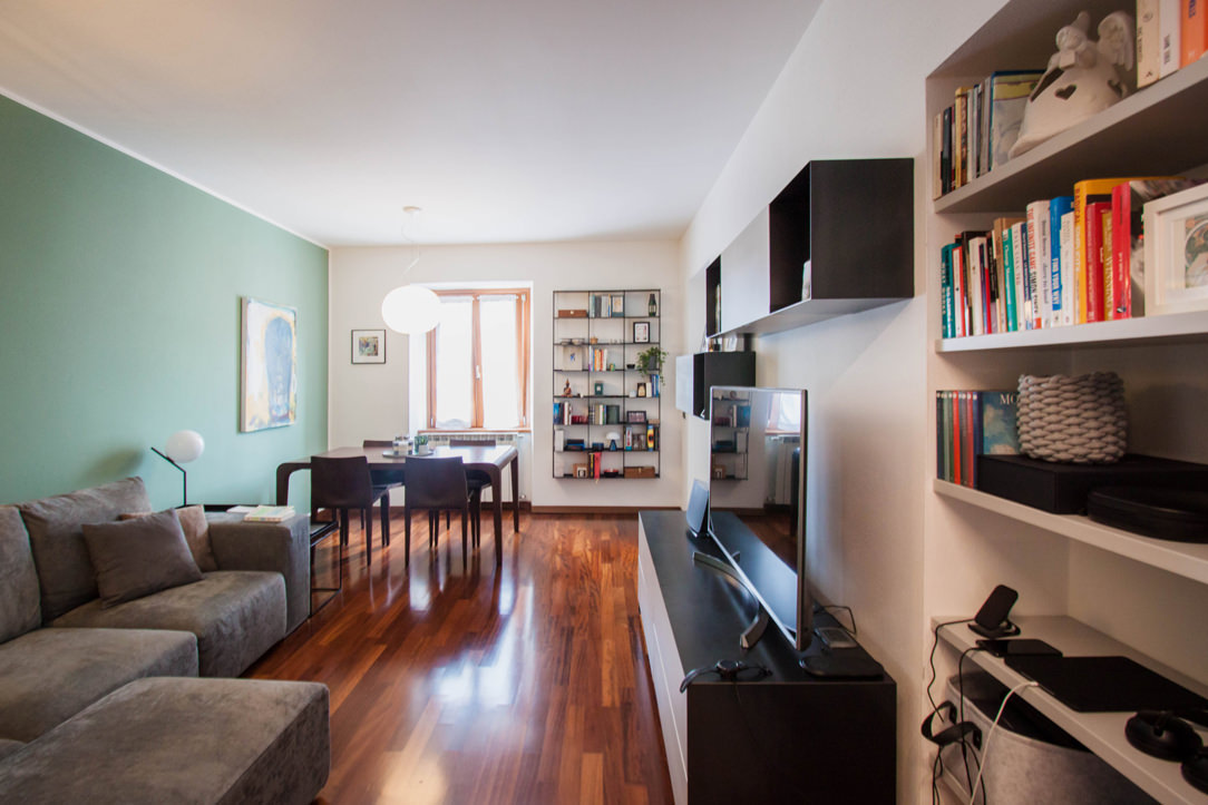
This houses a large corner sofa that stands out against a sage green back wall. A touch of color that rejuvenates the environment making it elegant and gritty.

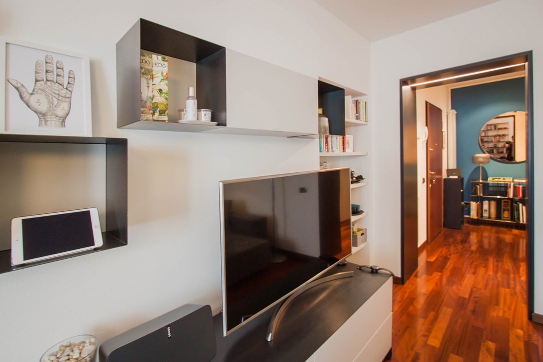
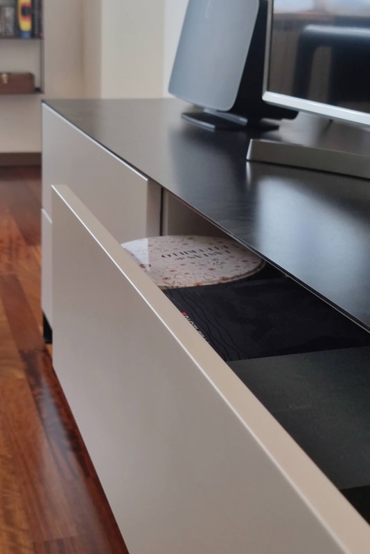
From the front, the furniture serving the TV is at home with a system of shelves and wall units with iron details.
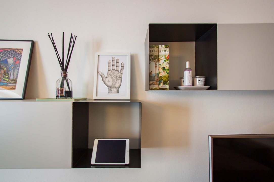
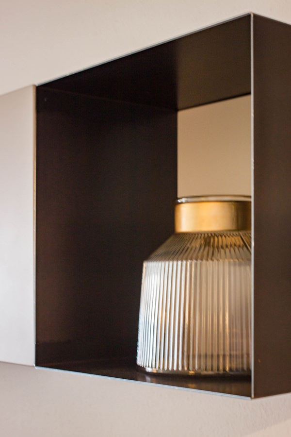
A composition of solids and voids that alternates the thin thickness of the iron sheet with the more massive dimensions of the matt lacquered MDF.
In particular, the open compartments in sheet metal are laterally inserted to the wall units with drop-down opening. The doors in matt lacquered MDF reflect the stylistic line of the TV cabinet in the color.
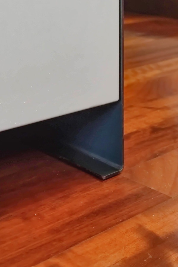
The latter is equipped with sheet metal shoulders which, by bending at the end, become a load-bearing structural element.
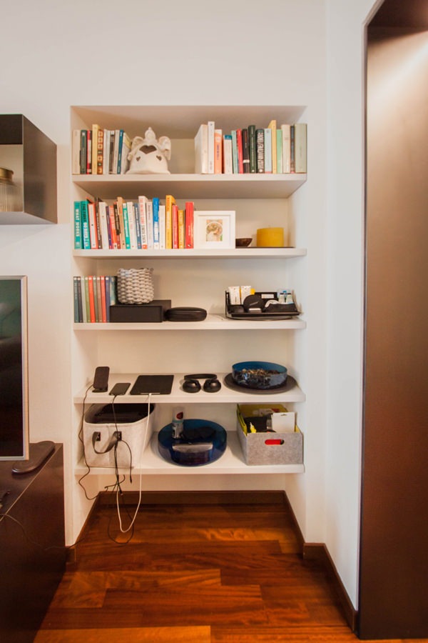
An equipped niche to the side of the TV cabinet accommodates custom-made shelves for small objects or books.

living-room-contemporary-iron-furniture-side-view
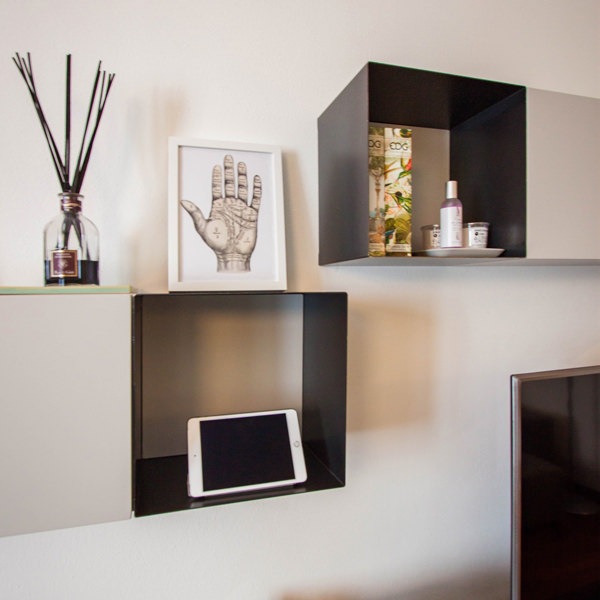
furniture-TV-details-iron-shelves-service
iron-furniture-living-area-detail-portals
living room-modern-cabinet-TV-wall-units-iron
detail-front-wall-units-flap-bookcase-iron-TV cabinet
detail-iron-shelves-TV-living-area
black-waxed-iron-tv-cabinet-drawers-handle-hollow
front-view-bookcase-niche-shelves
detail-furniture-in-iron-shoulder-support-feet

The sleeping area between the workstation and a walk-in closet created in the master bedroom

The corridor characterized by the presence of black waxed iron doors also leads to the sleeping area.
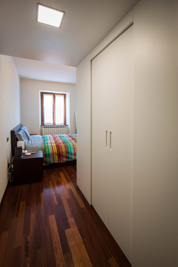
In the master bedroom the architectural conformation creates a space that allows the insertion of a custom-made walk-in closet.

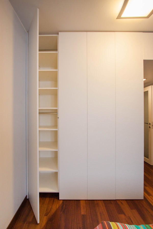
Its compact but roomy layout is set on the side access adjacent to the bedroom door. Two sliding doors fit into the white MDF closing panels, denoting access to the environment.
Here the central compartment is occupied by a series of linen drawers in the lower part and shelves above.
On the sides, on the other hand, hangers are arranged using the double height to organize shirts, jackets and trousers.

The containment structure is divided into panels that create a visual rhythm and allow in one extreme to take advantage of a niche accessible from the outside. Internal shelves adjustable in height make it functional for various uses.

walk-in-closet-bedroom-structure
composition-walk-in-closet-drawers-shelves-hangers
detail-opening-drawers-linen-walk-in-closet-handles-recess
fixed-tubular-detail-hanger-shirts-walk-in closet
double-height-hangers-shirts-jackets-walk-in closet
side-view-hanger-walk-in-closet-drawers-linen
walk-in closet-bedroom-double-access-sliding-doors
external-walk-in-closet-door-accessible-shelves-inside

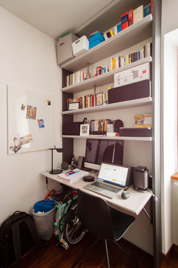
In the adjacent service room, there is instead a large desk with attached bookcase. A tailor-made solution that is increasingly current in times of smartworking. The upper bookcase has MDF shelves and iron side panels that also become load-bearing elements for the desk top, inserted to form a compact piece of furniture. The care of detail is expressed in this case with the 45 ° shaping of the front of the shelves. The effect obtained is to visually thin the elements, creating stylistic modernity.

mobile-desk-bookcase-shoulders-iron
detail-bookcase-shelves-shaped-profile-iron-shoulders

Inserting iron furniture in your apartment means endowing the rooms with character and elegance. Versatile and practical, this material manages to combine high resistance with reduced thickness, declining in different design solutions. Furnishings able to define the stylistic imprint of the interiors, they fit perfectly into interiors in a contemporary style, but also modern, industrial and boho chic ones.

Adapting standar furniture with tailor-made solutions

Adapting standar furniture with tailor-made solutions

Custom-made furniture and stardar products belong to two different worlds, bringing with them a large repertoire of solutions and projects. Each has great strengths and opportunities, but both also know their weaknesses. Sometimes it happens that these two worlds come into contact, helping and supporting each other. After all, it is well known: unity is strength!

bathroom-luxury-standard-furniture

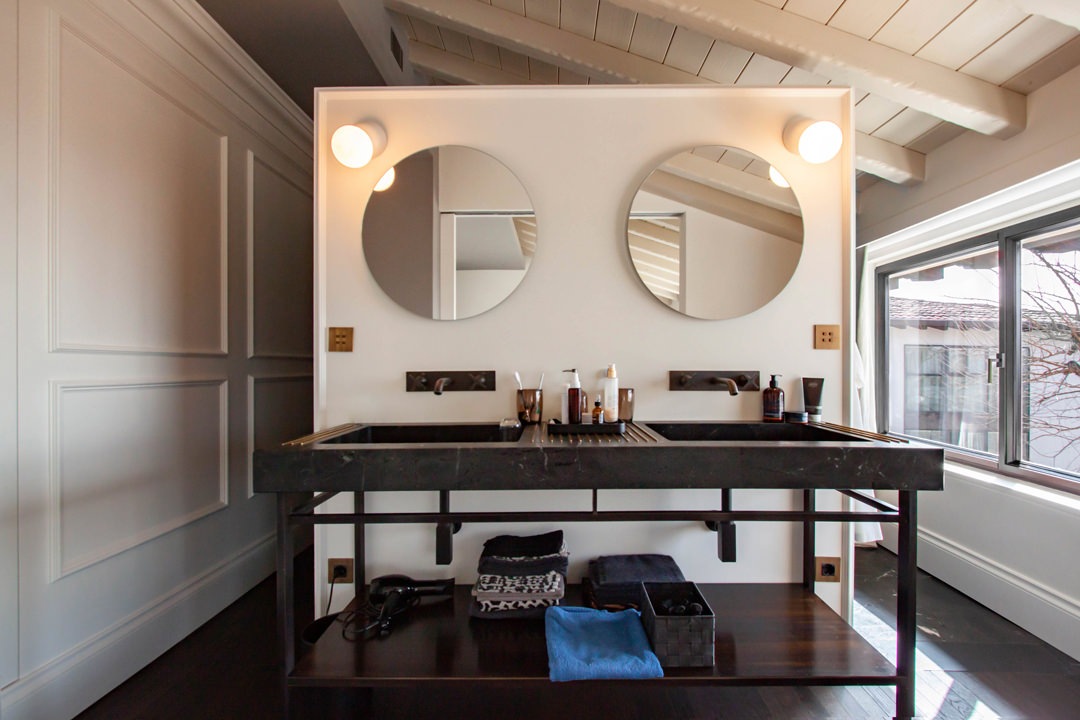
A master bathroom with elegant series furniture.
On the side, made-to-measure valances hide the support rails of the curtains

Standard and customed furniture: eternal rivals? Not at all!

It is common belief that standard furniture and custom-made solutions are ruthless competitors. Nothing true!

In fact, these are different realities that provide valid project proposals to customers, offering them a market capable of satisfying every request. Tastes, needs and desires of customers often interface with intrinsic constraints.
These include: budget limits, production restrictions, delivery times, availability and variety of alternatives.
Within the world of furniture design and production there are in fact an infinite number of secondary aspects that define the strengths, but also the limits of each company.

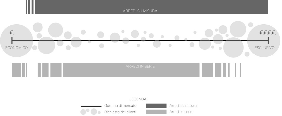
We can imagine the world of furniture as a range of parameters, at the extremes of which lie the cardinal principles of the two worlds.
On the one hand, standard furniture at super cheap prices capable of destroying any competitive market.
Its philosophy is certainly linked to a democratization of design that exploits large industrial production to contain prices and make its products accessible to all.

At the opposite end, a niche market, linked to the concept of “exclusivity”, chosen for its impossibility of identical reproduction and the opportunity for customization.
The choice of this type of furniture is linked to a feeling of privilege in its availability.

Between these two opposites there are the infinite number of companies that experience design on a daily basis.
Embracing the entire range of the market in this sector would be impossible and counterproductive, leading to poor results both for the manufacturer and for the customer himself.

It necessarily follows a specialization in the type of products and an identification of the reference target.
Precisely for this reason, standard furniture and tailor-made solutions cannot be considered competitors because they embrace different philosophies, targets and production systems. Their relationship is instead collaborative and mutually supportive, making the most of the potential of each party.

inpho-graphic-furniture-market

Potential and constraints of standard products

One of the main advantages of series furniture is the vastness of the market to which they belong.
This makes it possible to satisfy the tastes of each customer, providing a wide choice of solutions and variants. To this is added an economic advantage deriving from the optimization of production.In fact, by exploiting the industrial production and the repetition of the pieces, it is possible to optimize the production phase in the best possible way, managing to contain costs. This also implies an ever more careful precision and improvement of the single elements.

On the other hand, this specific reproducibility limits the scope for intervention and customization. The world of mass-produced furniture works in reproducible and combinable “modules”.
Customization consists in knowing how to combine the individual elements and organize them in a different way, but it certainly does not allow for specific product customization as in custom-made furniture.

So here are island, peninsula or monobloc kitchens that take on different shapes depending on the environment in which they are inserted.
However, these find their first obstacles when there are architectural constraints or special requests from customers.
Customization does not cover all levels of furniture reading.

This is where bespoke design comes in, offering its attention to detail and custom design.

spa-room-standard-furniture
customed-mirror-spa-sink-standard-furniture

When standard and customed furniture meet each other: a full-height shaped mirror fits into a SPA context with scenographic furnishings from important manufacturers

Works of tailor-made workmanship: a contemporary style kitchen

Where the supply of standard furniture reaches its limit of customization, the flexibility and spirit of adaptation of bespoke furniture comes into play.

An excellent example of this, is this luxury-style house distributed over three levels.
The maintenance and collaboration with Modulor involved different rooms.

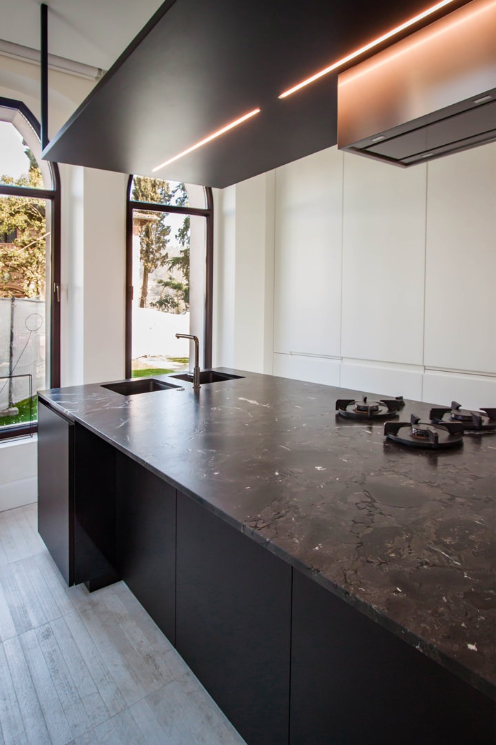
First of all, the kitchen, consisting of a wall equipped with full-height doors on the right side of the access and a central island with a design hood. Precisely in this last element, the volumetric composition of the furniture provides a large surface that can be used as a worktop, but it prevents its use of meals.
In fact, by equipping the worktop with doors and lower drawers, it could not be used as a support surface for quick meals, as it did not provide adequate space for the user’s seat.

Finding tailor-made solutions in this example meant creating a lateral niche in the volume of the island. In this way, even with a not very wide depth, it was possible for customers to find the right space to sit comfortably while keeping their legs perpendicular to the structure. A comfortable snack bar for 2/3 people that does not give up on a work surface and support surface.

island-kitchen-adaption
standard-island-kitchen

An important island kitchen modified with tailor-made solutions: a niche has been created in the lower volume in order to use the worktop also as a support point for the consumption of quick meals

The sleeping area between secret passages and princess bedrooms

Even in the sleeping area, custom-made design has found ease to express its experience and personalization.

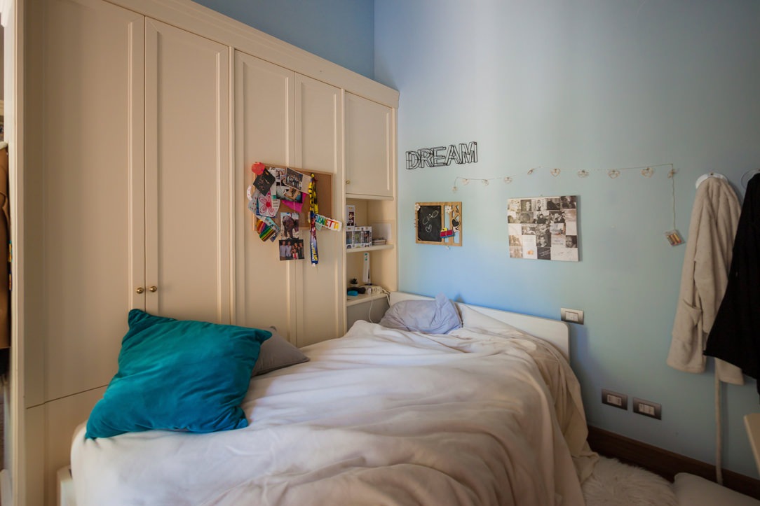
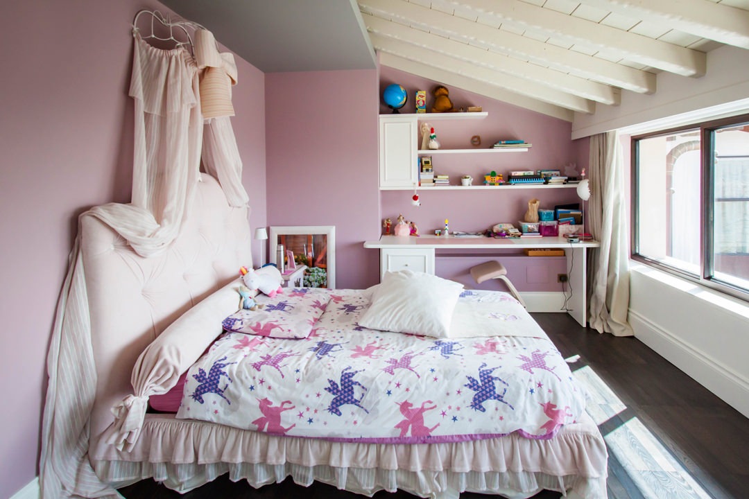
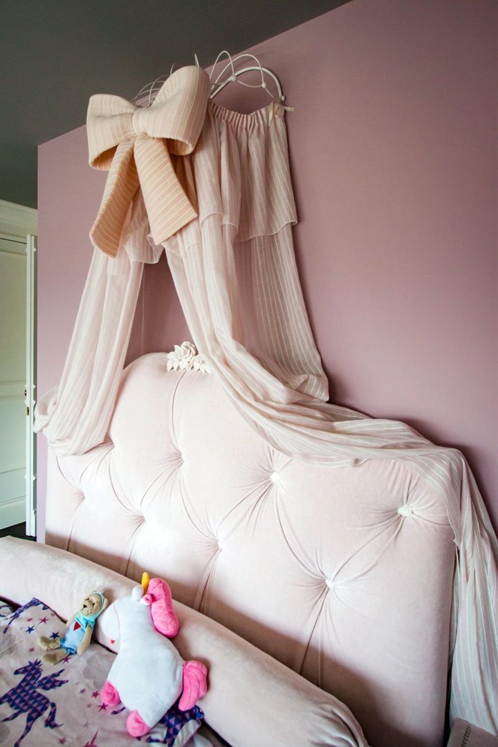
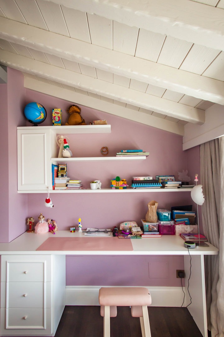
The classic-style bedroom is characterized by the presence of an important bed with drapery and padded headboard with a fairytale look. Taking advantage of a lateral architectural niche, a desk with wall unit and shaped shelves was inserted in order to make it an integral part of the spatial configuration.

The custom-made desk top is accompanied by a chest of drawers with bands that also acts as a load-bearing element.
This is accompanied by a wall unit with a molded door and shelves in matt white lacquered MDF that reflect the boiserie.

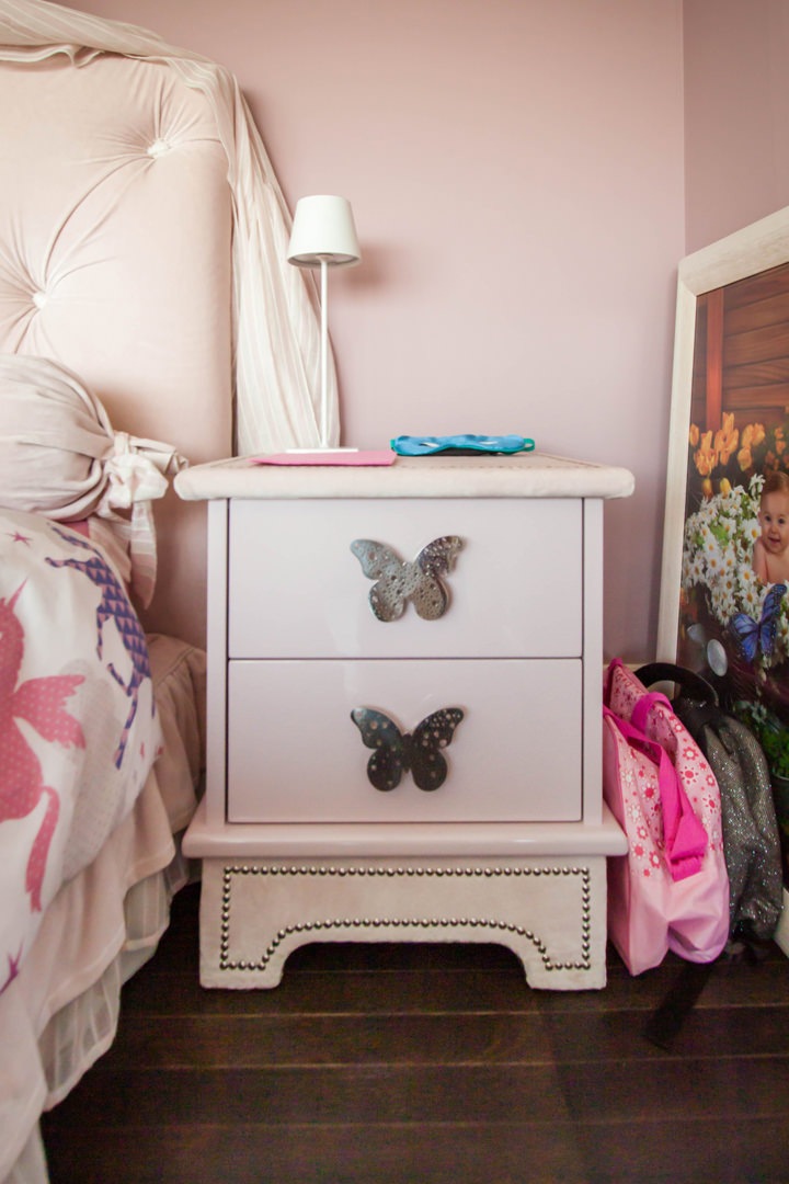
Even the bedside tables take up the style of the bedroom with handles in customed sheet metal in the shape of butterflies.
The side service bathroom illuminates the room with a glossy white tile wall cladding, crystal shower and pedestal sink with custom wall mirror.

classic-style-bedroom-princess-bed-standard-furniture

Every princess’s dream bedroom hosts an important bed with drapery and padded back

details-princess-bad-padded-back-drapery
details-bedside-tables-girl-bedroom

Details of a small bedroom from large-scale distribution: upholstered draperies and backrests perfectly match bedside tables with shaped sheet metal handles

customed-desk-bedroom
classic-style-bedroom-customed-desk

The desk in the niche takes up the classic style of the boiserie paneling through door moldings

detail-molded-door-bedroom
detail-white-laquered-shelves-bedroom

Shelves and doors in white lacquered MDF in warm tones for this classic style desk

customed-mirror-standing-sink
customed-mirror-standard-standing-sink

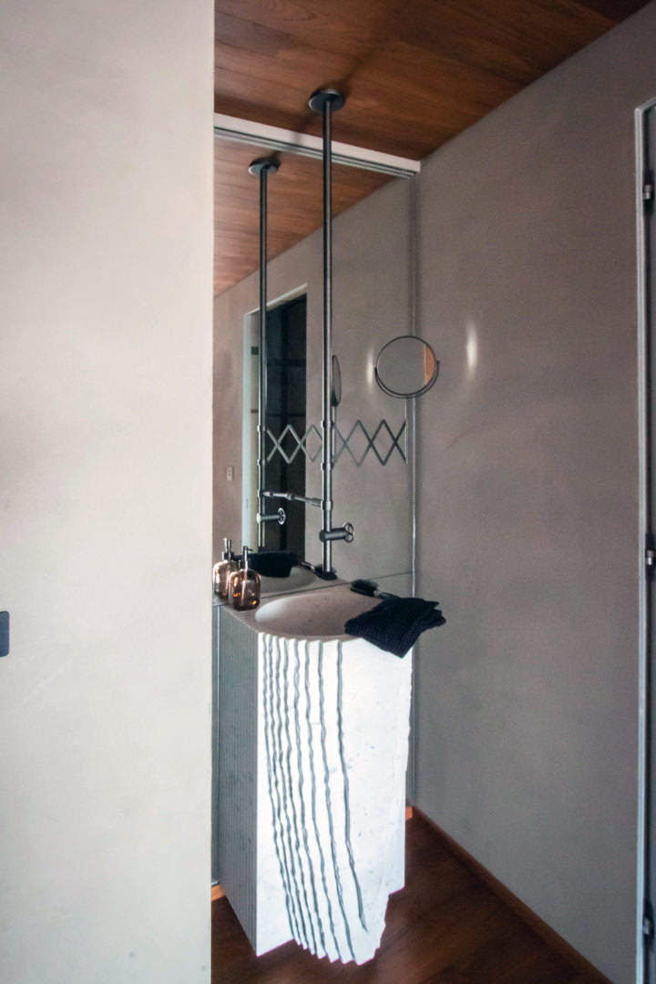
The made-to-measure mirror accompanies the classic style design pedestal washbasin

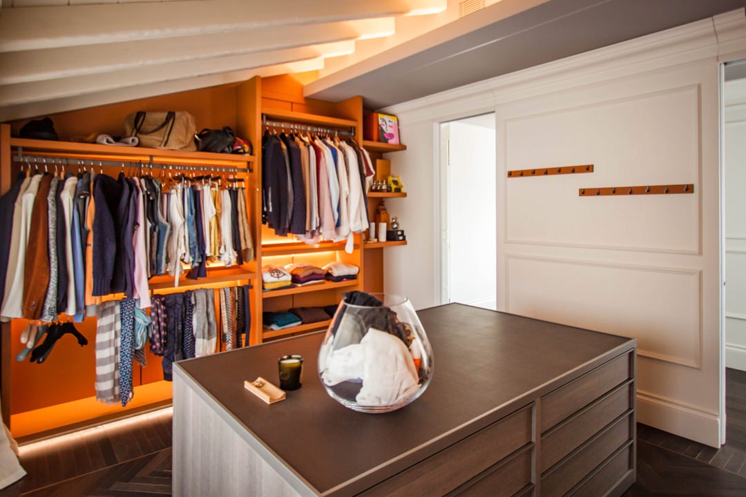
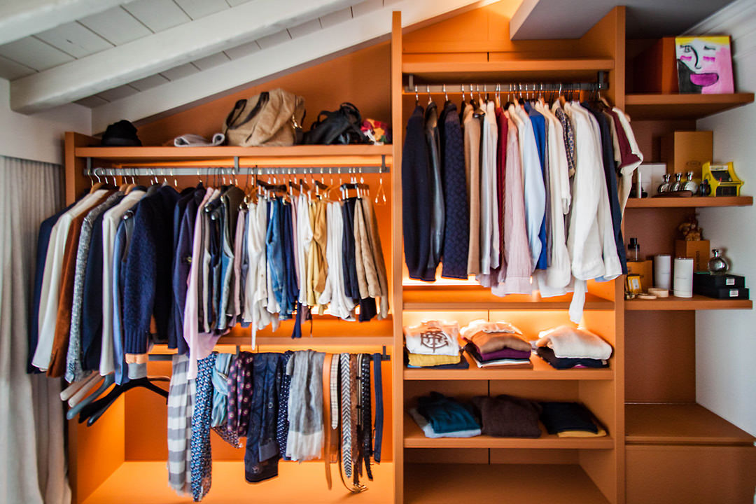
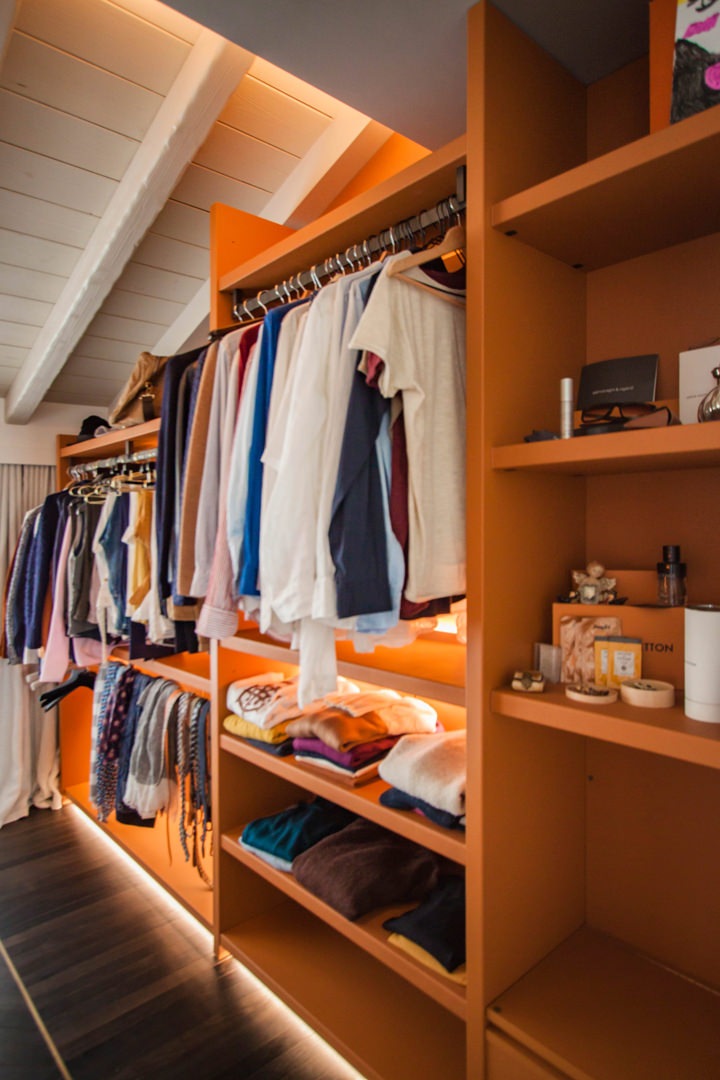
Always in the upper floor, takes place the walk-in closet, whose orange tones give a touch of character and freshness to the room while remaining elegant and impressive.

A retractable mechanism is hidden inside the side structure.
What apparently looks like a support bench hides a flap door with a system of internal channels that allow dirty clothes to be brought directly to the laundry area. This internal conduit channel is also intercepted at the level of the living area through the opening of a door on the external front of the kitchen. What apparently seems to be part of the molded boiserie is transformed into a storage point for the tea towels which, using the internal slope, are taken directly to the laundry.

standard-furniture-walk-in-closet-leather-finishes

Composition of a walk-in closet with elements in series: on the sides hangers and shelves covered in orange leather, in the center a chest of drawers in textured bilaminate

walk-in-closet-flap-door

The side wall of the walk-in closet with shelves and hangers.
On the right, the small service bench hides the channel that leads to the laundry

detail-flap-door-walk-in-closet
molded-boiserie-open-door

Left: the folding door mechanism from which the conduit for soiled garments starts. Right: the door incorporated in the boiserie that intercepts the path for the kitchen products.

Designing in details a customed wardrobe

Designing in details a customed wardrobe

From the needs of the customers and the type of clothing used, the project for a customed wardrobe is born, studied in its internal configuration in the smallest details. A careful choice of materials and finishes give importance and elegance to the project.
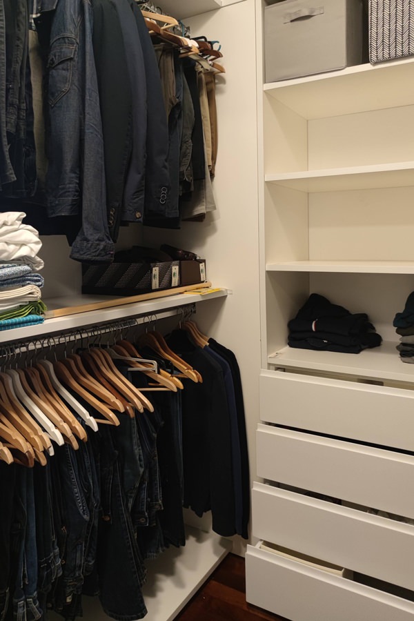
internal configuration wardrobe man shelves detail

Studying the internal configuration of a customed wardrobe

Studying the internal configuration of a wardrobe, it is essential, as a first step, to analyze the type of clothing owned. Tubular hangers and shelves for folded items are balanced to best meet the needs of customers, making the most of the space. In fact, shirts, jackets, trousers and dresses occupy different dimensions depending on how they are folded. For this reason, it would be counterproductive to design a “universal” wardrobe.
The first step in designing a made-to-measure wardrobe is therefore to study the customer: to know their habits, tastes and needs. In the case of this young couple, the six-door wardrobe has been divided equally into two compartments: the women’s section, in which the hanger certainly prevails, but in which there are also small shelves for folded items, and the men’s section balanced between folded and hung.

Each item has its own space

The next step in the design was to study different typological variants of the wardrobe product in order to maintain a uniform line of sight in both sectors, but at the same time find the optimal solution for the internal organization of the space.

The internal layout has been designed in such a way as to respect the two divisions and keep them mirroring each other. The pair of central doors was thus conceived with a symmetrical internal division reserved for folded items.

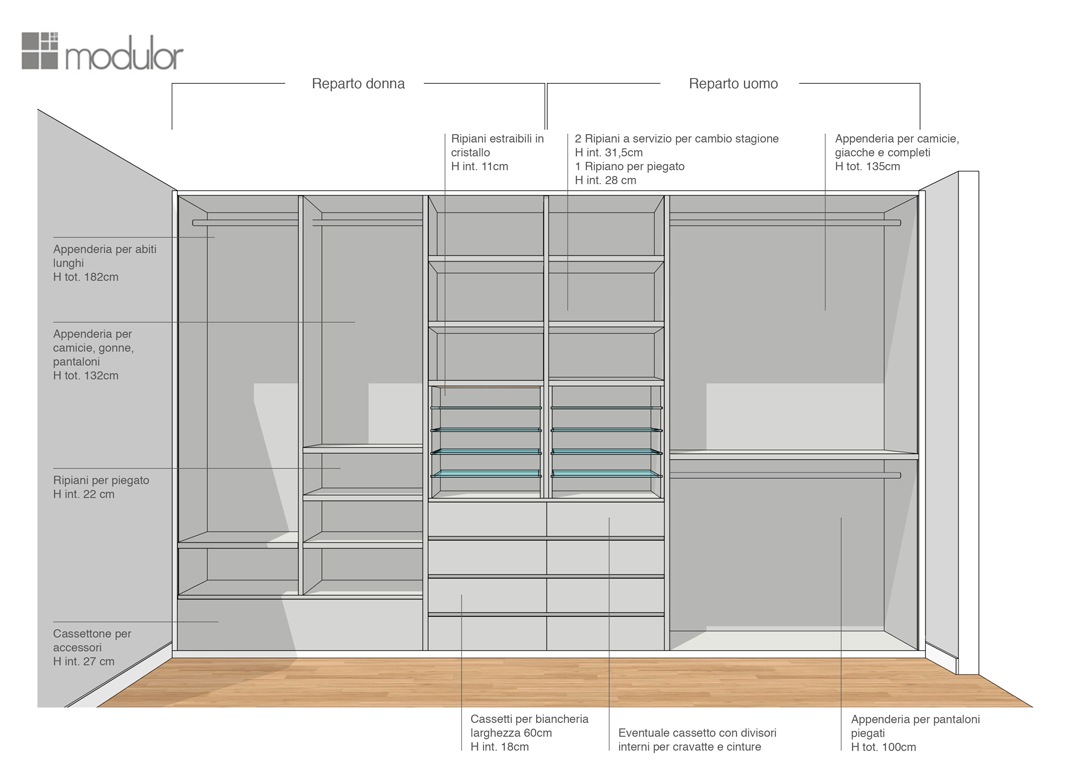
Modulor internal configuration wardrobe proposal 01


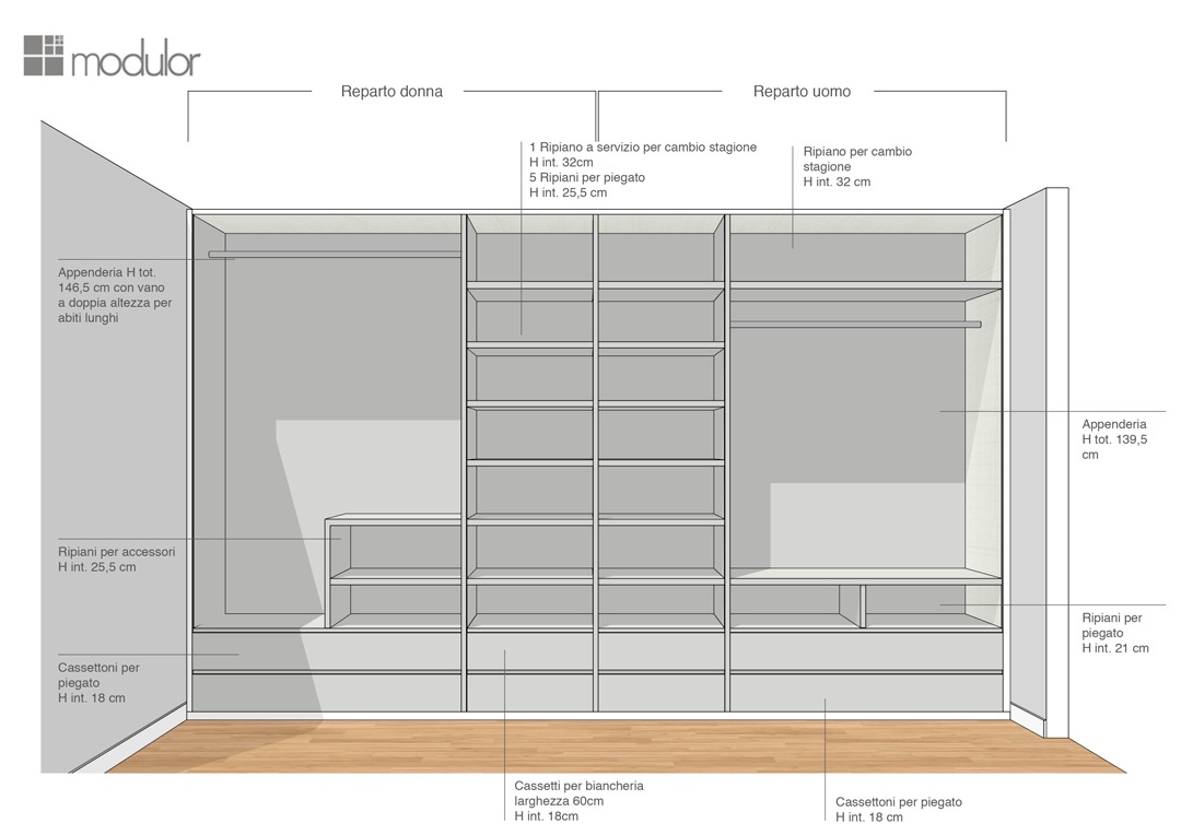
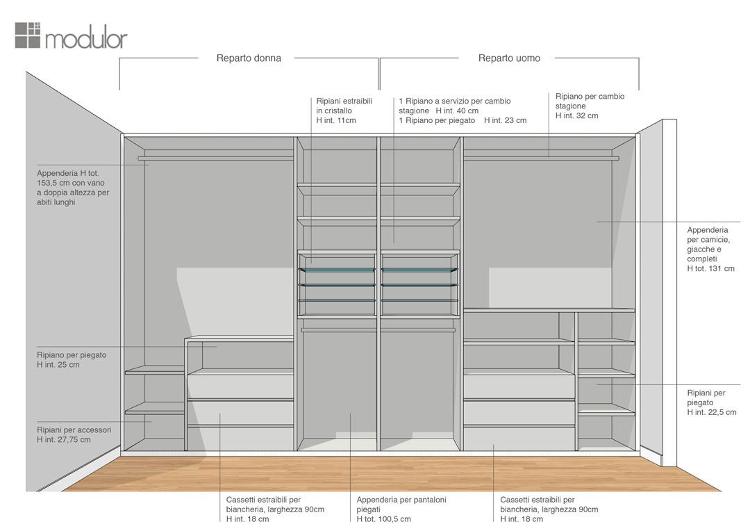
In the first solution, extractable glass shelves are designed for folded shirts and t-shirts in order to store them in a more orderly and elegant way. In the women’s department, the hanging division allows the set of long dresses on the left side, and short dresses with folded trousers on the right side. The women’s department is completed by a chest of drawers for bags and accessories and upper shelves. The conformation of the men’s department is instead characterized by fixed tubulars for trousers folded in the lower part, shirts and jackets in the upper part.
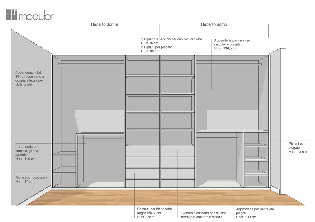
Modulor internal configuration wardrobe proposal 02
Modulor internal configuration wardrobe proposal 03
Modulor internal configuration wardrobe proposal 04

The second solution proposed sees both components configured in the same way. The only difference is in the women’s part, where a side shelf is eliminated to accommodate long dresses. The third and fourth solutions also see the alternation of shelves and tubulars in order to ensure the double height of the hangers on one side, and a good number of drawers for underwear on the other.
internal configuration wardrobe front view woman part

The definitive conformation.

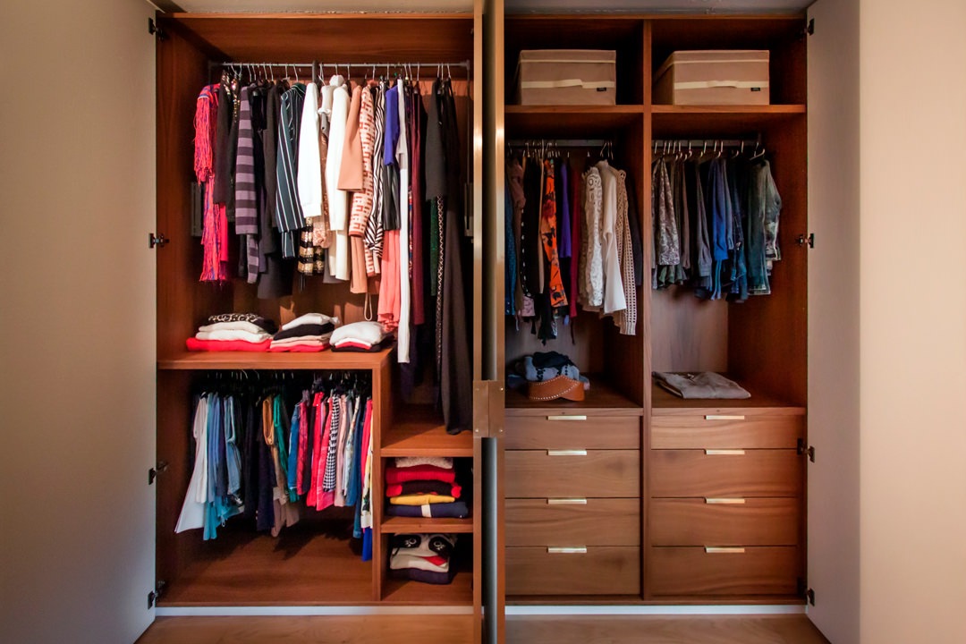
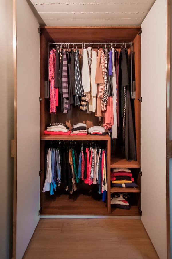
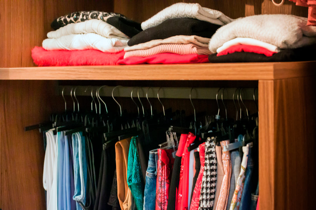
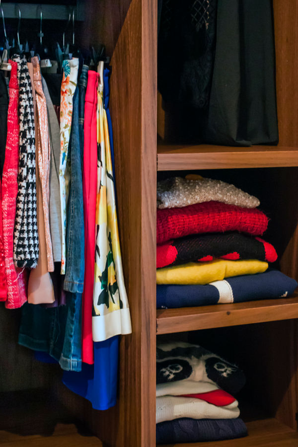
Among the various solutions proposed, after a comparison and mutual relationship with customers, the project proposal was born and then became reality. A configuration that respects the needs of each part, setting up a women’s department with hangers in the upper part that hosts dresses of different lengths. At the service of this, for greater practicality, a dark-toned side table with painted aluminum tubing that guarantees great resistance and capacity. In the lower part, a fixed tubular for skirts, blouses and shelves for sweaters and bulky items. 

Modulor internal configuration wardrobe woman
Modulor internal configuration wardrobe drawers
Modulor internal configuration wardrobe man

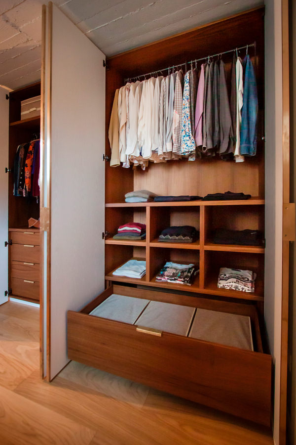
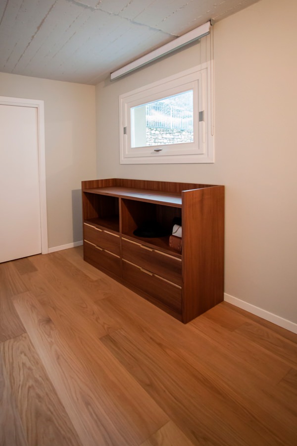
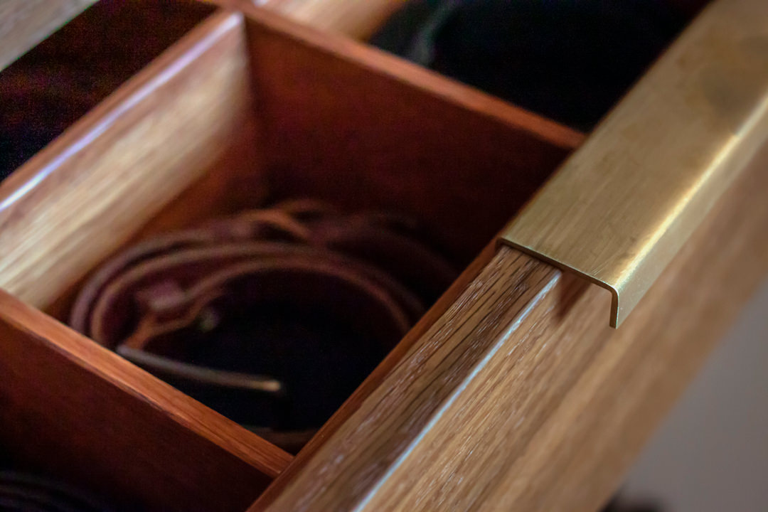
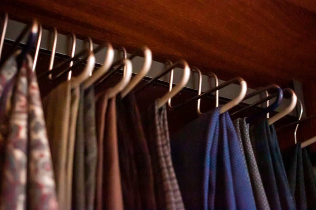
The pair of central doors, mirrored on both sides, has a fixed hanger for folded trousers in the upper part and linen drawers in the lower part. The first of these is characterized by the presence of internal dividers and velvet bottom to keep the belts in order. In the masculine part, the upper part with servetto is dedicated to jackets and shirts, while the lower part houses fixed shelves for folded items and a large drawer on the bottom for bulky. To accompany the whole, a chest of drawers with central compartment for accessories and upper service shelf.

Servetto brown detail
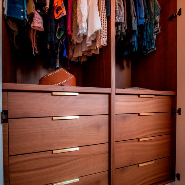
internal configuration wardrobe drawers with brass handles
open drawers detail internal configuration wardrobe man
internal configuration wardrobe woman hanger
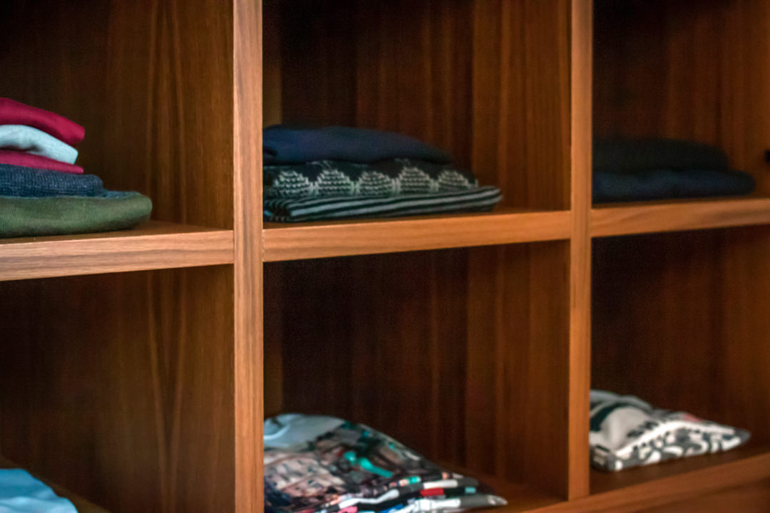
oak shelves detail
chest of drawers side view
chest of drawers front view
chest of drawers detail

Materials and finishes

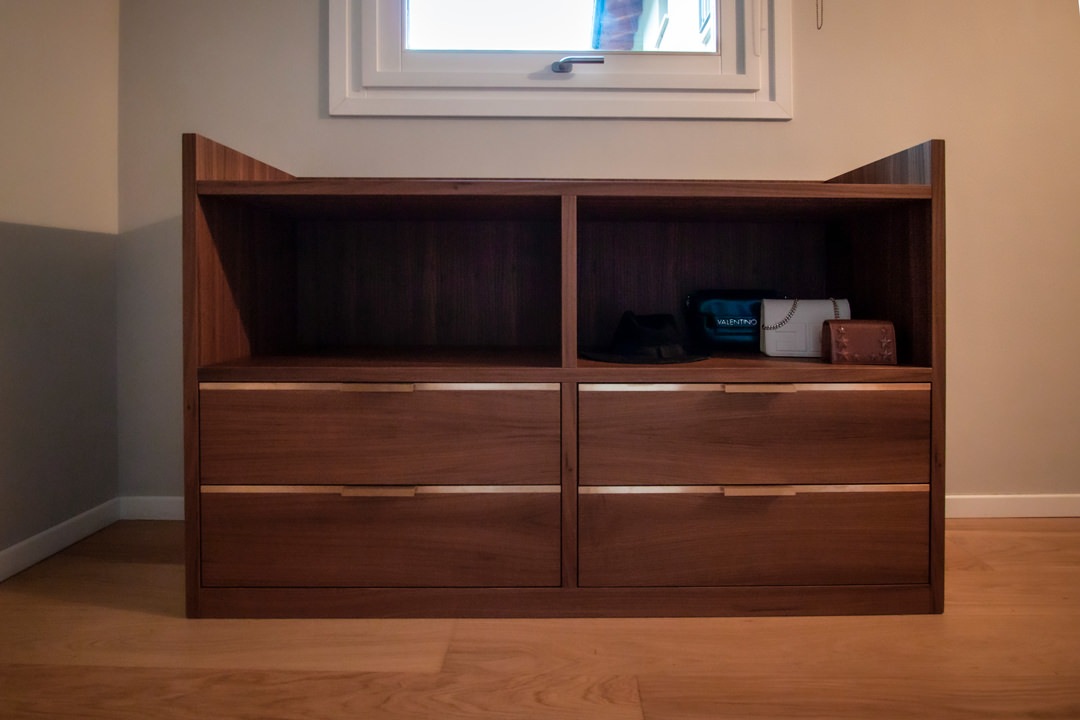
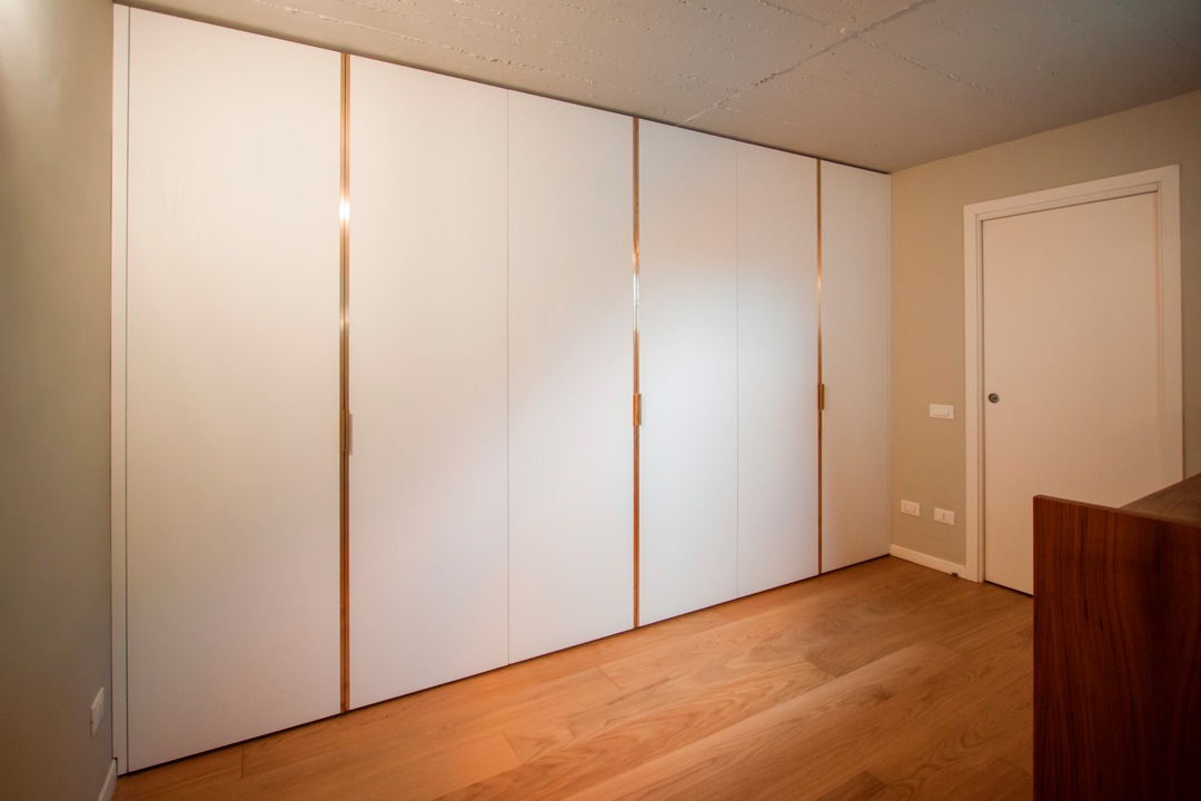
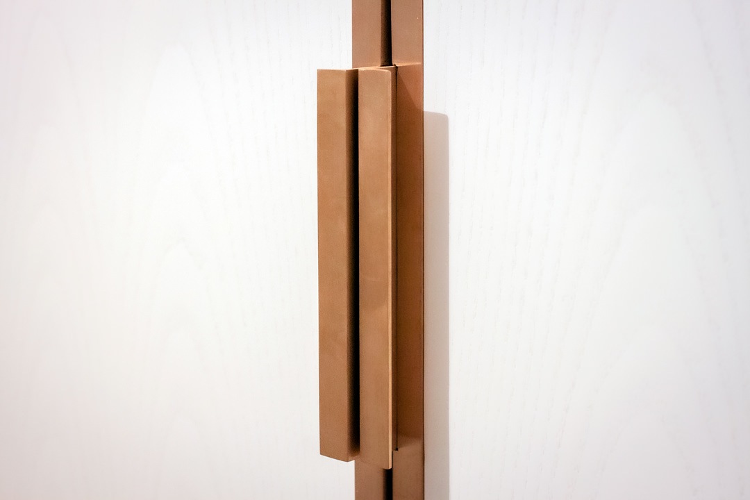
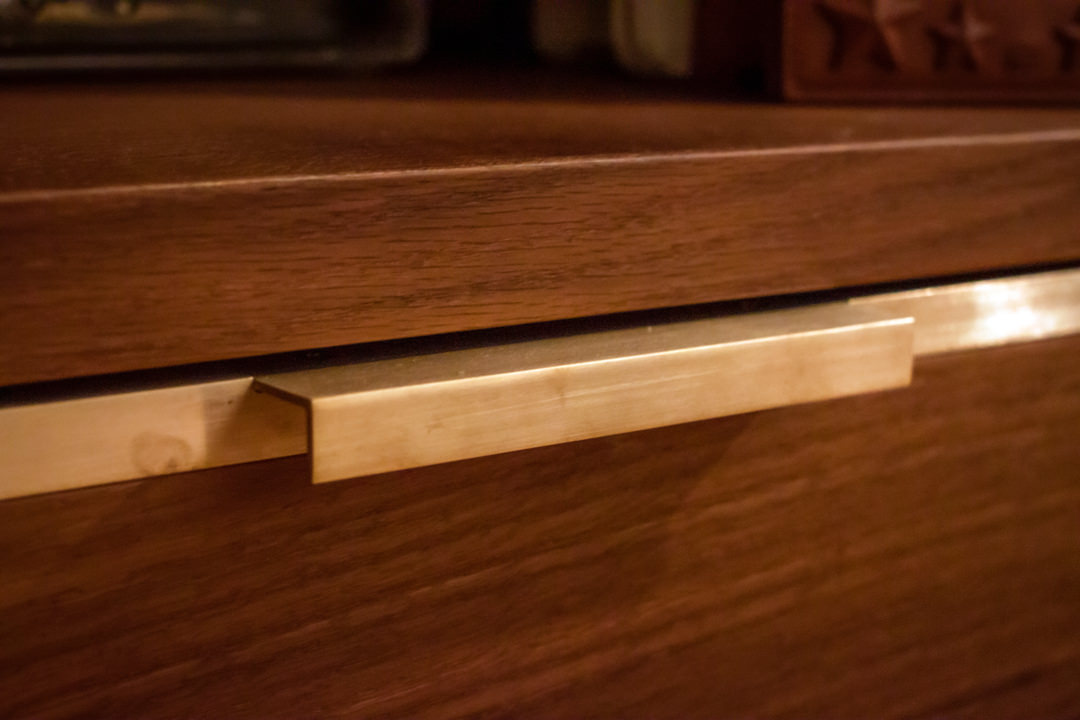
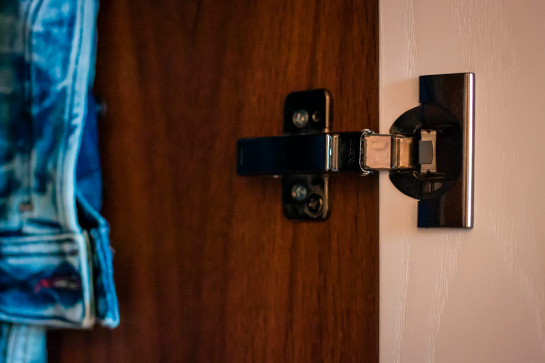
Even the choice of materials and finishes reflects a particular attention to detail and a refined taste. The doors in white-stained ash are combined with handles in satin brass sheet with joint and fold system that makes them elegant and refined. The same type of handles, with sheet metal coplanar with the wooden structure, is used in the external chest of drawers, whose development follows a horizontal rather than a vertical trend. The interior of the wardrobe and the structure of the chest of drawers are in smoked oak, whose warm and soft shades perfectly match the existing natural oak parquet. A reference to brass is also present in the internal drawers of the wardrobe, with very simple but elegant folded sheet metal handles that rest on the front of the drawers. Servetti with brown aluminum finish, fixed tubulars and hinges with black color finish complete the overall view with uniformity and elegance.

wardrobe doors white ash
brass sheet handle detail
brass handle detail chest of drawers
internal divider detail belt tray
fixed hanger brown detail
black hinge detail

Designing a made-to-measure wardrobe means thinking about an internal conformation that best meets the needs and practicality of customers. Like an item of clothing, furniture must also perfectly fit the personality of the user.